
Okay, here it is.
Just in case you missed it, in this recent post I innocently posed the question of an abstract art tutorial following the surprising success of my own flukey attempt.
I thought there might be a little interest though the response was actually overwhelming!
Seems abstract art tutorials are in high demand.
Now, you should know, I don’t lose sleep over too much, though the thought of having to produce a clear tutorial covering what was actually quite an ambiguous process made me restless. Compounding the self-imposed pressure was the level of excitement and anticipation you guys seemed to have about it. It was super flattering, though still…gulp.
How the heck was I going to convey my blundering process in a concise way?
Hopefully this tutorial does the trick.
![]()
Before I get started, here’s the usual yada-yada.
Of course, there are a zillion-trillion different ways to create a piece of art and a trillion-billion variations on my amateur process. For clarity and succinctness this tutorial will focus on the particular techniques I used to achieve the look of my artwork. In reality, it was probably much more time consuming, self questioning, step laden and fiddly than it appears though I don’t wanna confuse the bejesus outta everyone. I want this to be a straight-forward, step-by-step guide which arms you with some knowledge and, most importantly, the confidence, to find your own inner artist. So please, feel free to stray from my general directions (in fact, experimentation is a must!) and DON’T GET DOWN ON YOURSELF if things don’t seem to come easily.
This painting method is somewhat accidental. Have a general vision in mind though be open to adaptation and prepared to embrace the unpredictability of the medium. Although I think it’s important to undertake this project in a thoughtful way, try to strike that balance between discipline and abandon – I know, I know, much easier said than done!
I attempted to create this tutorial whilst painting a whole new large piece of art similar to my initial painting, though found it all too tricky. It was just restrictive having to stop frequently and take notes, stage strokes, demonstrate techniques and snap pics. The whole artwork felt too calculated. So, for ease, I decided to use a smaller canvas and merely demonstrate the basic steps. The resulting artwork turned out quite different though still kinda cool (there’s a photo towards the end of this post).
Anyhoo, here we go…
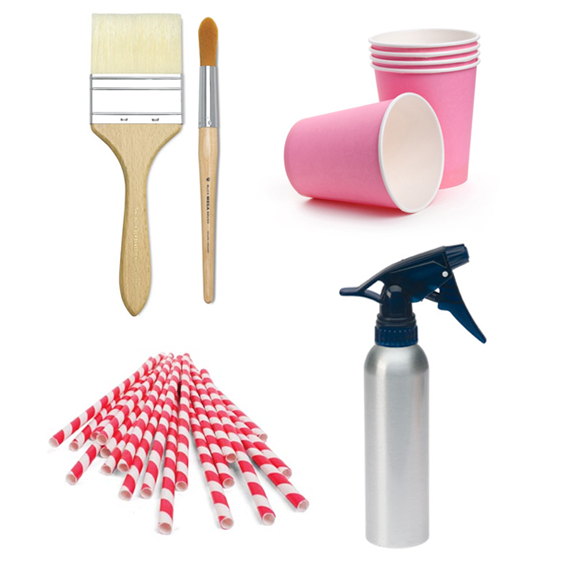
YOU WILL NEED…
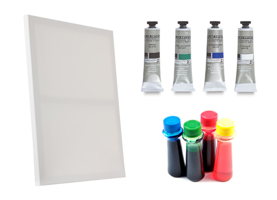
Stretched Canvas
I used a large 90cm x 90cm (36″ x 36″) canvas for my original painting and a smaller 60cm x 60cm (23″ x 23″) one for this tutorial.
You could use canvas sheet though pre-stretched frames are just so affordable and readily available nowadays. I like the deeper canvases as they tend to hold their shape better, don’t dip in the center as much and make framing easier. You might even find pre-printed canvases on sale for super cheap (I saw some HUGE photographic prints on sale at a clearance store the other day). Of course, if you do use a pre-printed canvas the additional step of an initial white coat may be required.
Note: Starting with a small canvas might seem to make sense, and whilst it is a good idea for practicing techniques and gaining an understanding of how the effects might transpire, in terms of producing an artwork it may actually be more difficult. Using a small canvas means scaling down details. Scaling down details means the need for extra finesse. Things can become all too muted then impact is lost. I also feel that large abstract paintings just have that air about them. That said, super large canvases carry their own problems as working on a huge scale can also be difficult. I recommend anything from around 60cm – 120cm (24″ – 47″) though it’s totally up to you.
Acrylic Paint
I used a combination of different craft paints I already owned. I know there are good and bad brands, though I’m not that fussy when it comes to paint. I used blues and greens to suit my colour scheme along with some white, black and brown.
Edicol Dye
I used regular food colouring. The dye works to give greater tonal variation. I don’t know how it does it, though it creates interesting transparent areas, distinct borders around shapes and is absorbed somewhat into the canvas which produces underlying patterns. As opposed to the acrylic paint, it also re-hydrates once dry which allows it to be picked-up and blended into subsequent layers. Just be careful if you want to produce a relatively muted painting though as dyes are heavily pigmented and tend to produce quite saturated colours. You only need a few drops.
Note: You can go as crazy as you like with colour though if you’re interested in creating a relatively monochromatic artwork similar to mine, opt for one principle colour (blue in my case) and one complimentary secondary colour (I went with green). White and black/brown can then be used to add depth and contrast. Also, keep in mind that when working with mixtures of paint, dye and water, colour creation is not an exact science. As colours merge and dry you will almost certainly notice some unpredictable results. You may want to trial any colours on a mini canvas first.
ALONG WITH…
PREPARATION
Lay down a drop cloth (if required) and position your canvas horizontally on an even-ish surface. Gravity will play some part in the look of this artwork as paint ‘flow’ is involved; too much of a slope may cause an undesirable bias, too even a surface may cause paint to pool in the center of the canvas. Of course, levels can be adjusted as required during the painting process and I did find myself carefully re-positioning the canvas from time to time. I like to work at around thigh height though you may prefer to work higher or at ground level, just ensure you can paint comfortably and maneuver easily around your canvas.
I like to work outside. Preferably on a nice, hot day. Temperature actually plays quite a role in the look of this painting as drying time effects the amount of flow and blending. It also dictates pace as some drying time is required between certain applications. You can use a hairdryer to speed-up drying time if required though be careful with ‘pushing’ the paint excessively.
You can prime your canvas (using gesso) if desired though most stretched canvases comes pre-primed anyway. You may also choose to add some texture (see note below).
Note: Given the fluid nature of the medium used, little texture is achieved. I really love textural paintings though in this case like the way the character of the canvas weave is so prominent. If, however, you want to increase the level of texture, build some up before commencing painting. You can use anything which will stick, set firmly and retain its form. Gesso is commonly used, though anything from craft glue to plaster paste can suffice. I actually trialed this style of painting over a previous textural acrylic of mine and found the subtle textures produced some lovely results though the more bold textures were overly distracting. Of course, it all depends on the look you’re personally after, though if you’re considering adding texture, maybe concentrate on gentle stippling over more obvious strokes.
THE PROCESS
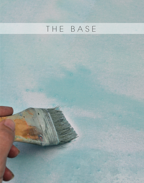
1 The base.
Mix up a runny combination of white acrylic paint, dye (in your chosen colour – I went with blue) and water then casually coat the entire canvas using a wide brush. Don’t worry too much about visible brush strokes and un-even distribution at this stage. Some tonal variation is expected though any obvious areas should self-level out (you can also use the atomiser to further saturate and blend any particularly patchy spots). Keep in mind that the colour will most likely fade as it dries. If it becomes too insipid, simply brush over it again with a less watery paint solution. As it begins to dry you can also spritz the canvas with a slightly darker combination of dye and water to add a bit more colour and some speckles. Alternatively, you can spray it with some diluted white paint if you feel the need to tone it down.
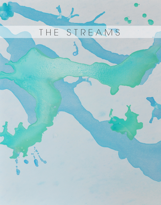
2 The streams.
Mix up a combination of white acrylic paint (you can also add some coloured paint – I used a little blue), dye (in your chosen colour – again, I went with blue) and water which is slightly thicker and more colour saturated than the mixture you used for the base (for some reason, the base appears quite white in the above photo – it’s actually more blue). Pour a few little pools onto the canvas, spread them out a little using a brush then allow gravity to do some work.
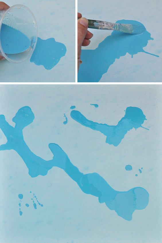
You can help guide the shapes of the streams if you like though don’t worry too much about their form as subsequent layering will hide and alter that anyway. This is more about laying down some areas of colour and movement and creating a foundation to build upon. You can also use a brush to simply drop a few small splotches here and there and a straw to blow out some thinner streams. Whilst some of this detail will be lost, in certain cases it may continue to show through the following layers (if desired, you can add any detail back at the end).
There’s no need to be overly careful, though don’t go too crazy quantity-wise. The watery mixture will spread considerably and you don’t really want to coat your entire canvas. Whilst you’re not in total control and further changes are still to come, keep composition in mind and try to retain some background expanses.
Before the streams are totally dry, pour on a few pools of an alternate colour (I went with green) and repeat the process. Some mingling should occur which looks quite marbled to begin with (which is lovely) though it does dry to a more uniform, flat finish.
Again, be careful with quantities. If you notice undesirable pooling or directional flow, try tilting the canvas mildly or sopping up excess liquid with absorbent paper towel. Don’t worry about paint dribbling off the canvas edge.
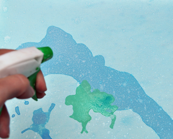
Play around with spritzing the canvas with water or diluted paint to achieve greater flow, softer edges, more blending or additional speckles as desired. Once again, colours will change upon drying so be patient and make changes as needed. Try not to pre-empt things too much.
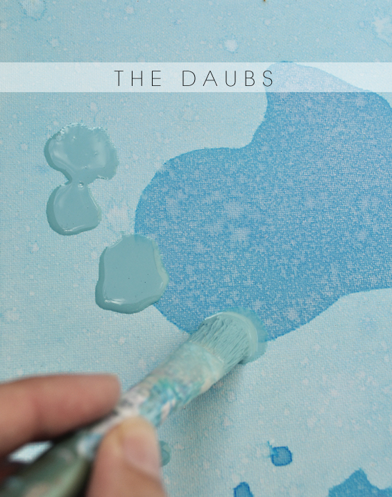
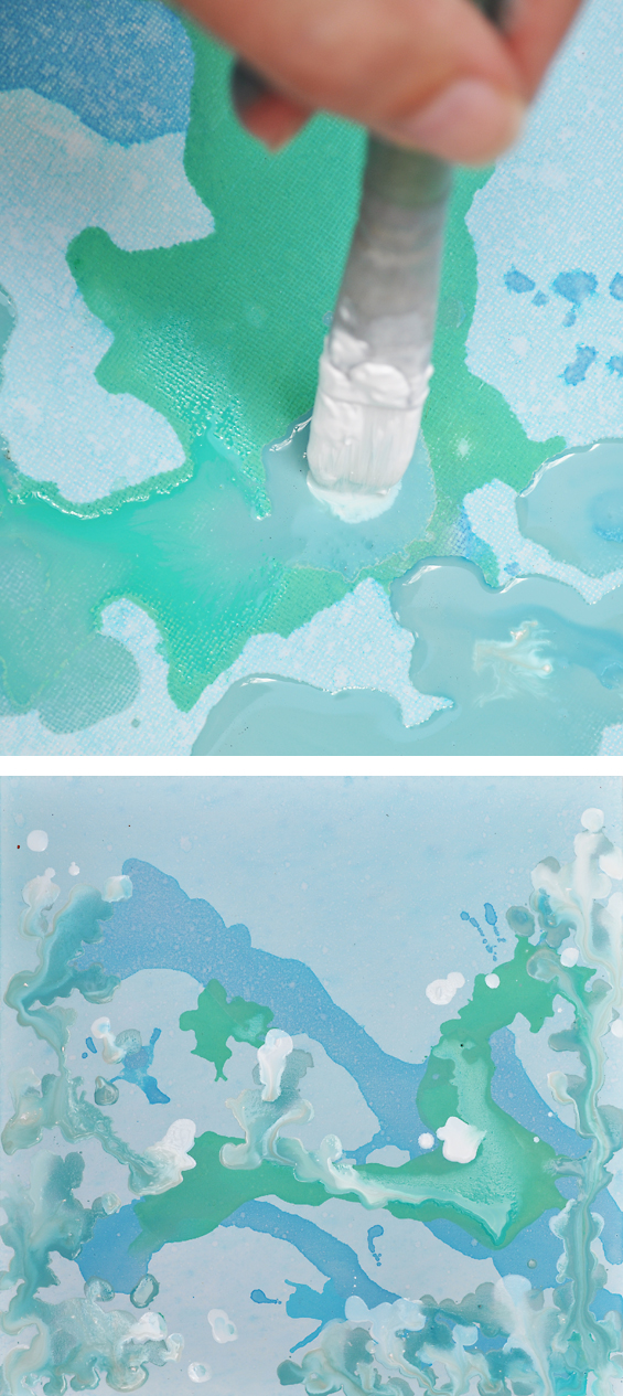
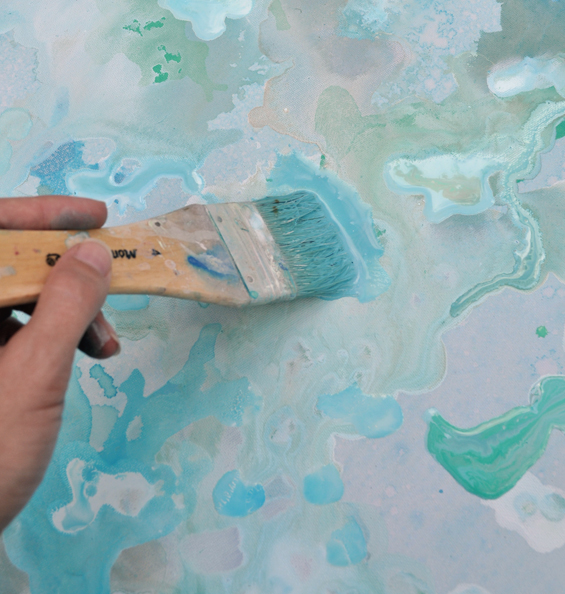
3 The daubs.
Mix up quite a thick combination of white acrylic paint, a little dye (in your chosen colour – blue again for me) and some water. You can also add any additional acrylic colours as desired (I used black to create a soft grey for my initial artwork though decided on a dash of brown for this tutorial). Whilst areas of the streams are still somewhat wet, randomly stipple/drop the mixture on, allowing the paint, not the brush, to form organic dappled shapes (to achieve this use a round-ish tipped brush, ensure you have a decent amount of paint on the canvas and flatten the brush bristles out so they push the paint – it just creates a more natural shape). I concentrated on concealing any particularly harsh dye lines or areas I simply didn’t like.
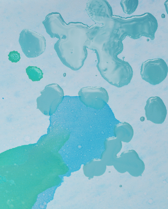
In areas the daubs will blend together (as can be seen in the above close-up), creating larger shapes. In other areas they might mingle with sections of wet underlying paint, running into your previous streams or creating whole new ones. Don’t worry too much about this unless all of your daubs are turning to streams and contrast is becoming lost. In this case, allow the underlying layers to dry more thoroughly before re-commencing, or thicken-up your mixture.
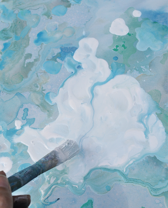
As the paint dries the colour mellows considerably, so bring some extra contrast to the daubs by dropping thick dollops of undiluted white paint among them.
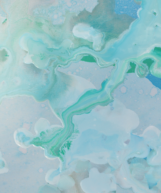
Directly above is the whole canvas after my first daub application. Getting there, though still lacking something. I actually decided to lighten things up further so added some more white daubs. I also spritzed the canvas with some diluted white paint. This mellowed out the colour blocks and created some nice new muted streams as can bee seen in the close-up below.
This ‘daub’ application is the stage which requires the most consideration and restraint. It’s easy to go too far and end up with one big mottled mess. Stand back often and assess where the daubs are really needed. Don’t just go wild daubing like a crazy lady! You want to retain sections of the background and portions of underlying colour. This helps create a more interesting painting with areas of both movement and rest.
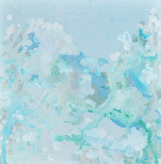
Below is the whole canvas, still somewhat wet, after my secondary application of white daubs.
If at any time you feel you’ve gone too far, bring out the atomiser and play around with spritzing. I know it’s daunting watering down all your hard work, though you’ll be surprised just how easy it is to create new interesting patterns and, if need be, a nice fresh base from which to build upon again.
Note: Although not essential, it might help to determine the painting’s orientation before commencing this stage. Whilst abstract art can commonly be hung in any configuration, composition wise, I personally find it easier adding these final elements if I have an idea which way I think is up.
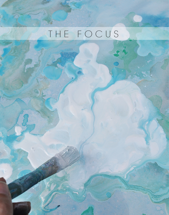
4 The focus.
This isn’t necessary, though I like the idea of having a particular area which draws your eye. If you’d prefer a more uniform look, simply leave this step out.
Whilst the underlying layer is still a little wet, lay down a small area of diluted dye solution.
Now, use a brush to apply some thick acrylic paint in the colour of your choice (I like the neutrality of white) on top of, or just beside, that area of watery dye. Begin spreading the pant into a desirable shape. The dye should be pushed to the edges of the paint and form a subtle border around it in sections. This helps create the impression the focus shape is embedded within the artwork, rather than merely being plonked on top.
It’s pretty inevitable that your focus area will pick up some of the surrounding and underlying colours. If you find it becomes overly muddied, apply additional thicker areas of paint. Remember, the colours will most likely dry more muted and you really want this focus area to stand out.
At this stage you should also assess the overall composition and make any changes you feel are needed. You may want to add some more defined shapes or areas of colour to increase contrast or provide balance.
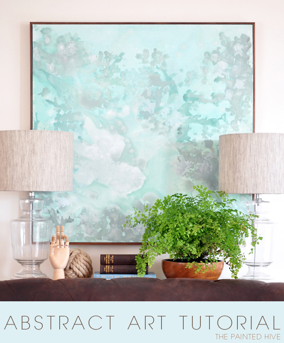
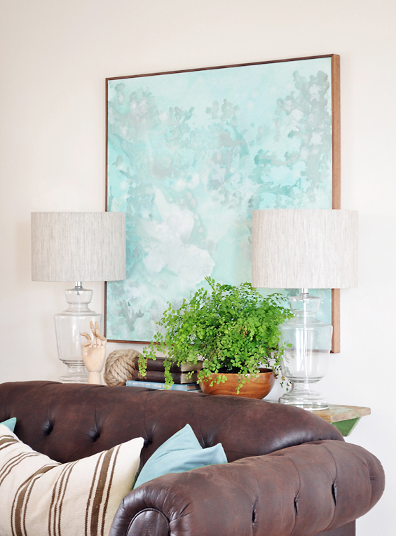
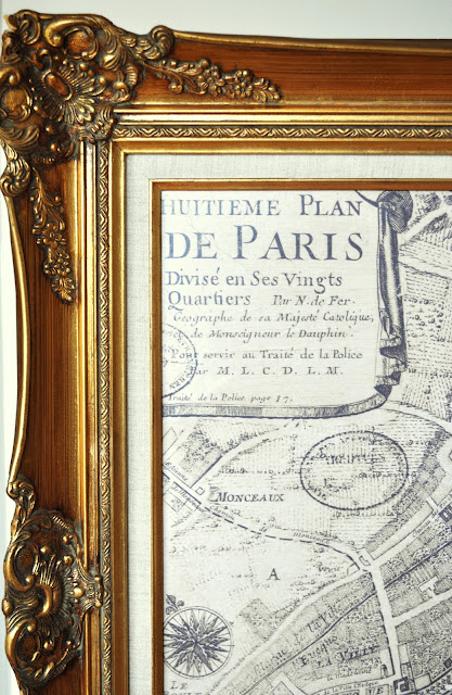
Note: To complete your painting, consider adding a frame. It really does help give a nice professional finish and is an easy DIY (I didn’t do a framing tutorial though it’s simply a matter of mitering some thin timber trim and nailing it straight onto the canvas frame – or, if you don’t like the idea of mitering, you can use simple abutting corners). If you prefer the casualness of no frame, you can paint the canvas edge a solid colour to co-ordinate with your painting or extend your painting to the edges during the painting process. Oh, and don’t forget to include your signature in the bottom corner!
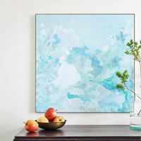
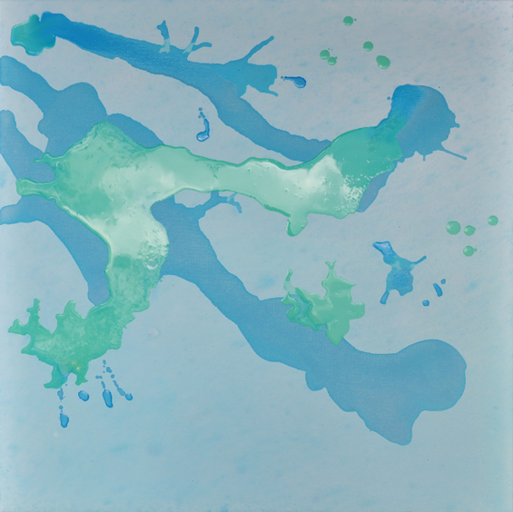
So, here’s the finished painting.
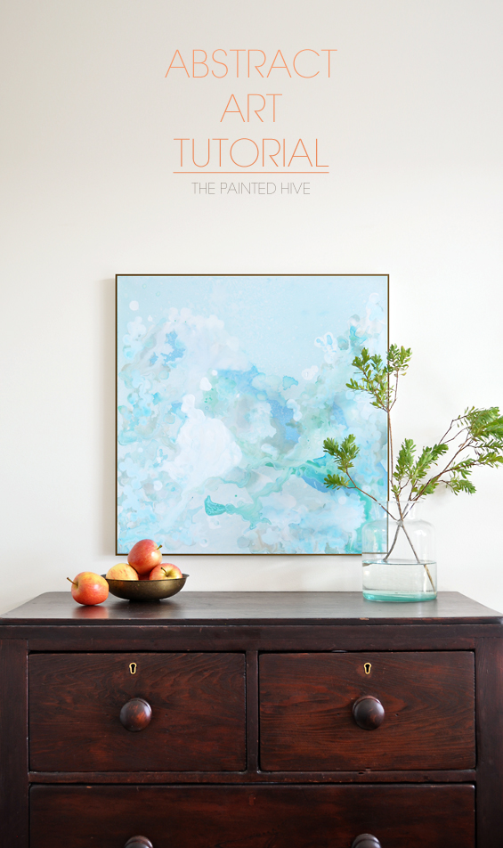
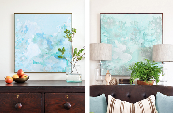
Remember, I did create this painting primarily for demonstrative purposes so it’s different to my original work, and also quite a bit smaller, though I think it still has its own appeal. Which one do you prefer?
I quite like them both. I think. It’s kinda hard to separate yourself and look at them objectively. I know I do like the colours though!
Here’s a super-duper close-up to show the canvas texture and paint detail.
TROUBLE SHOOTING & STARTING OVER
Inevitably, there will be hiccups and moments of doubt (I can certainly vouch for that!). If you find you’re absolutely hating the way your painting is progressing, don’t lose heart. If things aren’t too far gone, stand back and assess where you can make changes. It can be daunting to alter areas you’ve already painted, especially if there are sections you really like, though if you’re not totally in love with your art it’s worth giving it a go. If things are too far gone, simply water down the canvas and paint over it again. Remember, every mistake is an opportunity to learn something and you’ll almost certainly find that your previous attempts will have armed you with more skill and a better understanding of how to go about things again. Don’t worry too much if areas of muted paint from your previous attempt continue to show through the canvas. They can be used to add some extra interest. Please, just don’t give up too easily. I almost did!
Also, and I really have to stress this – DON’T DISMISS YOUR WORK TOO EARLY! I’ve been very lukewarm on a few of my paintings initially only to decide I actually quite liked them after a day or two. I don’t know what it is exactly, though it seems it’s easy to be extra critical early on. Bring your painting inside, lean it up against a wall, or hang it if possible, and allow it to grow on you a bit. You might be surprised!
![]()
Anybody can produce abstract art. I think the thing which causes trepidation among us aesthetic DIY’ers, is the fact we want to produce something with a specific, even professional, look. It can be daunting knowing where to start and doubly disheartening to take the plunge only to feel disappointed with the outcome.
As a fellow rookie (I’m assuming you’re reading this tutorial because you’re a novice too :-) I truly-ruly hope this tutorial, along with my advice, helps spur some confidence.
Have fun!
![]()
Oh, and send me a photo if you give it a go!

Pretty! It’s very Monet-esque. ;-)
Thanks Jen.
Such an amazing tute. One of the best I’ve seen for abstract art. I like the second painting too. Thanks.
Kristine, I must say that I really appreciate the time you have taken to produce this. I do feel very inspired to have a go myself now so thank you. I like all your tips about not giving up.
Yay, that’s great. So glad it has inspired you. That’s the whole point :-)
Fabulous as always Kristine. I’ll be doing some home grown art when I get a day off in a couple of weeks….I’ve got the water colours all ready to go.
Thanks again
Sounds great Lesley. Share a pic of your art with me if you like the results :-)
Have fun!
Your abstract looks so good. I’m totally hopeless at painting but this makes it look achievable. Love the colours: calm and relaxing. You must be very happy with the outcome.
Thanks Libby. I’m actually finding it really hard to look at it objectively. I think the fact I know I painted it makes it feel quite ‘home-made’ to me. Not sure if that’s the impression others have of it though I’ve been looking at lots of abstract art lately and much of it has a similar feel anyway so maybe I’m on the right track ;-)
Inspirational as always. :)
Love it. The colours!!!
Thanks so much for sharing your process. Both paintings are beautiful, and I love the simple wood frame.
Thanks Carrie.
WOW! I’ve been loving some of the ‘home made’ artwork I’ve seen on blogs recently, and thinking I’d like to try my hand at something for my living room which I’ve just re-decorated. I absolutely LOVE the second pic, as it’s a little more toward my own colour scheme, and it really looks VERY professional, so be proud! If I can achieve something similar from your brilliant tutorial I shall be well pleased. Thanks so much for sharing your methods.
Judi in the UK
Thanks Judi. Anyone can do it! Give it a go for sure :-)
Great tutorial, but what caught my eye was the frame. That is exactly the frame style I want for a large acrylic painting from my grandmother. Is it a DIY? Is it from a custom framer? Many thanks for your help.
Hi Melissa
Thanks. I briefly touched on the frame in the tute. Yes, it’s an easy DIY. Simply take some timber trim (at an appropriate width and depth), cut it to length, stain and seal it (if desired) then nail it directly onto the canvas frame. I mitered my frame corners (i.e. cut them at 45 degrees – using a hand saw and miter box) which means you do need to be quite accurate though you could simply cut them straight instead.
This is beautiful! I, too, have the problem of seeing anything I create as looking “homemade”!
Did I just miss where you added the brown?
Hi Lynn
I’m so with you on the home-made thing. I think it really does help to bring your art inside and leave it somewhere visible for a few days (or even longer). I painted another large piece around the same time I made this tutorial and wasn’t really loving it AT ALL to begin with. It has been sitting inside for a week or so and I really like it now! I haven’t got anywhere to hang it though so am even considering selling it!
I used a dash of brown in the paint I mixed up for the daubs to give it a bit more depth. In my original piece I added black for the daubs.
Hope this makes sense.
Kristine
Kristine thnk you SO much for this tutorial! I fel in love with your artwork from the original vignettes post, it was exactly what I had been looking for to hang in my lounge room!
I’m going to give it a go this weekend, fingers crossed it comes out as wel as yours! X
Thanks Cat. Go for it!
LOVE your tutorial. WELL done and easy to understand. You anticipate questions and answer them before we think of them. I have started following your Blog, which I found on Pinterest (the pic of the abstract).
Thank you for your generous sharing of how to!
Thank you for your lovely comment Mary!
Love both of these beauties… but I fancy the greenish blue/seafoam larger painting more because it reminds me more of the ocean. Beautifully done!
Thanks Candi :)
The colors are gorgeous! You make everything look so simple :)
Ha, I make it look simple so my tutorials are easy for everyone to follow. Most of the time I have no idea what the heck I’m doing.
:-)
What an easy to follow tutorial and a subtle painting!
Thank you.
Ok seriously…this is one of the most beautiful DIY art pieces I’ve seen. I’m going to be giving this one a try for sure. Paintings this size cost a fortune for this quality if you were to buy it.
wow abosultely crazy and wacky. I love it so much. There has always been apart of me that is just intrigued by the next level of creativity and though that goes into abstract art. I know many people that still think abstract art is what they say for crazy people painting who cant actually produce something nice looking but that is the complete opposite. It is for crazy people who dont allow the constraints of what arts should look like and they paint what they feel like.
it’s absolutely nice tutorial, thanks …
nice painting …
thank you for your information sharing, its very helpful …
Thank you so much for giving me the courage and tools needed to give this a go. Your artwork you created is absolutely beautiful so thank you for sharing your talent and for creating such a wonderful tutorial.
Could I ask a question in relation to your painting colours?
Comparing your first painting to your second, it appears to have more of a teal/Aqua background which is probably the colour I sway more towards as opposed to a definite blue. Are you able to tell me how you achieved this background colour?
Keep up the great work
Thanks for your comment Leanne.
Hmmm, to be honest, I’m not entirely sure though it may have to do with the fact I used more greens.
Kristine
Beautiful job, as usual!
love this!!
I just found your website. Your instructions are so well written and detailed and your editorial is beautifully written. When I saw that you spelled colour with a *u*, I thought you are either from England or Canada (where I live) and was so pleased to see you are from downunder. Looking forward to future posts!!
Thanks so much Janis. What a lovely comment :)
It’s funny. I get a lot of questions about where I buy certain things. Of course, most people don’t realise I’m based in Australia and the majority of questions come from readers in the US. Sometimes if the question includes the word “colour” I use its spelling as a clue as to their location so I can answer appropriately!
simple, nice, and beautyfull …
They are both stunning. I’d buy one! Great tutorial. Thanks x
the best tutorial .. :)
Kristine, your artworks are amazing. My friends have spent thousands of dollars on works that are nowhere near as beautiful. I’m going to try your tutorial, but I doubt I have your eye for composition, so we’ll see how this goes. I am SURE I’ll have to try this a few times, but eventually I will come out with something worth hanging! I always do…even though I may burn a few failed attempts and dance around them on my way to a successful outcome.
Thanks so much for this post! You have real talent. It’s so obvious. You also have taste…which is rare…and one of my failings…haha. And, while both paintings are really great, I think i like the second one better. Of course, they may look different in person.
PS I changed my mind. I like both equally.
Hi Kristine! I am attempting my own piece of abstract art and your tutorial is great! Can you tell me if you waited for the paint to dry between each step, waited until it was almost dry or “tacky” to the touch, or it does it matter? Thanks!
Hi Sarah. I know it’s a wordy tutorial, though I have mentioned drying time in a few instances. The weather was quite hot when I created my pieces, so the paint dried quickly though I don’t remember waiting for it to dry between steps. Ultimately, the wetness/dryness of the paint will effect the result as layers and colours will blend differently depending on the viscosity of the paint. For some steps it works well to have wet or damp underlying paint, for other steps having dryer paint might produce better result. Have a play around and see what looks you achieve and what you prefer.
x
Great article Kristine and lovely result with the artwork.
I’m about to experiment with some new artwork for my bedroom. In the past I’ve gone for bright colours or olive green and Wedgwood blue backgrounds. I’m changing my room to one of black, white, neutrals (as in linen type neutral) and a touch of gold or copper (but not too much- I don’t want to end up looking like I belong in BrisVegas on the Gold Coast now, do I?)
I have some gold and copper acrylic paint and am considering using some real gold leaf in sparing amounts. I’d love to try working with food colouring. The only thing is- do you think I’d ever find a black dye? I’ve definitely not come across one before. Do you think anything else would work instead? (Eg pen ink?) I don’t want to buy a whole tin of fabric dye- it’s too expensive to use for just a few drops. Any ideas?
Hi Louise
You should be able to find black food colouring online or in specialty craft/cake decorating stores. I think even Spotlight probably has some. Otherwise, you can mix blue, red and green to create a blackish-grey.
Alternatively, you could simply try black watercolour paint. It has similar properties.
Hope this helps.
Kristine
How ! Amazing… Great article. Thanks so much for ths post and God bless you.
I LIKE THE “DONT GIVE UP FACTOR”, MANY TIMES I HATE A PANTING ONLY TO LOVE IT IN THE END AFTER A FEW MORE “STROKES”.
YOURS IS VERY PRETTY. CONGRATS.!
Hi! I love this and plan to try it out in the next few weeks to cover a large wall in my living room. One question… where did you get the canvas with the gold frame around it?
Hi Mandy
Sorry, though both of the artworks I have shown actually have wooden frames which I created myself. It’s not hard to frame your own stretched canvas. If you’d like a gold frame, you could buy some brass flatbar (online or from a metal fabrication workshop) then cut it to size with a hacksaw before gluing it to the sides of the canvas.
Kristine
Hi! I found your site through pinterest and I’m SO glad I did! I’m in my mid 40’s and only in the last couple years have I really let mysefl give art a go as much as I love art and loved the idea of making my own…..well I’ve just always known I wasn’t capable. But, it came out of necessity due some ptsd and anxiety and physical disorders that I needed some help and a bunch of meds weren’t what I needed, so….figured I’d play with different art types and see what happens. It’s been very good for me and is good at calming me and being focused on beauty instead of horror :) money is beyond tight so I’m trying to learn all I can here and there online using simple inexpensive things :) so this beautiful tutorial is awesome! I’m nervous to try, but love yours so much I’m going to try n be bold, though I’m not good at that, and go for it soon! Thanks so much for the encouraging words to not give up ;) and for providing something so fun to try ;) hopefully I can do something not too too horrible ;) but either way I’m sure itll be fun trying! Thanks again, jade
Hi Jade
Thank you so much for your comment. It’s lovely to know my rambling on is actually reaching, and potentially even helping, others :)
I try to make my tutorials as encouraging and explanatory as possible. If reading them gives you confidence, then that’s a huge tick in my book!
Trust me, I have no idea what I’m doing most of the time and have little idea of the outcome. I just give it a go. I’m sure you can produce something that’s beautiful. Go for it girl!
If you feel like you ever need to talk things over, feel free to message or email me. I’m always up for chat.
Kristine
x
Thanks again SO much!!! Mine was nowhere near as beautiful as yours by any stretch, but it was great fun making it…I made a big mess and loved every minute of it :) thanks again!! :)
Is it strange that to me it looks like rushing water?
Also, would tempura or watercolor paint work?
very soothing piece.
Thanks so much :)
I just stumbled upon your lovely post and am in love with everything about it! I have been searching for a way to paint two large stretched canvases and your instructions are so complete I have finally decided on what I want for our home. Thank you so much for your great explanation! I am so eager to get to work on my project!
Oh yay! Glad it helped you decide. Have fun with it!
Hi can I ask how you framed this canvas , i love how it turned out and would definitely give it a go but I really think the frame gives the plain canvas an air of expense ! If you have a tutorial or some quick tip I’d love to hear 😀
Hi Laura. I don’t have a tutorial though it’s really easy. I just cut some trim to size using a mitre box and hand saw then with some finishing nails attached it directly to the canvas frame. You can punch the nail heads in then fill the little holes with some putty which matches the colour of the frame. Alternatively, you can just colour the nail heads with a marker.
Love the art work! I was wondering what your little plant sprigs are or where you got them??
They are just clippings from a shrub in my front yard. I don’t even know what they are sorry :)
Very pleased to have found your tutorial. I am an Acrylic Paint Pourer and have been quite worried about all the wasted paint that happens with this process. I will definitely try using food coloUring (yes, I am in Sydney, Manly) as I like the idea of transparency and maybe also water colours. Floetrol and PVA glue can also make the acrylic paint colours transparent if using enough of the stuff but again, not very environmentally friendly. Thank you so much for demonstrating this alternate way of abstract painting.
Thanks so much for leaving a comment. So glad you found my blog and that it has given you some new inspiration :)
Have a lovely weekend Anke.
I am very inspired, thank you! I am wondering how to go about sealing the canvas when done? I think typical finishes for acrylic paint may cause the dyed portions to run? Any suggestions?
Hi Tiffany
I never sealed this work and have since done others which have also not been sealed. They are still doing well several years on. One thing you could try if you would prefer to seal your work is an acrylic aerosol spray applied sparingly in several light coats.
Kristine
love this
Ooh la la! One thing I found about this article that seems interesting is when you informed us about inserting our artwork inside a frame to make it looks more refined. I’ve been thinking of beautifying my bedroom because I think it’s been ages since I last did that. I’ll certainly keep this tip in mind so the end result will be great.