On a crisp, sunny morning the french windows in our little living room greedily catch the first toasty beams of light and spread a gentle warmth throughout the space. When it’s cool and gloomy outside however, they frame a haunting view of dispersing mists rolling over the nearby hills. Either way, a sense of nostalgia is somehow born in me, conjuring feelings reminiscent of childhood which always seem to evoke contentment.
It’s quite amazing how a home can make you feel and to imagine that it may well be the simplest things which will become our fondest memories in the years to come.
Our living room is still evolving and while I’m happy with its calming colour palette and layers of natural texture there are a couple of pieces I’m kinda just making do with for now (I’m writing a separate post dedicated to some of the changes I’ve got planned).
All of the furniture, sofas aside, is second-hand and pretty much everything else was either thrifted, bought on sale or gifted.
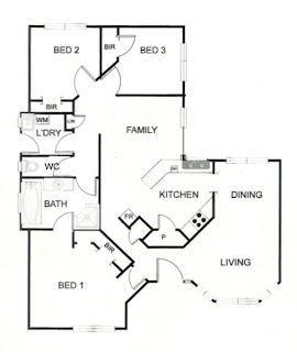
To give you an idea of the layout, here’s my hive’s floor plan:
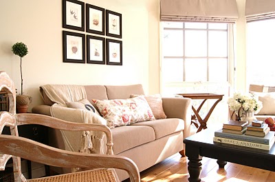
And here are some (very fuzzy – sorry!) before shots from the previous owners mid-way through moving out:

It’s a bit hard to tell though the walls were apple green and all of the trim was natural brown timber. To lighten up the space we painted the walls pale cream and all of the timber gloss white.
The original owners had installed a faux timber floating floor which, whilst it wouldn’t necessarily have been my first choice, is nice, clean and neutral.
I would’ve liked to have been able to keep the windows free of bulky furniture though there was nowhere else to put the second sofa and I couldn’t swap the dining room space for the living area cause it’s far too small :-(
It kinda looks like you might be able to put something horizontally between the dining and living rooms as some kind of divider, though trust me, it’s nowhere near wide enough!
As you can see from the floor plan there’s this weird little diagonal wall. The previous owners had a sofa against it though if you look at the floor plan and picture a deep piece of furniture on that wall it’s easy to imagine it leaving a pretty narrow gap from the entryway to the living room. We instead decided to put the TV there and it works perfectly. To the left you can glimpse the little entryway.
Now, just for comparisons sake, here’s some side by side before and afters:


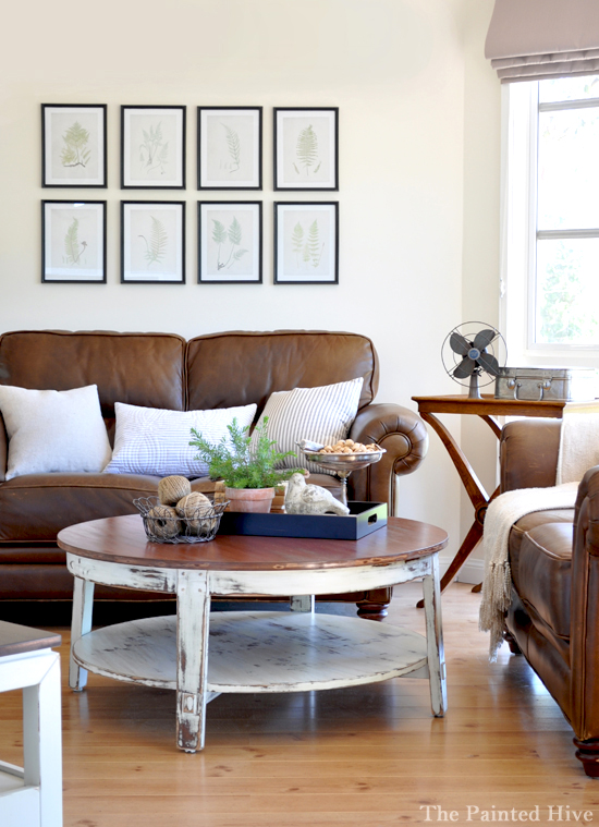
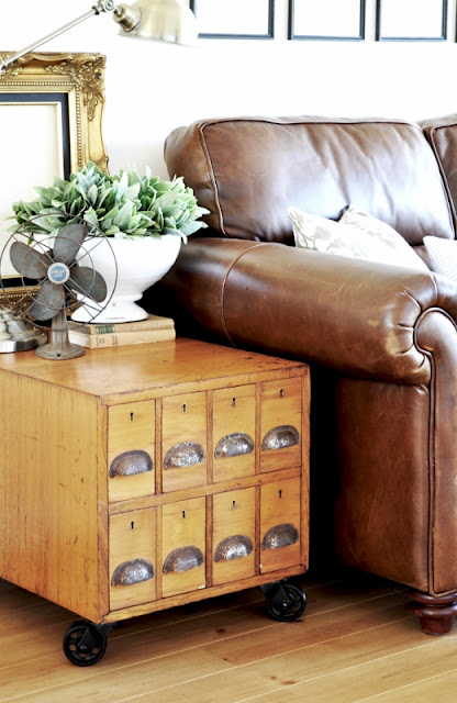
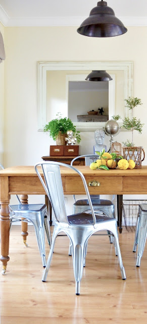
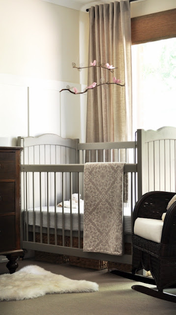
And here’s some more photos just because I can’t help myself:

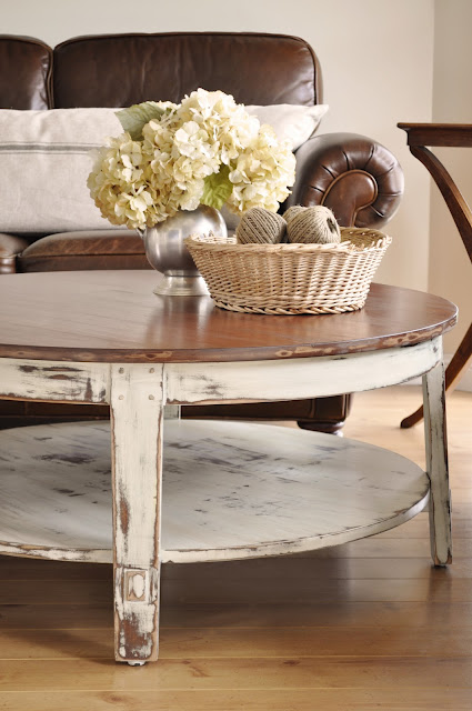


P.S. Do you have a tutorial on how you did your coffee table? I have one similar and now I am convinced it needs to look like that.
Absolutely fabulous! Saw this on Remodelaholic! I love the tv stand, I need something just like that – ours is currently on a white plastic table (no kidding). Where did you get it – LOVE LOVE it!!!!
LOVE IT! It “feels” so light and airy! Exactly what I am wanting to achieve with my living room ~ I do have a dilema going on if you want to swing by and leave your 2 cents ☺. Have a great day!
It looks so relaxing and fresh – thanks for posting your pics (I am a first time visitor following a link via Remodelaholic).
Me<-------jealous MUCH!... nuff said.
.
.
.
ps… your brother is CRAZY to not just paint those awesome ceilings! What’s his number…? Does he take to persuasion easily…?
:)
jk.
LOOOOVE your blog.
Shelley
What a transformation it is just gorgeous.
Your Coffee Table and the French Windows are the best… such a calming living room!
Let me go read more….I’m a new follower.
Sandy
http://thewondersofdoing.blogspot.com/
Oh wow, Kristine!!! It’s just simply gorgeous!! I love everything you’ve done…all the little details! What a transformation!
Beautiful! I love it all! Do you mind sharing what paint color you used for the walls?
What a lovely light living room you have! Love those bay windows. Thank you for linking up to the Ready Set Vignette Party! I hope you will link back to the party too!
Wow! Beautiful room! I like the mixture of textures.
So pretty! I love the windows and the roman shades are a perfect choice! I love it all! The coffee table and the floral pillow on the couch! Love that fabric!
Lou Cinda :)
Had a better look around your blog and seriously love your style :)
I love the bird prints- where did you get them?
Lovely living room interior design.
Deirdre G
Your living room is wonderful! It looks so cozy and inviting and effortless- though I can tell it was very well thought out. I can barely believe it was the same space from the ‘before’ pictures. Love your photographs too.
Love this! Your home belongs in a magazine! So clean and fresh and bright…. a truly happy place.
Thanks for sharing. I will follow you anywhere!
Beautiful – love it! All of it! Great job!
Hi Kristine! Such a beautiful job you have done. Can I ask, who did your blinds? X
Amanda
My blinds are just off the rack day/night romans from Spotlight. Not certain where you are based though I’m in Australia.
Kristine
Wow! They look really great! I do know Spotlight. Will head there for mine :) thank you x
Where are the window valances from? Or did you make them? If so, do you have a tutorial?
Hi Robyn
They are block-out roman blinds I bought off the shelf from Spotlight (an Australian discount fabrics and home-wares store). We have had them for nearly six years now and they are beginning to deteriorate so I am planning to replace them soon.
Kristine
Wow!
No doubt it’s all about latest trending of home decoration. Thanks for sharing your ideas with us.
Very helpful article. Your ideas are very unique. Thank you so much for sharing your knowledge.