I figured this little blog was in need of a fresh ‘afters’ injection following all the ‘befores’ ugliness of my master bedroom in progress posts – it’s slowly getting there though and I promise lots of (hopefully lovely) after shots to redeem myself.
Anyway, in the mean time, I thought I’d share this fun little comparisons refurb.
You may remember seeing these chairs before on my blog.
I scored a few of them for $5 each off eBay. I was hoping to use them in my dining room though when I went to pick them up and saw them in person I knew straight away that wasn’t gonna happen. They were huge – and hugely wrong for my dining room.
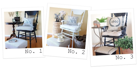
Given they were big enough to be used as occasional chairs I thought I’d refurbish them individually and pair each one with a co-ordinating footstool to make cute little ensembles.
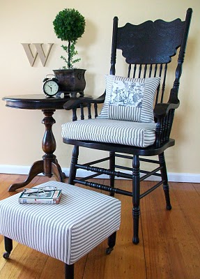
The first chair got a black ‘toile and ticking’ makeover.

The footstool was made from scratch and cute vintage castors were added to the feet.

I hand-painted a little french inspired emblem on the rear of the head rest just for something a bit different – and because I may, or may not be, slightly obsessed with anything resembling typography :-)

I decided to invert the colour scheme for the second chair and go with predominately white. It’s amazing how just changing the colour of the chair frame has given such a different feel.
Again, the footstool was made from scratch and the feet are actually cut down old side table legs.
It was back to black for the for the third chair though in a more rustic style inspired by french grain sacks. Seriously, who doesn’t love them some hessian (burlap)? Sigh…
The little stool was a curbside find. It just needed a fresh coat of paint and some new upholstery.
I hand-painted the stripes on the stool with craft paint after marking out some narrow lines with painters tape.
I designed the cushion artwork then printed it onto iron-on transfer paper. I cut around the outline of the graphic pretty exactly before transferring it so there was little visible transfer film.
All of the chairs have really beautiful, intricate pressed-backs.
So there you have it! Now, just for comparisons sake…
.jpg)
Which one do you prefer?
I’m a pretty neutral girl myself and these are all kinda conservative though I’ve still got one left I’m hoping to makeover in a more out-there theme.


They are all three just gorgeous and I love the little footstools you paired with them. Great job. Hugs, Marty
Although I love me some white furniture… I LOVE the black with the natural cushions, your transfer is perfection! Really, great job on all of them, no one would believe that they were only 5.00, crazy! Theresa
Love them all!! They look fabulous!!
I love all of them!! Simply gorgeous, but leaning torwards the black and burlap, maybe? Very inspiring, well done Kristine.
Rebecca
I love all of them!
they all look fabulous! number 2 is most likely to be found in my home since i don’t have any black. but…. i love teh setup of number 3 the best- that little table next to it is so awesome!!! you ar eso good at staging. i want to buy that chair 3 times over simply due to your good staging!
What a fun project! Don’t you just love getting to be creative? I don’t think I could pick which I like best. I love all 3 of them. I wish I knew a source for those little wheels/casters. I don’t think they exist new. I’ve looked.
Kelly
I love them all!!! You’re such an inspiration : )
Gemma x
They are all beautiful, but #3 is my favorite!
They all look really great. But I love, love, love the third look with the burlap!!! I think the brown burlap looks so great with the black paint!
I love the white one the most. It’s so fresh and bright and pretty. Of course, they are all amazing re-do’s. Great job as always!
I’d have to say version #2 is my favourite (love the white) although they are all so pretty.
I can’t believe you made those stools! So talented, I am envious.
:)
Since I am all thumbs, I think all 3 versions are amazing!! I adore black painted furniture, so chair #1 is absolutely a fav. (not a fan of burlap…is that a hanging offense?)
As to a suggestion for the 4th chair, do you like red?
These are amazing!!! I love them all! Great job, you talented girl! :)
~Terrell @ FrouFrouDecor~
I love them all. I think #1 might be my favorite just because of the cute casters on the footstool (can’t wait to hear how you made those)…and the date painted on the back. Beautiful job!
A hard decision! I think my first choice would be the white chair because I like the fresh cottage look about it. The way you have finished off all these chairs with cushions, pillow, stools etc. is just so charming! Do you hand paint your chairs or spray them with a compressor sprayer? (Hand painting all those chair parts would take a lot of time!)
All 3 are simply gorgeous… I think I am leaning to the burlap one for sure… I love that look. Nice job on all of them.
I am in stick shock, wow what a deal of a lifetime.
Hugs, Deb
You do such excellent work. The chairs are great. The stools are beautiful. And the staging is straight out of Pottery Barn!! Are you considering aqua for the next one?!!
They are all gorgeous.. but I’m for the WHITE! LOVE IT, with the natural in close second.
http://mommarhyne.blogspot.com
Amazing job Kristine. I love the stools – they each have such a different personality. What is the black paint you use? Black/black? Or charcoal black? I have my dining chairs lined up and waiting, waiting. waiting for some dry weather… Ann x
Love them all three! You did a great job Kristine! I would be hard pressed to pick just one I’m afraid. I can’t wait to see what you do with the 4th one. What about something totally different-a bright color with a “pop” of color for the seat? Or a beachy inspired theme with soft sea glass blue and a sandy/beachy sort of cushion/pillow. Whatever you do, I know it will be well done and fun to see. Diana
You are so clever Kristine! I love them all but if I had to pick I would choose the white one. I really like your footstools and I am looking forward to the tutorial! xx
Kris you are a complete genius! Really hard to choose but I’m a fan of black and ticking and toile, so No.1 for me :)
Gosh, they all look fabulous – you are so clever! Tooo hard to chooe a fave me thinks!
I think I like the look of #3 best, but the burlap that is available to me is so scratchy! I can’t imagine having pillows made from it, is yours nice and soft?
This is a beatiful piece of furniture! All of them are beautiful but I prefer t number 1.
I love all of them. Great job. Inspires me to do a chair and stool I have. Thanks for sharing.
Number three. I really like black painted pieces. These are all very well done. olive
Oh, I don’t know if I can just pick one! They are all SO gorgeous!
You are so, so clever! They just look amazing, though my fave would be the black one with the burlap – very stylish. Jane :)
They look just wonderful and my favorite stool is the last one…what a great makeover that was!
Rondell
Nice job! I think the last look is my favorite. You’re right, who doesn’t love burlap? Love the transfer work too. I’ve been doing some similar work with black carbon paper.
Kristine, I say # 3 I like the more current look with the grainsacks and black!
New Giveaway is on my site!
Karena
Art by Karena
Wow!! You’re so talented:) I LOVE them all but I think the third choice is the right amount of chic and rustic, my fav!
Visiting from justsewsassy.com
ps. Come by and check out a fun giveaway going on right now at my blog:)
Oh my good Kristine! These turned out great! I don’t think I could pick one to be my favorite, but I really like the look of burlap… so timeless right now!
awesome! I can’t wait for the footrest tutorial
My first set of comments went away, hmmm. I bow to your superior skills, you really did a wonderful job on these chairs and also on the photo vignettes. I cannot choose a favorite, I love them all! I love that you did not overdo it and the end result has much more impact.
Thanks Kristine! For the sweet words and the sources for the casters. I’ll check both of them out!
Kelly
They’re all so pretty. I think #3 is my favorite because I like the feed sack look of the pillow.
Very nice! La
I honestly can’t say I prefer one over the others. Love all the looks. Great accessories!
Love them all!
If I had to choose it would be #2!
Oh they are ALL so gorgeous. I would have a hard time chosing but I think it would have to be #3. While I love white, the white one is a little stark for me. I would love to see that one aged and distressed a bit AND paired with the burlap. You did an amazing job on all three. Nice to have such choices and can’t wait to see the next one.
xoxo
Nancy
Love the three interpretations–they’re all beautiful chairs.
So impressive Kristine, I like them all however I prefer the freshness of the white. Looking forward to seeing what you do with the last one. What about a french blue or grey that would be gorgeous.
Enjoy your day.
Donnaxx
Lovely! I think the white is my favorite, but all three are beautiful!
You do such a beautiful job!!! I love all of them, but no.2 & 3 are my faves! Great job!
I can’t decide which one I love the most. They are all fabulous! And that little footstool you made is fantastic! Thanks so much for linking up to CSI!
XOOX
Jen
First of all, I love them all. If I HAD to choose one, it’d #2. It’s fresh and beachy. Where did you find the vintage casters? They’re great!
Hi Kristine, thanks for the advice on the wingback..still haven’t decided what to do but will either slip cover or have a go myself! Love what you have done with these chairs and No 3 is my favourite. Have a great weekend X
I’m new to your blog and I’m enjoying it! I love the 3rd chair the best – great work!
XO
Lenore