I figured this little blog was in need of a fresh ‘afters’ injection following all the ‘befores’ ugliness of my master bedroom in progress posts – it’s slowly getting there though and I promise lots of (hopefully lovely) after shots to redeem myself.
Anyway, in the mean time, I thought I’d share this fun little comparisons refurb.
You may remember seeing these chairs before on my blog.
I scored a few of them for $5 each off eBay. I was hoping to use them in my dining room though when I went to pick them up and saw them in person I knew straight away that wasn’t gonna happen. They were huge – and hugely wrong for my dining room.
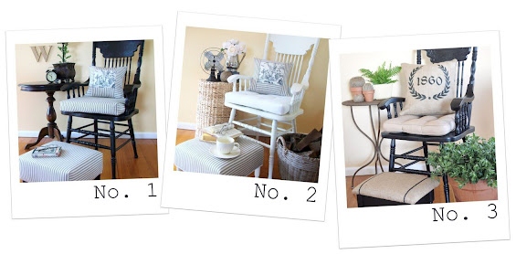
Given they were big enough to be used as occasional chairs I thought I’d refurbish them individually and pair each one with a co-ordinating footstool to make cute little ensembles.
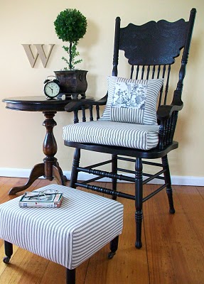
The first chair got a black ‘toile and ticking’ makeover.

The footstool was made from scratch and cute vintage castors were added to the feet.

I hand-painted a little french inspired emblem on the rear of the head rest just for something a bit different – and because I may, or may not be, slightly obsessed with anything resembling typography :-)

I decided to invert the colour scheme for the second chair and go with predominately white. It’s amazing how just changing the colour of the chair frame has given such a different feel.
Again, the footstool was made from scratch and the feet are actually cut down old side table legs.
It was back to black for the for the third chair though in a more rustic style inspired by french grain sacks. Seriously, who doesn’t love them some hessian (burlap)? Sigh…
The little stool was a curbside find. It just needed a fresh coat of paint and some new upholstery.
I hand-painted the stripes on the stool with craft paint after marking out some narrow lines with painters tape.
I designed the cushion artwork then printed it onto iron-on transfer paper. I cut around the outline of the graphic pretty exactly before transferring it so there was little visible transfer film.
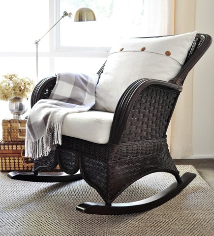
All of the chairs have really beautiful, intricate pressed-backs.
So there you have it! Now, just for comparisons sake…
.jpg)
Which one do you prefer?
I’m a pretty neutral girl myself and these are all kinda conservative though I’ve still got one left I’m hoping to makeover in a more out-there theme.


I love #3! Please link up to Vintage Suitcase Friday!
Very nice. Thanks for sharing the three looks of one chair. Just found your blog and am looking forward to more!
Brittany
http://www.prettyhandygirl.com
They’re all beautiful! Goodness it’s hard to pick. But I think I’d have to go with #3. Love that burlap. :)
I love them all!! Thanks for sharing them over at the PoPP.
All are gorgeous, but number three is my fav!! Great little footstools too – looking forward to finding out how you made those!
All three look great!
Love,
Susan and Bentley
xxoo
Visionary make over! If somebody good fix me up that radically I’d be thrilled, but I think I’d have to go under the knife to do it!
Very cool! We are fairly average-sized people here, but I love anything oversized. So, I am digging the big lumberjack chairs! Great job on the re-dos. Love them all, but that grain sack pillow is giving me goosebumps; I need to make one asap!
~Misti
They’re all beautiful! I think I slightly prefer the black one with ticking, but only a tad bit more than the others. I love all of the matching footstools too!
I love it! The first one is my favorite (I have a thing for ticking). The footstool is adorable! The casters were a great idea. I absolutely love it!
OMGosh…all three look outstanding…so NIFTY THRIFTY!
Blessings,
Linda
They all look great but #3 looks fabulous to me. I love the rescued footstool too!
#1 for me. Love them! Great work, I like how you added the stools.
They’re all wonderful, but I think I like No. 1 the best. I think a red chair would look great too.
Found you via the Perfectly Imperfect link party.
Those are all gorgeous!!! The white one is probably my favorite, but the other two run a close second. For the fourth one how about red with a polk-a-dotted fabric? Something that would look good in a kid’s room.
I love occasional chairs like that. Your footstools are fantastic! You are good!!!
Amazing job! I love all three of them!
Okay, not only do I love the makeovers (of course), but I am in love with your styling! Where do you get all those gorgeous baskets?? The rattan “side table?” ??? You amaze and perplex me…in a good way! Thanks so much for linking up your talent to Style Feature Saturday, Kristine! -shaunna :)
Oh my… such a stunning photo shoot with equally gorgeous subject matter. Every detail made me smile. Love’m all but that #3 stole my heart!
Donna
#3 is my fave! I adore anything with feed sack material. Great before and afters!
I just wanted to stop by and let you know that I linked to this post today from the new Home & Garden channel at Craft Gossip. :) My hope is to share many of the fabulous projects I see everyday with the vast CG audience. I hope you will not only stop by and subscribe to CG, but will tell your friends about the new category! Hope you see some traffic from it!
Your feature will appear in the main Craft Gossip RSS feed, on the main home page and can be found directly here
http://homeandgarden.craftgossip.com/1-chair-3-looks/
If you would like a “featured by” button, you can grab one here!
http://homeandgarden.craftgossip.com/grab-a-craft-gossip-button/
Please don’t make me choose, as all three are scrumptious! Can not wait until you share your from scratch ottoman secrets. What treasures you have created!!
Just beautiful! I’m working with a similiar chair right now trying to decide which way to go with it. Unfortunetly, I love all 3 looks and this hasn’t helped me decide on one. LOL
Love your blog!
Who can choose? They all look fantastic!
Totally impressed, but honestly even though I usually paint everything white myself, I couldn’t choose which one I liked best, they’re all so AWESOME! Thanks so much for sharing, looove em’! Debbie @ Cottage Hann~Me~Downs
The first one is my favorite. I love love love black. The black toile could not be more perfect!
Hi Kristine! I am not sure which one I like better – they are all fabulous! Love the footstools too! Fantastic job. I am featuring this today; stop by and grab a featured button if you like. Thanks so much for joining the Sunday Showcase Party. I greatly appreciate it. Hope you have a fabulous week! ~ Stephanie Lynn
Starting with those wonderful Victorian armchairs with incised design it’s hard to go wrong. And each one really does have a different feel.
Kristine,
This looks fabulous, and thanks for showing them off because I happen to have 4 chairs very similar that I got on Craig’s list, and have been planning on refinishing! I wish mine had the arm rests, which they don’t!
p.s. I just wanted you to know that people are loving you chest makeover, you have such great skills! I love what you do!
I can’t tell you how much I enjoyed this post! I worked on a chair of my own recently and was wishing I had 3 more just like it so I could try out various “schemes” because it was was so hard to decide on must ONE. Love all of them- you’re amazing!!
Loved these so much I featured them this week!
I love all the chairs! It’s too hard to pick just one.
I would like to know how you covered the foot stool. It’s very “clean”, not to mention the cushions. Very Nice. Is there any possible way you could let me know? I would really appreciate it! :o)
OMW!!! Pure LOVE! I have these same chairs and I’m sooooooo sick of oak, oak, oak – painting them black is GORGEOUS!!! I HAVE to talk my husband into letting me do this!!! My kitchen is red with b&w toile butterfly valances – this would be sooooo pretty! You’ve inspired me!
I have the chairs, now I know what to do with them. Thank you very much!