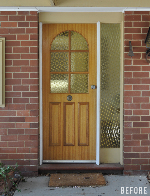
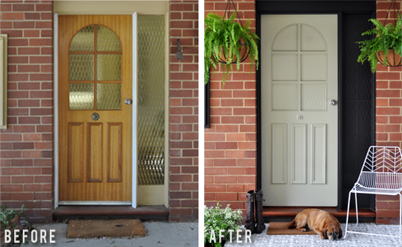
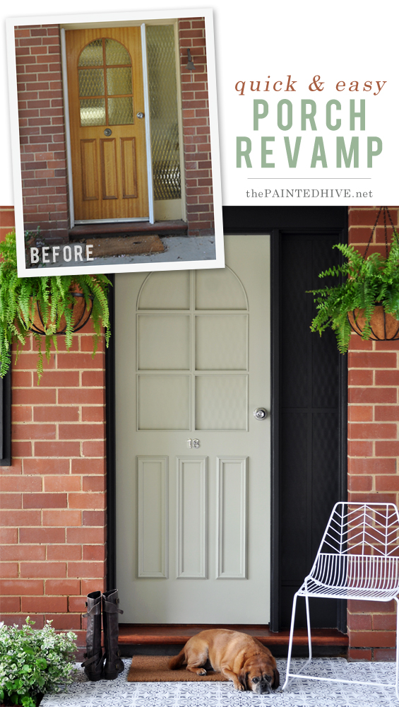
I’d walked through my brother’s front door dozens of times before though for some reason, one day a few weeks back, it made me pause…
…and kind of burned my eyes.
I know he’s not alone in having an ugly dated facade along with no real budget and limited aptitude to undertake a complete overhaul.
And I know a mere cosmetic update may seem totally fanciful…though there is hope!
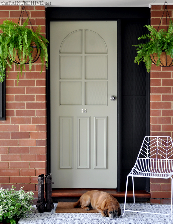
With just paint and some plants (and a cute gingerbread-coloured canine) you can totally transform the look and feel of a dated exterior entrance without replacing anything!
You might think that simply painting old glass is a total cheat (and, well, it kinda is) however it can also be a long-lasting and super effective fix.
This door opens into a large living space with three generous windows so blocking the light wasn’t an issue. And although I don’t currently have a pic showing the glass from the inside it looks totally fine.
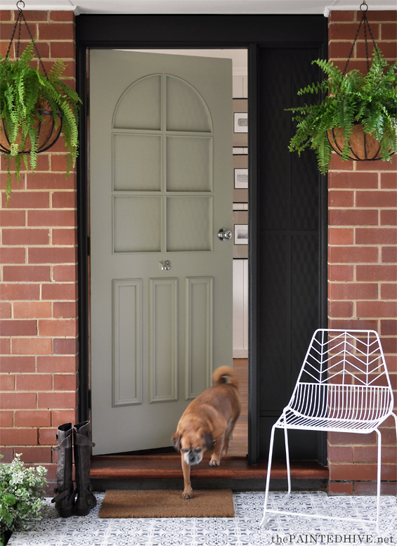
To paint the glass I first cleaned and then primed it with ESP (Easy Surface Prep) before slapping on three coats of paint. To save on expense (and take choosing colours out of the equation!) I used left-over paint I already had. The black is Dulux Aquanamel in Domino and the sage is a custom mix. I decided on sage for the front door because green and red are complimentary colours which work to boost one another. The contrast beautifully highlights the old brick which could otherwise look a bit drab.
I wasn’t sure how the diamond pattern in the glass would appear once painted though found that it imparts a subtle rippled effect with I think lends interest.
It’s hard to make out in the pics though I also added some simple trim to the sidelight. The idea behind this was to make it look more like a timber panel and also to reference the moulding on the door. It’s just two strips of masonite packers (75 cents each) attached with multi-purpose glue.
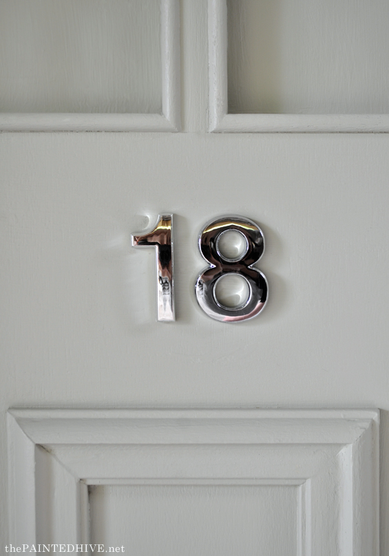
In the center of the door there was a weird old mounting plate (where the original handle used to be) so I replaced it with some simple house numbers. They are just basic self-adhesive ones though definitely do the trick.
I loved the idea of introducing brass here, though given the existing door handle was chrome I decided to stick with that. And I think the silver works really well to add a touch of class.
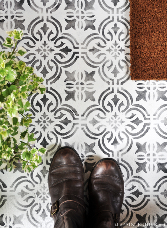
A really easy change which packs a huge punch is the stencilled floor. It’s hard to grasp the full impact in the before and after pics.
It was only a small area and took less than one hour to complete. I simply cleaned the concrete, applied one coat of white floor paint then stencilled over with charcoal floor paint. I used floor paint because I had it left-over from some previous projects however you could certainly use porch or concrete paint. I didn’t document the process this time around though you can find more information about how I stencil a floor HERE. If you’re interested, the stencil I used is from Gemini Creative.
To complete the area I painted the electrical box charcoal to tie-in with the sidelight and architraves, and re-varnished the redwood step before adding some simple decorative touches. Two traditional hanging baskets burst with blousy Boston Ferns (my favourite!) and a simple wire chair adds a slight modern kick.
All up this project took less than a day and cost under $150! I know it’s far from spectacular though I hope it helps inspire.


So cool! Can’t beleive it’s that easy to change glass. We have an amber bottle sidelight and I never knew I could just do this. Thank you!!!
You’re welcome! Have fun painting :)
Please, PLEASE can’t you be my friend and come help me with my house?! ;) This is really just amazing, and you are too… Everything you do is crazy good.
LOL! Aw, thank you :)
Yes! After Sara could you come to my house? The weather is really nice in Tucson at this time of year! That is a WOW transformation! You could do “staging” for Realtors! Makes a GREAT impression!
Thanks Pat :)
Such a big difference – I can’t believe it! Love the chair and the dog’s pretty good in photo shoots. Well done. Love the stencilling looks like tiles.
He’s such a good boy. My brother has two dogs of his own though they don’t pose like my Cooper. He loves the camera!
So glad you like it :)
It’s gorgeous! The stencilling is amazing and really makes it. And you are too modest!
Thanks Sherylee :)
Fantastic job Kristine, you are so clever! Love the stencil.
Thanks Etta :)
So awesome! I never knew you could paint glass and have it not rub or peel off. Beautiful transformation!
Thanks Jackie. Yep, if you prep glass right it’s possible :)
Bloody hell, you are a magician. I haven’t made time to complement you on all your fabulous work. But I can tell you I get as excited as getting a surprise present, when I get your email. Thankyou as always darling, you always get my imagination flowing on how to spouse up my own place.
Aw, too nice Carol. Thank you x
Great update! I really like the use of the stencil for outside – kind of brings the inside out…if that makes sense. I also like the effect of the painted glass…gives me an idea for my own outdated front door and sidelight! Thank you!
Thanks Leslie :)
Wow! With little investment you made it look amazing! Thank you for the inspiration!
Thanks :)
Love the stenciling WOW what a difference to the front porch!! Love it
Gives me ideas!!! THANK YOU as always.
A another job so very well done!!! I love your ideas of using what you have and making do.
Thanks Dianne :)
I love the stenciled concrete! However, I cannot get behind painting over glass & losing light from a front door. I think it does look better overall, but would have liked to see a black lacquered door with glass replaced & side window replaced with smooth glass or opaque glass & plant stand with multiple flowers & a bush vs hanging plant. Love your thriftiness & style.
Thanks so much. I totally agree that replacing the glass would have been ideal, however this update was all about working with what we already had within a very limited budget. My brother had little desire to makeover his front porch at all, let alone spend several hundred dollars. Plus, it’s just fun to get creative and see what’s possible! He can always replace the glass later if he feels it’s a priority though at least for now he has a slightly more attractive space.
As mentioned in the post, this front door opens into a large bright room with three generous windows so losing the entry glass light has no impact. In a confined dark space it may not be the best option. I even did a trial by taping black card over the glass. When I found it had zero effect I was happy to go ahead and paint it.
The little porch is flanked by garden beds and the hanging hooks were already in place (installed by the previous home owner – you can see them in the before pic) so although I did consider floor pots and plant stands I decided to go with hanging baskets and a simple chair.
Cheers
Kristine
Love Holly’s idea about a black door and leaving the glass unpainted. The stenciled cement is adorbs.
As always you are so incredibly modest, but this IS spectacular! I think painting the glass was brilliant and it looks amazing. Sort of a textured cast iron look, which I adore.
You’re taking what was there and transforming it, is why I love your blog. Many people do not have the time and money to replace things, but taking what you have and, with little money, completely and tastefully updating a space is really difficult. You make it look easy!
Thanks Suzy. You totally get me :)
I love this! Smaller projects like this are exactly the kind I’m more willing to undertake. If only I had your creativity. Thanks so much for all of the inspiration you provide.
Thanks Carrie. It’s all just about giving stuff a go :)
It is spectacular! For a one day project it packs a huge punch!
Thank you Cheryl :)
That was a great transition. What did your brother say ? Or being a man did he even notice. lol
LOL! Yeh, basically. He graciously said thank you though I don’t think he really cared that much :)
Said it before and I’ll say it again, this is one of my all time favorite makeovers. 1. Because of the simplicity. 2. Because of the affordability. 3. Because of the ingenuity, like who else would think of painting the glass?? And last but not least 4. The impact!!! What a cool transformation and improvement!!! Love it!!!
Thanks so, so much Maria :)
Sorry, but the before looked better than the after. The after makes the front door look off-center or lopsided.
I totally agree that the after plays-up the asymmetry more though in my opinion the before certainly doesn’t look better. Each to their own :)
Awesome!
Fabulous… one that will go viral I’m sure!
I wish, though I don’t think so :)
As usual I was delighted to see an email from The Painted Hive. You never, ever fail to inspire and I was particularly pleased to see this makeover as I want to repaint our front door. You’re so right about the sage lifting the brick colour and the contrast with the black is perfect. I recently saw an episode of Better Homes and Gardens where the door and the side glass were all painted the same colour and that looked cool too. I hope your brother takes care of those lovely ferns. Would you have time to take a photo of the inside to show the effect of the painted glass?
Thanks Julie. I’ll have to check out the BH&G episode.
Will see if I can get some pics from the inside. The black just looks, well, black, and the sage has a slight yellow tint from the glass.
Great cheap quick fix. Good job!
Great job! You have to be really creative to have that vision and make it happen, the before and after is a huge difference! I was thinking about a new look for my entrance as well, but mine needs more work, actually I’m going to replace the door. Found out the costs aren’t as high as I expected with this online tool https://app.mykukun.com/Entry-Door-Installation and you inspired me to add some hanging plants as well :)
What size stencil did you use? Love it!
Thanks. I can’t remember exactly and I don’t have the stencil with me to check right now. Seems like the seller has more options than when I bought it last year. From memory, it was just the 18cm x 18cm full stencil.