As exciting as the construction phase of a new build can be, we all know that the truly exciting bit lies in pulling everything together! Choosing fixtures and fittings, selecting colours, looking at wallpapers, comparing tiles, deciding on flooring…I could go on.
At this stage we’re still far from having seriously considered most of these elements, though due to the fact my parents took off on vacation about a week after the build commenced (yep!) there were some early decisions which needed to be made in order for things to progress in their absence. These decisions mainly centered around the plumbing fittings, electrical plan and exterior colours.
If you’ve been following along from the start of this extension, you’ll probably know that my mum has quite classic taste and creating spaces which can stand the test of time is super important to her. So, bearing that in mind, which kind of finish and style do you think she went with for the bathroom fittings?
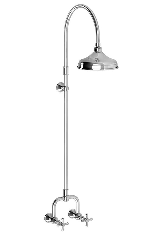
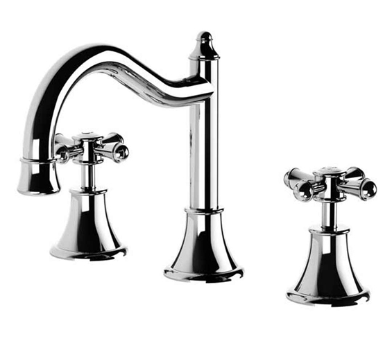
Yep, chrome and traditional all the way!
These were a bit of a splurge but aren’t they gorgeous?
They are part of the Nostalgia range from Phoenix Tapware.
There will be a simple white ceramic basin to compliment the mixer set.
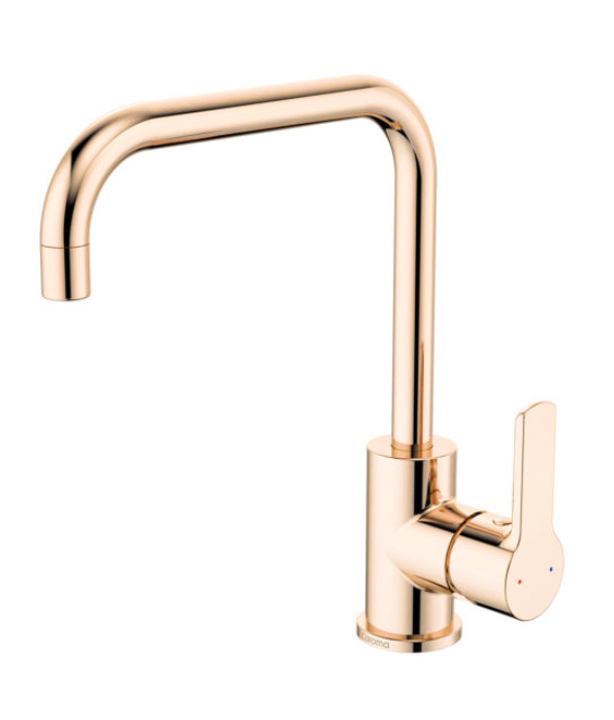
Now I’m going to contradict myself because for the kitchenette mum chose this more modern brass (it’s actually called ‘rose gold’ though it definitely leans brass) fixture from Bunnings.
I can’t find this model in the same finish on their website anymore.
She isn’t opposed to mixing metals and felt that a single kitchen mixer is much less of a long-term commitment than a whole bathroom set.
It will be paired with a simple square stainless steel sink.
Although mum had to lay-out a basic electrical plan before going away on holiday, we haven’t actually chosen any light fittings yet.
There will be downlights throughout most of the space, along with a sconce above the mirror in the bathroom, a pendant over the dining area and two ceiling fans – one in the living zone and one in the bedroom nook. Being north-west facing, plus on an upper level, means this extension has the potential to get super hot during summer. There will also be a reverse cycle air conditioning unit near the kitchenette.
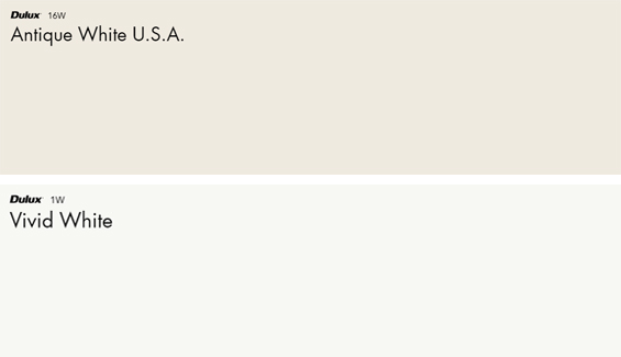
The interior colour scheme isn’t set in stone yet though I’m assuming my parents will want to continue the theme from the rest of their house by using Antique White USA on the walls and Vivid White (Builder’s White) on the ceilings and trim.
I’m also liking the idea of introducing wallpaper and maybe some feature paint somewhere. Not sure yet.
Unlike the interior paint colours which we can chop-and-change as desired, the exterior colours needed to be locked-in so the roofing could be ordered, the render could be arranged, and the gable weatherboards could be painted in advance.
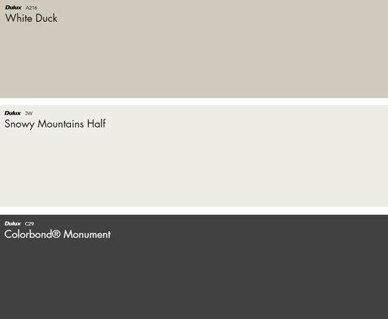
As mentioned in my previous post, my parents wanted a light scheme with dark accents. We’ve chosen White Duck as the main colour, Snowy Mountains Half as the accent, and Monument for the roof and gutters.
Not entirely sure about the window frames, eaves and shutters yet. Still tossing up whether to do them light or dark.
Although White Duck appears tonally deep and somewhat beige here, when used in many exterior conditions it actually presents as quite white with an earthy grey-green undertone. Given how pale it looks outdoors I needed quite a crisp white for the accents to create enough contrast. I was tempted by Vivid White though know it can be overly stark, which is why I settled on Snowy Mountains Half.
Actually, funny story about the exterior colour selection…my parents had decided on White Duck and Monument before they went away on vacation, though shortly after they left the builder contacted me about choosing the gable weatherboard colour! And he needed to know ASAP! My local hardware store doesn’t carry many swatches, and not having time to test numerous sample pots against changing light conditions (and all that blah, blah, blah), I jumped on the Dulux webchat to talk things through with a colour consultant. At the end of the chat she said, “Just wondering, are you Kristine from The Painted Hive? I follow you on Insta and love your projects”. Ha, ha. I almost felt famous for a moment.
Of course, although not ideal, we can always easily change the accent colour if needed if we feel it’s not quite right once up on the house.
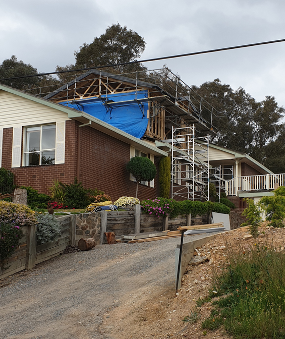
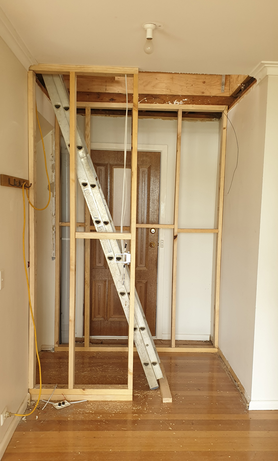
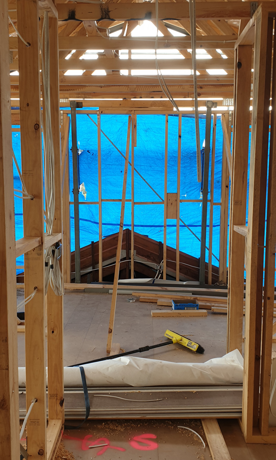
In regard to the actual build progress…the roof is on, the electrical has been run, the window frames are all in (that just happened yesterday so they aren’t shown in my pics which I took a few days back), the gable weatherboards are up (again, I don’t have pics yet), and an opening to the stairwell has been created.
It’s moving along quickly!
PS I’m launching a really awesome giveaway tomorrow so keep your eyes peeled!
I don’t do many giveaways because it sometimes seems like the web is saturated with them, though I do love that they provide the opportunity to say thanks to all my reader and followers (plus this one was just too good to pass up!).


It will be fun to see how this progresses! :) It looks like it’s going to be lovely.
Thanks Elayne :)
I love your paint selections. It is going to be great. I’m enjoying following along and as usual am being inspired.
Thanks Diana :)
The fixtures are beautiful and such a classic style. Love the paint colours! Exciting to see progress!
Can’t wait for the wall’s to go up and see the suite starting to flesh out. Quit question. The new entry looks like the existing door will be walled in?
Yes, the stairs will block that exterior door (it’s never used as there is a second door through the laundry which is just to the right). We are going to keep the exterior access though and create a small storage area beneath the stairs for fire wood which can also hopefully be accessed from inside.
It’s fascinating to watch something being built. Nice faucets and shower head. I believe in keeping things simple. In Europe recently, we encountered some unnecessarily complex shower heads with too many options.
LOL, yes, high tech isn’t always best :)
Fantastic progress! That is SO cool that the color consultant knew who you were!
I am really enjoying following the progress of the renovation and the thought process behind the choices you are making. I am wondering if you are keeping the brick natural or if it is going to be painted. I like the idea of no maintenance for my own home therefore painting brick is probably out, or at least only one elevation. however getting a cohesive scheme seems easier without brick as one colour and selectiing another for cladding. When we used to select display homes we had the advantage of choosing bricks in a palate that would match or complement the render and cladding colours, especially given the contemporary brick choices. My house has just a small amount of cladding and a large amount of brick and roof visible and I have found the fixed colours such as the brick and roof make choosing the other ones harder as its not ideally how I want it to look…So I will be watching for inspiration here. Thanks for sharing all this with us. I love that the dulux consultant knew who you were. I love the dulux colours you have mentioned.
Thanks Rebecca.
We will be painting the brick in this case. Mum and Dad have been living with this mission brown for over thirty years and want a change. We will probably use a render style paint (same as I used on the flip house facade: https://thepaintedhive.net/2019/05/the-flip-house-exterior-makeover-reveal-before-after/). I totally understand what you mean about trying to work with what you already have. It can mean compromising on the general look you’re after because sometimes the colours you want just won’t compliment the existing elements. It’s give and take in that case. Otherwise, if you’re genuinely not happy, it can be worth biting the bullet and just refreshing everything. Depends on how much it matters to you :)
Have you got any photos of the completed exterior? I like the combination of Monument roof/guttering and White Duck, would love to see it !
The house itself is almost finished but the landscaping etc. is still a long way off. If you have a look through this list of posts there are some photos of the exterior:
https://thepaintedhive.net/tag/suite-extension/