Although I’ve worked on a heap of bathrooms in the past, they’ve always been simple refreshes, or DIY makeovers, so this is the very first time I’ve ever started from scratch!
And it’s sooooo exciting!
I mean, as much as I love my basic updates, there’s just something about the total freedom of a new build. I wouldn’t say I prefer one over the other, they’re just different.
Of course, the bathroom layout was determined a few months back when the official floor plan was drawn up, though we’re now at the stage where all of the design decisions need to be made. And pretty quickly…the tiler could be starting as early as next week! Yikes!
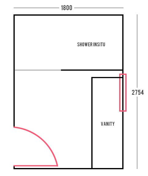
Just to help you get your head around things, here’s the general layout as per the original floor plan (dimensions in millimeters)…
Remember, there will be an adjoining separate powder room so no need for a toilet in here, and there is already a tub in the main bathroom downstairs.
As mentioned in the past, although mum is open to being a bit adventurous with changeable elements, she is a stickler for timeless neutrals when it comes to most fittings. In many ways this is a blessing as it helps define the direction of the room and instantly eliminates a heap of the endless options out there!
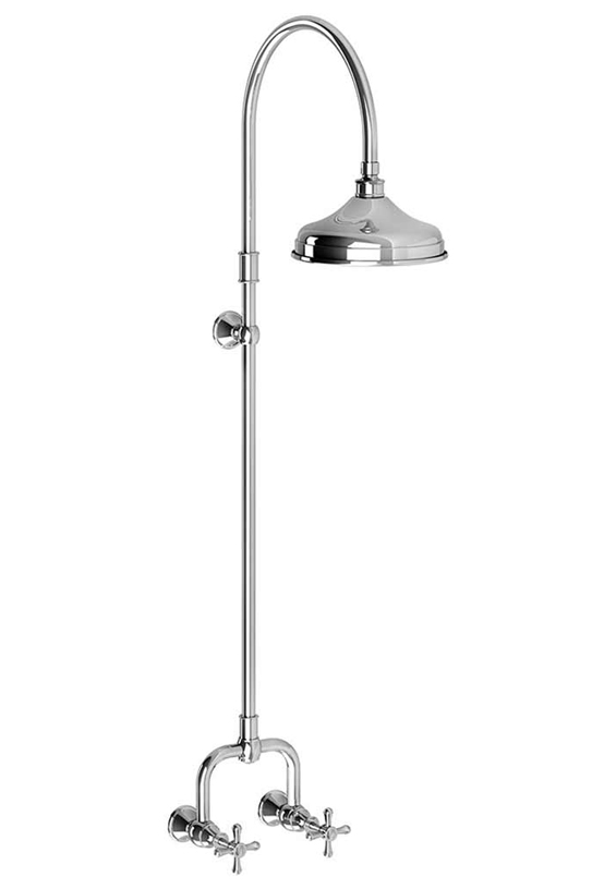
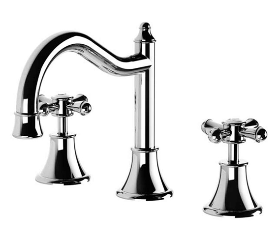
I’ve already shared the tapware she chose…
Phoenix Nostalgia Exposed Shower Set ($730)
Phoenix Nostalgia Basin Set ($420)
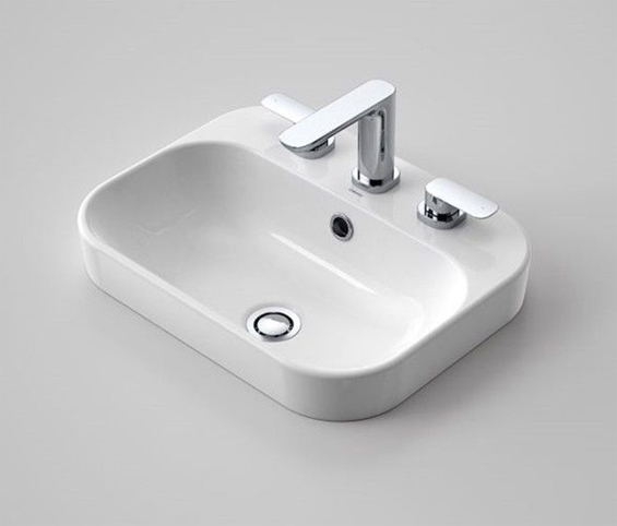
And here is the basin…
Caroma Luna Inset Basin ($120)
Mum didn’t want to deck mount the basin set and it was tricky finding a good-looking, affordable basin which had the three hole option. This one is nothing special though it’s nice and simple and will do the job.
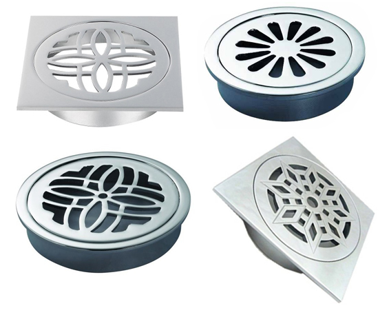
To round off the plumbing fixtures, all we needed was a floor waste for the shower drain. And man, I had no idea how many options there were out there!
My initial thought was to simply use a tile inset waste, though then I started finding all these pretty traditional ones and couldn’t look back!
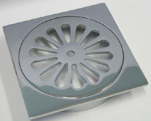
I love the round options though know they can look a little messy (depending on how skilled and fastidious the tiler is) so decided to go with this classic square one…
Sunny Design Solid Brass Floor Waste ($12)
The next big decision was the tiles.
To be honest, I had barely given these a thought, assuming we had plenty of time, though just last week mum mentioned that the builder was pressing to have them arranged! Argh!
I knew mum wanted some kind of white subway for the walls, so it came down to selecting a timeless yet interesting floor tile to add some depth and interest.
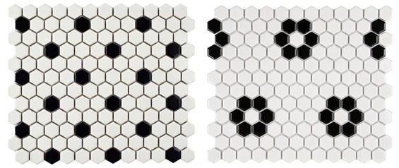
My initial idea (given mum’s love of classics) was to go with black and white hex tiles.
I pretty much assumed this selection would be home and hosed though, rather surprisingly, my parents weren’t keen.
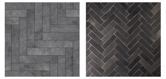
The next style which popped into my head was charcoal subways laid herringbone.
And they liked it!
I figured finding charcoal subways would be super straight forward, though it actually took two days and four different stores! Turns out, floor grade subways aren’t particularly common.
The first store we visited only had one option. It was nice though kinda expensive and not quite the right scale.
Forte Urban 40cm x 8cm ($170 square meter)
The next store also had only one appropriate option. It was like a brick slip and we were smitten! Only they had none in stock in the colour we wanted and wouldn’t be getting any until January!
Bricklane Cemento 30cm x 7cm ($99 square meter)
The third store had a similar brick slip option (which I adored) though it was too rustic for mum.
Tribeca Grey Brick Textured 25cm x 6cm ($120 square meter)
The fourth store also only had one option. It wasn’t completely as I had envisioned – perhaps a tad less earthy – though it was the right price and in stock. Plus in the overall scheme of things, I knew it would look fine. Sold!
Conazzo Charcoal Brick Matt 30cm x 7cm ($49 square meter)
Not totally sure yet, though we’ll probably go with a mid-grey grout.
As already mentioned, I knew mum wanted white subways for the walls, though as anyone who’s shopped for tiles lately will know, there are about one zillion different white subway options out there…bevelled, rippled, long, short, smooth, textured, gloss, matt. I was pretty sure mum would go with the most traditional style, and I wasn’t wrong…
1:2 (20cm x 10cm) White Subway Gloss ($24 square meter)
To be honest, I actually really like their simplicity too. Am thinking we’ll team them with a light-grey grout to compliment the floor and add some definition.
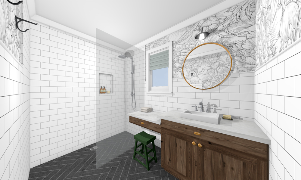
So, with the wall tiles sorted, we just needed to figure out where we actually wanted to put them! A full room of floor to ceiling tiles can be really striking, and it was tempting, though we both felt it may look too clinical, plus mum wanted some wall space to play around with colour and/or pattern. After considering a few different options, we settled on floor to ceiling in the shower, and tall-ish wainscotting for the remainder of the room.
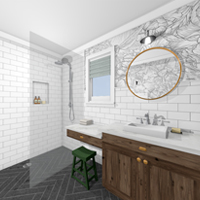
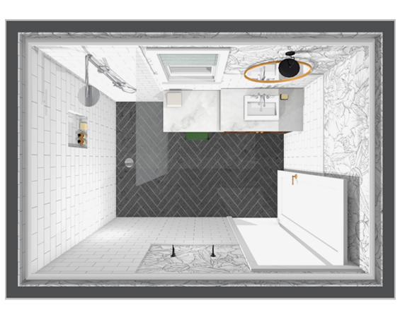
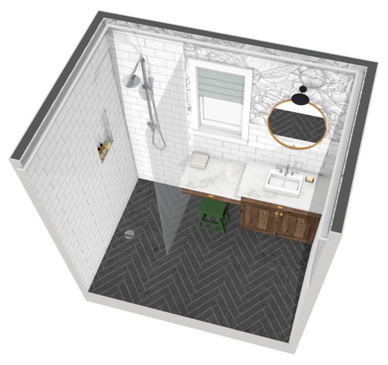
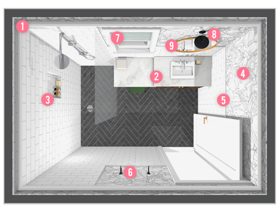
We still have lots of decisions (big and small) to make, though here’s the general plan at this stage…
1 | CORNICE I know it’s not the most trendy thing to do in a bathroom, though I really love the way a cornice (crown moulding) can finish a space. If we’d decided to tile floor to ceiling throughout the whole room, we may have forgone one, though we’ve chosen to include a cornice here to create a nice clean border for any wallpaper or paint we add to the walls – plus I just like the character it imparts.
2 | VANITY We’re still currently nutting this out. A custom vanity was included in the build contract, so we assumed we could request pretty much whatever we liked (within reason of course) however it turns out there are quite a few restrictions. I initially suggested a stepped vanity to mum because the plans showed the window as being too low for a continuous counter. And although we’ve since learned there is actually plenty of space, mum was already sold on the ‘floating make-up’ bench idea. Fair enough because it’s cute and different. The top will be a subtle white stone though we’re not yet sure about the base. If timber (or decent faux timber) is an option, we will likely go with that. Otherwise, as much as I love the idea of deep green, it will probably be something more neutral, like charcoal or soft grey.
3 | SHOWER NICHE Not totally sure what we’re doing here yet, though I like the idea of something tall rather than long. Am contemplating using pencil tiles as edging and adding stone shelves.
4 | WALLPAPER Because mum is totally paralysed by the thought of adding pattern or colour in any kind of fixed feature, I suggested wallpaper several months back as a less permanent alternative to inject a bit of bang. Here I’ve used a large scale black and white floral, though I have no idea what we’ll actually end up going with.
5 | TILE CAPPING We’re still trying to work out the best way to finish the exposed edge of the wainscotting. Pencil tile is an option though they aren’t cheap. An alternative we’ve been considering is basic timber trim painted a gloss white. Could also just go with regular white schluter edging.
6 | TOWEL HOOKS Not sure if we’re going to use hooks or a bar yet. Obviously, it’s not a pressing decision so we’ll wait until the room has come together.
7 | WINDOW DRESSING There isn’t a privacy issue, so we may not end up installing any window dressing, though sometimes it’s a nice way to add a bit of softness to a room with lots of hard surfaces. Here I’ve just used a basic roman shade however I have no idea what we could end up going with.
8 | LIGHT FITTINGS Much to my dismay, dad is insisting on a heat light so we’ll just get the most basic one we can and hope it blends in! Not sure what we’re doing with the sconce above the mirror yet. Am thinking something quite simple, like a clear dome or cone shade on a brass or black arm. We’ll see.
9 | MIRROR Obviously, this isn’t pressing. I do love a round mirror though lately have also been coveting oblong shaped ones. Will depend what we find. Not sure on the colour yet either. As much as I adore mixing my metals I don’t want to go too crazy!
So, that’s where we’re at!
The plaster is going up today so I’ll take some progress pics soon and share them when I’m back next!





This is really exciting. I’m planning to put a new bathroom in our basement this winter and this really helps me to get organized in my plans. I really like the choices you’ve made – the grey herringbone floor is going to be beautiful! Anxiously awaiting to see how it all comes together!
Thanks Leslie :)
Hello,
Great design! Although I would not like that the shower floor is level to the rest of the bathroom, even though there’s a glass pane. Maybe it’s just me, but I’d be concerned that the water would spill all over the room!
I’ve experienced it in many houses we’ve rented in Europe. We would put down a rug or a towel to absorb the spilled water, even when the shower floor had proper inclines.
I would do some sort of a separation between the shower and the rest of the bathroom with 4-6 inch high border so that the water will likely stay “in” the shower! Some people really do splash a lot!
LOL.
LOL, yes, I’ve heard mixed stories about insitu showers. Some people have no issues, other people end up with water everywhere! We’re going to see how it goes and can always add something later if needed. We really didn’t want to break-up the floor if it wasn’t warranted. As it’s just a guest bathroom the shower won’t be used much so my parents don’t see a bit of water from time-to-time as being a huge problem. Will wait and see I guess.
I’m just in love with the circular floor drain waste. I could not see them on the link. Would you mind sharing where you found them online? Thank you you in advance
They are available in lots of places. If you do a Google search for “decorative floor waste” or “flower floor waste” you should find some :)
Very lovely! Herringbone patterns in tile or wood are my favorite design elements. The rain shower head is a beautiful piece. Depending on your parents age however, you may want to include a hand held shower head as well. It’s handy for a quick clean up without getting soaked and also if an injury or disability requires the person to sit while showering. Just a thought! Best of luck on a beautiful design!
Thanks Karen. The bathroom is part of a guest suite so my parents won’t actually be using it. This particular shower fitting doesn’t come with a hand-held however I guess it’s something we could look at installing separately later if we feel it’s needed. Though, like I said, it’s just a guest bathroom so I’m not sure my parents will bother :)
Yes ,please!
:)
Gorgeous, as is all of your work! While I love the look of towel hooks the practical in me likes to spread my towel along a rail so it can air and dry well. Likewise the subway floor tiles will have considerably less grout than the hexagons; always a good thing for those cleaning bathrooms. Looking forward to watching this progress.
Thanks Julie. Yep, was thinking about the towel situation today. Am figuring there might need to be a bath mat (nice one of course) so a bar might be the way to go so it can dry. Maybe some hooks above too? Not sure yet :)
Hi,
We are about to start major additions and renovations on a property we’re about to move into. What is the program you’ve used to do this layout on? I like the intricate detail.
It’s a Chief Architect product called Home Designer (Pro version). It is awesome though not cheap and takes a lot of learning. Worth the cost and time in my opinion though depends how much use you’ll get from it :)
thank you
We’re in the middle of redoing our MA BA, which is similar in size (and design!) to this one. We’re also building a curbless shower (at least that looks like what you’re doing), as it’s ideal for us oldies! When we talked to a few tile people in choosing a tile to run the entire bathroom/shower floor, though, they said we needed to have tile small enough to allow for more grout, as that prevents slippage; that if we went with a bigger tile (read: larger than 1″), we ran the risk of having slipping issues. Did anyone indicate that to y’all with the larger (roughly 11″x3″ according to Google’s calculation) rectangular tile?
It looks beautiful so far — I mean, duh! It’s you we’re talkin’ here!
Thanks so much. That’s really interesting. Was not mentioned once by anyone we’ve spoken to. It’s actually very common to have this style of shower here in Australia and nearly all (in fact, probably every one I’ve seen) has large format floor tiles.
Looks fantastic Kristine. I’m currently not on your FB group but love getting your blog posts. My only thought looking at your plan is something that was mentioned to me when doing our bathroom… cleaning the glass with the cabinet butted up to it can be a challenge… As you know I went with a high nib wall to avoid this issue but maybe just a bit more gap between bench and shower glass so you can easily access the glass to clean both sided. Can’t wait to see it all coming together and look forwards to blog updates… such exciting times ahead :-)
Thanks Vic. Yep, I’m super excited!
This is something we’ve discussed. There is a gap there actually, it just doesn’t show with the angle of the renderings. The first plan image which shows the position of the vanity gives a better indication :)
Can’t wait for the tiling to start!
Lovely design! Re the hooks or bar debate, we installed 2 bars for our bath towels so we were able to put a towel on each to dry. We put one bar above the other (with a fairly big gap in-between them) and have to say that arrangement has worked a treat. It looks stylish and the towels don’t take so long to dry. Also, having lived with our bathroom for a few years before we did our mini revamp, I had a towel hoop (from the same range) put on the wall near to the sink for a handtowel. This was purely to save all the drips (= slippery floor) from having to turn around after washing our hands and walking over to where the towels were hung.
Thanks Jenny. Yes, all good practical ideas. Will wait and see how the space feels once it’s together before we choose. So many decisions!
I love the bathroom plans and product choices shared in this blog post! The design concept and color scheme create a stylish and cohesive look. The detailed explanations of the chosen products make it easier for readers to find similar options for their own projects. Well done to the author for sharing these inspiring ideas and providing helpful insights!