On a crisp, sunny morning the french windows in our little living room greedily catch the first toasty beams of light and spread a gentle warmth throughout the space. When it’s cool and gloomy outside however, they frame a haunting view of dispersing mists rolling over the nearby hills. Either way, a sense of nostalgia is somehow born in me, conjuring feelings reminiscent of childhood which always seem to evoke contentment.
It’s quite amazing how a home can make you feel and to imagine that it may well be the simplest things which will become our fondest memories in the years to come.
Our living room is still evolving and while I’m happy with its calming colour palette and layers of natural texture there are a couple of pieces I’m kinda just making do with for now (I’m writing a separate post dedicated to some of the changes I’ve got planned).
All of the furniture, sofas aside, is second-hand and pretty much everything else was either thrifted, bought on sale or gifted.
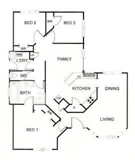
To give you an idea of the layout, here’s my hive’s floor plan:
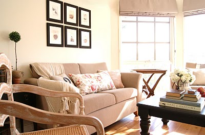
And here are some (very fuzzy – sorry!) before shots from the previous owners mid-way through moving out:

It’s a bit hard to tell though the walls were apple green and all of the trim was natural brown timber. To lighten up the space we painted the walls pale cream and all of the timber gloss white.
The original owners had installed a faux timber floating floor which, whilst it wouldn’t necessarily have been my first choice, is nice, clean and neutral.
I would’ve liked to have been able to keep the windows free of bulky furniture though there was nowhere else to put the second sofa and I couldn’t swap the dining room space for the living area cause it’s far too small :-(
It kinda looks like you might be able to put something horizontally between the dining and living rooms as some kind of divider, though trust me, it’s nowhere near wide enough!
As you can see from the floor plan there’s this weird little diagonal wall. The previous owners had a sofa against it though if you look at the floor plan and picture a deep piece of furniture on that wall it’s easy to imagine it leaving a pretty narrow gap from the entryway to the living room. We instead decided to put the TV there and it works perfectly. To the left you can glimpse the little entryway.
Now, just for comparisons sake, here’s some side by side before and afters:


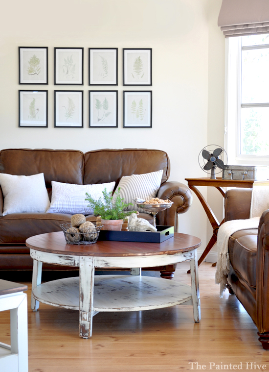
And here’s some more photos just because I can’t help myself:



Hi Kristine
Just gorgeous, what a transformation. I love it! Those windows are stunning and I love reading how you described the view. It is amazing to me how our homes can affect us.
You have done a really wonderful job in creating an airy but still cozy room. I can’t wait to see more!
Janice
Hi Kristine!
thank you for your visit and your sweet comment!
Your living room is amazing! I love all that light coming from the french windows!
I’m a new follower!!!
Hugs!
Mara
Kristine, your home is BEAUTIFUL. All that glorious light!
beautifully written, especially that first paragraph, I see in a crystal ball a book deal coming your way!! Looks great, love the neutral palette and good idea to keep the windows clean of big curtains for that wonderful view. also you never see photos of peoples TV’s within decorating blogs (or mags or books for that matter) so nice to see how well yours works in with the layout.
alicia
I love everything – the idea of the twine in the clay pot – I love little touches like that! There’s a chic simplicity in the way you decorate that is perfect! I love to decorate with baskets – my daschund likes them too – to eat! Jennifer – come by sometime! jennsthreegraces
Hi Kristine your living room is just beautiful and so my taste!!!! I love the soft wall color and the mixture of different tables,and you added such pretty accessories! Have a great weekend, Martina
I just love your blog, it really is a feast for the eyes. Please hop on over to http://www.recapturedcharm.com as I have passed an award on to you!
Thanks
Lisa
It’s lovely and beautifully styled as always. I’m sure you remade the tables in that room. I’m looking forward to all the details about this room!
Kristine,
I most certainly would love to feature this!! It is wonderful all of it. The photography and decorating/staging for the images is PERFECT! I love it all!
If it looks like that at all times, I am truly jealous! I love your style, clean yet nicely layered.
Absolutely gorgeous! I want to just sit right down and take it all in. Thanks for all the pictures…love them! Oh, and your description about the window view was so beautiful!
Kristine-
I am such a procastinator!! You visited me ages ago and here I am late-as usual! OH MY HECK! Not only is your home and style covet worthy-your gift of writing is fabulous as well!! I feel honored that you would put our styles in the same bracket.
I can’t wait to read the rest of your blog and see what other fantasticness you have!!
Happy Friday!!!
I think you’ve done a fabulous job,Kristine! I love the windows and all the light you get in here. I think you’ve created a very welcoming and friendly living room. I’d be happy to plop down on your couch and watch TV anytime! : )
it looks like it is out of a freaking pottery barn catalog, but ten bazillion times better because it is made with true antique pieces, and non mass produced items! LOVE LOVE it! when can i come over and hang out? ;)
Lovely makeover , stylish but homely. Wish I could finish just ‘ONE’ room in our reno. I have half done rooms everywhere. You might have inspired me enough to focus , so I can do a post on a finished room.
Enjoy your weekend
Karyn x
wow what a huge difference! does it make you want to send the old owners the updated pictures? I think they would be in shock! I can’t wait to read about all the items you have in your living room. I really love the bird cage, the fan and the wire basket with the two flower pots! They are perfect!!!
lovely post Kristine, fantastic before and after comparisons. Your home is lovely cannot wait to see more.
Donna xx
Kristine..what can I say…simply stunning. Love the mixture of black and white furniture and neutral colours. Bird cage fabulous and that rattan chest is ‘to die for’. Did you stencil it? Thanks for sharing how you placed your TV…as I need to incorporate ours without hiding it and have been so undecided on how to do this.. Love it all…congratulations..can’t wait to see more..please ..;) Kym X
You’ve done such a wonderful job achieving this gorgeous room Kristine. It’s so lovely. I love your butlers tray/table with the sexy legs! It all looks very relaxing.
Angex
I think that you will have BHG knocking on your door any day now. Your home is just perfect!
Hi Kristine, you living room is stunning!! It looks like it has come from a magazine. I love your colour palette and use of texture, it has given some very much needed inspiration for our living room. I love your ‘2’ cushion. The whole room is just gorgeous! I have to go back now and have another look!!! Happy weekend to you ~ Tina x
What a lovely peaceful space you have. It’s beautifully done and so much better than before. And you have a WHITE tv…get out of here!! :)
What a fantastic job Kristine, it looks amazing. I am so jealous of those lovely windows! I really like your colour scheme, and the vintage pieces scattered throughout make it so much more original and unique. Great work! K xx
Hi Kristine, love this room all the colours tie in nicely. Just a beautiful look overall and such a great place to curl up and read your favourite mag. You have done a beautiful job. Sandy x
I LOVE how you decorate! I would love for my home to look like yours; it’s so neat!!
Nancy
Beautiful before and after photos…thanks for sharing your lovely room!
What a beautiful, comfy space. You’ve decorated it beautifully. I was admiring your floral cushion and realised I have the same fabric as my couch covers!!
Hello…..I just jumped over here from RMS and have to say your living room is beautiful! Love the pottery barn vibe along with the calm feeling. Great work, off to see more.
Wow – just lovely! I love your photos too.
Oh, Kristine, I LOVE THIS ROOM!! It’s very much the direction I’m heading in our living room. I’m featuring you on saturday shout out later today…come check it out! :)
Wow! I totally love your livingroom! I love the light from your beautiful windows and your attention to detail.
xoxo
Biana
It’s gorgeous! You’ve done a fantastic job bringing the full beauty of that room to life. Nicely done.
Kristine- it’s so pretty & fresh!!! I LOVE what you’ve done!!! It’s got such a natural, relaxed & comfortable feel. totally looks like something from a magazine!! YAY!!!
xoxo,
lauren
Wow! Simply beautiful!
I have a coffee table on my to-do list that I’m going to refurbish and I’ve been trying to decide whether to paint it black or white. Thought I’d settled on white until I saw these pictures of your black one. Beautiful!
Christa
That looks great – Like it’s right out of a Pottery Barn catalog! And I think I have the same basket your fan is on (the bottom one)!
I love your style! That transformation is incredible. Thanks for sharing.
Beautiful, beautiful room! You have done a wonderful job…it does look airy, clean and cozy at the same time. What a gorgeous home!
I LOVE your living room!! It makes me want to just come on ob=ver and plop down on your couch! It’s so magazine worthy. I love all the colours you chose, and how light and welcoming it has been made! A breath of fresh air! Good taste!
Your room looks like it’s right out of a Pottery Barn catalog. Great job.
-FringeGirl
You have done a beautiful job! :)
Visiting from the linky party Under The Table and Dreaming.
Terrific makeover. Love your color scheme. Please stop by if you have time. Jane F
Wow! Not only is the room awesome, but you take great photos too! I definitely could use some talent in that area…
Great job!
Your room is simply stunning! I love all the unique touches you have added – gorgeous! Love the roman blinds they look fabulous! Thanks so much for stopping by and joining the Sunday Showcase Party! I greatly appreciate it! Hope you have a wonderful week! Hope to see you again Sunday! ~ Stephanie Lynn
Hi Kristine,the place I went thrifting …is on the Mornington Peninsula in Mornington.It didn’t have the name of the antique place out the front but if you are ever out that way it is on the Mornington Tyabb Rd in Mornington between the racecourse and Nepean Hwy.It is an old shed with a sign out the front saying Lu Lu’s cafe. It is full of lots of old stuff, a bit like the Packing Shed in Tyabb but much cheaper. I think you would love it! Now I’ve given away all of my secets…Take care and can’t wait to see more of the house. :) Kym X
Beautiful!! You really have great style.
The after is so light and airy and welcoming. I’m in love – truly.
I’d also like to take a nap on that comfy couch :)
It looks polished and homey. I would love to spend time there enjoying the light bright cozy room.
Thanks for sharing.
your lounge room is amazing i love how you decorated it – we have so much in common miss Kristine when it comes to style and decorating..look forward to seeing more of your house pictures it coming up so beautiful XX
your room looks so calm and serene and clean! love it, and i am especially loving those chunkly little legs on the coffee table :)
Kristine-
I am in absolute awe. This honestly may be the best makeover I’ve ever seen in the blogosphere. It is incredible! You’ve made the space so inviting and rich, I love it! I can’t wait to see the cost and item location/break down!