Update: Check out how my bedroom has evolved! View more recent posts here.


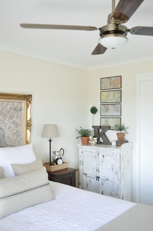
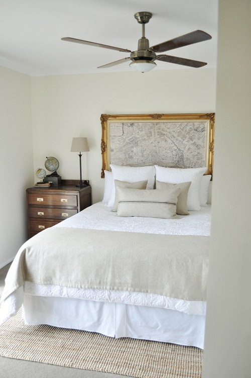
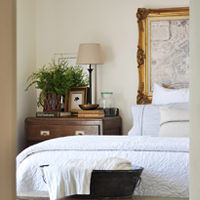
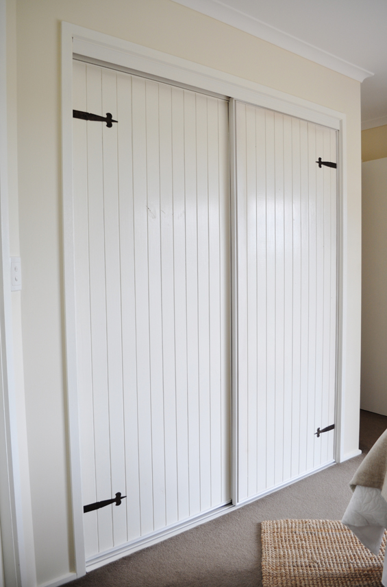
Some interesting wall angles and the need for tonnes of storage really dictated the design for our master bedroom. Function and budget were high priorities so I decided to work ‘pretty’ around ‘practical’. The neutral palette combines loads of natural texture with vintage elements for a relaxed yet fresh feel. While there are still a few additions I’m considering I’m pretty happy with how it’s coming along. I’m also waiting to put some finishing touches on the built-in robe doors and will share the after pics of them soon too.
So, here’s the floor plan just to give you an idea of the room’s weird shape (BED 1)…

And here’s the space before (cringe!)…
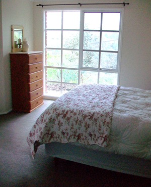


Well, that was after we already simplified the canvas by painting out the green walls and brown trim (Dulux Chalk USA on the walls, Dulux White Watsonia on the trim), replacing the dirty old carpet and removing the completely translucent ultramarine blue curtains!
If you’ve been following this makeover from the beginning, aside from being incredibly patient), you should also recognise a fair bit of the decor.
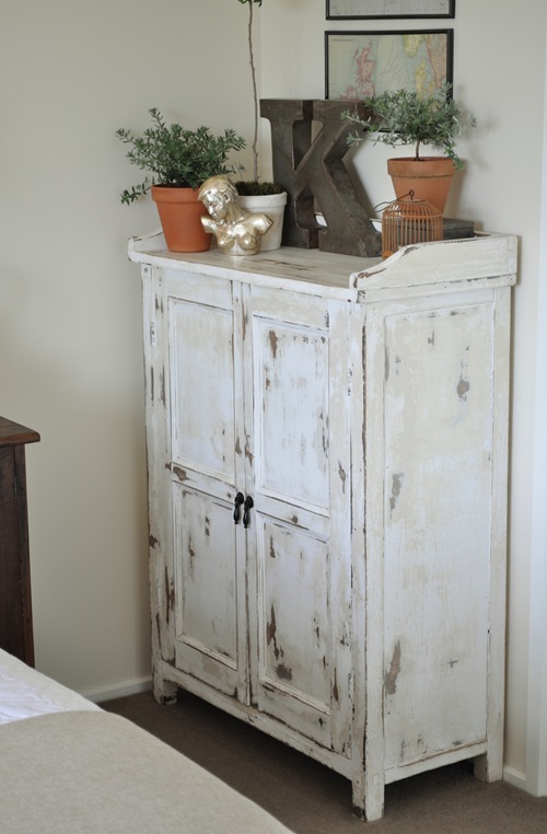
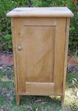
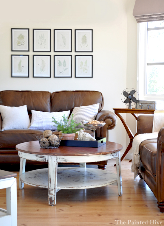
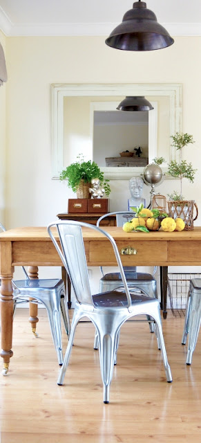
Pretty much all of the furnishings have been thrifted, bought on clearance or hand-made and every piece of furniture in the room is second-hand. To avoid a massively lengthy post I’ll cover each refurb in more detail in separate upcoming posts.




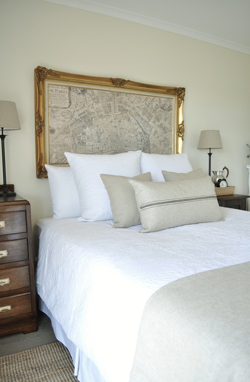

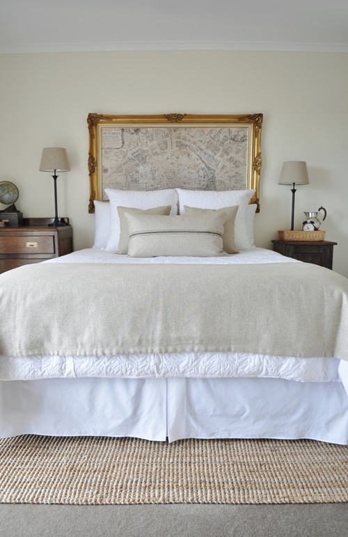
Update: Check out how my bedroom has evolved! View more recent posts here.


Thanks Kristine! I actually do live in Australia so I will check out my local Bed Bath and Table this weekend thanks. Can’t wait to see your updated bedroom pics.. and hopefully one day your kichen!
I love your eye for recognising that someone’s trash is your treasure & where possible, you too like balance & symmetry. Please change your blog profile though to remove “just” as it clearly undermines your talent.
Thanks Anne :-)