This post is sponsored by Beacon Lighting.
When it comes to room makeovers, I generally like to work with what I have.
This means leaving well enough alone – using cosmetic enhancements and avoiding the possible mess, expense and hassle of disturbing anything “fixed”. There’s lots to love about this simple form of room transformation. It’s usually very achievable and super rewarding. And from my perspective as a blogger, I think it’s relatable for my readers. Unfortunately though, it’s not always possible.
Sometimes things simply aren’t “well enough”.
Such was the case with the weird lighting configuration in my parent’s open plan living-dining room. I knew straight away it had to go.
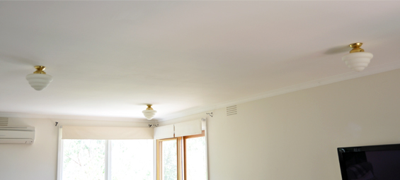
I’m not sure what the architect was thinking back in 1969, though the asymmetrical triangle arrangement was doing nothing to compliment this long-ish, narrow-ish room…
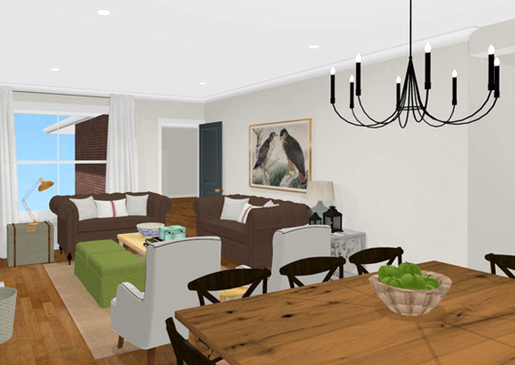
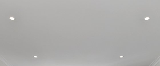
To help define the two zones we were introducing, a fresh configuration was needed. So, we decided to position one feature pendant over the dining table and simple downlights in the living area.
Concept rendering (taken from the opposite end of the room as the before shot above).
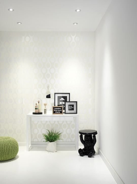
Downlights are perfect for when you already have a statement fixture nearby. They are incredibly discreet and “clean” so won’t fight for attention and are so subtle they can fit into a myriad of interior schemes…
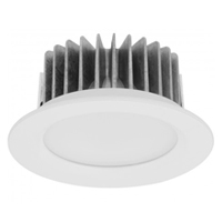
We went with LED downlights from Beacon Lighting which are available in seemingly endless options, from fixture style to wattage, to brightness (lumens) to colour temperature and even beam angle. Because there are so many choices, selecting the right LED downlights can seem daunting. Fortunately, Beacon provides really great information about all the specification variants to make choosing easy.
Of course, variety is not the only thing going for LED lighting. I’m sure I don’t need to stress the energy efficiency and longevity of LED ceiling lights. They use up to 85% less energy than halogens or incandescents and can last as much as 44,000 hours longer! Yes, 44,000! That’s around 20 years!
We switched out our kitchen downlights for LED’s from Beacon Lighting quite a few years back after we got sick of blown bulbs and ascending power bills. We have not had to change one of our LED light bulbs since and, teamed with our solar panels, our power bills have never looked better!
For my parent’s living room we went with dimmable LED lights (the previous lights were on a dimmer which mum and dad used daily so it only made sense to retain this function).
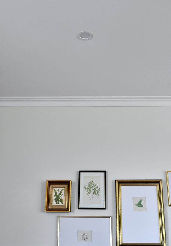
They work amazingly well and have a much broader brightness range than the previous lights did. We also went with a plain white casing to co-ordinate with the ceiling and a “Warm White” colour temperature to produce a toasty and inviting glow.
Gallery wall sneak peek!
Getting rid of that strange triangle configuration and installing these simple LED downlights really helps makes the room feel like a nice blank canvas.
Fresh, clean and versatile.
I’ll be sure to share some wider angle shots when the whole room is complete.
Soooo, on with the “paint” next (oh, I should probably explain that by “paint” I mean “furniture and decor” as we are not changing the colour scheme. Please excuse my poor attempt at a clever metaphor and this ensuing explanation which has pretty much rendered it pointless anyways :)
View Beacon’s entire range of energy efficient LED lighting here.
PS Sorry I’ve been a little absent lately. I’ve been busy working hard on an exciting new project I’ll share further details about soon!



Ooh, that gallery wall looks exciting! And those lighting choices seem perfect for your parent’s space.
We have low ceilings and I’ve been toying with the idea of a pendant over our coffee table for no real reason other than I really like statement lighting and have a thing for those rustic wood and iron ones. In reality, I think downlights will work better in the room. Thanks for the post.
Yes, those three beehives did have to go lol.
Can not wait to see this finished space!!!
good article! any recommendations for those existing down lights from the 80’s? :)
Hmmm, I’m struggling to picture those Jillian. Out of interest, what did/do they look like?
If they’re from the 80’s I’m guessing my recommendation would probably be to replace them ;)
Wow, really, 20 years??? I knew they were good though that’s insane. I need me some.
Haha. Love your closing statement. You are just too cute. Can not wait to see the wider shots when the room is done.
I also use LED lightning and I recommend it everyone.
It’s the way to go Katrin.
It’s so pretty – love your botanical prints too! I blogged them the other day & gave credit to you. They’re in my home and I love them so so much! Plus -they were free!
http://www.theruggedrooster.com/blog
They are perfect in your corner Jessica. For someone who likes neutrals and isn’t a fan of bold wall art they are just right! Thanks for sharing :)