So, I know it’s basically December and publishing a post without any hint of pine needles or flocked snow is seemingly akin to impudence, though let’s be rebels!
Over the past few weeks I’ve been chipping away at Riley’s bedroom re-do, with the most recently completed project being his new desk.
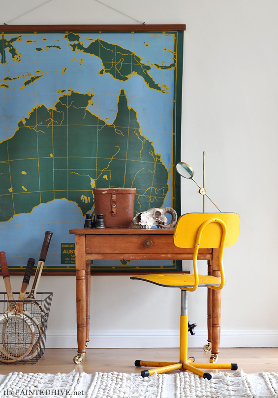
A month or so back I found this old hall table at a local antique warehouse for $120.
It was perfect though, being standard table height, just a tad too tall (sorry, I don’t have a before pic). You see, along with operating as a functional desk for a four year old, I also needed this item to act as his bedside table.
Fortunately, curtailing fully grown furniture is in my repertoire! In the past I’ve already shortened a hall table to become a desk (for my daughter), a console table to become a TV cabinet, a dining table to become a coffee table, a dresser to become a bench seat, and I could probably go on!
Anyhoo, it’s a very easy process as I’m sure you can imagine. I simply used a basic hand saw to trim off an equal portion of each leg (around 18cm/7″).
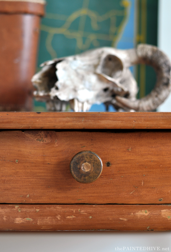
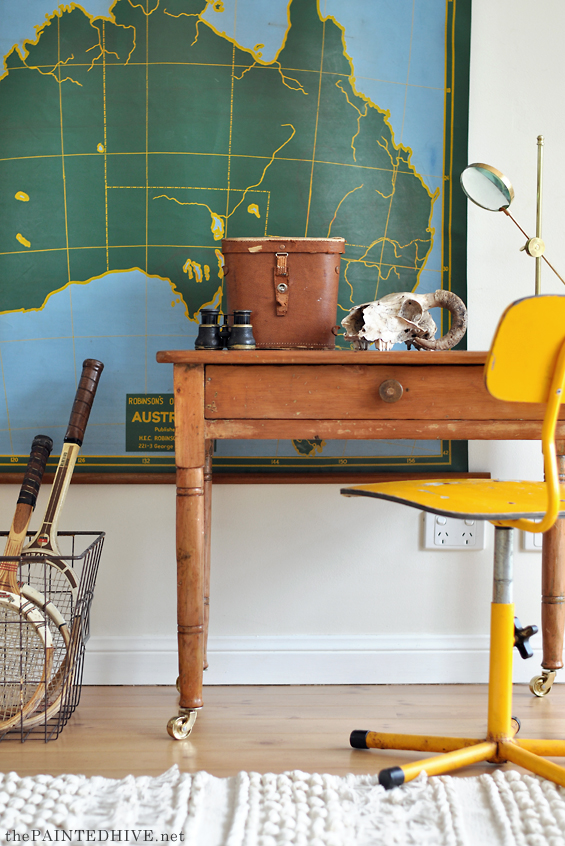
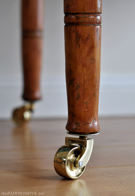
Because my desk legs were turned (as can be seen in the photos – notice the two pairs of bands, well, there used to be three pairs), I chose to use the lowest turnings as my trim point due to the fact they were set at around the right height. This made my cutting easy and created a nice flange on the end of the “new” feet. However, because the turnings were only set at around the right height, it also meant that the desk ended-up a little shorter than ideal.
Luckily, this was actually a blessing in disguise as it gave me the idea of adding these castor wheels from Early Settler. They boost the height a tad and complete the desk perfectly!
I love furniture with little wheels! Don’t you?
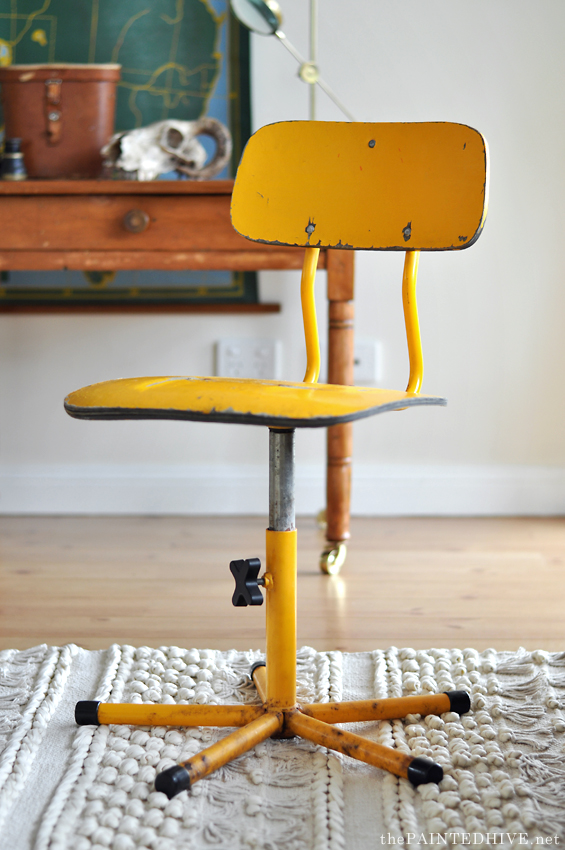
On the same day I bought the desk I also picked-up this sweet vintage swivel chair.
I found it on eBay for just $19 and I LOVE it.
It’s got the perfect amount of grunge, is a bit unusual and is even height adjustable.
Initially I thought I was going to have to paint the desk because the yellow of the chair seemed to clash with its golden wood. Though the colour combo is growing on me. I guess I’ll reserve judgement until the whole room is pieced together.
Speaking of the whole room, if you’ve been following along with the makeover, then you’ll know that these pics have clearly been taken elsewhere. I’ve staged my living room for this shoot because in Riley’s bedroom the desk sits right in front of a full length window which makes it almost impossible to get a decent photo.
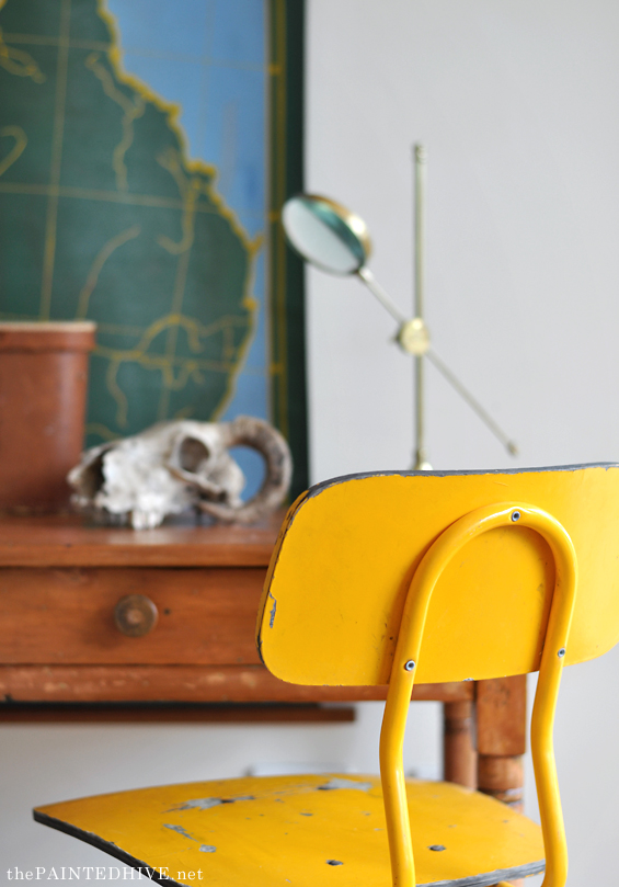
It also meant I could use the HUGE vintage wall chart that was going to be thrown away from the school my husband works at! Seriously, what were they thinking? I honestly have nightmares about all the cool stuff schools must have thrown away over the years.
Although there won’t be space for the wall chart in Riley’s room, the new textured rug and tennis rackets will eventually live there. So too might the brass magnifying stand and ram’s skull. We’ll see.
Catch up on all my posts about Riley’s bedroom makeover here.



Just gorgeous Kristine. You really have a knack for pulling things together. Those wheels are the perfect touch too.
I love it. That map is cool. I remember when i was working at a school they were going to throw away a big bank of old library file drawers. They are now in my craft room!!!
Looks so refined. I need a discretionary eye in decorating. I can’t seems to focus my ideas into a consistent style. I like too many things. Yours looks pared down and elegant. I’m going to have to find someone to come to my house and tell me what to keep and what to get rid of. Good eye. I have to FOCUS, FOCUS, FOCUS!
Debbie, this was me too – and I commissioned this very Kristine to design my living room so I knew what to keep! Pared down and elegant was what I loved too!
Thanks Debbie. It think refining a particular style is one of the hardest aspects of decorating. Not that there’s anything wrong with eclectic, though getting that look right isn’t easy either!
Love the individual pieces and love the staging! Can’t wait to see the whole room reveal.
Thanks so much Deb :)
Oh Kristine, the map certainly caught my eye in your photos – I can see why you are having nightmares! It is superb. Little wheels sure work on furniture, the desk looks great. And I love that brass magnifying stand! Have we seen that before and I missed it?
Thanks Sherylee. I found the magnifying stand at a new TK Maxx store which opened-up near(ish) to me a few weeks ago. I think it was only around $17. I don’t think you have any TK Maxx’s in WA yet though?
I too, love the map! I think the chair color brings out the yellow in the map…but I read you will not be using the map in your son’s room….so sad….it has to go in there!! Wheels on furniture…YES PLEASE!
I know Leslie! Though I only have one large enough wall in that room and I already have a landscape gallery planned for it. I really love the map, however I just can’t fit both and I have wanted to do a landscape gallery FOR EVER!
Can’t wait to order some of your printable quotes. I lovelovelove what you do!! Just so beautiful.
Keep up this extraordinary work.
All the best,
Marisa
Thanks so much :)
Fantastic…everything! I’m going on a hunt for similar chair. Thank you for your posts!
Thanks Rae :)
As always, a lovely job, Kristine! Love those brass casters.
Thank Suzy :)
It’s coming along quite nicely! I just added some casters to a table in my kitchen. Love wheels on furniture–so functional.
And they look so cute too!
Yikes, just everything is awesome about this. What a shame the wall chart won’t be in the same place, ’cause that yellow edge around the map is well matched to the chair! Looking lovely.
I know Sharon, they work really well together though I just don’t have any free wall space :(
Thank you for being a rebel!! I’m already sick of seeing Christmas stuff. I feel you’ve seen one you’ve seen them all!!
Hi Kristine! New to your blog and came across this blog post and fell in love. I know you did this for a child but my husband would really love it hehe. I love how you re-use old furniture and give it new life, you’ve inspired a thrift shopping weekend for me soon!
Thanks so much Samantha. It’s always lovely meeting new readers.
Yes, this is for my son though it’s not very childish and is kinda cool and could totally work for an adult. Your husband obviously just has great taste :)
His knees might get squished though. LOL!
Thank you for sharing! It’s very rustic looking, and I really like the map on the wall (perfect for a young child learning their geography!). But I think the desk and chair are too small, and honestly, look a tad uncomfortable. If he’s going to sit and do homework there, he’s going to need more space on the desk, and probably at least a little padding on the chair for his tush.
LOL! He’s only four so I don’t think he’ll be doing much homework on it! It’s really just to encourage him to colour, draw and read from time-to-time. And it looks perhaps deceptively small in the photos due to the massive scale of the map. It’s actually very generous in size (for his teeny bedroom it’s as large as I could fit) :)
Love the texture and color of the rug, Can I ask where you got it?
Hi Lori
Thanks. I found it on eBay though I just had a look and the seller is no longer offering them. It’s actually quite a bit smaller than it appears in these photos (90cm x 150cm). You should be able to find something similar on eBay/Amazon/Etsy if you search for “boho floor rug”.
Cheers
Lovely, thanks for sharing xx
The vintage desk looks amazing and especially the idea of adding the golden castor wheels. The vintage swivel chair in yellow colour also looks elegant and I thought wall chart always bring back to old school memories. Thanks for sharing such a wonderful post and I really appreciated your dedication work. Keep sharing like this.
Very inspiring post. Thanks for sharing.
My son has the same style map, but the world version, in his room! it came from the school at Apollo Bay. It has a different aspect ratio, landscape-style, so it works above his bed.
That sounds lovely :)