The frame is already up and as I type this the roof is going on (yep!) though before I get to sharing the build progress, I thought I should divulge the plan.
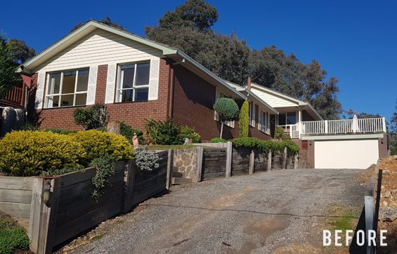
As mentioned in my last post, this will be a second story addition to my parent’s 1960’s house. They currently have a triple-split-level home (that makes it sound huge though it’s a regular family-sized home) and the addition will be going over the middle section.
In conjunction with the extension, they’ll also be making-over the exterior and doing some landscaping.
Of course, this means the size of the suite is dictated by the existing underlying level which is around 7 meters/22′ square.
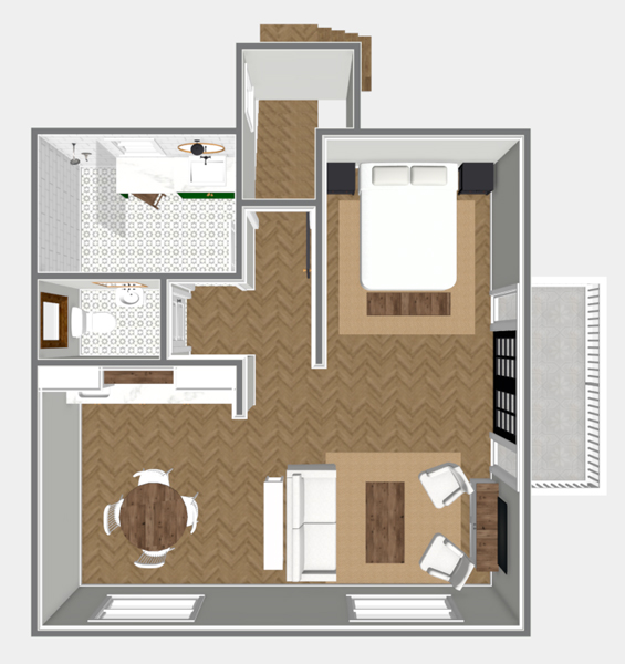
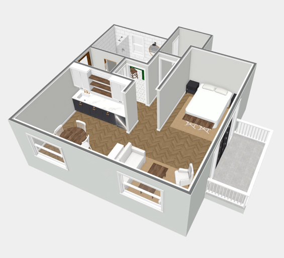
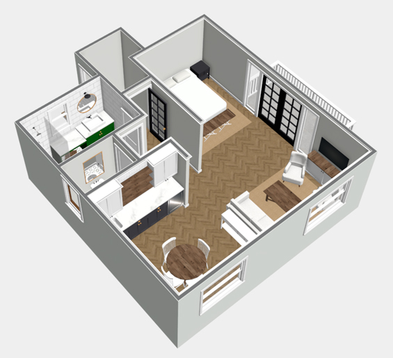
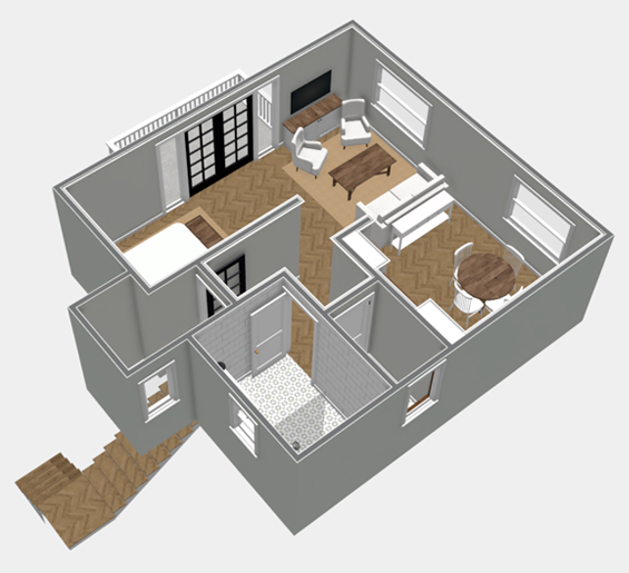
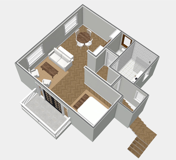
We played around with a few different layout ideas though here’s the basic plan my parents settled on…
CLICK THE ABOVE PLAN TO LOAD A NAVIGABLE MODEL
If needed, refer to my instructions at the end of this post for viewing instructions.
Although these plans are to scale for the most part, they are just rough (we had official drawings created by a qualified draftsman), and the inclusion of most fixtures, furnishings and materials is merely suggestive at this stage. As much as I’d love for mum to go for an emerald green vanity, I’m not sure that’s on the cards (we’ll see!).
Along with the overall size being governed by the underlying level, for budget reasons as too is the position of the bathroom and powder room which sit directly above the main bathroom below. Fortunately, this works out well anyway as they are on the ‘blind’ side of the house, which leaves the living quarters open to the glorious view and little balcony.
There won’t be anything overly “designery” or extravagant about this build. Far from some additions where a charming old home is juxtaposed with a striking contemporary extension with all the bells and whistles, my parents want to keep things simple and consistent, which I think makes sense. They will retain the same basic architecture as already in place throughout their existing home, and in many ways this decision to remain homogeneous is actually a blessing, in that it eliminates the need to agonise over every…single…detail!
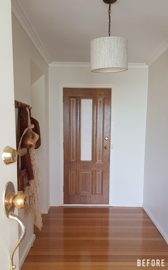
The stairs will go up at the far end of my parent’s entry hall, where there is currently an external door (which basically leads to nowhere), and a secondary passageway to the lower level (there is another access point to the lower level which you can’t see in this pic – hidden behind the open front door).
The staircase aesthetic hasn’t been locked-down yet, however it will just be relatively simple in-keeping with the existing style of the house.
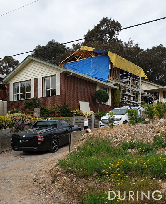
As mentioned earlier, the build is already underway and this is the current state of things…
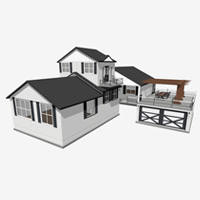
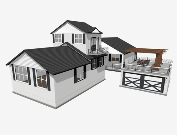
Obviously at this stage you need to use your imagination, so to help give my parents a visual idea, I created this rough rendering (not fully to scale)…
The completely different colour palette might surprise you, and whilst this is just a vague preliminary concept, my parents really want a light house with dark accents. I’m not entirely sure how it’s going to evolve yet, but the possibilities are exciting!
HOW TO VIEW 3D MODELS
The 3D model viewer offers lots of different functions, so be sure to have a good play with all of the options. I highly recommend trying the mobile app for its rendering quality and dynamic interface. Please note that navigable 3D models don’t display in full detail which can result in some aspects of certain plans appearing a little flat and dull.
DESKTOP
Simply click ‘Load Model’ and the plan should load and open (it may take a little while). To expand the size, click the ‘Full Screen’ icon in the lower right of the viewer. To enhance the texture quality, select ‘Standard’ from the ‘Rendering Techniques’ menu.
MOBILE
You can view the model in the Chief Architect 3D Viewer app. If you haven’t already, you can download the free 3D Viewer app to your mobile device here:
iTunes App Store
Google Play Store
If you have any issues, please let me know.


I don’t know how they’d feel about it, but when we got our house repainted in Nashville, we went with a lovely color – Benjamin Moore Stonington Grey – which read as ‘just about white’ when the sun was out, but a lovely pale grey other times, esp. with dark trim (the picket fence is painted in the same color and you can see how the shadows and sun affects it). I really loved it. Anyways, you can see the before and after we had on our decorator’s blog link (below), if you are interested.
Thanks Elayne. Just visited the blog and the colour looks gorgeous. We’ve actually already had to select the exterior colours (will share more soon) and we went with something which looks similar. My parent’s house is north-west facing and not very shaded so gets lots of bright light. The colour we’ve selected will look quite white (which is what mum wanted) though the slight depth should knock back too much starkness.
The only problem that I can envision with this plan is that the bedroom is open to the lounge and kitchen areas. If Mum wants to nap and Dad wants to watch TV – Could be problematic?
Also Kitchen smells/noises will be noticeable which is not ideal or conducive to rest/sleep.
I would want a solid wall/door between the 2 areas but I can see the difficulties with the balcony and current lack of bedroom windows. 🤷♀️
There won’t actually be anyone living in the space. For the most part, it will just be a hang-out/chill-out zone, and occasional guest retreat (my parents guests are usually just individuals). The kitchenette will only have minor provisions for food prep (a microwave oven, a portable hotplate – it will be more of a wet bar) so no-one is going to be cooking up a three course meal or anything :)
My parents didn’t want to define the space with walls or any built-ins so it can be used for anything in the future (both by themselves and for resale purposes) – a games room, a teenage retreat, a party space, an art studio, a gym, a yoga room.
Remember too, this plan is just rough and I’m not even sure what’s happening with furniture yet. It makes sense to included a proper bed (as my parents won’t need that area for anything else at the moment) though it could be a sofa bed or a murphy bed or a day bed. Nothing is set in stone :)
My bad – I didn’t read your blog carefully enough and presumed that your parents were planning on using the space as their Master suite. You’re right to leave it so open, if the space is to be versatile. it’s so much easier to add a wall later down the track than tear one down.
I’m really looking forward to the exterior transformation as I’m toying with the idea of painting our red brick house – I’m currently thinking white too!💗
All good, I don’t expect everyone to read every word of every post, and everyone has different ideas and opinions anyway. Was just explaining the thought-process behind our decisions :)
This is a very nice studio apartment layout. In the U.S. the toilet isn’t in a separate room from the shower/tub. The closest design we have is the tub/shower/toilet positioned in the back of the bathroom and separated from the sink by a wall and door. I think you’re on a white and black scheme carried over from the flip house. :) The brick looks in good condition, but dated. A white hue would look great. Elayne recommendation of Benjamin Moore Stonington Grey sound like a great choice (like a great basic black/white dress). The landscaping can be the accessories to make everything pop and sizzle.
Thanks Pat. Yes, my mum has a thing about separate toilets. It’s pretty common here if you can spare the extra floor space. I looked up Stonington Gray and it’s lovely. We’ve actually already had to choose the exterior colours and have gone with something that looks similar :)
I love this. We are building a guest house (28 x 28 feet) to a recent house we built. It is challenging to make everything fit in a small space. I am in the US and the first thing my husband or I do in any house we remodel or build, is make a separate toilet room. I am with your mom on that one. :)
I don’t see a closet? Do you plan to just have an armoire?
Thanks Janelle. Yep, there will be a free-standing wardrobe somewhere. Mum wanted to keep the whole area as a flex space so didn’t want any built-ins. Not sure exactly what we’re doing with the furniture at this stage :)
This is very exciting! I think that you had said this is a guest suite, right? With the view, I think I’d like to be up there myself! I’m looking forward to seeing how it all evolves, and to see the process with the extension. You always have the most inspiring ideas!
Thanks Leslie. Yes, just a guest suite and hang-out area. I think it was slightly tempting though mum and dad will be staying in their current bedroom :)
My husband and I live in a very similar space. I love the toilet and little sink separate. The shower room never has to be “open” to day visitors! It looks like you have room for a pocket door in the hallway wall. That would provide the option to close it, and have the entire 2 bath spaces function as one…say if AFTER you strip down for a shower…you decide you need to “powder”!😄
where’s the closet? or any clothes storage?
I was going to ask the same thing!
Remember, this is just a rough concept. When we get around to working out the actual furniture, there will be some kind of free-standing wardrobe solution. My parents didn’t want any built-in elements stealing floor space or defining the future use of the area :)
I’m with Sara, Mama has to have a closet. Probably lots of storage room beneath the stairs. As far as odor: Be sure to vent thru the attic to the O/Side. It will not hurt the look of the roof line. You will not have a problem with city code or permit. Your parents are going to be so happy with your plan.
This is just a rough concept. When we get around to working out the actual furniture, there will be some kind of free-standing wardrobe solution. My parents didn’t want any built-in elements stealing floor space or defining the future use of the area. The kitchenette will be more of a wet bar so there’s not going to be a heap of cooking going on though we can easily install an exhaust if needed :)
Very Cool!
Thanks Deb :)
Significant piece of work, Thank You!!