I’ve been meaning to tackle my master bedroom for ages and have half-heartedly been planning a scheme and searching for new goodies to furnish it, though for some reason I never had enough motivation to really get stuck in….until NOW!
NOW I seriously can’t wait to kickbox the heck outta it – don’t feel sorry for it though, it deserves it, trust me.
So, here’s the plan….

What’da ya think?
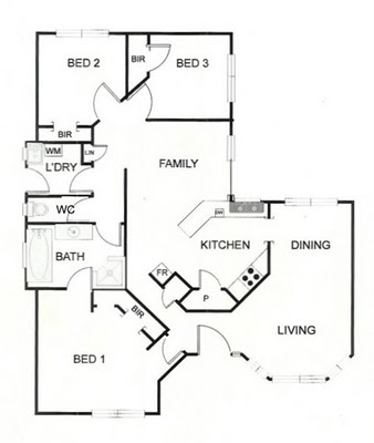
It’s a pretty small, irregular space with two doors, one large off-centre window and a built-in robe which takes up one entire wall. Rather than pretend the room’s proportionate, I’m gonna play up the asymmetry with some mis-matched furniture though will give balance to the overall scheme through consistency in colour, style and decor.
Now, I gotta apologise cause I don’t have any before ‘before’ photos of the room (as it was when we first moved in). The walls were green, the trim and doors were brown, there was a massively ugly light fixture, worn-out dirty berber carpet and completely see-through bright blue curtains – just lovely.
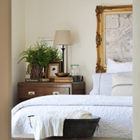
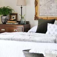
We got rid of all that pretty quick-smart so here are some more recent ‘before’ pics (cringe, I can’t believe I’m putting these out there – please be kind!).
The furniture is all outta my room from when I was still living at home with Mum and Dad – a bit sad, I know, though we had zero dollars just after we bought the house and never really got around to getting anything new (i.e. nice).
We painted the walls Dulux Chalk USA and all the trim and doors gloss white (as per the rest of our house) and although I would have l-u-r-v-e-d floorboards it wasn’t to be (not for now anyway) so we put down some nice plush carpet.
Hence, a new blank-ish canvas was born!
Soooo, that’s my starting point.



I love the angles of the room. I think it will give it a tone of interest. All of the storage you have drawn in the plan sounds wonderful to me. I can’t wait to see your mood board. I know it will be a gorgeous room when you’re done. Hugs, Marty
What a great starting point for your bedroom makeover! Can’t wait to see what you’ve got planned.
I am so excited to see what you do. We have left our room to last in our place. The kids have freshly painted rooms…new curtains etc etc. I need to do ours too…I am just saving for the curtain fabric and waiting for the Aussie dollar to bounce again against the pound!
Kristine, all I can say is if it turns out half as gorgeous as the guest room you styled for your parents (your old room) you’ll have done yourself proud and we’ll all be drooling!!!
Angex
hi kristine! i think the layout you have is perfect and fits the space nicely. and it’s not so bad as it is now- just not charming and full of character like the rest of your house! i think a big headboard would be fantastic as you have a perfect wall behind the bed for it. i wanted a tufted headboard but we have a window behind our bed, so it would block our light, and there is no way to move the bed so that it’s not in front of a window… so it owuld be a nice way to add interest and drama.
You’ve got to love a blank canvas. I’m sure you’ll spruce it up very nicely. Your plan looks good too. Can’t wait to see the mood board of ideas. xx
Thanks girlies. Cassie, I was contemplating a head board for a long time though I’ve got something a bit different planned now. It’s kinda like a headboard (of sorts!).
Kristine
xxx
Kristine-Just having found you, I love what you are setting out to do. Good luck and I will be waiting to see pictures of the finished product. Actually, what you have isn’t half-bad but I know you are ready to really “DO IT OVER” And, you’re right, it looks like a blank canvas with nothing too bad in it to have to rip out. Can’t wait!!! Diana
I think a headboard is a great idea and could you have some floor to ceiling storage or book shelving next to the window, that’s not too deep? It’s certainly an interesting space to work with and I can’t wait to see how it turns out. Good luck! Jane :)
That is a great space. I see what you mean about the window. You can die the rod into the wall, if you want a long rod, I have done it many times. You can also still use the window space for a piece of furniture or your bench. Don’t discount that space as no wall space. Also, you might want to use some type of roller shade in the window for the light issue, and then add a drapery panel on one side to soften the wall. I would keep concentrating on using the tallest furniture you can get away with to minimize the storage. what about DIY roll out drawers under the bed for your shoes? Can’t wait to see the mood board! Sorry for rambling on!
Okay, I think I may have given a false impression of the size of my room :-) It’s pretty small and my quick floor plan is not exactly to scale – and the photos make the floor space look much larger than it actually is. The bed pretty much has to stay where it is (I can’t really move it because then it would either be too close to the window or too close to the built-in robe). At the moment there’s really only one persons width between the bed and the window wall and the bed and the built-in robe so I’m afraid I can’t fit any furniture along that window wall (otherwise Luke will have to walk over it to get into bed and whilst I’d be happy to sacrifice his path for the sake of aesthetics it would probably make him pretty grumpy!).
Kristine
xxx
Hi Kristine,
That has the makings of a really lovely room. I wouldn’t begin to suggest anything! But I am glad that the bed stays where it is. I really don’t like beds in front of windows…they’re to look out of surely! Look forward to the mood board. I used a painted Indian screen for my headboard when the sleigh bed bedhead I had made the bed too big for my tiny sleeping space. I love it! Wonder what you have in mind??
Your drawings look great Kristine, I think you have worked the shape of the room really well. I am looking forward to seeing your bedroom come together! xx
I am so excited to see the final results! You have a great way with decor so I am sure it will look like it came from a magazine.
Another question (sorry) in your header, where did you get that “&” pillow??
Your layout looks great…and as another commenter stated that if it looks as good as your mums guest room when you are done it will be lovely.
Your before pics are nothing to be ashamed of. Truly there is nothing like a blank canvas. Have fun decorating.
Hi Kristine,
I’m really looking forward to seeing your MB come together…I’m re-doing my bedroom soon so yours will be an inspiration lol.
Gemma x
I think it’s great that you have a plan, Kristine. I think that will make things go so much smoother for you. Looking forward to seeing if you come up with an inspiration piece for colors and so forth.
I love your blog, so I’m your new follower:-)
Hi Kristine,
Thanks for stopping by my blog and leaving a comment. Thank, thank you for posting a room layout. I wish more people would do that. Helps me to visualize how their house works. I can’t wait to have more time to dive into your blog. I’m totally OCD about reading all the back posts. I’ll be back soon. I’m a new follower.
SO pretty – I love the window! This looks like a good start for an aqua and red color scheme. I’ve seen it in a wedding or two, and would love to see it in a home: http://tammybecker.com/blog/?p=44 I found this, take a look!
And thanks for commenting on my workroom!
Hi Kristine!! First I want to say thanks for commenting on my blog! It’s so new to me so I get really excited. Now about your room, I have absolutely zero jurisdiction giving you any advice because my own bedroom leaves much to be desired lol. I will say this, I love the layout that you did and I think the room will look great that way. I look forward to seeing the shoe cabinet and the decor. One thing additional…I think you should definitely do away with the tiny pictures above your bed. I think larger frames would look much better :-) I’ll be checking in on you!
G’Day~Nice of you to stop by for a visit.I wish I could have found about 10 more of those scales I could have sold them Dang! Your Welcome to come with me next time for sure.I am off to another sale tomorrow………….
Excited to see your room.If I were you I would put the head of the bed in the corner where your bedside drawer is.I think it would help with the flow of your space.Then you could put something very yummy behind your head of your bed.
I’ll be back for another visit.~Cheers Kim
Kim. Thanks so much for commenting. Unfortunately if I tried to put the bed diagonally like you suggested it would cut too close to the door and wall with the robe against it – and would cover a chunk of the window too (my floor plan isn’t exactly to scale :-). Also, I did mention putting it like that to hubby once and got a firm, “I don’t think so”. Oh well, gotta compromise sometimes I guess!
Kristine
xxx
hello Kristine, thank you for stopping by my blog, popped right over to read yours. I would say you are just doing fine with all your ideas for your makeover room ..must admit I all so love to fall asleep to the wirrrr of an overhead ceiling fan. Perhaps you could consider a large wide floor length mirror next to the windows..that will add the feeling of space and give more dimension as well -if
you cant go for full width breadth, then rather a horizontal mirror and not vertical.. just a suggestion. warm wishes Colette x (laBrocanteuse)
I love your blank slate. You have great creativity. When you stated black-out drapes and a neutral pallette, I immediately identified with that and wanted to share what I am doing. I am using the 12 oz. canvas drop cloths from Home Depot and hanging each one on rings on a dark rod. I need darkness in the room for movie-watching and these do a beautiful job as they are thick but lightweight and have a gorgeous slightly nubby texture that makes me think of French canvas/linen. The 8 oz. do not have as much black-out ability as the 12 oz., nor the nubbiness in the fabric. I can’t wait to see how you make this your sanctuary!