
For the first time in a long time we were lucky enough to get away for a few days and spent last week at my parent’s beach house in St Leonards, which is on the Bellarine Peninsula along Australia’s south-eastern coast.
I’d been looking forward to heading down there for ages. Yeah, sure, for the salty scent in the air, barefoot walks on the sand, laid-back evening BBQ’s and the general un-necessity for usual household chores, though also because I wanted to finally finish off their living room coffee table so I could blog about it.
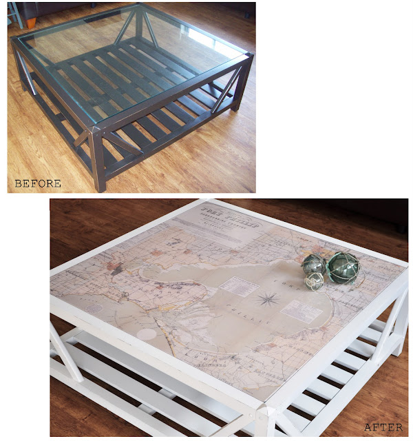
I picked up this large coffee table from eBay for just $10.
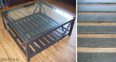
The reason I was able to buy it so cheaply was because the glass top was severely scratched, which to most people is probably a major deterrent, though to me (and I’m sure many other crafty bloggers out there) was an excuse to get creative!
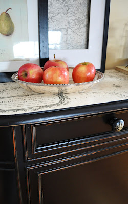
Soon enough I had an idea, and if you’re not new here you may be familiar with some of my previous projects, including this cabinet….
and this map….
….which both helped influence the direction I took with the coffee table.
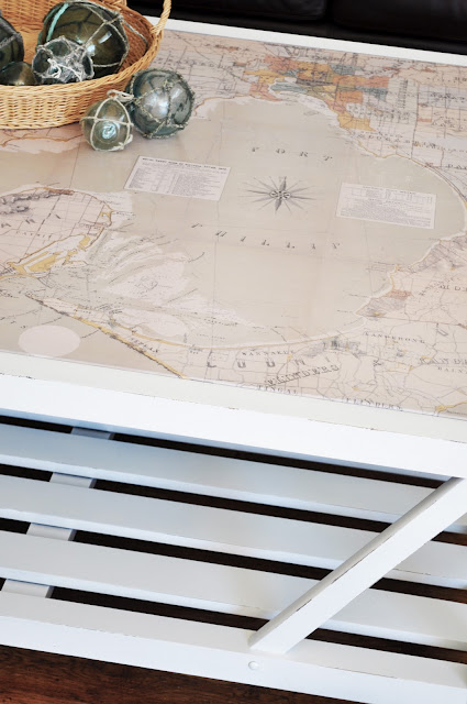
To give the table extra interest and a personal touch, we (that’s Mum and I) decided on a map which incorporated St Leonards (the town their beach house is in). So, I searched the internet and eventually found an awesome zoomable historic yatching and excursions map of the area.
Using the same process I used to create my large map of Paris, I zoomed, copied and then pasted (into Photoshop) portions of the digital map to eventually create one large image big enough to fit the existing glass table top. This process can take some time (fiddling with size, colour, cropping, etc) until it’s just right. I then took it to my local printer and had it printed on medium weight paper. It cost around $35 (for a full colour print at over one meter square in size – not too bad).
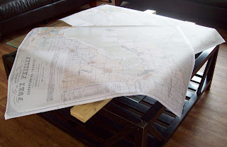
The map had to be printed in two parts because it was too large for one sheet of paper.
Then, using the same process I used to affix the gift wrap to the top of my nautical cabinet, I attached the map of Port Phillip Bay to the coffee table glass.
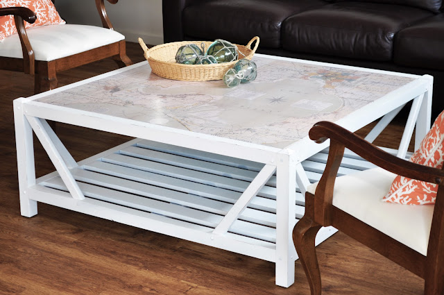
Dad repainted the timber base white which gives it a fresh, coastal feel though it would also look great colour-matched with one of the muted sea-greens or sepia tones in the map.
I lightly distressed the edges of the base with a sanding block to soften the starkness of the pure white.

The map was treated with about eight coats of acrylic sealer so is really well protected and can be wiped clean with a damp cloth just like any surface.

The digital map I used is scanned from an original so shows signs of wear (such as fold lines and tears) which I personally really love.
And look, here’s St Leonards (on the Bay) – the town my parent’s beach house is in!
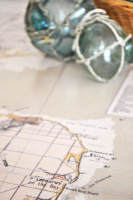
It’s really wonderful to have this map, not only for its aesthetic appeal, though also for its connection of place which makes it extra interesting and somewhat special.


You produce such beautiful things on the cheap. Your parents must love this!
This is one of the best furniture make-overs I’ve seen in a long time! I have a really old pull down school map- I’ve been trying to find a way to incorporate it into my space without destroying it. …. Aren’t the colors of a map so calming? love! Stop by and share this on my WhateverWednesday party, if you would like. Hope to see you there!
Beautiful – I was going to put a map on my coffee table also but couldn’t find one I really loved in a size that worked. I love, love, love the look!
Great job!
It looks really great! I’m wanting to do something similar now, thanks!
I really, really love this! Gorgeous.
This is fantastic! Nicely done!
that looks amazing, kristine! so clever!
What a great idea! We have some old maps from the area that we currently live that are back from the 1800’s that I have been wanting to do something with! Thanks for the inspiration!
That’s a great transformation!
So creative! It looks awesome, glad you had a nice time at the beach, lucky dog!
ohhhhh this is so cute!! I def need to try something like this! So cute!
Love, love, LOVE the coffee table! You and your dad did a fantastic job, and what a great idea to use a map of an area that’s meaningful to you all.
Also love the glass floats on the table – are they original working floats?
I just discovered this site a week ago, and I am already a “PaintedHiveAholic”! Love your style and ideas!!
Wow, I love the coffee table now. The map top is to die for! Perfect!
Oh, I am in love. I think one of the first projects I saw of yours was the map cabinet that I tried to copy!
It looks absolutely fantastic! You really are so creative and clever. I’m always so impressed by your work :)
Nice work Christine, I bet your parents are very happy. Enjoy your break at St Leonards. ;-)
If I haven’t said it before I’ll say it now…you’re a genius!
Wow, want to come to my house and do another one? Seriously an amazing job! Someday I might have to get adventurous and give this a try!
Yup, I am kind of in love with this table! Great job! Visiting from Somewhat Simple link party.
That is so fantastic! I actually saw some beautiful hand printed paper of an antique map of Paris and I was mulling over what piece of furniture I could put it on. What a great idea, thank you for all the info. I have a linky party every Friday, I would love it if you stopped by to link up. Thanks! -K
Yep…another fabulous makeover from the brilliant Kristine!
Oh my gosh, you did it again!!! Loved that nautical decoupage dresser, and I’m loving this coffee table! Will have to feature that too! I think I want one!!
Kristine, This is so fabulous! Perfect table for coastal decor…love it.
Hugs,
Sherry
This came out so beautifully! I LOVE it!
~ Meredith From A Mother Seeking Come find me on my blog, A Mother Seeking…
Wow! I love how your coffee tabled turned out. It looks amazing. This would be really fun to do in our bedroom on our nightstands. Thanks for the inspiration. I found you through the Miss Mustard Seed link party – glad I did!
Great redo! I love it!! I am your newest follower.
Hi Kristine, I absolutely LOVE it!! Well done, and what a bargain! I have a ‘thing’ for maps too, and this one is stunning…although it just misses out on Flinders on the Mornington Peninsula, where my Mum and Dad are (and I spend lots of time!). Good to see you’re able to get some projects done, and I hope you are sleeping well!
So unique! Love it!
Hi Kristine, This is my first visit to your blog, I love it. I have seen your cabinet featured over at Maya’s, and think it is super! I also have a fondness for nautical maps, and back in March re-did a horrid table over, with map paper. I adore how your mom’s table turned out, and thank you for the tip about the National Library. That is really such an awesome map you found with such great color.
This is fantastic. My mum has a place at Point Lonsdale, so I’ll have to share this with her.
Great table. Kylie x
Totally love this!!!!
Hi Kristine
All i can say is FABULOUS
Kind Regards
Karen
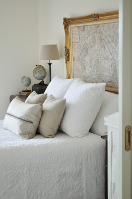
Such a great idea for a table top and a great makeover. The framed map in the bedroom looks great too.
This is beautiful! Great job!
I featured this , this week! http://mommahenscoop.blogspot.com/2011/10/whateverwednesday-link-party-features.html
This is uhhhmazing. I am basically drooling over it!
Your table jumped out at me at one of the link parties I was visiting today. I’m a sucker for a classy coastal look, so you had me at hello!
I do a “Get Me Motivated Monday” post each week featuring the projects that inspired me from the prior week. Usually I feature 5-6 projects from various bloggers, but after poking around your blog today and finding so much great stuff, I decided to do a full-on feature of The Painted Hive next Monday. Be sure to come over and check it out!
I LOVE everything about this project. The table looks great but the sentimental value of the maps location tugged my heart strings. Great job, Kristine!
what did you use to seal it?
Hi Kristine, what a wonderful job you all did of the coffee table. Congratulations. I have recently found your blog and am now following you, and will visit often. Please stop by my blog and perhaps you would like to follow me also. Have a wonderful day. Hugs, Chris
Hi Kristine! I just discovered your blog. I too LOVE maps Could you be more specific about where you found this one and how to search the National Library collections? Thank you!
Hi Danielle
Hmmm, it was a little while ago now so I can’t quite recall how I came across this one.
I generally just Google until I find a good resource then I search, search, search.
Here are a few sites you can use to get started:
http://www.euratlas.com/cartogra/
http://www.maphistory.info/
http://nla.gov.au/nla.map-vn3790884
The last one is an Australian site though you can try searching for similar resources in America.
Kristine
Oh my gosh you inspire me….thanks so much for your ideas! http://www.alterinterior.com
Fabulous idea! I love this.
This is great! I have a similar table and have been looking for ways to upgrade it. Did you affix the map to the top or bottom of the glass? I like the idea of the glass on top to protect it.
Hi Shelly
As the glass was really badly scratched we affixed it straight on top. It has been in place for around three years now and thanks to the multiple coats of sealer we have not had any issues. That said, I don’t see anything wrong with attaching it to the underside if you’d prefer.
Kristine