Just as promised here is the reveal of my parent’s refreshed master bedroom!
I know, crazy right? I must be getting efficient or something. I hope you were sitting down.
Anyhoo, as eluded to in an earlier post, it’s not one of those “full-on” kinda makeovers though the change is still pretty substantial and mum is just rapt! Just goes to show, you don’t always have to go “all out” to make a major difference, and it doesn’t need to be perfect to make you smile.
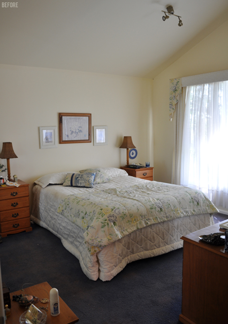
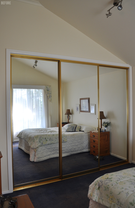
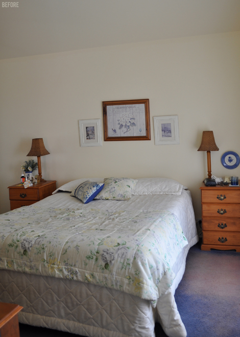
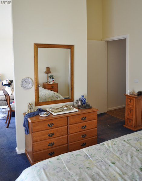
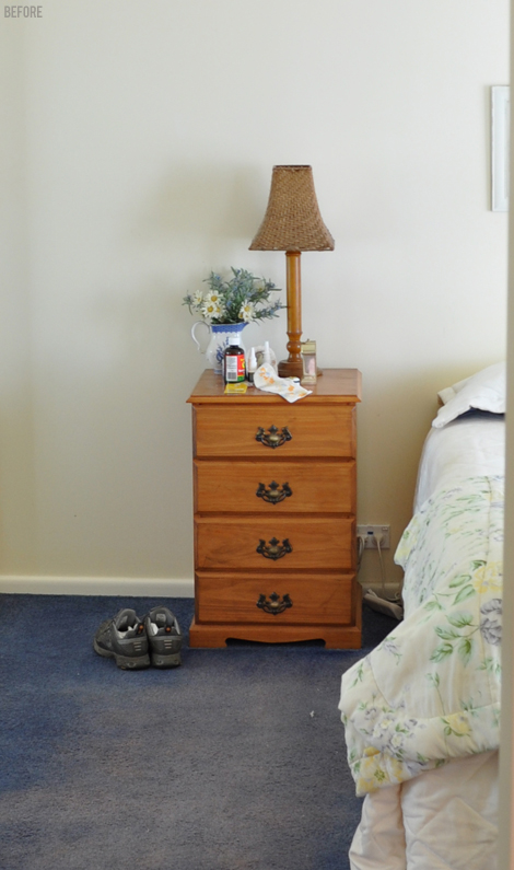
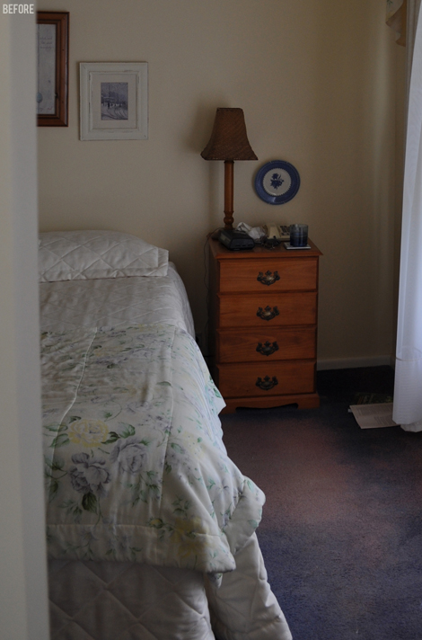
Here are some of the lovely before shots…
As you can see, it’s a pretty great space, just neglected and out-of-date.
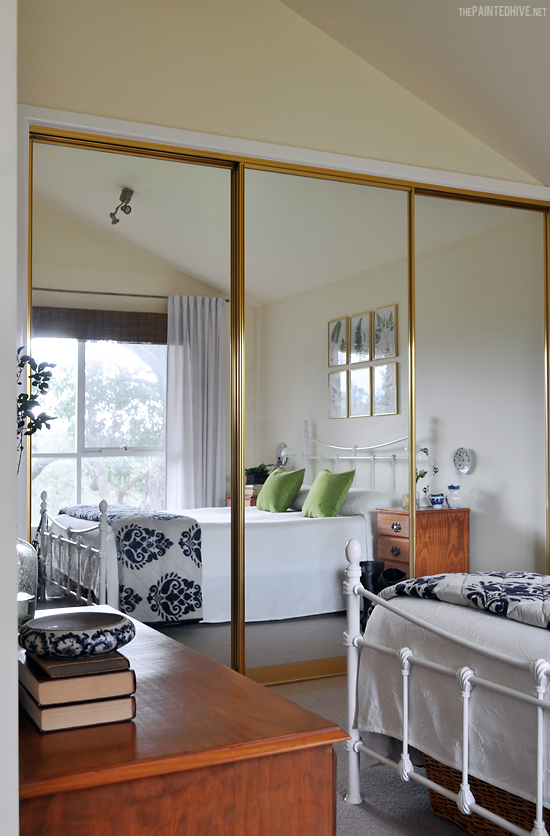
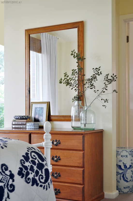
Aside from some new carpet (which was sorely NEEDED), a fresh DIY window treatment and the addition of an affordable iron bed, credit for the transformation can be vastly attributed to some thoughtful re-accessorising. We didn’t paint any walls or furniture, change light fittings, or buy new bedside tables. We didn’t transform the wardrobe doors, switch-out the dresser, or even replace the basic mirror above it. We worked with what we had (for the most part) and in doing so discovered just how rewarding the challenge, and surprisingly successful the outcome, can be.
So, was it a lazy girl’s make-over? Well, I like to think of it as smart :-)
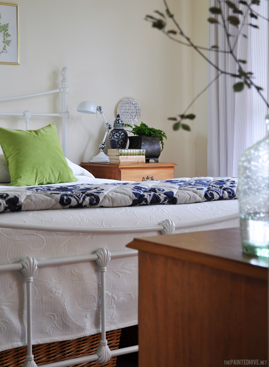
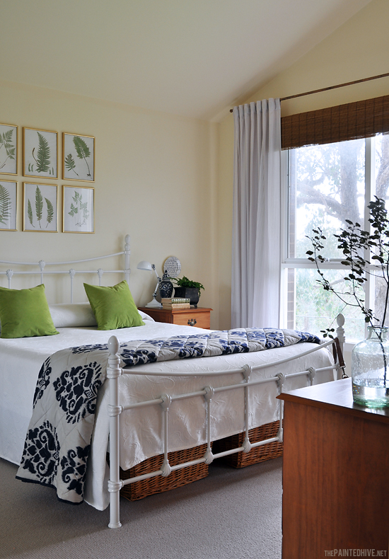
Here are the afters…
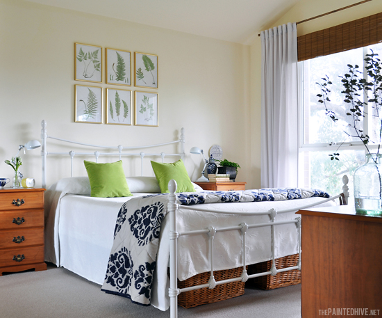
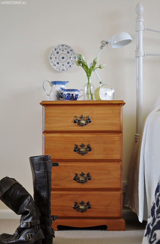
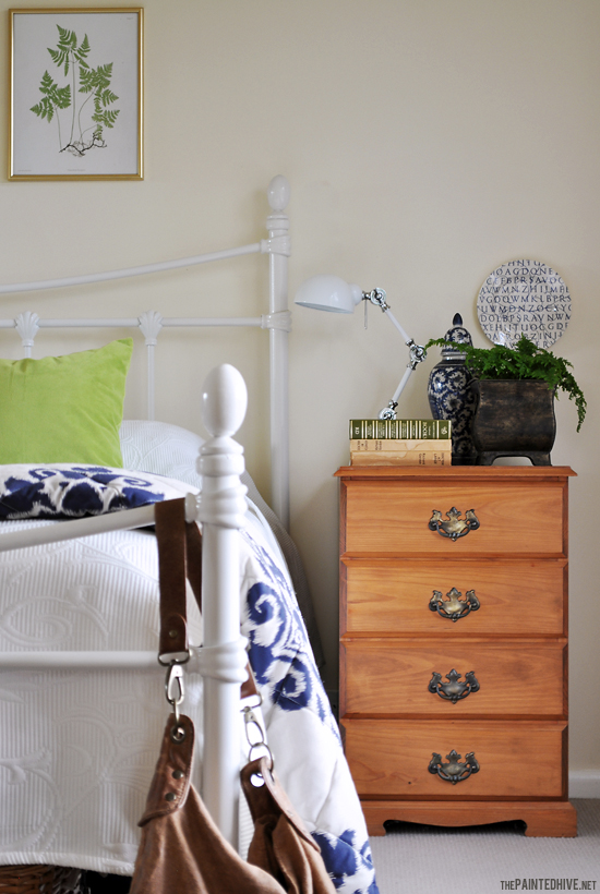
The bedside tables and dresser hold sentimental value and are still perfectly functional and in great cosmetic condition so we kept them. And although we did consider it, in the end we didn’t even switch out the hardware or paint them. We’ve actually done a really great job of convincing ourselves that rather than being old-fashioned in a drab and out-dated kinda way, they are actually old-fashioned in a quaint and unpretentious way. And instead of the orange-toned timber being garish and dowdy, we’ve decided it is in fact quite fitting, playing nicely off the cool whites and earthy greens, adding needed warmth and depth (I actually quite like orange-toned timber, especially when teamed with navy blue, and think it’s going to make a resurgence some time soon – if it hasn’t already).
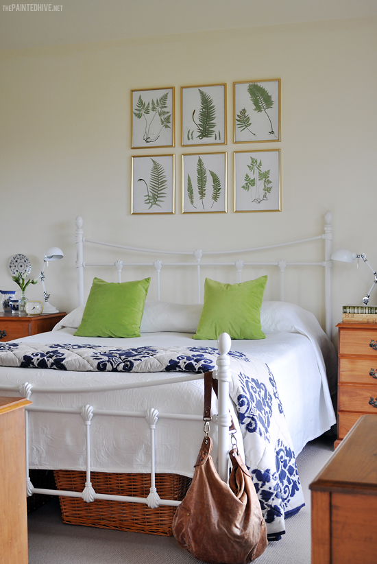
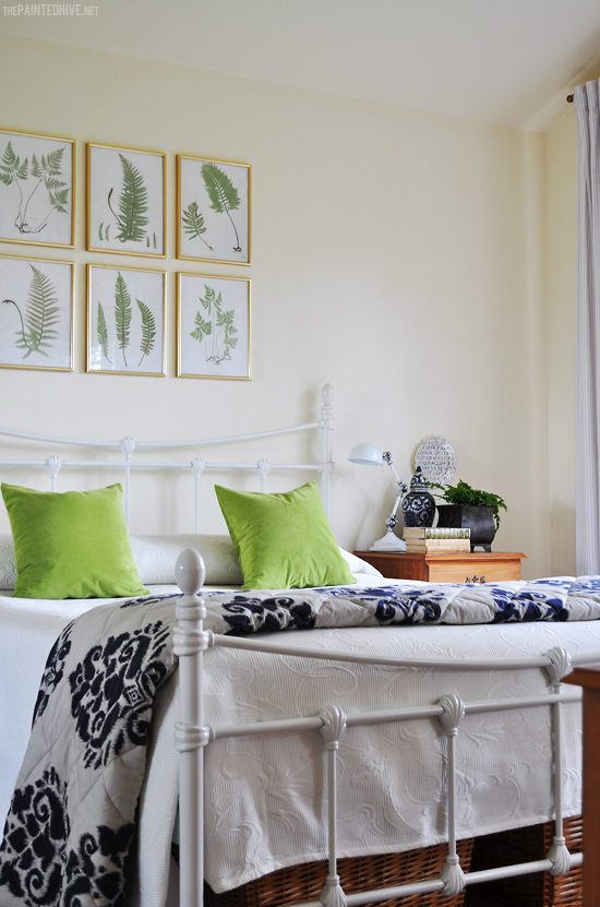
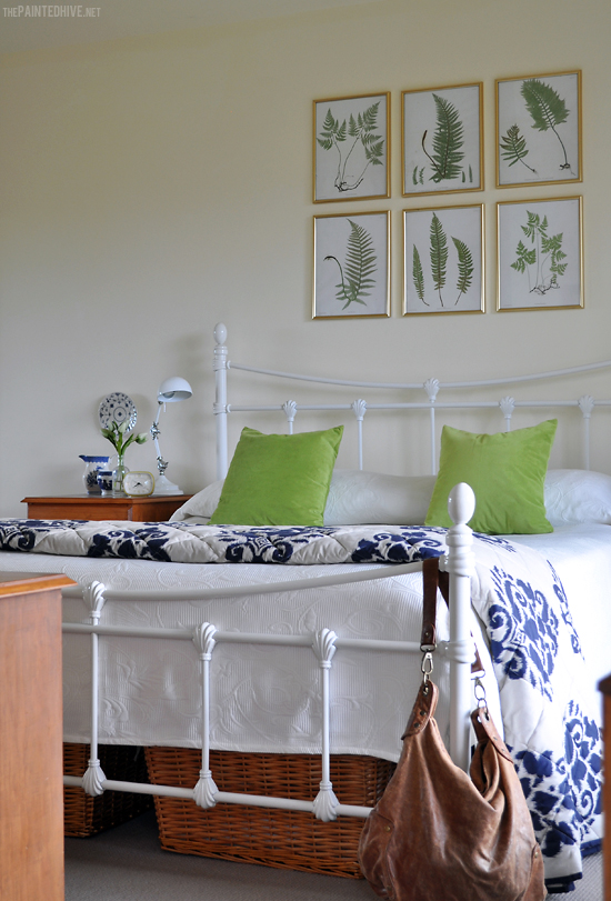
The new iron bed is from Early Settler. Mum picked it up on sale a few months ago for just $290. The white bedspread is from Spotlight and the green velvet cushions (which were just $4 each!) are from Target. The accent throw is actually a second bedspread, so mum can always switch them around if she ever feels like more punch. It features a really lovely over-sized damask ikat and adds just the right amount of pattern. And, here’s a tip…if, like me, you like your bed to look as perfect each day as the first time you made it, opt for quilted or embossed bedding. It doesn’t wrinkle easily and always appears fresh and plump.
I talked about the fern prints in this previous post where I offer them for free download! The gold frames are cheapies from The Reject Shop. They echo the brass wardrobe door surrounds perfectly.
The pretty (yet not so practical) window dressing you can see is actually little more than a disguise to conceal the practical (yet not so pretty) window covering you can’t see. Confused? Well, both mum and I love the look of soft curtains paired with timber blinds, though for a bedroom also like having something with a block-out capability (to help control both light and temperature). I usually find that block-out curtains hang too stiffly and block-out timber blinds are too heavy to comfortably operate on a daily basis (in fact, lots of timber blinds even come with a disclaimer stating they are not intended to be raised and lowered frequently), plus they can be pricey. So, behind the light-filtering ticking curtains (which mum made herself from inexpensive fabric found at Spotlight) and the timber ‘blind’ (which is really just a valance made from half a bamboo roller shade) lies a very basic though perfectly practical block-out roller blind. It is simply lowered each night, then raised each morning. Oh, I also have a simple trick for creating those perfect curtain tab folds you can see – that’s coming up in a future post!
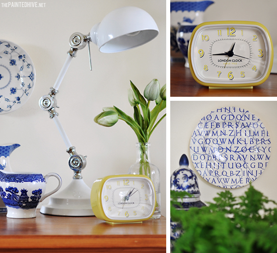
Almost all of the accessories we already had. The retro style alarm clock was a recent Mother’s Day gift. The lamps mum picked up on sale from Target a few months ago. The plates are part of mum’s vast collection of blue and white china and are simply attached to the wall using 3M click strips. The under-bed baskets, which provide pretty yet practical storage, are from Masters – I love a touch of cane in a space, it always adds such a nice relaxed feel and the tone of these particular baskets ties in perfectly with the timber furniture.
Although I am happy with the room and the basic-ness of the make-over, there are still a few things I’d like to add (isn’t there always?). I would LOVE to install some simple faux beams to the vaulted ceiling – how awesome would that look? Mum is kinda hesitant about the idea of nailing wood to her roof. I get it, kinda. Actually, not really. It’s just wood and nails, right? Maybe next time my parents are out of town some ‘fairies’ might make it happen (if you are my mum and you are reading this that last sentence was just a typo).
I also adore the idea of extending the botanical grid right across the wall. Adding an additional six, or even eight, prints at either end of the existing gallery would create such impact. Don’t get me wrong though, the current configuration of six frames is lovely in its simplicity.
In addition, I wouldn’t mind attaching some divisional trim to the mirrored wardrobe doors, making them look like huge french windows. That’d be pretty cool.
Now, here are some side-by-side before and afters just for comparisons sake…
Not too bad for around only $600 total (excluding the cost of the new carpet).
Of course, we could have done lots more and created a potentially outstanding room, though sometimes isn’t simple best? Maybe not from a jaw-dropping or Pin-worthy perspective, though perhaps in the interest of creating a more timeless space. I truly admire the commitment and tenacity of people who are willing to decorate boldly and re-work their spaces every other month, though mum didn’t want a trendy room which would need a complete overhaul in another year or so. And, to be honest, I must admit, I do get her thinking.
Smart, not lazy, remember? ;-)
SOURCES
Bed – Early Settler ($290 on sale)
Fern Prints – Free Printables (see link below) Frames – The Reject Shop ($5 each)
Curtains – DIY (fabric from Spotlight – $12 meter)
Bamboo Valance – DIY (blind from Bunnings – $18 for half)
White Bedspread – Spotlight ($60 on sale)
Accent Throw – Just Bedding ($140)
Green Velvet Cushions – Target ($4 each – covers only)
Under Bed Baskets – Masters ($20 each)
Lamps – Target ($18 each on sale)
Ceramic Garden Stool – Roadside Find ($0)
Silent Sweep Retro Style Alarm Clock – eBay ($25)
PROJECTS
Free Fern Printables


Oh Kristine,
What a lovely makeover! Simple yet fresh style and love those prints over the bed! It looks quite amazing! Have a wonderful week!
Thanks so much Kelly. I am so loving you for saying it is “simple yet fresh”. That’s pretty much just what we were going for.
OMG!!! I can not stop looking at these photos. You are so clever. I adore the fact you kept so much and just re-accessorized. It seems so wasteful to me when people just get new everything. This really shows what can be accomplished with a bit of vision. LOVE, LOVE, LOVE!
Wow, what a fantastic change it looks so fresh now:)
You have done it again Kristine. Always soooo exciting to see a post from you in my inbox. I love the colors and the prints above the bed. I love the orange wood and the damask bedspread. I love those clever curtains and the styling. I guess you could say I love it :)
Just lovely. So fresh and bright, I bet your parent’s love it. They are lucky to have such a talented daughter.
Hugs
Laura
bed frame & prints really dress things up
What a refresh! I am a big believer in using what you have to change things up, and very often, old becomes new again. Thanks for sharing!
So true Emily.
:-)
The room is lovely, and the simple changes you made have given it a really fresh appeal. I like the idea of extending the prints above the bed, thinking it might be good to take to the ceiling and then extend either side of the existing 6 so that it is as wide as the bed.
Love it all.
Jane
Thanks Jane.
There’s isn’t enough space to add more prints vertically though I would really love to extend them horizontally, even beyond the bed width and over the bedside tables. Maybe one day (if we can find more of the same frames).
Kristine, I _love_ this! It looks so crisp and refreshed. We have been collecting furniture for an apartment for my college-age children, and a lot of what we have found is orange toned wood. This gives me some great ideas of colors and accessories to use so that it looks up-to-date.
I always look forward to new posts from you. Your style is so similar to mine that I know I’ll get some ideas that I can use.
How absolutely beautiful! I love it all. I love your style so much, Kristine!!!
Thanks so much Brandi.
What a lovely make over! The room looks so fresh now with the simple changes although, I must agree with you that expanding the grid of artwork would look really good and your idea about the mirrored closet door is a smart idea. I too like beams and this room would be a good candidate for them with the high ceiling but if your mum isn’t up for more changes the room looks very good just as it is.
Thanks Lynne. I would really love to make those changes though think mum is pretty content (and, well, I guess it is her room :-) Maybe in a year or so when I can dedicate more of my own time to doing the actual work. At the moment I come complete with two small children which can make getting even the simplest of things done difficult. This room refresh has been about two years in the making.
:-)
The before photo looks very similar to our bedroom, hubby will faint if I paint the furniture! I would however like to paint the trim on the mirrors white. Do you think one could do that?
Hi Etta. I assume by “mirrors” you mean mirrored wardrobe doors? If so, then yes, you can definitely paint the surrounds if you like. I spray-painted my wardrobe door surrounds a few years ago. It was pretty easy and they haven’t even got one chip!
You’ve worked your magic again! I love how the fern print frames echo the closet doors. And I too am a fan of orange wood. (It’s been on my mind to do a post about orange and yellow toned wood, actually.) Absolutely love the blue and white bedspread too.
Thanks so much Camille. That little pop of pattern in the bedspread really helps make the space, doesn’t it? And I’m so glad to hear you too like orange and yellow toned timber. In the right setting it really sings.
More magic than I can handle…..so simple but edited and styled like no other….seriously you rocked it!
Sherry, you are too, too nice.
:-)
I love the way you use botanicals, floral and fauna to decorate spaces. It’s so bright and fresh!
Wow, what a lovely transformation! It’s opened up the space incredibly well and I’m sure your parents are delighted with the outcome.
Just wondering about the mirrored built-ins. According to the principles of Feng Shui, mirrors should be positioned so that they don’t deflect the wealth back out the opposite windows again.
Just a thought…. :-)
Thanks!
I wish I could pretend I was all cool and spiritual and into Feng Shui though the truth is I’m really a bit too boring and practical :-) I do totally get the basic principle though. Our environment definitely affects us which is why I like to create clean, flowing, warm, relaxed spaces.
Out of curiosity I actually did a little research and found some conflicting information. Most of what I read indicated that mirrors in Feng Shui are commonly misunderstood and that reflecting a beautiful view is actually good for chi.
Kristine, I love three things in particular here. As mentioned before I love how you’ve paired the print frames with the wardrobe frames. Most would have replaced the wardrobe doors, you made them work! I love how you’ve “raised the ceiling” by mounting the curtains higher- super clever. And I think you’ve done an amazing job with furniture I know I would have (stupidly) replaced! The colours you’ve chosen and the wicker baskets under the bed blend beautifully and actually highlight the beautiful grain of the timber. I wish I had such talent. My parents bedroom is way more drab than your Mum’s ever was!
Rebekah, I so love that you really considered the space and I truly appreciate you taking the time to write down your thoughts about it.
Thank you.
Very lovely and refreshing. It is very similar to my bedroom makeover. Again Kristine, thank you for your inspiration.
This is spectacular :) OK, I’m sold! I used to think orange timber is rather blah, but in fact it’s totaly great with this company of blue and white and nature. At my workplace we have large scale B&W prints of African animals on walls. Actually there is a tint of greenish beige on them, which softens contrast. I always thought they look pretty nice next to an old orangey locker, but what you have chosen makes the furniture so vibrant and perfect! Thank you for sharing those photos :)
Monika, I’m so, so glad this makeover has given orange-toned timber fresh appeal in your eyes. I must admit, initially I was a little sceptical about leaving it as is, though as the room started coming together it just got more and more “right”. I’m a strong believer that with the right ‘company’ (love how you used that word!) almost anything can look great.
Thank you Kristine, for sharing the makeover of your Mom’s bedroom. It was a breath of fresh air in makeover land for us common folk who don’t have tons of money and time and access to a myriad of one of a kind awesome repurposed finds. Great job!
Jeanne, you have just made my day – seriously. I even giggled out load after reading your comment.
With all the amazing work being done by bloggers it is so tempting to “keep up”. And as great as a little healthy competition can be for pushing the envelope and spurring crazy levels of creativity (which can be super inspiring), sometimes it’s easy to forget about the most important aspect of blogging in the first place – the readers! I really hoped this makeover would demonstrate that with a little thought and vision ANYONE can create their own beautiful spaces.
Thank you!
Kristine, you are just amazing to see all those finnishing touches you can do, to pull it all together. I so wish I could get my place to have that fresh country look like you do. Instead my place always looks Eclectic.
Eclectic is pretty cool Carol :-)
I love this makeover, you’re right you could’ve probably painted the furniture, got rid of the closet mirror, blah, blah blah, but honestly I think it’s perfection, updated, clean and fresh and pulled together! I think it looks incredible!! Great job!
Thanks so much Laurie.
I love what you did with just a few simple updates! The room is charming. I am very much in love with the bed. I was all ready to order it from Early Settlers when I realized that the freight to Boston, Massachusetts in the USA is probably quite expensive!! Very jealous we don’t have something like that here!
He, he. Yes, the cost of freight might negate the affordability to begin with!
I am always in awe of the furniture I see at great prices in the USA. What about Overstock? They have some pretty great deals, don’t they? And, I know they aren’t as cheap, though how about Pottery Barn and Restoration Hardware? They have some beautiful stuff.
This is so perfect. Some of the things I love:
– How the lamps co-ordinate with the bed though not in a matchy-matchy way
– The accent throw – it’s so perfect (I’m going to buy one)
– How the gold frames match the mirror
– The colour of the cane baskets and how they tie in with the furniture
– The green cushions – genius touch
Katy
Just gorgeous! I really love that ikat bedspread with the rich blue – plays so nice with the green cushions. You have lovely taste!
Thanks Karen. I think that bedspread adds just the perfect hint of colour and pattern.
Just read your latest blog post, tried to comment though had computer trouble. I wanted to say that it’s so great to hear that your hard work is beginning to pay off – that’s fabtabulous! Sometimes I’m that girl in the pineapple hat – and my jazz hands can get ca-razy!
It’s so true that words can’t express just how valuable “vocal” supporters are.
Just gorgeous! I love seeing makeovers that reuse what is already there. So smart and lovely!
I love the new look. It’s so fresh and calm. You’ve done a great job for your mum. I particularly like the second bed cover, beautiful.
http://llibbyslifestyle.blogspot.com.au
Thanks Libby :-) That little punch of bold pattern really helps make the room.
Lovely. Clean. Stylish. A job well done!
This bedroom redesign is just lovely! I really appreciate how much you re-used decor items you already had. You got *so* much bang for your buck. Would you (and your parents) be four or five times as pleased with the result if you had spent four or five times as much? I doubt it. So, kudos to you for an effective, pretty, modest-budget makeover!
Thanks so much Kathleen. You’re totally right. It’s so much more self-satisfying to have achieved what we did on such a tight budget and to have avoided getting rid of stuff that is really completely usable.
I love what you have done, especially that it is “real” room, with affordable items. You have a a great eye, and make rooms you just want to visit.
Thanks so much Karen. That is a truly lovely compliment.
The room looks lovely and fresh!
WOW! What a difference. I must admit, the old room looked kind of drab but the new room is so bright and beautiful! Fantastic job on that.
Cheers,
Victoria
What a beautiful makeover!!!
Love those pictures over the bed and the green pillows – so fresh looking !
Visiting from Bloom Design
XOX
Looks great! I would love it if you joined and contribute your awesome posts at my link party at City of Creative Dreams, starts on Fridays :D Hope to see you there at City of Creative Dreams Link Party.
I would love to have such a spacious room, great makeover indeed :)
Thank you for sharing this post at City of Creative Dream’s City of Links on Friday! I appreciate you taking the time to party with me. Hope to see you again this week :)
How beautiful!
Beautiful! I love the new carpet. I didn’t know what you were going to do with mirrors on the closet but with the frames over the bed matching the framing on the mirrors, they look like they were meant to be. Your parents sure are lucky to have such a talented daughter! :)
Thanks so much Khristine.
Wow. your bedroom looks great…..just like out of a magazine. I love your iron bed too!
What a makeover! And all for only $600?! Work smarter not harder I guess!
Great work!!
-Britt
This bedroom makeover is simple yet very effective, you have successfully managed to turn it into a clean, fresh and sophisticated room. I have recently written a short post on how to give a bedroom a classic vintage feel, but at a low cost. Hope you enjoy having a read!
Hi Kristine – I’m a newbie to your Blog, after seeing the artice on Houzz. I’ve had a lovely time checking out The Painted Hive. Love what you have done with this bedroom – so clean and fresh!
I particularly love the vignettes you’ve created; charming but not cluttered. I’d love to have that skill. After reading the article of the vignette you did of your Mum’s lounge, I had a crack at one of my own – took me ages!!!!! I just used things I had around the place and kept taking away and then adding until I was happy with it. I’m pretty pleased with the result, makes me smile when I walk past it, so that’s got to be good! Now what to put on the top of my old kitchen cabinet……..
Julie
Hi Julie
Thanks so much for your comment. It’s always really lovely to read how someone came to find my blog and hearing that it also helped inspire is just the best for me.
Vignette styling is one of my fave things. I guess I’m lucky I enjoy it so much because it usually takes me ages as well!
Have fun with your kitchen cabinet :)
Kristine
Can you explain how you did the faux bamboo valance?
Sure Erica. It’s kinda similar to what I did here (https://thepaintedhive.net/2010/10/bamboo-faux-window-valance/). Only, instead of draping the valance over a rod, in this case I attached it with some horseshoe nails to a piece of wood mounted just above the window frame (the wood was already there as it had been used previously to hold the timber pelmet). I can’t recall exactly how I did it, though the nails are concealed beneath one of the folds in the bamboo and I think I might have used some wire to keep things together. It’s a pretty easy DIY, just takes some playing around to get the right look.
Thanks for sharing Kristine, absolutely LOVE your blog. So much so I’ve stumbled upon your 2014 posts… promise I’m not stalking you! LOL! All jokes aside, I love your design ideas, though. You seriously are a genius!! -Teniesha C.
I’m excited to uncover this web site. I wanted to thank you for your time due to this wonderful read!!
I definitely loved every part of it and I have you book-marked to
see new things on your web site.
I am glad to be a visitor of this staring web blog, thanks for this rare info!
Thanks for watching Jackson=)
My website Best Realtor Near