With the exterior finally nearing completion (yay!), it’s time to turn our attention to the flip house interior (double yay!).
As much as I’ve loved transforming the facade, and as exciting as working on my first ever curb appeal makeover has been, I’d be lying if I said I wasn’t looking forward to getting cracking inside.
If you’ve been following along with the flip house from the start, you might recall that in my very first post I shared a rough guide outlining our intended scope of works (you can catch up on it in full detail here). As my friend had no interest in undertaking any major renovations and wanted to keep the budget at around 12K, our plan was pretty simple; make the most of what we already had. In essence, strip it down then dress it up, baby!
At this stage we’ve managed to create a relatively fresh blank canvas by removing all furniture and decor along with any un-needed/un-sightly fixings and fittings, by patching and spot painting walls, ceilings and architraves, as well as painting some feature walls (as much as I would have loved to paint the entire house, it just wasn’t going to happen), and laying new carpet.
Although there’s still lots more to do, including LOADS of cleaning, I finally feel ready to begin dressing some areas….starting with the entry.
From the start it’s always been my vision to create a great first impression by ensuring the facade looks amazing, and it just makes sense to capitalise on that by carrying the standard inside with an equally striking entry.
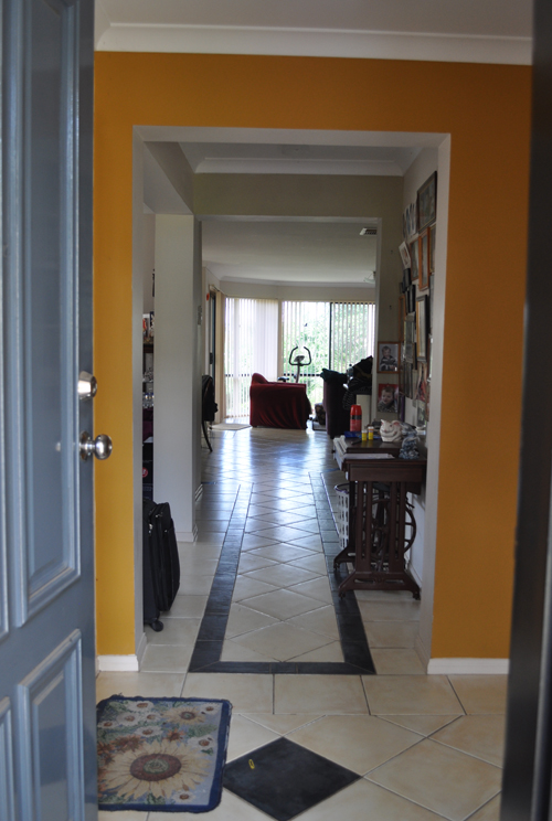
Here’s how the entry looked at the very beginning of the flip…
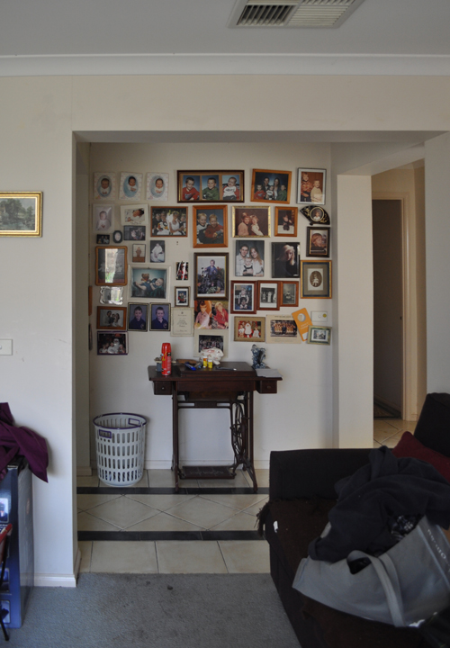
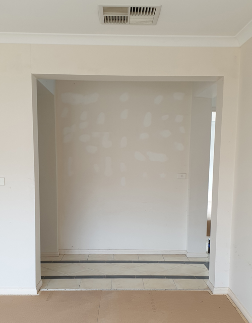
And here it is from a week or so back (before the walls were painted and the carpet was installed)…
Doesn’t just removing all the old stuff make such a huge difference? This is why I consider de-cluttering so important.
So, now that I have my relatively blank canvas, it’s time to start considering ‘style’ – and I must admit, I’ve been struggling with this!
Unlike decorating my own home, a client’s home, or a friend’s home, in this case there is no personal taste preference to help dictate the direction. So the possibilities are mind boggling!
Sure, there are certain factors to leverage, such as the style and location of the house plus what’s currently on trend, though I really don’t want it to look like every other staged house in the area.
In order to help me I thought I’d take a cue from House Rules (which just started airing its new season on Channel 7 this week!) and create a set of guidelines based around the feel I want to achieve. So, my ‘House Rules’ are…
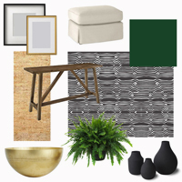
:: Use black and white with a hint of gold.
:: Add greenery for a vibrant punch.
:: Go for simple lines with a rustic twist.
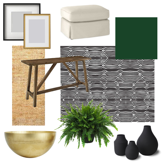
And this is my rough plan so far…
WALLPAPER
I don’t tend to use a lot of wallpaper, and in general I’m not a huge fan of feature walls, however they definitely have their place. Here, because I don’t love the wall paint colour and want to create a bit of a statement, I’m planning on using this stunning black and white wallpaper from Luxe Walls. It’s actually an Aboriginal painting created by artist Brentyn Lugnan and I just adore it! The paper requires no messy glue and is repositionable and removable so I’m super excited to try it!
CONSOLE TABLE
I’ve been scouring second-hand sites for a table though haven’t found anything which quite meets my style, size and price requirements yet. Sometimes sourcing pre-loved items can take months and unfortunately, in this case, I just don’t exactly have the luxury of time. Have been thinking about maybe building something myself using some scrap timber our previous home owners left behind – over 12 years ago! If I do, the base will likely be treated pine so I may paint it the deep green shade shown above. I was originally leaning toward duck-egg blue, in order to tie the exterior in (remember, I’ve used duck-egg blue on the shutters and front door), however I can’t get this green out of my mind!
OTTOMANS
For as long as I can remember I’ve loved the look of a generous console table with a pair ottomans beneath it. Sadly, my little home offers precious little scope for any such arrangement – so this is my chance! There’s no way buying tailored ottomans is in the budget so I’ll be DIY’ing these. Have been looking everywhere for some storage tubs/baskets/crates/toy boxes/side tables, I might be able to easily hack though most which have the right overall scale are too long. At this stage I’m thinking I may need to build some basic frames myself using left-over MDF we have in the shed. Then I’ll use the foam from one of my friend’s old sofas to create the ‘cushion’ tops before upholstering them.
RUNNER RUG
To add some natural warmth and texture, and help soften the floor tiles, I may use a woven runner rug. Not sure on the exact style or colour at this stage though you can never go wrong with jute.
DECOR
To meet my self-imposed ‘House Rules’ I’m thinking of using a lush plant in a brass bowl, some simple modern frames in black and gold, and a nice collection of vases (most likely inexpensive second-hand ones I will spray paint). In addition, there will probably be a stack of contemporary books and perhaps a few wicker items for texture. Who knows?
In other flip house news, the garage door has been confirmed! For those of you who, like me, have been waiting to see the finished facade this is pretty significant. It will be installed next Thursday after which point I can finish the “curb appeal” styling and share the before and after pics!
Catch up on all the previous flip house posts HERE.


Absolutely adore the direction you’re taking with this scheme. Can’t wait to see when its done!!!!
Thank you so much :)
That wallpaper looks stunning, and with the gold and green it will be spectacular. So excited to see this makeover in its finished state.
Thanks so much Sherylee :)
Excellent design choices, and I cannot wait to see what you do with the inside !!
Thanks :)
What a great idea to create your own ‘house rules’! Too much choice (in anything!) is overwhelming so narrowing the parameters is a wise way to go. Whatever you choose will be amazing. I am curious to see if you incorporate that wonderful old treadle sewing machine into the decor somehow.
Thanks Julie.
The sewing machine isn’t actually super old and obviously it’s a little too petite for the entry wall though I may find a spot for it yet :)
I love the plan so much! It’s going to be a dramatic difference that is for SURE.
Thanks Erin. Here’s hoping it comes together well!
Love the direction you’re going! Classic AND relevant. Can’t wait to see the nook with that gorgeous wall paper up.
Thanks so much Deb :)
Ugh, I can’t stand waiting!!!! Hurry. Hurry. Hurry, Thursday!
Ha, ha. I can’t wait for Thursday too!
Can’t wait , to see if finished…..
LOL! It will happen next week!
Love your work – fascinating to follow along and I’m loving the insights into your thought process!
Thanks so much. Looking forward to to the reveal :)
I would bet money you’ll make the console & ottomans and the following week the perfect items will appear on marketplace or Gumtree?? I speak from experience!!
Great work as usual Kristine
Cheryl
Of course. Isn’t it always the way? LOL!
Thanks Cheryl.
I’m really liking your choices. Can’t wait to see the end results! Exciting!
Thanks Kathy :)
Would something like this work? https://www.amazon.com/Whitmor-Collapsible-Storage-Ottoman-Paloma-Gray/dp/B075FFMLVS/ref=mp_s_a_1_16?keywords=whitmor+paloma&qid=1556804430&s=gateway&sr=8-16
Yep, this is the kind of thing I’ve been looking at everywhere though I can’t find anything quite the right size. I’m after a rectangle and want them to be larger than standard ottomans. All of the plastic storage tubs I’ve seen which are about the right overall size appear to come in a standard length of around 57cm/23″ which is too long. They will look a bit too squished.