Things are flying along at the suite extension at the moment!
I think it’s partly because we’re just at that stage where things seem to go quickly, though also partly because the builder is keen to have everything done and dusted well before Christmas.
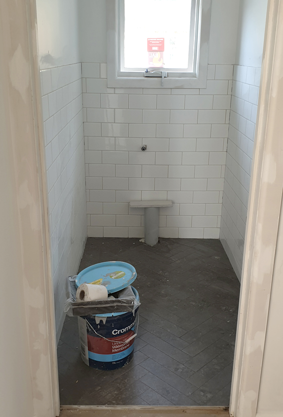
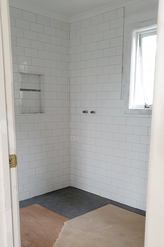
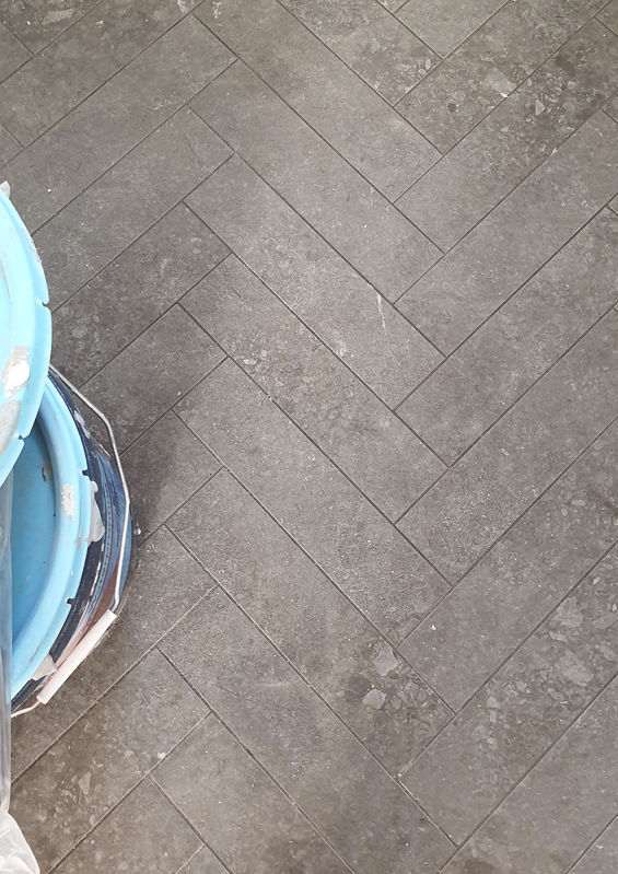
In terms of progress, the tiles have all been laid and grouted (still some caulking, touch-ups and cleaning to do).
Ended up going with mid-grey (Charred Ash) grout for the floor, and light-grey (Misty Grey) grout for the walls.
Sorry, floors are sheeted over here because we’ve been painting.
At first I thought the floor grout was a mistake and that the herringbone needed something lighter to accentuate the pattern, though after playing around with some pale grey grout powder I’m convinced it was actually the right call.
With the subway walls it would have been way too busy. As things stand the herringbone is definitely noticeable, though it’s more of a subtle detail than a bold statement.
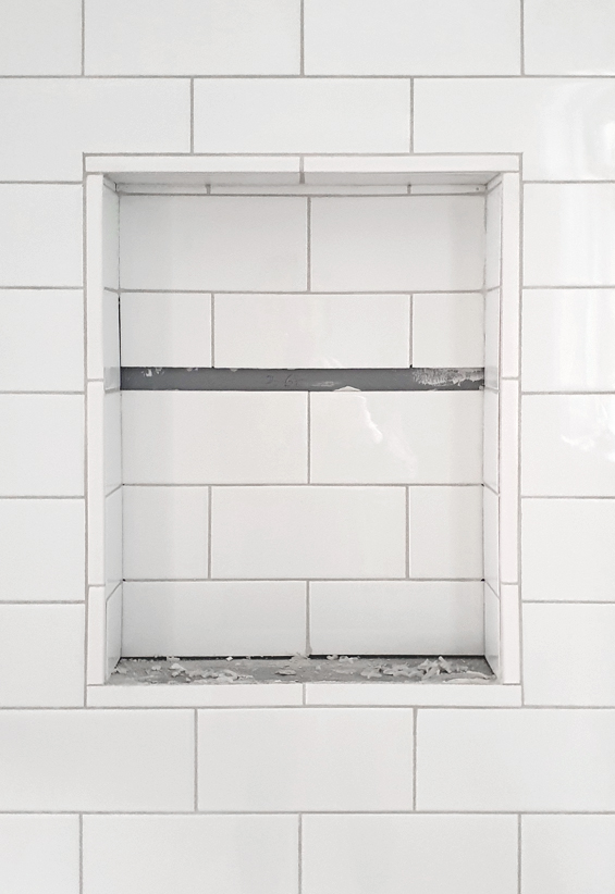
Still need to finish the shower niche which we’ve decided to add stone shelves to. The shelves will be Caesarstone Frosty Carrina to match the vanity top.
Love the simple pencil tile we chose to frame the niche with. They aren’t cheap (about $7 each – yikes!) but we wanted something different to the usual schluter edging and thankfully we didn’t need many.
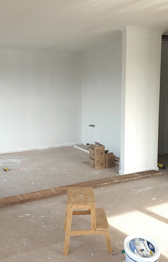
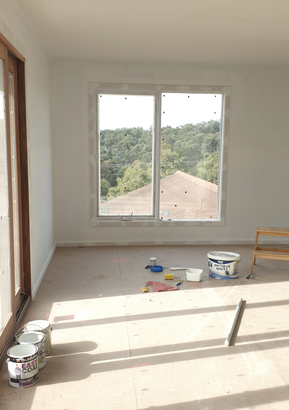
All of the plastering has been done, and we’re working our way through painting the ceilings, walls and trim.
This is the kitchenette nook (taken from standing in the ‘living’ space).
And this is the ‘living’ space (taken from standing where the bed will eventually go).
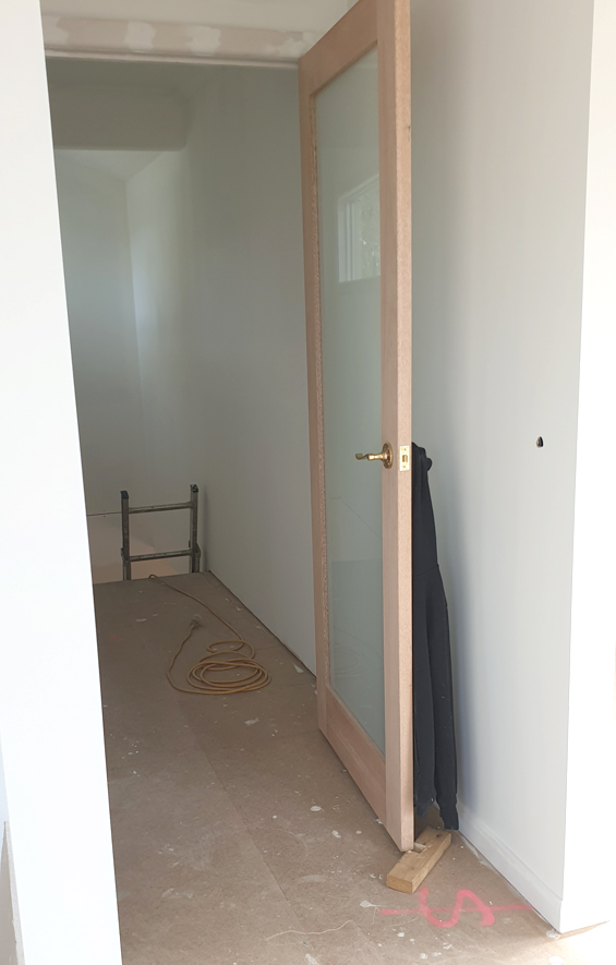
Obviously, this is the little hall, beyond which the stairs will be positioned.
Mum was looking to install a more decorative door here, though the one she liked was double the price of this simpler one so we’re planning on hacking it a little.
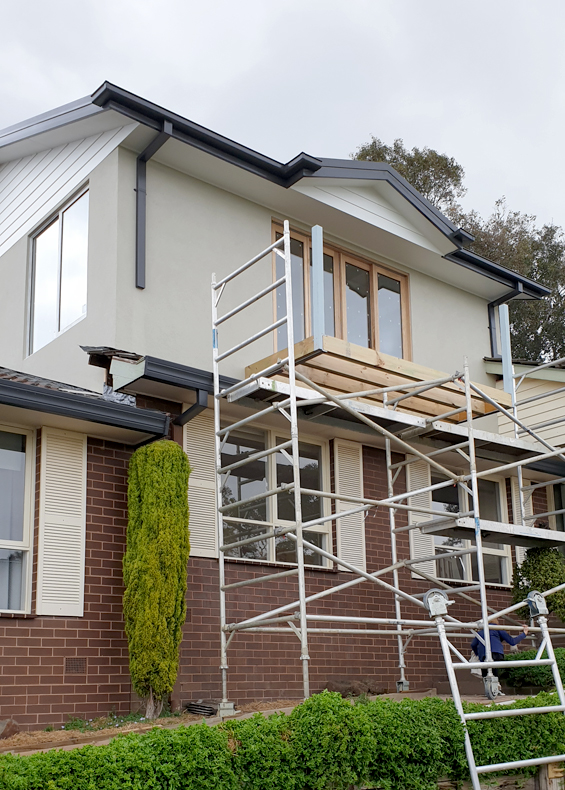
Outside, some of the bulky scaffolding has come down so there is a clearer view of the exterior.
Still lots to be done though at least you can see the colour scheme now (which I’m sooooo happy with!). Just ignore the mission brown brick!
So, in terms of projects moving forward, I’m pretty sure the internal stairs will be installed by the end of next week! And I think the balcony should be finished off too.
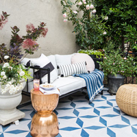
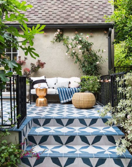
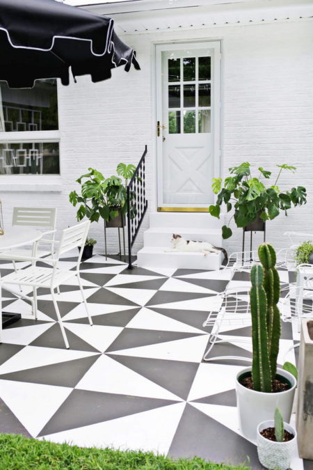
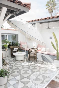
For the balcony, we were contemplating the idea of patterned tile, though they can be pricey and my parents just weren’t sure. Instead, we opted for simple inexpensive concrete-look tiles, which I plan to jazz-up with some paint!
Not totally sure what kind of look we’ll go for yet, though it will be something quite simple. Can’t wait to share more about that!
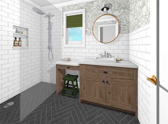
In other news, after a bit of angst and lots of tweaking, the bathroom vanity has been ordered. I’m still nervous about how my rendered design is going to translate in reality, but we just needed to bite the bullet and get it done already. We needed to add a panel on the left (so the make-up bench is no longer floating). This is kinda how I’m hoping it turns out (wood grain tone is just suggestive).
There were lots of limitations based on what the cabinet company could offer, but I think this is a good compromise.
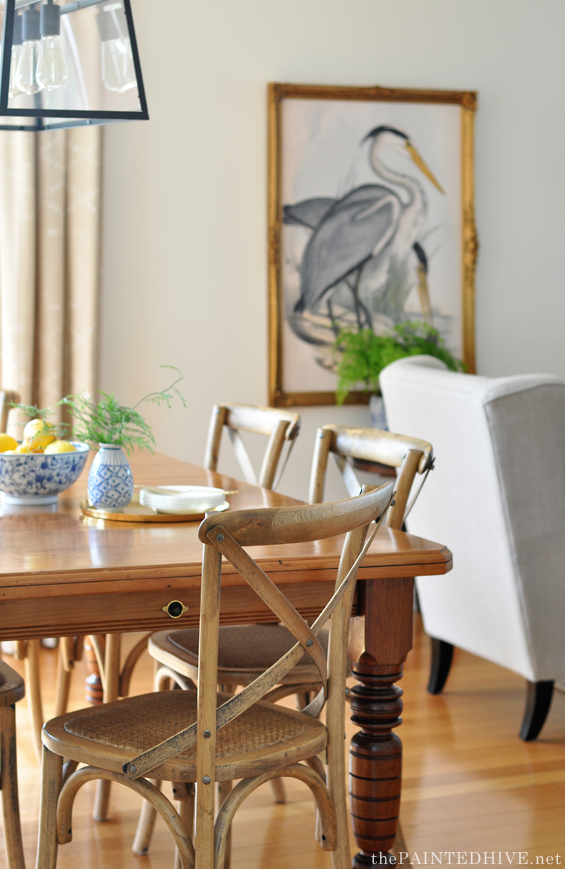
We’ve also started to think about flooring which, aside from the kitchenette, is really the only other major component still undecided upon. We know we want some kind of timber plank, we just don’t quite know what exactly. The stair treads will be Vic Ash to tie-in with the existing flooring throughout the original portion of the house (as shown below in the dining room), however we want something different for the extension.
Light fittings are still up in the air (no pun intended) though we have bought two simple fans which will be positioned over the “living space” and “bedroom”.
There will be simple downlights throughout most of the space, with a pendant over the dining area and a wall light in the bathroom. Not sure on style yet though probably something a bit transitional.
My current obsession though is wallpaper for the bathroom!
As per my rendering, we will be papering the upper portion of the walls (barring the shower of course which is tiled floor to ceiling) and there are just too many beautiful options!
Something like this black and white floral line art is a possibility, however I’m also loving bold botanicals and even the idea of a vintage landscape mural! In fact, I have so much to share about the wallpaper I’ll be back with a separate post soon.



This looks absolutely stunning – well done!
Beautiful things! I love them. I am so excited for you, So stylish! Thank you for this interesting post and amazing pics.
This is looking great! I know that it’s probably not going quickly on your end, but it seems its moving along quickly to me. Love the herringbone tiles! Cant wait to see what you pick for wallpaper! I’ve seen some beautiful (although very expensive) vintage landscape murals…so many exciting choices. Thanks for sharing!
Yes, they aren’t cheap! Am trying to come up with a bit of a DIY solution! Can’t wait to share more :)
Really loving the herringbone floor tiling and the dark ceiling fans you’ve chosen – it’s all coming together so well. Good job!
Thanks so much :)
Looking great!
Its coming along beautifully! I love all the choices you’ve made so far and I’m looking forward to seeing what wallpaper you go with!
Thanks Erin. Argh, choosing wallpaper will be the death of me – LOL!
I love your flooring in the herringbone pattern and the grout you chose is just perfect. What a beautiful view you will have.
Yes, the view is great. This is just a snippet. To the left are the Kinglake mountain ranges and over the other side you can see the Melbourne city skyline.
I noticed the view too. How lovely. The rooms are looking great
Getting there!
Your work seems to be great. Continue the great effort!!
Can’t wait to see how the balcony tiles turn out!
Me too. Have no idea at this stage – LOL!