If you caught my last suite extension update, you might recall reading that I was in wallpaper town trying to decided on something for the bathroom.
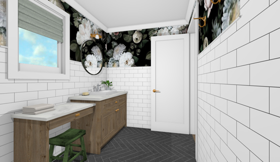
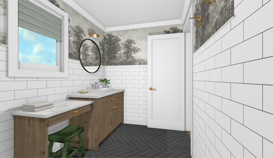
As mentioned early on, my parents like simple classic interiors which can stand the test of time, so injecting a bit of whimsy and interest through changeable elements (such as removable wallpaper) was on our radar from the start. In fact, we specifically chose not to tile the bathroom floor-to-ceiling to give us some wall space to play with.
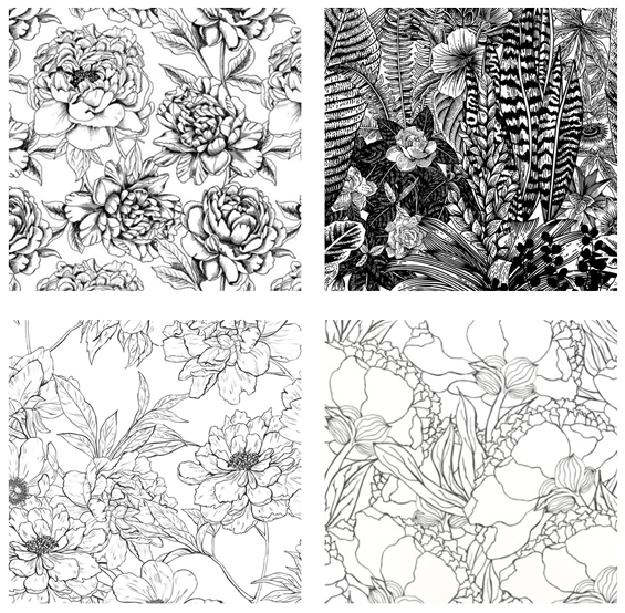
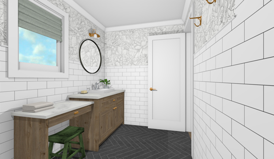
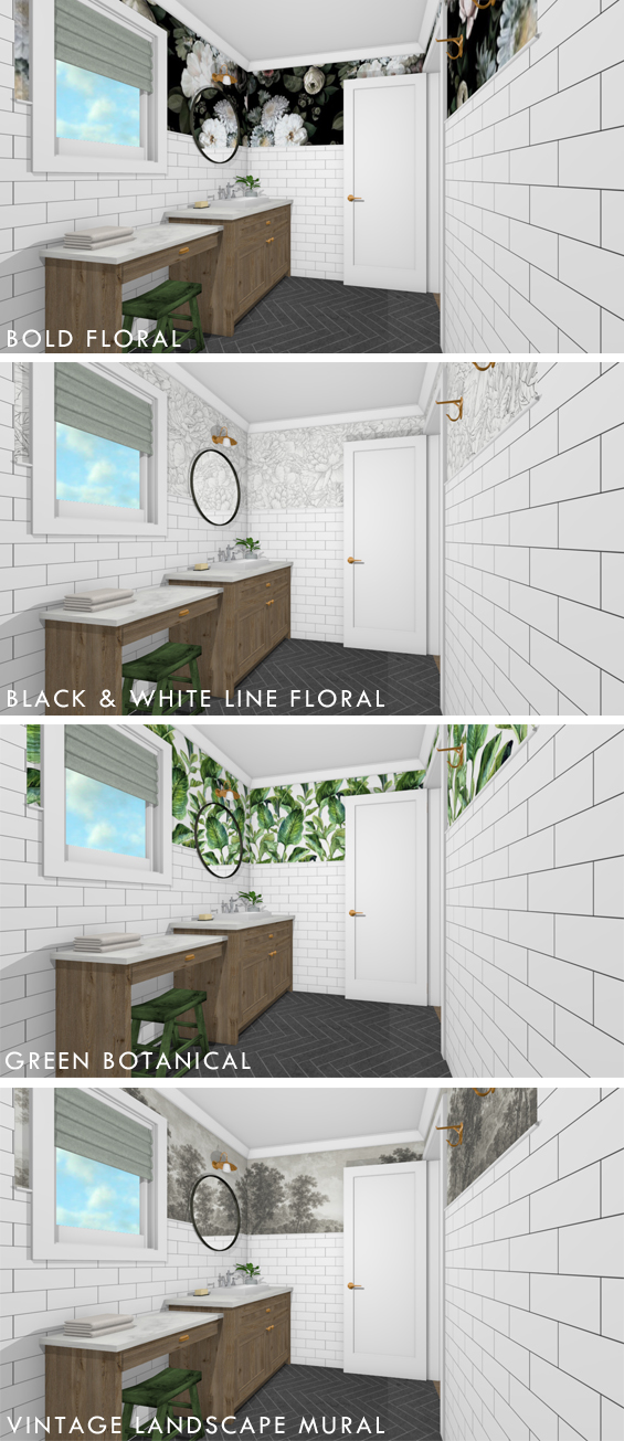
To begin with I was envisioning a large-scale floral in here.
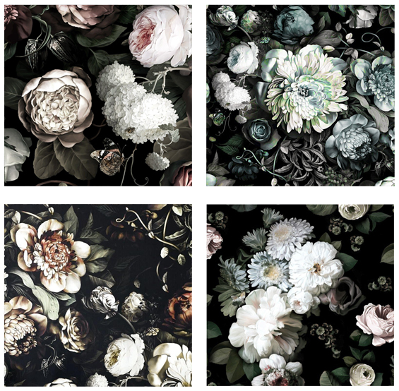
Something bold and moody…
Or something simple and understated…
Both very different, yet with their own appeal.
Then, as happens, once I began researching actual products, a few more ideas crept in.
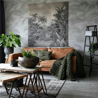
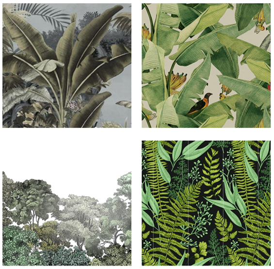
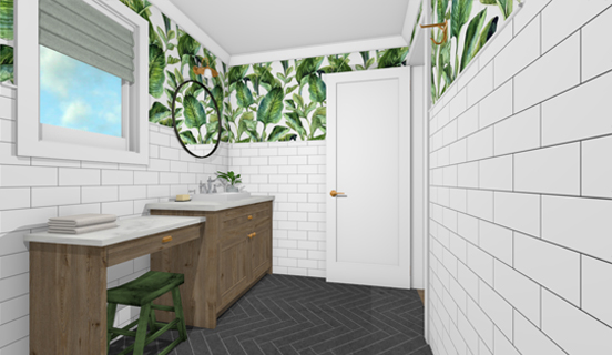
What about something green and botanical…
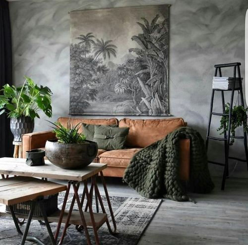
Or, something totally different, like a vintage landscape mural…
Of course, these four general “styles” are only the tip of the iceberg when it comes to wallpaper. And, even among just these basic options, the amount of choice is still totally overwhelming!
It’s at this point where you can become completely paralysed by indecision.
However, there comes a time when enough is enough already! You’ve got to acknowledge that any number of options could work equally as well, and realise that it’s not something you’re bound to for the rest of your life, and remember that it’s just decorating after all.
So, with that in mind, we’ve decided to throw caution to the wind and opt for the vintage landscape mural!
I’m well aware this is unlikely to be the favourite choice, however I need to stop worrying about what everyone else might think. I’ve adored this look for years and years, and my parents are keen to go with it, so it’s happening. I’m a little bit excited!
Before we settled on this choice, I knew it wasn’t going to be easy to find an appropriate “off-the-shelf” wallpaper. Despite the fact they are generally super expensive, wallpaper murals are, well, often just that, murals. Unlike regular wallpaper which repeats, most murals are an individual image designed to create a singular feature, usually over the span of one large wall. Yet, here we have three narrow half walls. Although there are some options out there, the choice is pretty limited, plus I had an idea brewing…
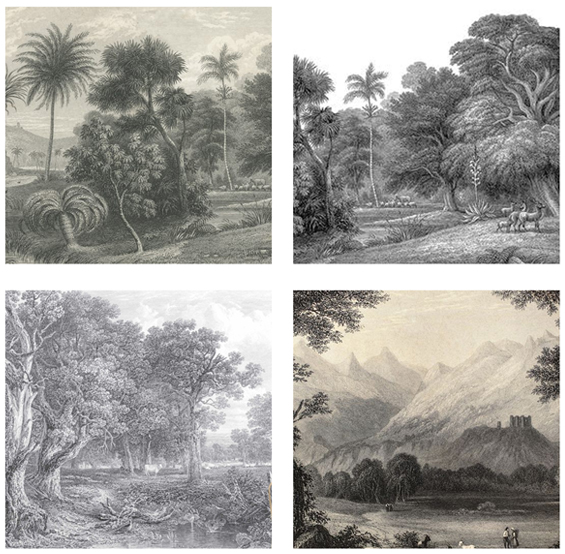
Based on my research, most of the vintage murals being offered by wallpaper companies are reproductions of genuine antique artworks (etchings in my case). And, if you know where to look, you can find these images, along with many, many, many more, available online as large-scale digital downloads…for free!
Yes people! Free!
Then, if you’re somewhat handy with digital design, there are ways you can edit these images to make your very own custom wallpaper files!
Now, I’m not gonna lie, when it comes to vintage artwork online there are seemingly endless options out there and if you’re not careful you could find yourself looking for months. Again, this is when it pays to remember my aforementioned points – it’s just decorating, it’s not forever, nice is enough.
To begin with, I had a few basic criteria to help narrow things down…I wanted something that was preferably in landscape orientation, had a decent amount of sky in it, and could be blended into a repeatable pattern without too much trouble (more on that below).
Initially I was after an Australian landscape, possibly even something local, to bring meaning and context to the wallpaper, and whilst I did find several etchings, none were quite right for my purpose.
So, rather than spend my life endlessly searching for that perfect (possibly illusive) image, I decided to cut my losses and focus purely on aesthetics.
Which opened up a heap of options!
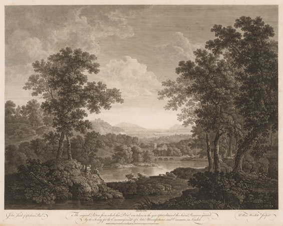
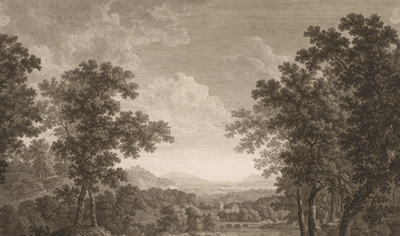
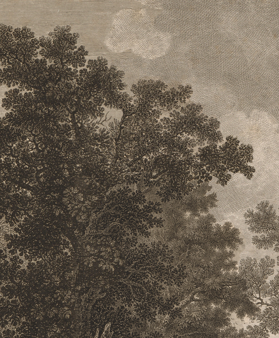
And after playing around with a few possibilities we eventually settled on this antique artwork…
Landscape Etching by William Woollett (1760)
Of course, selecting the image is only the first part of the process.
It then needs to be edited as required. I’m still yet to completely customise my image however will need to re-size and re-scale it, plus do some general enhancing and adjusting. The great thing about creating your own file is having the ability to tailor it as desired. I can play with colour, tone, contrast, and so on, until I’m happy. Which is pretty cool.
The more complex editing step is making the image repeatable.
You might wonder why this is necessary. I mean, couldn’t I just blow it right up, crop it to fit, then stretch it all the way around the room?
Well, technically, yes, though it would be far from ideal.
You can’t overly enlarge an image without majorly depleting the quality, plus in this case it would be so harshly cropped that only a small snippet of the overall artwork would remain (because the aspect ratio of the image and the walls is so different). It would end up looking something like this…
In all honesty, I actually quite like this because it’s a bit abstract and quirky, though in reality the quality would be noticeably poor and the room would have obvious large blocky patches (light skies/dark trees) rather than an over-arching continuity.
You might also wonder why I don’t just place the individual image on each wall and ignore the fact it doesn’t wrap around.
I could do this too but having the artwork abruptly end at each corner would look pretty clumsy and make-shift. Not having a seamless look would forever annoy me.
So, repeating the image is the only decent option in my case (if you have a wall with a similar aspect ratio to the image you’re using, creating a repeat is probably unnecessary). Although it does take a bit of work, time and skill, it’s pretty achievable using an editing program.
Here’s my effort…
ORIGINAL IMAGE
EDITED IMAGE WITH REPEAT (PLUS CROPPING)
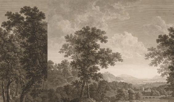
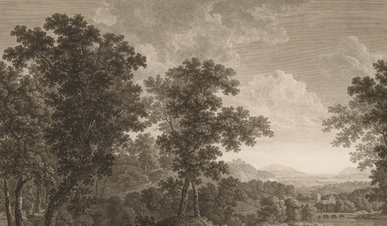
Notice the ‘new’ trees on the left. These blend with the original trees on the right to create a seamless look when repeated.
REPEAT PATTERN
Granted, it doesn’t look great when viewed small-scale like this, though in the context of a whole room where the image is over-size and you don’t actually view each wall at the same time, it works really well.
Having never done anything quite like this before, I must admit, I was quietly impressed with myself. Especially when I asked hubby to pick the join and he didn’t have a clue!
INITIAL SPLIT
The noticeable seam is where the true image starts and ends as can be seen in the original artwork above.
EDITED REPEAT
I’ve “cut and pasted” choice areas of the existing image to make the seam blend in.
I can elaborate on the process if anyone is interested, though basically I used Photoshop to split the image then I did some artistic “cutting and pasting” until you could no longer tell where the seam was. I don’t want to say it was fun, because how boring does that make me? But it kinda was, plus rewarding.
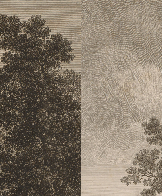
INITIAL SPLIT CLOSE-UP
EDITED REPEAT CLOSE-UP
So it’s nearly ready to go! As already mentioned, just need to finish editing it then look into which company I should choose to produce it for me. As much as I’d love to be able to DIY the actual product, I don’t exactly have the capacity to manufacture my own wallpaper! And unfortunately I’m not holding my breath about it being super cheap – as most custom wallpaper can be a little pricey. Still, I’ll do my best to find an affordable option, and will remember to appreciate the fact this method still gives me ultimate control over the final image.
Can’t wait until it’s up on the walls!
As an exciting extra, I’m rapt to share that I’ve decided to optimise some of my favourite vintage landscape finds and share them as free downloads!
I’ll include a few seamless options if anyone needs a repeating wallpaper, and will also offer some which can be used as regular murals or large-scale wall art (which you can frame or create wall charts with, and so on).
Stay tuned for them!
Catch up on all of the other suite extension posts HERE.




Just one word … WOW! What a great idea and stunning execution. Can’t wait to see the final result.
Me too! Thanks so much :)
This is amazing!
I also love it in that lounge room set up!
Is that setup yours? I need that green knit throw! Would love to know where it is from.
Isn’t it an amazing room? Not mine sadly (don’t think that couch would fit in any space I have – LOL). It’s by HK Living though I can’t see that green throw on their website. If you Google “green chunky knit throw” you will find some :)
I can’t wait to see it done. We’re still procrastinating over our wallpaper decision 🙄
Love it! Reading down I was hoping you would choose the vintage mural! Can’t wait to see it
I’m quietly impressed with you too!
Looks wonderful and thanks so much for sharing your resources and ideas – this will look amazing once it’s done – can’t wait to see it finished!
Beautiful!! What program do you use for the room layout?
It’s Home Designer by Chief Architect :)
https://www.homedesignersoftware.com/products/home-designer-pro/
The florals really rock!!!
They are beautiful :)
So glad you chose the landscape over the other 3 options. It’s going to look fab. So interested to see what company you find to print it. It’s nice to read a local blog and know I can use the same businesses to source stuff instead of fruitlessly wishing we had Home Depot here.
LOL! Yes, I often find myself wishing that too. Happy to be relatable :)
Wow! Beautiful choice. And hugely impressed with your editing!
You are pretty incredible:)
Ha, ha. Too nice. Thanks Sherry :)
I love how your brain works, how creative it is, how smart you are! Beautiful ideas and execution! I look forward to the end results.
Aw, thanks so much Jody :)
Unbelievable!!! I can’t believe you created your own wallpaper. Your creativity blows me away.
I love that design! You are amazing at Photoshop. You can’t see the repeat seam at all. Very well done. I’m enjoying this series. Thanks for sharing.
Beautifully and skillfully executed wallpaper – wow! That is just so darn cool!
Excited about the freebies you’re going to share!
Yes, can’t wait to get them ready!
You are so GENIOUS!!! Can’t wait to see the final product, and do share all the details and sources! Best wishes!!! :)
Thanks :)
*GENIUS!!! ;)
This sounds hugely complicated and I think you’ve done a wonderful job. Can’t wait to see the finished room.
Honestly not hugely complicated. Just a bit of creative thinking and patience. Can’t wait to share how it all turns out!
So glad you decided on that one. Well done!
Ohmagaad that looks amazing! I so not understand how you managed to fix the seam and doubt I could do the same, but whatever you will offer up I will attempt. You’re offering an opportunity I’ve been gagging for, for years! Can’t wait to see bathroom reveal and your downloads!
Yes!!! You chose the one I hoped!
This is absolutely amazing ! I love this.
Love this! Call me boring because your cutting and pasting process seams really fun to me. Ha!
LOL, yes, it was rewarding. Getting a little tired of it now after having done three images. Ha, ha.
I am so very impressed and filled with anticipation! 🎉
Thanks :)
Once again, you amaze me. The mural was my choice, too.
Thanks so much. Yep, absolute winner!
I soooo love reading your decorating exploits! Thanks so much for sharing and I am looking forward to your downloadable pics. Thanks again for your efforts you are a huge asset to us home decorators who do have as much patience or vision as you do
I’m so impressed by your photoshop skills!! I love this wallpaper so much! It’s perfect!!
Thanks so much :)
This is exceptionally well done and, truly, so lovely. Please share your Photoshop process as well as advice on installation. Thank you for allowing others to benefit from your experience.
Stay well.
Thanks so much. The Photoshop technique was pretty involved and took a lot of trial and error. I’ve actually had no-one else interested in learning more about it – LOL! If I have the time in the future I can try and get a tutorial together though it’s really just a matter of playing around with the tools. I wish I had some special insights or short-cuts though unfortunately I don’t.
The finished bathroom so gorgeous — I am ALMOST speechless but I have to ask…. I have been looking wallpaper like this for for my powder room, and I was crazy excited when I read that you have offered to release several files that could be used to print similar wallpaper. Any idea when those files might post? Thank you!!!
Thank you. I have a few other things to wrap up first, though am hoping to have those ready to go within the next fortnight :)
Hi I just found your site today and fell in love with this bathroom idea…its just a wonderful mix of timelessness .. and just what I had been looking for without realising it11
I realize the post is 2019 but wondered if you could direct me to the free download files mentioned in the post as I cannot seem to find them…
I look forward to hearing from you and thank you for sharing – really super
Rubina Faber (just mention I’m in the UK so don’t sadly have access to your suppliers here)
Hi Rubina
So glad you like the bathroom.
I actually never uploaded the image sorry. The file is huge so was excessive for my bandwidth unfortunately. Perhaps in the future I can come share some smaller versions.
Kristine