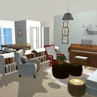
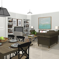
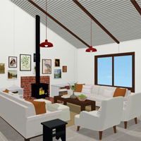
This space is really getting there now!
Over the last few weeks we’ve been chipping away at the diminishing ‘to do’ list. There are still a few projects to cross off though we have acquired pretty much everything we need!
So here’s where we’re at…
If you need to catch up you can check out my last progress post here.
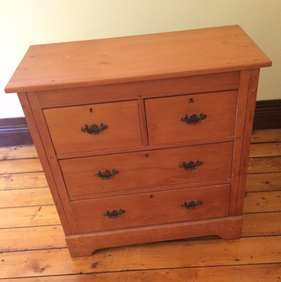
I found an old dresser for the dining room on eBay for $80…
Photo from the eBay listing.
Although it’s fine as is, we’re going to switch out the Queen Anne hardware for inexpensive chunky wooden knobs and paint the whole thing in a warm greenish grey to bring the colour of the linen armchairs back into the dining area and help break up all the wood.
I love beautiful aged timber so struggled to find an old piece I wasn’t opposed to painting. This dresser, although very well built and antique in style, appears to be a reproduction of sorts so the wood actually looks quite new.
We finally made a decision on the pendant light for above the dining table.
You might remember from my last post that the chandelier I originally bought was advertised with inaccurate dimensions. Unfortunately, it was quite a bit larger than we really wanted and although I think it still could have worked, I knew mum and dad weren’t that keen on it.
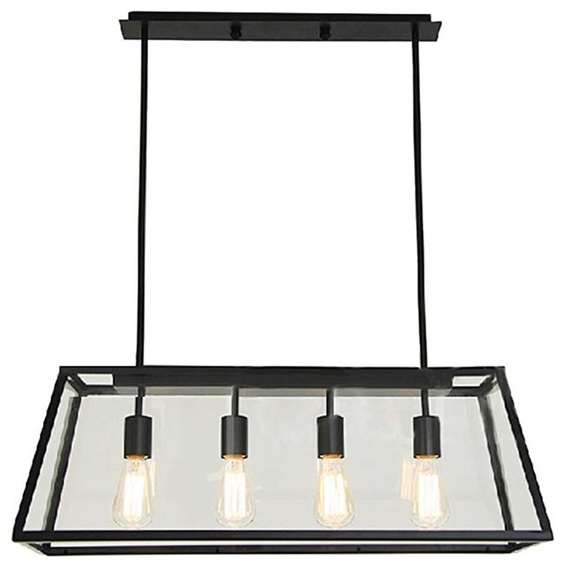
So I started browsing for an alternative, not really knowing what I wanted, when I happened to come across this pendant on eBay…
I’ve loved this style of light for ages now. They are generally priced between $300 – $800 though this brand new one was just $170 with free shipping – SOLD! I bought it from this eBay store. Unfortunately these particular pendants appear to be sold out at the moment though this seller does have some other cool and affordable lights to check out.
We’ll hang onto the original chandelier for a future room makeover.
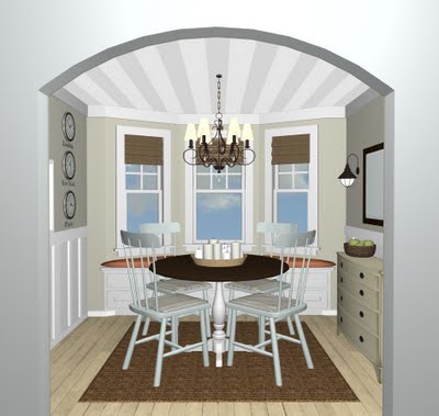
We bought some curtains. The LENDA (in beige) from Ikea…
This pic makes them look a little dated though we’ll be replacing the tabs with rings and won’t be using any tie-backs. We’re also going to stencil on a subtle geometric pattern in off-white. This will just add a dash of interest and provide some relief from the solid beige.
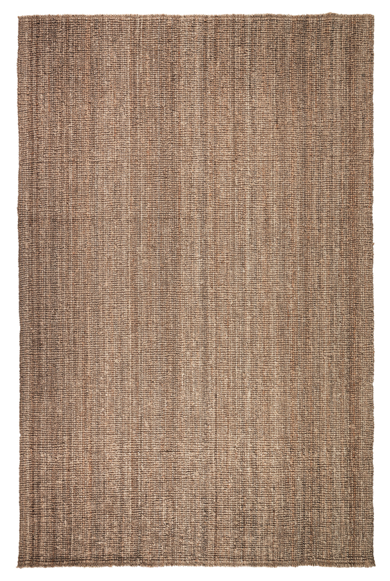
We also bought a rug. The LOHALS from Ikea as originally intended…
LOVE it!
Some decisions about the artwork have also been made.
Remember how I was contemplating using one large statement piece above the couch…
We came to the conclusion that a gallery would work better there. We’re going to use a collection of thrifted frames (in golds and blacks) which we already own and, as per my blog post here, a series of simple botanical illustrations…
Check out my blog post to download these high resolution images for yourself!
The hint of green should add some freshness and tie-in with any plants we use in the room.
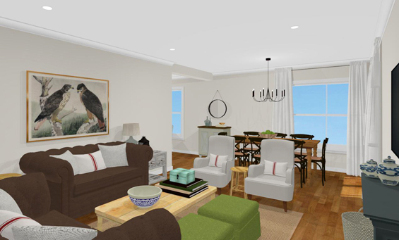
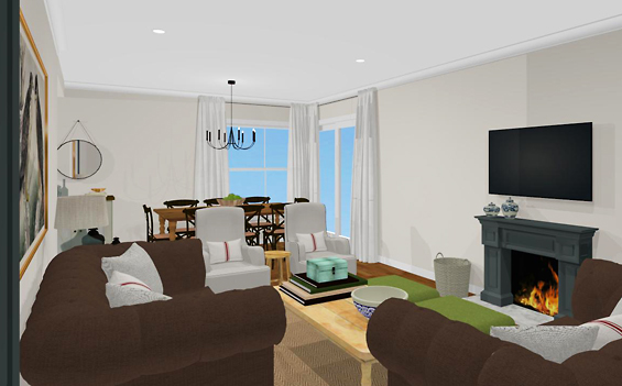
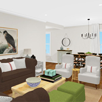
Although I was happy about our decision to go with a gallery, I wasn’t completely happy about losing the over-sized art. I just really wanted that punch! So I am still going to try incorporating something big. This time on the expanse of blank wall between the fireplace and the sliding door…
As this space is more conducive to a portrait oriented artwork I searched around (again) for a new image to use. Eventually I decided on this gorgeous natural history illustration by ornithologist John Gould…
It features a pair of beautiful Shaheen Falcons and has the unexpected, masculine edge I’m after. I found it as a free large-scale download here on the Biodiversity Heritage Libray website. I’m planning to edit it a little (mainly to soften the colouring), have it professionally printed (this shouldn’t cost much more than $40) and then frame it myself. I’ll be sure to post a full tutorial when I get the project complete.
I bought a table to sit beside the couch.
You might recall that I was having difficulty finding something appropriate due to wanting a piece with odd proportions (something tallish yet not too deep or wide).
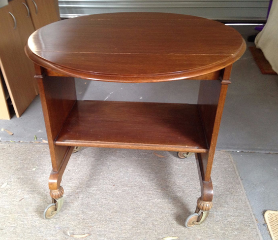
Well, a few weeks ago I stumbled across this antique beverage trolley on eBay for just $50 and thought it could work…
Photo from the eBay listing.
It’s a bit of a mix between art deco and jacobean. I love the slight quirk of it with its large original castors and reeded feet. The shelf is handy too as it allows for storage (something mum really wanted). It’s perhaps a little larger than I wanted though its dual drop leaves provide flexibility in terms of size and shape.
My original idea was to paint it a light colour to, once again, help contrast with the browns in the room and brighten-up the space. Though mum and dad both really like the wood so we are going to try stripping back the dark varnish and possibly white waxing it. We’ll see.
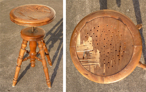
Finally, I found a cute little antique stool to sit between the armchairs…
I was looking for something quite primitive and rustic, like an antique elm stool (love!), though I couldn’t find a second-hand one and all the brand new ones were soooo pricey.
I figured this adjustable height piano stool was equally cute. As you can see it is absolutely charming though the top is completely destroyed. No matter. I plan to simply cover it with an inexpensive round bread board – easy! I found it on eBay for around $30. I think I might stain it walnut to contrast with the linen armchairs and all the other honey-toned timber in the room.
So, that’s it for now. Like I said, we are almost there!
What do you guys think. As always, I’m super open to hearing any ideas :)
If you missed my first few posts about the living-dining room makeover you can find them here…
Part 1: The Plan
Part 2: Progress and Pieces






kristine i would never presume to give you advice you have the best eye for finds and this room is so gorgeous already, your parents have to be gobsmacked over it xx
Thanks Chris. It’s getting there. Still not really sure how it’s going to come together. Fingers crossed!
Love the dresser ! D. Lawless Hardware has a great selection of inexpensive knobs that one can order on line . Can hardly wait to see how you put your own style to it.
That stool looks like a challenge! Can’t wait to see what you do with this one!!!!!!!!!!!
I have a simple plan for that one Kay. I’ll be sure to post all the tutorials and before and afters once the projects get done :)
Hmmm, it looks like a jumble to me. Nice pieces on thier own maybe. Interested to see how you make it work.
Can’t wait to see the (re)finished furniture and the whole setup.
I hope I can make it all work Alicia :)
I love the pieces you’ve collected. You have a great eye for a lovely eclectic look!
I always look forward to your blogs, keep it coming……
Thanks so much Maggie :)
Hopefully I can pull it all together.
Are you still liking the Lohal’s rug? Is it soft on bare feet? Thanks! I absolutely adore your blog and your style:)
Hi Hayley
Well, it’s at my parent’s house though I visit there often and still love the rug! I find it soft and comfy (it’s not scratchy at all like some sisals can be) though as it’s straight on their hardwood floor it isn’t really “cushiony” – if that makes sense. I guess you could always add a padded underlay though if you wanted a more plush feel.
Kristine
Looks very good! Expecting more pictures soon :)
Thanks Lynda. Yes, there will be an update soon :)
I just came across your blog today. I love your style – absolutely love the light :)
Thanks Janelle :) Love that light too!
I am looking forward to the next post :-) I think the botanical gallery wall is a good choice! We have that same rug and I love it- very soft underfoot, though it does shed fibres.
There should be an update tomorrow Ashlea! Though it won’t feature the whole room – it’s going to be about the dresser makeover.
I love that rug!
Looks very fabulous .nice collections of picture. Nice to see your work.