
A little while back now I was contacted by one of my lovely local readers who was seeking some design advice. She was actually enquiring about ‘hiring’ me to help, and whilst this is something I’ve done in the past, the timing was just a little off for me so I felt uncomfortable committing to the work.
That said, I was still keen to help her out and do enjoy the challenge, and just plain fun, of playing ‘dollhouse’.
Fortuitously, I’d actually been toying with the idea of beginning a new reader-based design segment and her open plan living space seemed like the prefect kick-off candidate!
The segment will focus on breathing virtual life into your design visions. In other words, turning your dreamy home desires into realistic concept renderings you can actually see!
Notice how I said ‘your’? Whilst I’m super open to helping propel the design – filling in any gaps and dealing with dilemmas – at this stage I’d really like concentrate on rooms you guys already have some ideas for, rather than full-blown “I’m totally lost” re-dos. I love the idea of working in a collaborative way to make your own imaginings visible.
Maybe you’ve got a new colour scheme in mind, different furniture layout to trial or are even contemplating a mini reno. From using a specific wallpaper to creating a particular overall ‘vibe’, it can be as precise or vague as you like, as long as there is some intent. The general goal of the rendering is to provide a motivating (and hopefully exciting!) visual guide which you can then tailor to your needs during the design implementation process.
Anyhoo, back to the kick-off space.
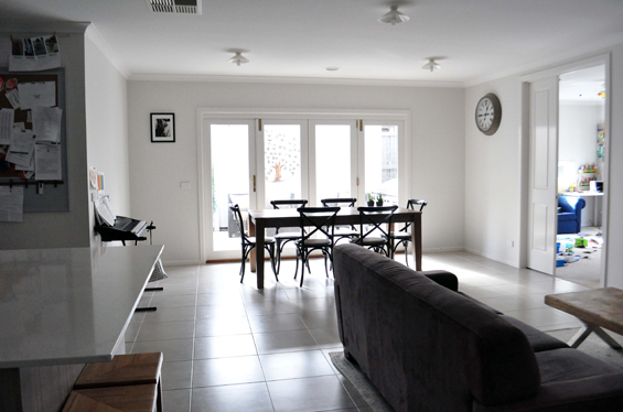
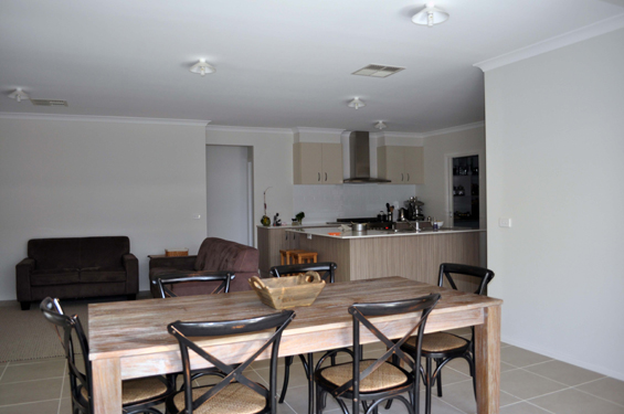
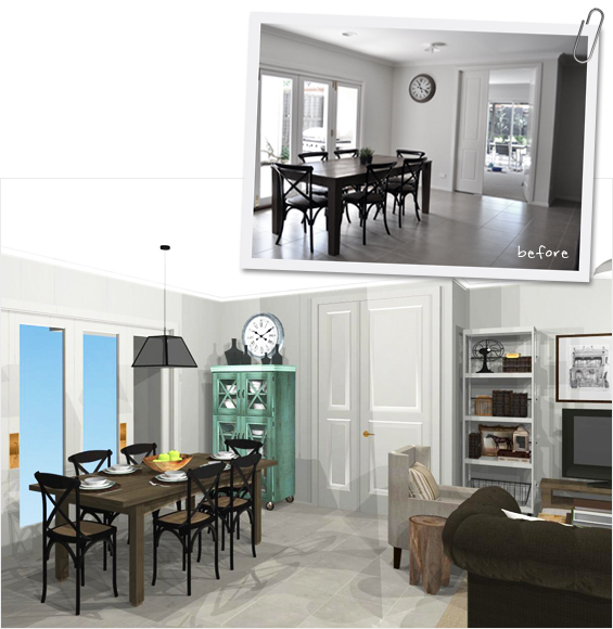
My reader, Jelaine, had come to a stand-still in her combined living-dining area.
She wanted to work with what she already had (for the most part) to achieve a cohesive modern french country feel, with hints of vintage industrial. Although she had some ideas, she just wasn’t quite sure how to pull everything together.
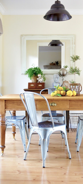
Here’s her space…
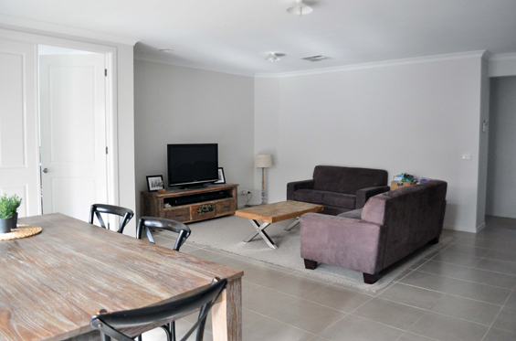
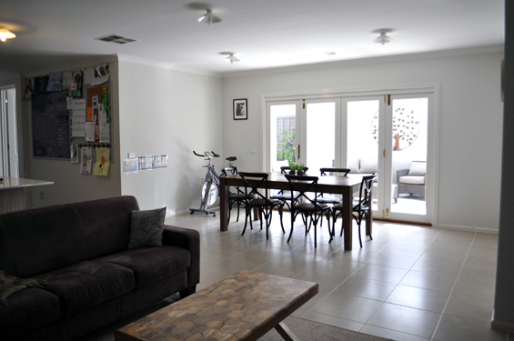
Note: Jelaine purchased new sofas mid-way through the consultation process after I saw a great deal on some which I thought fit her criteria and suggested she check them out. Although I was sent a few fresh pics of the space including the new sofas – which were sufficient for my rendering purposes – the initial photos (incorporating the original micro-suede couches) were just a little wider angled and better showed the space as a whole which is why I’ve used them above. Of course, the new sofas are depicted in my plans and here they are in the room…
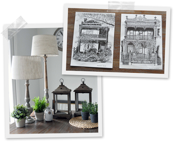
She also shared photos of some accessories she’d like included…
And here are her needs and wants…
DINING AREA
– Table, chairs and clock to stay
– Lighting for above dining table
– Furniture (incorporating storage) for beneath clock
– Artwork for blank wall
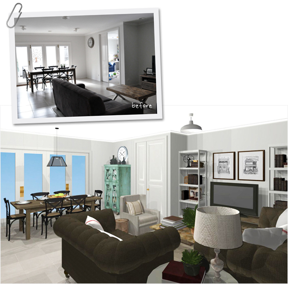
LIVING AREA
– Rug, coffee table, new brown sofas and TV bench to stay
– Incorporate lamps somewhere
– Artwork for above three-seater sofa
– Use architectural prints if possible
– Lighten-up the overall brown-ness
– Additional furniture to accompany TV bench (likes the look of built-ins)
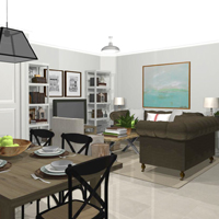
So, taking all things into account – including accurate dimensions of the room itself along with any existing furnishings – here’s what I came up with (side-by-side comparisons can be found further below)…
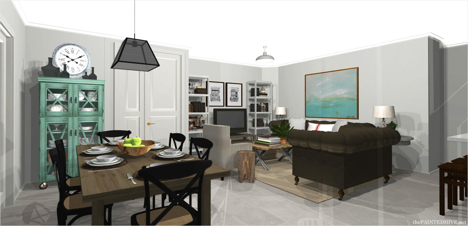
CLICK THE ABOVE IMAGE TO ENLARGE
Go on, you know you want to – it looks heaps better big!
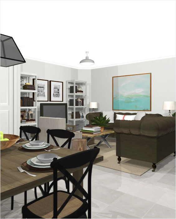
Pardon the funky shadowing. Just a quirk of the program.
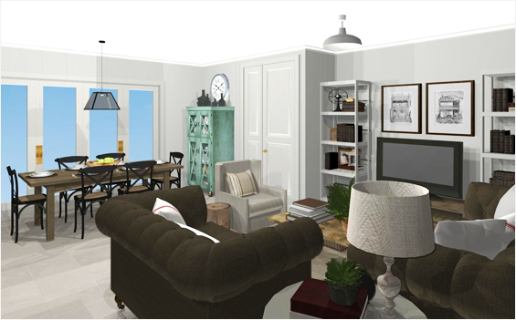
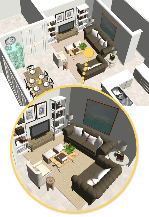
Below is a ‘doll’s house’ view to more clearly show the spacial planning and furniture lay-out.
And a bit about the decisions I made…
DINING AREA
I was initially going to suggest placing a small cabinet beneath the clock, though its high hanging position prompted me to recommend a 3/4 cupboard instead. Not only does it provide more storage, thought it’s also just a bit different. I went with a distressed mint green which references the artwork in the living area, breaks-up all the timber in the space and adds some needed personality. Atop the cupboard a simple collection of glassware befriends the solitary clock.
On the opposite dining room wall I have created a basic photo gallery. This area is currently a bit of a transient zone (you might have noticed both a spin bike and keyboard in each of the before pics – which were taken a few weeks apart) with no real defined future plan. The gallery, being both simple and interesting, provides flexibility yet works to give purpose and impact to the wall. If in the future Jelaine wants to pull in something more permanent (maybe in the form of a sideboard, low bar or bench) the gallery can easily be adapted to work.
A low central pendant helps define the dining area. I used an industrial pyramid style pendant, though a longer rectangular one would work equally well, as would an appropriately scaled pair of alternate pendants, like glass cones or traditional lanterns.
LIVING AREA
Rather than commit to the permanence and expense of built-ins, I have simply flanked the TV bench with two tall narrow shelving units. Although open to changing the TV bench, Jelaine did mention that she does like it, so I have retained it at this stage. That said, I do like the idea of switching it out for something simpler which can be painted to match the shelves (and doesn’t compete so readily with the coffee table). I mentioned this to Jelaine and she is now keen to find an alternative. Restrained yet thoughtful styling using co-ordinating accessories (notice I sneaked in her pair of lovely lanterns?) helps avoid a cluttered feel. Pretty baskets can be used to store any smaller, less decorative items. To bridge the shelves and take focus off the TV I have used Jelaine’s existing architectural prints which were purchased by her husband.
I retained the couch configuration – which, after brainstorming all the alternatives, I decided does work best for the space – though added a small occasional chair and two ottomans. The chair works to define the seating area without enclosing it. It also provides an avenue to introduce a lighter coloured fabric. I felt the rectangular shape of the coffee table was a little ill-fitting so have teamed it with a pair of ottomans to create a collective square shape which I feel works better in the space. Along with providing additional seating, the ottomans are easily repositionable as required and, depending on the style, can also be used for storage. To help brighten things up I have used a combination of light-toned linen cushions, some plain and some with simple grain-sack stripes to fit with Jelaine’s desired french feel. I have placed a brown ticking cushion on the occasional chair to tie it in with the chocolate couches.
To break-up all the angles in the room I added a round pedestal table between the couches. I went with something reasonably tall so it didn’t get too lost behind the sofa arms and chose a warm grey to add a bit of depth. Atop the table sits the shorter of Jelaine’s lamps. Positioned symmetrically at the other end of the three-seater sofa is the taller of her lamps. You can’t see it clearly in the pics though I’ve used a small milking stool to bring it up to the same level as the table lamp (books could also be used as risers to get the levels perfect if need be). Giving company to the occasional chair is a small side table, here in the form of a stump stool, however numerous different styles could work well.
To cleanly counter-balance the fullness of the shelves and create a focal point away from the TV I have placed one large artwork above the three-seater sofa. I chose a muted abstract for a bit of edge and colour (as mentioned above, the artwork colour is referenced in the green dining room cupboard to help unite the areas).
Note: Of course, all the specifics in my design are merely suggestive. Particulars concerning details such as colour, style, finishes, etc, can and should be adjusted as necessary.
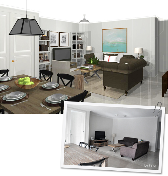
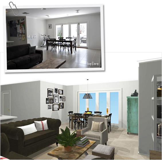
Now, who doesn’t love a before and after? Here are some comparisons to save all that back and forth scrolling (remember, she already has the new couches)…
Soooo, now I invite you guys to submit one of your spaces!
If you have a room you believe would be a good candidate for this new segment simply send me a brief overview of your vision for the space along with a few photos.
Email thepaintedhive@gmail.com with subject line “Room with a View”.
Guys, please don’t go into too much detail or send a million pics at this stage. Depending on the number of submissions I receive I may not be able to get to them all and I’d hate for anyone to take a heap of time composing a submission which doesn’t evolve into a rendering. I plan to select a space as often as time and motivation permits, any of the more nitty-gritty deets can follow if your room is chosen.
Although I have this awesome rendering program (and have somehow conquered the considerable learning curve in order to actually use it!) I can’t count the number of times I’ve just wished someone would simply show me how an imagined space might look. So, I’m really looking forward to being able to do exactly that for some of you! Eeeek!
![]()
Don’t want to gamble with the chance I might pick you? Feel free to contact me about a custom consultation.
![]()
This room was rendered using Home Designer Architectural.


That’s fantastic! I love the touches of green in the cabinet and the artwork, and how balanced everything is now. It makes such a difference to see the added accessories, taking it from plain and simple to something you can really imagine living in. My house needs some work… I’ll have to think about submitting a space!
Thanks Heather!
I think accessorising is one of the most powerful things you can do in decorating. It adds such interest and personality.
Kristine
This is absolutely gorgeous! I love the colours and the way it looks personalised without being too busy. Lovely to see it.
Thanks so much Sherylee.
Looks brilliant. I wouldn’t change a thing and would never of thought to be so clever in the first place.
Love it, love it. What a great program. I need this in my life.
T
xx
OUT. OF. THE. PARK!!!!!
This is just so impressive. I absolutely love everything you did and especially like the color pop with the green on the art and cabinet.
Wow, love how did you got all those personalized details in there like the actual building prints and the lanterns and the matching dining setting. Very realistic and makes it seem so doable.
Oh my I have to get organised with this one. I love your style and I just get this dark version it. The house has had a re- arrangement to make way for to many cats, but really it’s what I have always wanted, it’s just two years to early. Any way I know what I want to do, but I know it’s going to turn out eclectic. I would love your take on it.
So Ms Kristine you might finally get pictures of my place.
The room looks beautiful! I especially love the sofas you selected. I would like to purchase these sofas. Where did you find the sofas?
Hi Gina
Thanks!
I came across them in a furniture store here in Australia (I believe you are in the States?). However, I did some research at the time (just to see if they were cheaper anywhere else – although they were very affordable anyway) and noticed they are available internationally. Try doing a Google image search for “Longdon Sofa Suite”. You should find a few suppliers.
Kristine
Thank you Kristine,
I Googled it. They do sell them here in the states, and they are a great price!
I noticed they are faux leather. I’m not familiar with the durability of faux leather?
I want to find something stylish, but I need something very durable, as my husband is stationed on the sofa whenever he’s home from work. I don’t really care if it’s a comfortable sofa though.
Do you know if faux leather is very durable?
Yay! So glad you found them. By Australian standards the price for this suite was pretty amazing but I did notice they are even more affordable over in the States (everything here is soooo expensive).
My parents also have these sofas and they are quite suede-like which I personally think is nice. Guess it depends what you really want though. They have not had any problems with wear or stains and they have four dogs and seven young grandchildren who practically live there! That said, they have only had them for around seven months.
If you can view the sofas in-store somewhere I would definitely recommend it. Otherwise, ask lots of questions via email or over the phone prior to purchase, just to make sure you’re getting what you really need and want.
Have fun and good luck. So thrilled I could help an international reader with a product – awesome!
Kristine
Thank you Kristine!
Your review of the sofas was very helpful. If they can withstand four dogs with no issues, they’re worth checking out! The sofas are made by Ashley, and we have a few local Ashley Furniture stores here in Texas.
these are gorgeous! your renderings are fantastic..i have just started to figure out rendering, so I know how much time you’ve spent into learning. well done!
Thanks Emily. Which program are you using? I purchased Home Designer a few years ago. It’s really versatile though, like you said, time-consuming.
I would like to move right in there! It looks great :)
I think you are so talented and simply look to your blog quite often for inspiration! I especially love those antique-style multi-drawer map cabinets you did last summer (http://tinyurl.com/pghpdvb). They would be perfect in the bedroom I am redoing right now.
Speaking of… I have a bit of dilemma about walls vs. ceiling shades in that bedroom redo and was hoping you could help.
This is a very small bedroom (10 feet square with decent 8.5 feet high ceilings) and the bed is a loft bed, so I want to make the room look larger and the ceiling recede.
I am doing a coastal, old-world inspired bedroom redo for my 8-year-old son. I have chosen a very light cream (almost white, but not quite) and he chose a barely-there shade of blue. The rest of the elements (rug, bedding, drapes) are all in monochromatic shades of white-cream-taupe with colored accent pillows. The roller shade is an old monochromatic map with navy blue and cream. We live near a beach where we have access to very nice driftwood, so it is present throughout our home. I will anchor the room with a faded navy or denim big Fatboy-style pouf on the floor. We are also stickting glow-in-the-dark stars on the ceiling.
So here is my dilemma: I was thinking of using the barely-there blue on the ceiling and blur the demarcation lines by wrapping it at the top of the walls (about 8 inches down), and then blending it with the very light cream shade of the walls using a soft ombré technique to blur demarcations lines. I’m about to begin painting, but I’m hesitant. Do you think it’s a good idea or should the ombré flow the other way around (very pale blue on the walls, light cream on the ceiling)?
Thank you in advance for your inspired thoughts! :)
Julie (Canada)
Hi Julie
I think you’re right! The blue should be on the ceiling. Not only does this mimic sand rising into the sky (to suit your coastal theme) though having the neutral at the base should give the room the illusion of more width. I feel like having the blue at the base might cause the impression of an inverted triangle. Sounds like you have a lovely room in the making and I am envious of your courage to attempt that ombre effect. If you find the blurring isn’t working as desired, you can always revert to a crisp line, still with the blue extending slightly onto the walls.
Kristine
It looks so gorgeous. i love these furniture in room. very nice picture.
HI Kristine,
Would you consider doing a design consult again? I loved the ideas you gave the reader in this article, and I also loved seeing ideas for a normal person’s house to be invigorated. I have some pictures I’d love to send your way if you are still taking them.
Hi Darla
I am still accepting submissions for my “Room with a View” segment however I can’t promise when I will get around to doing another one! I was hoping to select a reader’s space every three months or so though have just been too busy lately. Please feel free to email me with some photos and details and I will keep it on file.
Kristine
Fantastic and appreciating idea so keep doing work is best!