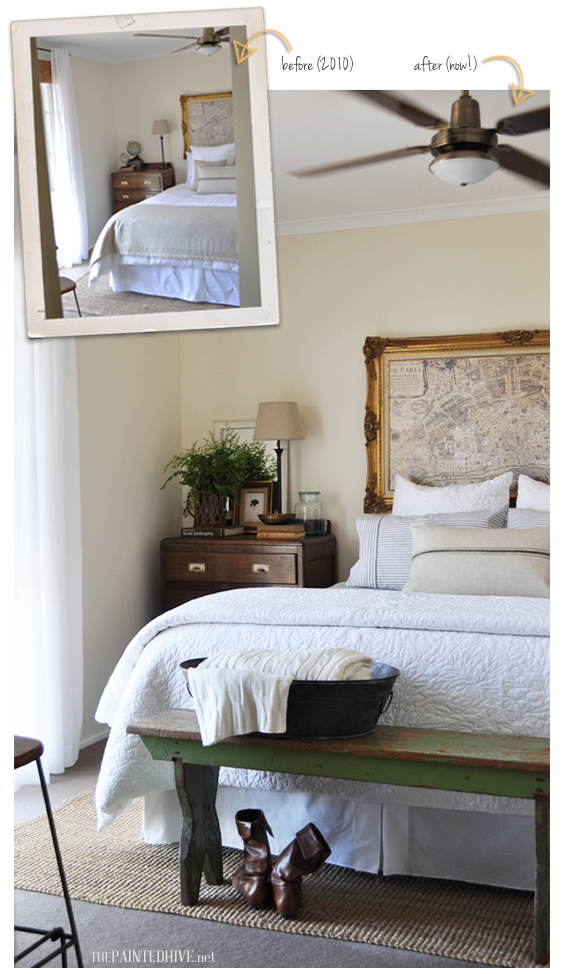
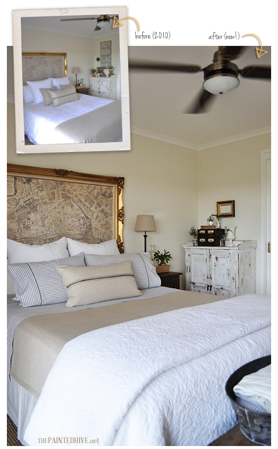
I first, and last, shared a complete tour of my master bedroom waaaay back in 2010.
It was a time when I still ignored the kid’s department in Kmart, thought ‘twitter’ was simply the sound a bird made, could wear a white shirt and keep it clean all day long, and had no idea how to use my DSLR camera (not that I really know how to use it now)!
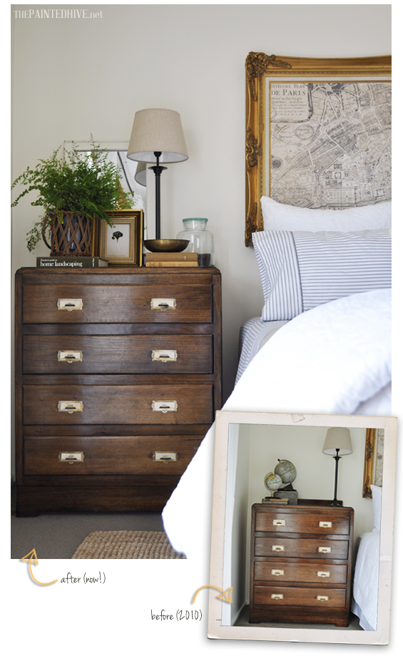
Anyhoo, since then my decorating tastes, and I’d like to think my photography skills too, have evolved somewhat so over the past few months I’ve been refreshing my bedroom and thought it was finally time I made the bed properly and shared it already!
As with most of the spaces in my home, small proportions and some funny angles make it a little tricky to capture with a camera though hopefully you’ll get the general gist :-)
I know that to some people it’s mundanely practical and somewhat boring, though throughout my home I purposefully use a predominately neutral scheme and fairly timeless main pieces for a few reasons; one) to ensure I don’t tire of my surroundings too quickly, two) so things aren’t out-dated in five minutes, three) to make refreshing my spaces easy, fast and affordable – some different wall art, a throw pillow or two, fresh décor accents and a new occasional piece is sometimes all that’s needed to rejuvenate a room completely.
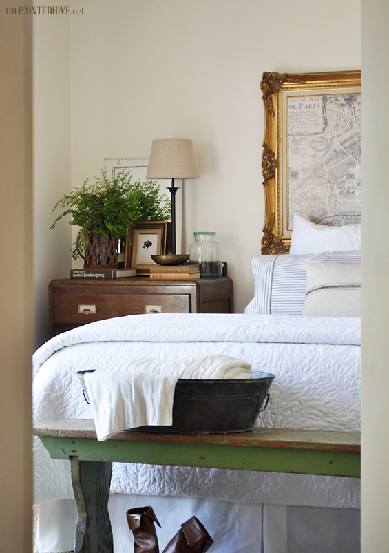
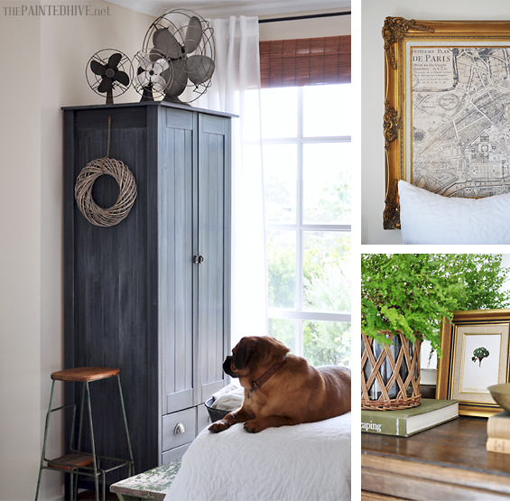
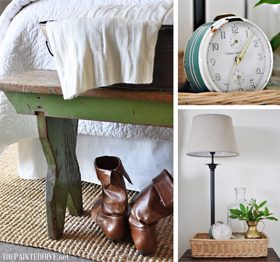
Well, my logic may just have worked in the master bedroom where I’ve created a renewed look with some extra depth and interest more in-keeping with my current eclectic(ish) farmhouse(y) style without touching the neutral canvas and main furnishings. I’ve simply added a distressed green bench seat, charcoal ticking sheets, some new décor accents and different wall art.
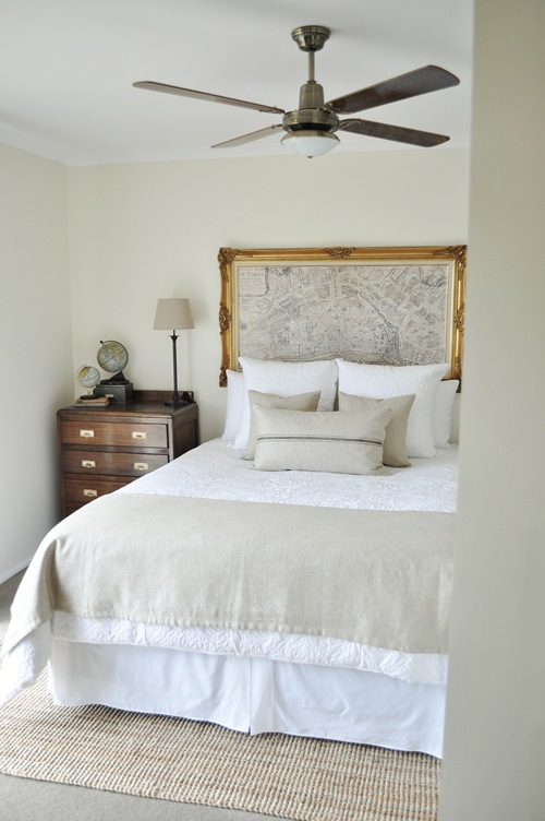
When I originally posted about my bedroom a few years ago, the framed coloured maps (which are actually sheets of gift wrap) were a pretty popular feature, and whilst I did really like them, in the overall scheme of my bedroom, to me, they always seemed a little too competitive – I wanted my framed map of Paris to be the star and set the tone. So, whilst the map gallery would make a lovely feature elsewhere, for the bedroom I decided to switch it out for something more simple and subdued.
At the moment I’m kinda obsessed with indoor greenery. Ferns are my main weakness though I’m also loving the simplicity of cut fronds and foliage. For me their natural presence always imparts a fresh, homey feel, and plunged in water they can last for up to four weeks. Most people have free and easy access to at least one appropriate tree or shrub which also makes them obtainable and super thrifty!
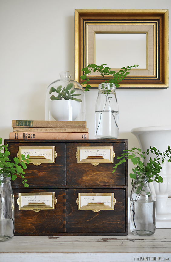
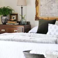
Along with the greenery I’ve also included more gold and brass accents to tie-in with my DIY headboardy-type thingo. And there are little clusters of vintage books and a smattering of glassware – two of my go-to décor elements…they just seem to work so well wherever they land!
I know that to many people the changes may seem fairly insignificant, though the subtle updates have contented me (for now!).
I still have plans to add some new curtains (I’m thinking either something linen-y or green-ish) and perhaps in the future even a timber framed bed, though we’ll see.
If you’re after information on any of my bedroom sources or DIY projects check out the ‘At a Glance’ section below.
Hope you like my little updates :-)
SOURCES
FURNISHINGS: Armoire – eBay ($90) Chest of Drawers – eBay ($60) Timber Side Cabinet – eBay ($50) Distressed White Cabinet – eBay ($60) Bench Seat – Yarra Valley Antique Centre ($70) Step Stool – Yarra Valley Antique Centre ($40)
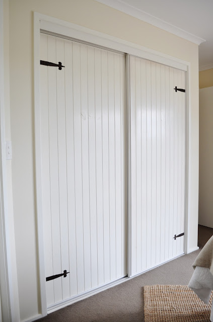
DÉCOR: Rug – IKEA ($130 Tarnby) Ceiling Fan – Beacon Lighting (gift) Lamps – Recollections (gift) Ticking Sheets – EziBuy ($70 on sale) Quilt Cover – Bed, Bath and Table ($90 on clearance) Curtains – IKEA ($12 Vivan) Gal Tub – Paper Occasions (gift) Vintage Alarm Clock – How Bazaar Antiques ($4) Cable Knit Throw – Spotlight ($25)
PROJECTS
Robe Door Update
Bamboo Window Valance
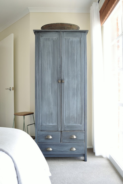
Chalky Washed Armoire
DIY Large Scale Framed Map Headboard
Distressed White Cabinet
Mini Card File Drawers
Dark Stained Side Cabinet
Library Style Chest of Drawers
DIY Linen Throw Blanket


Holy Moly!!! This is one of the most stunning blog bedrooms I have seen. Pinning now. I love the way you updated the room without doing anything too costly or time-consuming. Sometimes I look around my house and it all feels like too much work and money so you’ve inspired me to think about it more simply and actually get some things done :)
He, he, ‘holy moly’…I haven’t heard that for a while.
Thanks so much Emma and have fun getting stuff done!
After seeing this I now can’t wait to see your home office too!!! Everything is just perfect…can you come and decorate my bedroom next? The green pops are lovely with the gold hints.
I’ve been thinkin’, can I come and live with you? I’ll bring my own toohtbrush :)))
Sure thing Triss. If you don’t mind sharing a room with an 18 month old then come right on over :-)
Oh it is gorgeous! That map is awesome and the restyling of the nightstand made a huge difference!
There’s something about an item when its starting to rust around the edges. So charming. Lovely Kristine.
Anne @ Domesblissity
Thanks so much Anne. I agree, you can’t beat a little imperfection (or should that be perfection?) around the edges :-)
LOVE it! It really looks cozy and beautiful.
Such a beautiful space! I love all you furniture pieces and your dog. :)
the green touches are wonderful especially that green stool
LOVE LOVE LOVE your bedroom! We bought our first house last year and I’ve been ignoring the bedroom while focusing on the main living spaces. You have totally inspired me to get started on the bedroom. I love all your little pieces and I adore those fans! You have the perfect balance of having lots of fun interesting pieces everywhere without it feeling too cluttered. I love old stuff too and I’m always combing through thrift shops in hopes of finding exactly the type of stuff you’ve used to decorate. I’m inspired. Thanks!
Thanks so much Sarah. I’m totally flattered by your sweetness. Have fun decorating :-)
Your bedroom is lovely. Just the perfect farmhouse touches.
Farmhouse hugs,
Cindy
Oh I love all your new additions. Your vignettes are fabulous. I love the use of the stacks of books and the greenery. Perfect. Such a lovely and welcoming room. Hugs, Marty
Thanks Marty :-)
Neutral background works for us too, love your styling and the green accents look great. My bedside is a dumping ground at the moment – you have inspired me to clean it up.
I love the little upgrades throughout the room! I totally agree with your idea of neutrals and this is beautiful!
Your room is lovely and the little updates and styling really make it stylish.
This is seriously stunning. Every detail is perfect. I love both the card catalog and the drawer dresser. And that map, AMAZING. I love this room!
You are too sweet Taryn. Thanks so much :-)
your room looks so cozy and comfy. I your style.
You’re bedroom is so peaceful & lovely Kristine! Thanks for sharing the process with us. Oh’ and your photography is beautiful too.
Have a great weekend… Tracy@CottonPickinCute
This is by far the best blog anywhere, love love love it!! Tried to figure out for ages how to get the right finish on furniture, and have recently made-over several pieces using the brown/black stain mix and then Danish oil like you suggest….Results are fabulous. Thank you so much for the inspiration Kristine. I was happy with my master bedroom but now I think I may need to tweak it a little bit….
Hi Andie
You are so lovely. That is truly one of the most flattering comments I have ever received.
I’m glad my love of Danish Oil has managed to rub off somewhere else – I just adore the stuff…so easy to use and results always seem to look just right.
Kristine
My bedroom is all made-over now…thanks to your inspiration! I go to bed earlier as a result just so I can sit up and look at it all for awhile. I’m all enthused now because it was so easy to get a great result…I’m off to the pawn shop to get a roll top desk to make over…daughters room is next! Thanks again for the inspiration Kristine xx
Yay, that’s awesome Andie!
I love that you like to be in there so much you go to bed earlier, how cool. That’s the power of having a space you truly love.
Found your blog via common ground. Love the room update. I started browsing your site nay to realize I have several images of your home pinned to my Pinterest boards already! Love yor home and will def follow along.
He, he, isn’t it funny when that happens. There are soooo many great blogs and websites out there it’s pretty much impossible to keep track of where posts and photos come from nowadays.
Glad you found me :-)
Kristine, you did a beautiful job!!! I’m in the process of softening my home by repainting (the WHOLE thing) a light color! Do you mind sharing the paint color you used? I can’t believe how hard it is to pick out the right white! I love your room! It’s perfect! Enjoy!
Hi Julie
My walls are painted in a Dulux colour called Chalk USA. It’s not what I would call white. It’s more of a soft cream which looks warm in dark light and cooler in brighter conditions.
Kristine
This is gorgeous! We are at a standstill with what to do in our master and I think this just gave us the push we needed! Love it all! Fresh, inviting, beautiful!
I love your room. I love that it is classic and simple and elegant. I really love the fresh green of the ferns, I may just have to go and get one myself!
Yes, get a fern…or two or three!
Thanks for the lovely comment :-)
I loved your room when you first posted back in 2010, (has is really been that long?!) and didn’t think it could possibly be any more lovely. I was wrong, as I love it even more. Beautiful job on the update.
Thanks so much Tricia.
Doesn’t time fly? I couldn’t believe it either when I dug through my archives to find it was that long ago…crazy.
It’s lovely, Kristine. I am artistically/decorating/designer-challenged and you make everything look so simple, yet stylish and just overall amazing. I love the little details!
Thanks Yessi :-)
I think the changes you made are precious. The addition of color (blue and green fern leaves) and dark wood accents really ground the room. I always wondered what makes a room polished and I believe you achieved it. Thank you for sharing!
Take Care
Sue
Holy banana rama!!! This looks AMAZING!!!
You’re a master stylist, and I need your help! LOL. I always feel so awkward when it comes to the styling stage of my projects. Is it too little, is it too much??? ack! (we’re our own worst critic I guess)
But honestly it looks AWESOME and you should be SO proud of yourself!
Two thumbs up girly! :)
Are you kidding me Mrs Smith? Your styling is sublime!
And ‘Holy banana rama’…love it :-)
Thanks so much for stopping by and commenting.
I am so in love with your bedroom. Beautiful down to the very last detail. Thank you so much for sharing at the Inspiration Gallery, you have been featured today!
Jaime
The changes you’ve made are perfect. I live ferns, glassware, and the fabulous Paris map with gilded frame as a headboard. Beautiful!!!!!
Ruth
Oh it looks amazing. So beautiful. And I love some pretty ferns – but I have such a black thumb, haha! I can’t keep plants alive. I always have to buy the fake ones.
I must admit there have been a few innocent fern victims over the years in my home! I figure the more I practice the better I’ll get…hopefully :-)
Try the cut foliage route instead. They will inevitably die after a few weeks so you needn’t feel bad and they are free and easy to replace!
Kristine
I LOVE the bedroom updates! Just some simple things make a huge difference. And I’m in love with your Paris map. Everything is perfect ;)
Your bedroom is gorgeous – I adore your headboard!
Your mini-makeover is lovely! The collection of fans is my favourite!
I love your renewed farmhouse style – but my favorite element is still the map of Paris!
Thanks Heather!
I adore that map too though one day I’m sure I’ll want something different. I just hope I don’t cause a riot when I decide to replace it :-)
I LOVE the timeless look of your bedroom. I think its absolutely gorgeous..not boring in the slightest! I do have a little question for you..it appears that your new bench (which I love) buts up pretty close to your opposing furniture piece. About how much distance is between them? I ask because I am sort of stuck with my overpriced matching HUGE bedroom set we bought several years ago and I really want to add a bench to break it up but afraid it would be too cluttered. Curious how much space you really have there. I have a wood sleigh bed so the bench will be tucked under the lip somewhat, it will really be for looks rather practical use.
Hi Christina
Thanks so much for your lovely comment.
Between the bench and the free standing wardrobe there is around a 60cm (22″) gap which we find ample space to walk through. All of our rooms are reasonably small though so I guess I’m pretty used to having minimal available floor space. That said, I don’t like an overstuffed, cluttered look either so the bench is pretty non-invasive. We use the bench at night to hold our excess pillows which used to otherwise get tossed on the floor so it does serve both a practical and cosmetic purpose.
Sometimes when I’m considering adding or changing a piece of furniture though am uncertain about proportions I create a mock-up with the same approximate dimensions out of cardboard (or similar) and position it in place to see how I feel about it. Perhaps you can try that first.
Kristine
So vey beautiful! I absolutely love all of the details and elements you’ve included in your bedroom to make it such an inviting and fabulous space! So glad to have found you at My Uncommon Slice of Suburbia!
Mundane? No way! You’ve got such a lovely combination of texture, patina, and lots of green. I love it. It’s a great example of how those little things can make a huge difference! This is one of those rooms I could spend a long time in, just looking at all the little details. Great job!
Your bedroom looks gorgeous. Love it
Love the simple changes you made. They are simple, yet beautiful and elegant ~ as pretty as a magazine picture. I especially love that bench at the end of your bed.
Cindy
This is STUNNING. I’m with you in that I like a lot of neutral, classic furniture for the very reasons you named. Trendy stuff can be fun, but then what are you supposed to do with it later?
Wow…what a beautiful BEAUTIFUL bedroom, Kristine! Pinning for future reference/inspiration. I dream of something so peaceful and lovely!
Everything looks absolutely PERFECT Kristine! When can I move in?
Thanks for sharing this at The DIY Dreamer… From Dream To Reality! Can’t wait to see what you link up tomorrow evening!
I am in love!! Seriously like, I. LOVE. YOUR. BEDROOM. Now can you please fly to the states and come do mine!
He, he. Thanks so much Brandi.
:-)
Your bedroom is simply beautiful. I love how you have used the glassware to add texture and light!
Kristine,
What gorgeous details against the warm, neutral backgrounds – gorgeous photos, brilliant post. Thanks for sharing!
Beautiful. I love the color and style of furniture. It all fits together perfectly.
Well done.
Love your blog, your very clever.
Thanks
Amazing room, love your style and your blog. Lots of work has obviously gone in to create all of these projects on your blog. You are one talented lady. Bec
Thanks so much Bec :-)
Just e-visited your baby boy’s nursery too – love it!
Just came across your blog via Pinterest, and think your bedroom is absolutely perfect. I have just discovered my love for house plants and indoor greenery, and love a nice clean neutral palette with vintage accents. Completely beautiful.
My husband just finished up law school and is taking his bar exam in a week. He has been holed up in our bedroom almost daily for the last 3 years, making it hard for me to do much with it, so this is perfect inspiration to beautify it very soon. Thank you :)
Thanks Tori.
Funny, I was just sitting in my bedroom yesterday thinking how much I like it. It’s not uber trendy or overly spectacular, just a nice calming space filled with elements I love.
Have fun when you finally get your hands on your bedroom! It’s a space you can easily put lots of yourself in, I think, which seems to make the process really cathartic.
Hi please tell me about the white old looking piece of furniture…what is it? Also that dark brown box what is it a recipe box? How can you make and paint the white piece as the wooden box?
Thanks!
Oops just saw your other posts. Arw you going to show how to do theat dark recipe box or what is it? Where did yiu get the paper for the dresser old recipes?
I keep forgetting stuff. If you want to do the room like you but don’t want to copy it so its more yours/unique what other pictures would work for th bed frame that goes with your electric farm like bedroom?
Hi Maria
The tutorial for the little card file drawers is here:
https://thepaintedhive.net/2012/04/ikea-card-file-drawers-hack/
Regarding the picture above the bed, a vintage landscape or large-scale animal print would be nice. I also like the idea of antique botanical or educational charts.
Kristine
Beautiful room. Where did you get your pillows?
Thanks Cara. I got them from Target (cases only) for just $5 each though that was a few months back now.