If you’re not new here you might be wondering just what’s going on with my previously blogged about home office space.
Well, between scrubbing breakfast cereal off my walls (no-one warned me that, once dry, milk and weetbix actually forms a NASA-grade adhesive) and all of life’s other rigmarole, the room has actually been slowly evolving and is finally nearly done!
I’m looking forward to sharing it soon, along with dedicated posts for a few of the remaining projects, though whilst I complete them, I thought I’d work simultaneously on a little revamp of my less-demanding entryway.
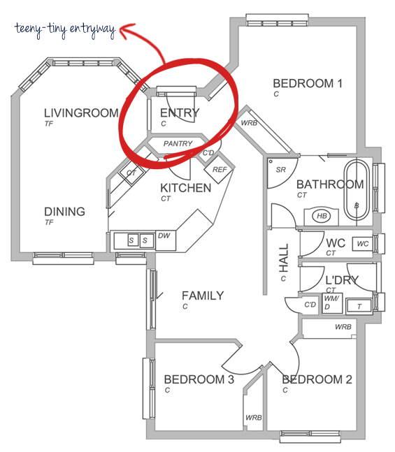
I don’t have a proper before before shot of my entryway (as it was when we first moved in) so just imagine a boring un-dressed space with dirty beige carpet, a dirty green wall and dirty brown trim. It’s teeny-tiny (as evidenced by the floor plan below, it’s virtually swallowed-up entirely once the front door is opened) though there is just enough room for a little vignette to help give the space its own welcoming identity.
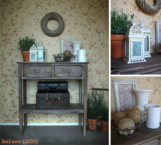
I first shared my entryway back in 2010 – not long after I began blogging, when I was still using a pocket point-n-shoot camera and had no idea what a digital SLR even was.
There was nothing wrong with it (you may even prefer it ‘before’) though as is the catalyst for most of my re-decorating, I just wanted a change, in this case – a move away from the rustic, coastal vibe to something a little more classic and refined.
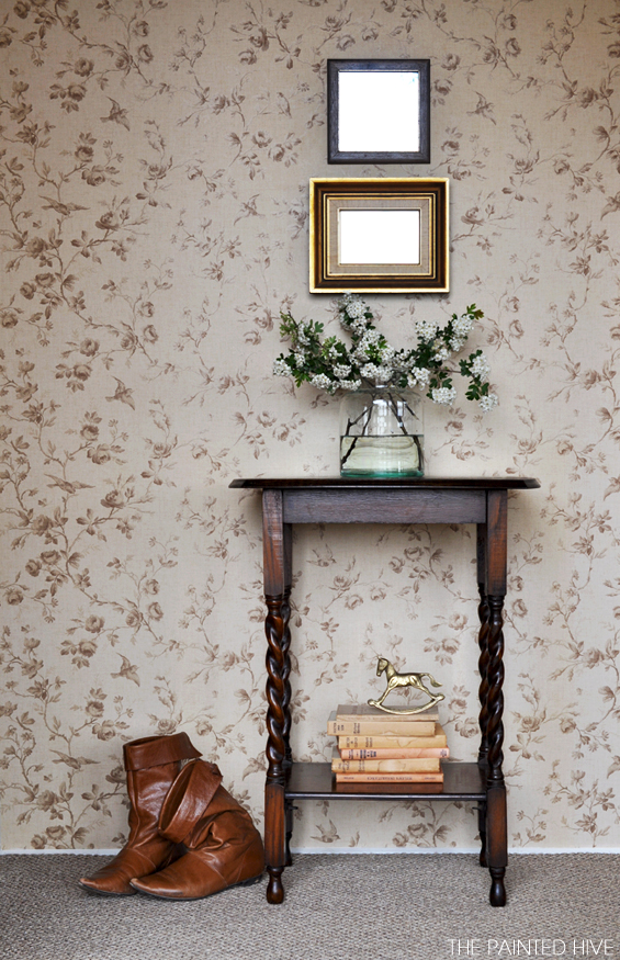
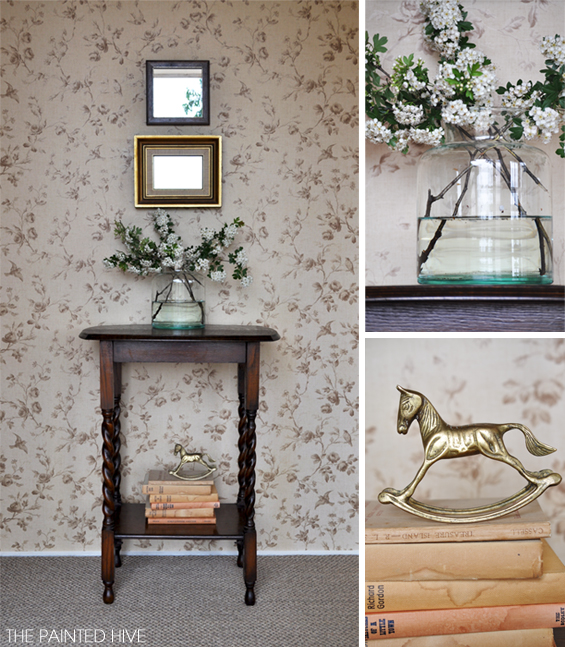
We rarely use the front door as our main entrance so there’s little need for practical paraphernalia (such as coat hooks, hat stands, mail dumping drawers or key collecting dishes) which gave me free reign to focus purely on aesthetics. Because it’s such a small space it is awkward to photograph so please excuse the lack of perspective. Anyhoo, here it is now…
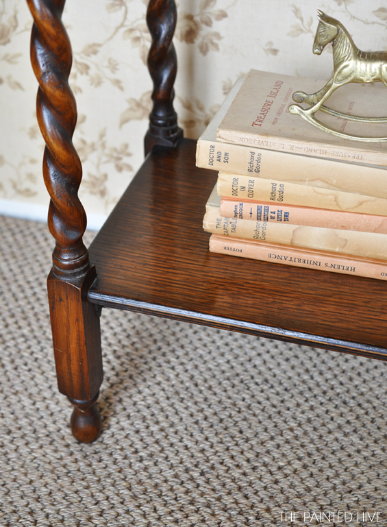
After a long search I found the sweet antique barley twist table on eBay and it was just what I’d been looking for. As can be seen in the above floor plan, the front door swings open to leave a petite gap between the adjacent wall so I needed something suitably narrow and the proportions and style of the barley twist table were just perfect.
I always get questions about my wallpaper. I put it up about five years ago, long before I started blogging, so sadly it never occurred to me to keep a record of the brand or design. All I can recall is that I purchased it from a Bristol Paint Centre and at the time it was around $45 a roll (at the low end of the price scale). I assume that by now it’s likely discontinued.
I already owned the jute rug. It was initially intended for use in a different room though it never quite worked in there so I decided to try it in the entry where it is surprisingly perfect. When I originally bought the rug (for its intended room), I couldn’t find one with the dimensions I needed, and after contemplating – then dismissing – various methods of making my own, I decided to have one custom made (argh, I know, the term ‘custom made’ makes me flinch too, though in this case it’s not nearly as scary as it sounds). Because the rug is quite narrow I negotiated to have it made from an off-cut that was left-over after a carpet installation (rather than having it freshly cut from a new roll). I saved over $100!
The mirrors are encased in cheap vintage frames I found at charity stores. I replaced the original artworks with mirrors I had cut by a local glazier. Don’t dismiss having mirrors cut because you think it might be too costly. My mirrors were only $5 each! Add that to the few measly dollars I spent on the second-hand frames and that’s two pretty thrifty pieces of wall decor!
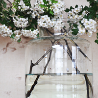
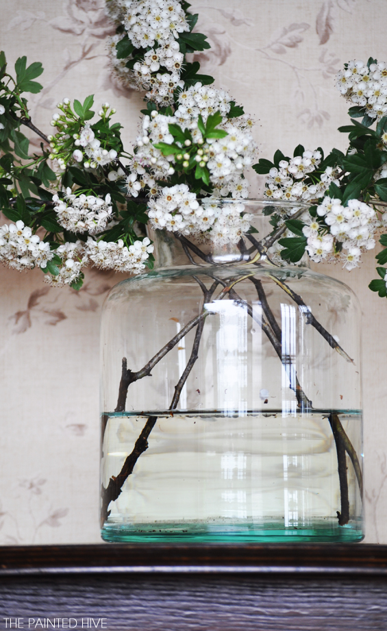
Given it’s mid-Spring here down-under, I couldn’t resist filling my oversized glass canister with apple blossom branches, though ordinarily I might use some fresh flowers (lots of options via flowers delivery Sydney), or even a potted fern as a more permanent solution.
Although I’ve moved towards a more traditional, vintage look the space feels somehow new. I’m sure in the future I’ll be nudged once again by the inevitable desire for change though for now I’m loving my revitalised entryway.
SOURCES
Jute Rug – International Floor Coverings ($80 custom made from an off-cut)
Barley Twist Table – eBay ($60)
Wallpaper – Bristol Paint Center ($45 per roll – brand and design unknown, may now be discontinued)
Glass Canister – Spotlight ($13 on clearance)
Wall Decor – Frames from Thrift Stores/New mirrors custom cut by a Glazier ($7 each)
Brass Rocking Horse – Gift ($unknown)
Vintage Books – Thrift Stores ($5 total)



I love the table, it is fabulous and your vignette is stunning. Beautiful entry. Hugs, Marty
Thanks Marty.
Ooh! I love the new look! That little rocking horse is sweet. A beautiful vignette.
I love that little rocking horse too. Mum gifted it to me years ago and my daughter Charlotte adores it as well.
Sweet, simple and beautiful! I love it!
Thanks so much Madalyn.
I really loved the old one but I love this even more! Beautiful, simple, classic and stylish. That vase of apple blossom has me swooning.
Isn’t it a shame cut flowers can’t last forever. Sigh.
Thanks for the comment Catherine :-)
That looks gorgeous!
Thanks Megan.
I loved it both ways but you had me with the barley twist! It does seem to be perfect with that wallpaper and I love that wallpaper! I think I just realized I love traditional too. Great job and great ideas!
Thanks so much Sandra.
I’m so glad I originally chose a relatively timeless, vintage style wallpaper. At the time it was tempting to opt for something bold and trendy though I still adore my little brown birds and you’re right, perhaps it was made for barley twist :-)
Lovely!! I like the simplicity of it.
We just finished painting two accent walls in our L–shaped living and dining room. As convenient as it was to retire to a fully furnished condo, it’s been like living in someone else’s house. This is the beginning. We took down the heavy cornice over the triple window (which looks very clunky in sunny FL) and moved a bunch of things around, adding two reading chairs and getting rid of two of hers. When it is fini, I will share pics. Blessings
Would love to see some photos MaryLena.
I’m sure it will feel like a breathe of fresh air once you’ve stamped your own identity on your condo.
Just beautiful….love the new look!!!
Thanks so much Shirley.
What a beautiful table! The space looks great. I had a similar space in my last house so I know how hard it is to decorate. My front door hit the bottom step when you opened it.
Well, that sounds like a well-designed entry. He, he.
It is a funny little space. You need to make certain you are standing to the left of the door before you open it otherwise you get trapped behind it and your poor guests are greeted by an invisible host!
First, get some Mr. Clean Magic Erasers (heavy duty ones), lol. Ta for the chuckle. Secondly, I love your new entry. That table was a find.(love the twist legs)..
Those Magic Erasers are kinda magic, aren’t they?
Thanks for the comment :-)
Oh I love that glass jar.. I have a weakness for cherry blossom myself but I am thinking apple blossom could take over :)
Hi Tessa :-)
I fell in love with the jar too. I found it at Spotlight and it didn’t have a price on it. I couldn’t believe my luck when the sales assistant swiped the barcode and told me it was only $13 – I’d been prepared to put it back on the shelf.
We are surrounded by old apple orchards here and at the moment the blossom is just lovely.
You are a shoo-in for a feature next week! This is the most beautiful thing! The styling, the furniture… perfection! Love it!
Thanks so much Rachel.
It’s quite simple for many people’s tastes so I’m glad you like it :-) I wasn’t quite sure how it would be received.
I love your blue bird dresser – so sweet.
Looks great! So glad you are back posting I have gained a LOT of inspiration from your posts! :)
Thanks Emma.
Love it! Thanks, I needed some inspiration! :)
How delightful. When I started reading the post I loved the “before” just as you said. But, given the limited space, this is so much a lighter feel to the space. Just lovely.
I love your entry table and vintage looking wallpaper. I have a lamp very similar to the legs and I absolutely adore it. Great inspiration!
It is gorgeous…so warm and homey! I also love the wallpaper. You have done a great job!
Simple, elegant, stylish. LOVE it.
I love your entry way. It’s beautifully simple and sweet. You did a lovely job in here.
Thanks Diana.
Thanks so much for sharing your fantastic makeover on your entryway on Simple & Sweet Fridays.
Happy Halloween!
Jody
So pretty, Kristine! (before and after!) I love changing/rearranging and your after is just so sweet and perfect for spring (wish it was spring here…I’m a spring/summer lover). I’m including a link back in this week’s highlights. Thanks so much for sharing. Inspiring! :)
I love both old and the new style:D!!
Can I ask you if you restained your table? if so, what color and brand? I love it!
Hi Alysson
I was lucky to buy it the way it is so sorry though I can’t help you with a stain colour.
Kristine
Hi, love all the clever ideas, just bought old house and so much to renovate and little cash……..i am hooked with your page
Thanks so much Aida.
I love it when my ideas help inspire others :-)
I love your decors, make-overs, your style and your creativity. I love your brass rocking horse and I can’t believe that I was able to buy one in a vintage store at Steveston BC. I now have it displayed in my entry atop books :) I totally copied you.
I love that little rocking horse too! It’s not copying, just fortuitous :-)
Very nice. I love the look.
Thanks :)