Every now and again, I get a question from a reader asking why I haven’t yet shared photos of my kitchen, bathroom and laundry. My usual response is generally along the lines of “because they’re pretty darn crappy”.
Yep, I know it might seem hard to believe, though all of our ‘wet’ areas still remain un-touched. Without going into too much detail, our kitchen, bathroom and laundry all require more than a mere aesthetic update, and whilst there are always temporary cosmetic changes I could have made, over the past few years I’ve chosen to focus my decorating energy elsewhere, and have been happily chipping away at our less demanding ‘dry’ areas (and walking through my kitchen wearing blinker hands).
Recently though, I have come to realise two, well actually, three, things; 1) we have reached the last of our ‘dry’ spaces (inevitable tweaking and updating aside), 2) I think I have finally found the motivation, courage, commitment and decisiveness needed to tackle some bigger, more permanent room re-dos, and 3) our shower is about to fall apart!
At the moment, finishing Charlotte’s room is my top priority, though once it’s done I’ll be moving straight on to our bathroom (which I may, or may not, have already started planning – so excitement!).
As is the case with most spaces in our home, Charlotte’s room is pretty miniature. It measures just 2.5 x 2.5 meters (8 x 8 feet), has a small built-in robe and a full length window.
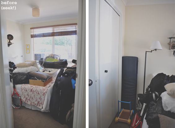
It was originally our guest room, which was never properly decorated, though it became more of a storage space/dumping ground after Charlotte was born…
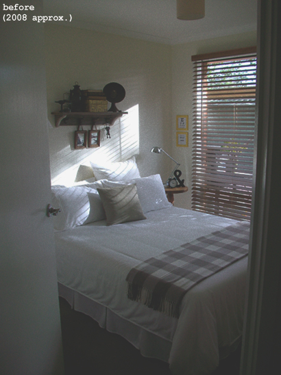
Holy moly! I had totally forgotten just how bad these before pics were! In my defence, I only remembered to take before photos after I’d already purged the entire wardrobe. The room was ordinarily much less hoarder-ly (my inner neat freak is hyperventilating just looking at these shots!). Here’s a much more respectable pic from about five years ago…
Ah, that’s better (kinda). As you can see, that standard double-sized bed consumes pretty much the entire floor area. It looks like the door is partially closed, though it opens onto an angled wall and is actually fully ajar.
I’m a bit ashamed to admit that poor Charlotte has been in her new room for around six months now with little more than a solitary single-sized bed. Thankfully, that’s all about to change!
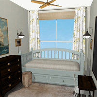
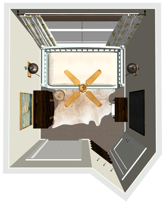
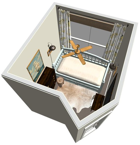
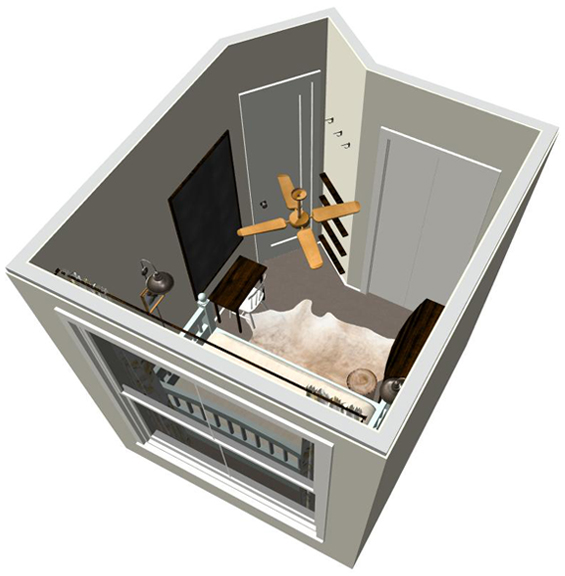
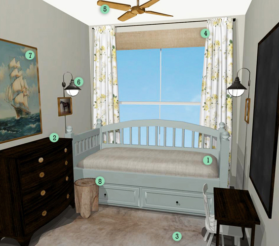
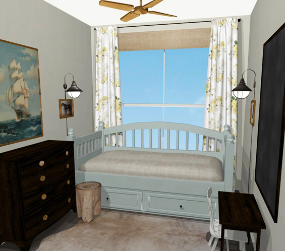
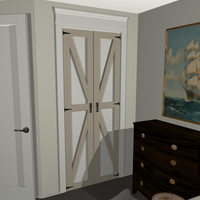
So, here’s my rough plan (furniture configuration and mood concept). Of course, the design of the actual room will be dictated by what bargains I can hunt down. Bear in mind that the virtual renderings are relatively basic. I hope to inject lots of personality with cute accessories and a sense of comfort with cozy bedding.
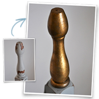
1 BED Deciding on the style and placement of the bed helped govern the overall scheme and layout. The best position for a single bed is against the window, and so it can be centrally aligned, a symmetrical ‘day bed’ style bed is ideal. As touched on above, and briefly blogged about here, I have already bought and re-finished (heavily modified) the bed (well, technically, beds – more on that to come!). I’m yet to finalise linen, blankets and pillows. The bed shown in the virtual plan is merely a basic representation of the actual bed which doesn’t have underneath drawers. I plan to create some large rolling baskets for storage instead.
2 CHEST OF DRAWERS To incorporate some warmth and character, and provide additional storage, I want a generously proportioned dark timber antique chest of drawers, similar to the one in our nursery. I contemplated using a free-standing cupboard or tall shelving unit instead though decided they would be too imposing in the small room. I also considered using a smaller, more traditional bedside table though figured a larger chest of drawers would provide more storage and better capitalise on the existing wall space.
3 RUG There is nothing wrong with our dark taupe carpet though I really like the dimension, texture and sense of cohesion a rug can bring to a space. Given the size and shape of the room, a rug with organic lines would be lovely (something like a faux hide or sheepskin). Failing that, a rectangular or circular jute rug would be almost equally as welcome.
4 WINDOW DRESSING This is brave for me! I generally like to keep window dressings plain and neutral, introducing sparing colour and pattern in more transient items, though I just can’t kick my craving for vintage style yellow floral drapes! I have been searching (slightly obsessively) for the perfect fabric, concentrating my hunt on affordable vintage bed sheets. I plan to hang the curtains from a natural bamboo pole. We have already installed a very dull, though perfectly practical, black-out roller blind which I plan to zhush-up with some textural fabric. The curtains will be functional though will remain predominately stationary, their main roles being to; hide the ugly ends of the roller blind, block the sneaky light creeping in from the sides, and look pretty.
5 CEILING FAN The big west facing window greedily consumes all of the hot afternoon sunshine, turning Charlotte’s room into a little oven! A ceiling fan is mandatory and we have already installed a simple antique brass one. I’m not a big fan of ceiling fans with attached lights though, as is the case with the fan in our master bedroom, Charlotte’s fan replaced the original ceiling light so re-incorporating it just makes too much practical sense (unfortunately).
6 WALL LAMPS I love the look of hard-wired sconces though given Charlotte’s room will likely see numerous configurations over the coming few years, I’m not ready to commit to that just yet. I’m contemplating installing corded wall lamps instead. We’ll see.
7 ARTWORK The wall décor shown in the renderings is simply suggestive. I like the idea of a big chalkboard, an eclectic gallery wall, small vintage prints, educational charts, large scale antique oil paintings in decorative gilt frames….I could go on :-) I’ll make a decision regarding artwork once the big elements are all in place and I can actually see the vacant wall space.
8 STUMP TABLE/STEP STOOL This is just a thought. I like the idea of placing a small, quirky element beside the bed though I’m yet to determine if it will realistically work in the space. We’ll see.
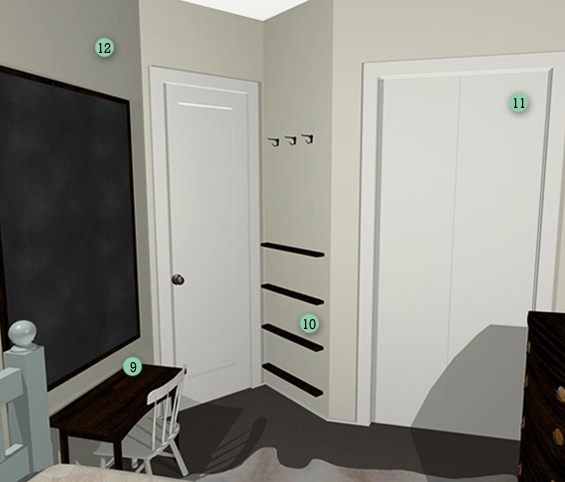
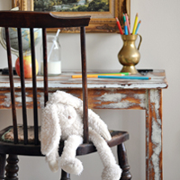
9 TABLE & CHAIR To avoid impeding the flow from the door, quite a narrow table is needed. I’ve found that most kid’s tables are far too deep, so I’ve been searching for a petite hall or coffee table to use instead, however finding something with appropriate proportions has proven tricky. We just might end up making something custom from scratch. To reference the chest of drawers I like the idea of a dark timber table with simple lines. To contrast this I want a rustic white chair with some character. I have been hunting for a cute cottage-y style kid’s chair forever! If you’re in Victoria (Australia) and happen to stumble across one, feel free to let me know :-)
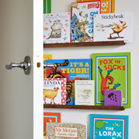
10 BOOKSHELVES To utilise the ‘dead’ space behind the door, I want to install a series of minimal floating bookshelves. Above these, a row of hooks can neatly collect strewn coats and hats.
11 BUILT-IN ROBE I have plans to clad the plain bi-fold panels with decorative timber trim to resemble antique barn doors.
12 WALLS Call me lazy, though we’re not painting. The existing soft cream (Chalk USA by Dulux) forms a great neutral canvas. In a few years time, when Charlotte claims greater ownership of her space, I’m sure the walls will probably wear some shade of pink (probably much to my dismay :-)
Soooo, whadya think? This will be my first attempt at a kid’s room so any ideas, suggestions or well wishes are more than welcome.
UPDATE There has been quite a bit of interest in the program I use to create my virtual designs. I’m lucky to have Chief Architect software (which I received as a birthday present a few years ago). They offer lots of different products, ranging in price from $60 (for home enthusiasts) to over $2000 (for professionals). It’s a powerful and complex program which takes time, patience and persistence to master (heck, I’m still learning) though it is pretty awesome.


This is too fun. I can’t wait to follow along. I LOVE the virtual design. The blue bed and floral drapes are too perfect. I wonder what you will find to bring that room into reality.
Oh yay. I am about to re-design my little girl’s room and I adore your style so I’m sure I will probably just completely copy you :) Nah, seriously, I love your plan for the space and can’t wait to see what you find/make!
Get out! That virtual plan is total amaze-balls. Love the farmhouse style and simple color palette. The giant chalkboard will be awesome…definitely do that one.
Love, love, love your vision for this little room. I’m looking forward to seeing all your tutorials for the DIY projects. Especially the bookshelves and closet doors. You write the best tutorials.
And am really interested in seeing the amazing fabric I’m sure you will find for the curtains :)
Hi there Kristine,
It looks so good!!! Can’t wait to see it for real! Exciting!
xo,
Shannon
OK..I Luurve this. I can only imagine what the finished product will look like and I’m sure the bargain hunting will be the best part. I’m totally digging the virtual design, can you tell me what program you used? I could use this kind of help visualizing my kitchen & living room redesign. Awesome job!
Thanks Diona.
I use Chief Architect software. They offer lots of different products, ranging in price from $60 (for home DIY’ers) to over $2000 (for professionals).
It’s a powerful and complex program which takes time, patience and persistence to master (heck, I’m still learning), and there are some frustrating limitations, though overall it is pretty awesome.
Kristine
Kristine, I love the new look. I agree with Diona. Can you tell me which software program you use to do the renderings?
Hi Ellen.
I use Chief Architect software. They offer lots of different products, ranging in price from $60 (for home DIY’ers) to over $2000 (for professionals).
It’s a powerful and complex program which takes time, patience and persistence to master (heck, I’m still learning), and there are some frustrating limitations, though overall it is pretty awesome.
Kristine
love the very grown up design with the feminine touch!
Thought I would throw my opinion in the ring! Your plans and details are great! I applaud you for what seems to be careful planning! I have 2 suggestions. I’ve seen before a very small desk that has no legs, but attaches to the wall! What I’ve seen has a piece of wood on each side, kind of like a bracket. And, I would put some serious door stoppers on the door. With anything on the angled wall, the outside door would constantly hit it (trust me on this).
Love it and can’t wait to see the finished project!
Thanks Pat.
I know what you mean about the angled wall. The door already does have a great stopper with a catch (as installed by the previous home owners). We would certainly have a huge hole otherwise!
I considered attaching a desk to the wall (even thought about one that could fold away completely) though as it will be Charlotte’s only ‘play’ table I want her to be able to move it around.
Kristine
What program did you use to create your mock up? Love it!
Hi Julie.
I use Chief Architect software. They offer lots of different products, ranging in price from $60 (for home enthusiasts) to over $2000 (for professionals).
It’s a powerful and complex program which takes time, patience and persistence to master (heck, I’m still learning), and there are some frustrating limitations, though overall it is pretty awesome.
Kristine
Nice design plan! Also curious about the design program your using :)
Hi Tiare
I use Chief Architect software. They offer lots of different products, ranging in price from $60 (for home enthusiasts) to over $2000 (for professionals).
It’s a powerful and complex program which takes time, patience and persistence to master (heck, I’m still learning), and there are some frustrating limitations, though overall it is pretty awesome.
Kristine
Can’t wait to see the cupboard doors. Will keep my eyes open for that chair!
Thanks Etta :-)
I love this! It looks like you spent a lot of time and detail in this. I would love to see how this turns out!
Such a great plan. I just know the finished room will be awesome.
I so admire the vision you have for your little rooms. We have a small house too and I always find myself wanting more. You remind me to be grateful for and make the most of the space I DO have.
What a great design board! I love all your ideas. Can’t wait to see it all put together!
Hugs,
Jamie @ somuchbetterwithage.com
Hello, I check your blog regularly. Your humoristic style iis witty, keep doing what
you’re doing!