Well, hello there.
Sorry I went missing over the whole of December. Yikes!
And thanks so much to everyone who asked where I was at.
Things just got a little hectic, as they do for everyone at this crazy time of year, though clearly I’m less adept to multi-tasking than most of my more efficient blogging counterparts.
I hope everyone had an awesome Christmas and is looking forward to an amazing New Year! Thanks soooooo much for your e-friendship over 2015!
Anyhoo, I’ve made a surprisingly (for me!) good start on the open plan living-dining room makeover I’m currently working on for my parents.
A few purchases have been made, some refurbishing has commenced and we’ve even narrowed-down options for most of the ‘still-to-be-obtained’ items.
So, I thought I’d share where we’re at.
Remember, you can read more about the room plan, and see some before photos and additional pics of the concept rendering, in my first post here.
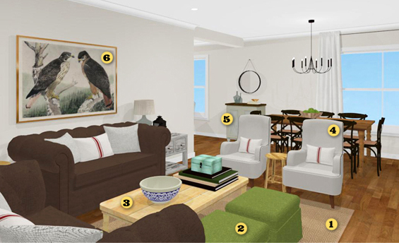
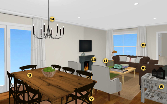
Here’s the virtual plan…
1 RUG
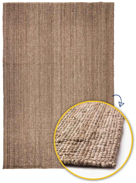
This baby needs to be pretty big – around 2 x 3 meters (7 x 10 feet). I would love to use a herringbone sisal (as shown in the rendering) or an over-dyed traditional though they are just too pricey so we’re thinking of going with the Ikea LOHALS.
This jute rug has a lovely nubby weave and natural tonal variations which will add texture and warmth to help break-up the hard surfaces in the space. From experience, it’s also an easy rug to keep looking clean.
2 OTTOMANS
The room already had two ottomans though with the narrower coffee table some larger ones are required to help balance the center of the seating area. I want these to be pieces of furniture unto themselves, not merely pokey boxes meant for little more than supporting lazy feet. After lots of searching, and even taking repurposing into account, we couldn’t find anything quite the right size (which didn’t cost a zillion dollars!) so decided to make our own. This is a relatively simple process of constructing a timber box, attaching foam to the top then sewing a slip-cover to fit (or attaching fabric directly).
We’re yet to finish these though the bones are complete. Although I’ve used a green fabric in the rendering, Mum is leaning towards a neutral instead. The great thing with slip-covers however is that they can be easily interchanged, so we can always make a few different ones and switch things up from time to time.
3 COFFEE TABLE
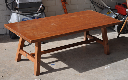
I used a pale turned-legged table in the rendering though recently came across this stretcher style one on eBay for just $10 and couldn’t say no.
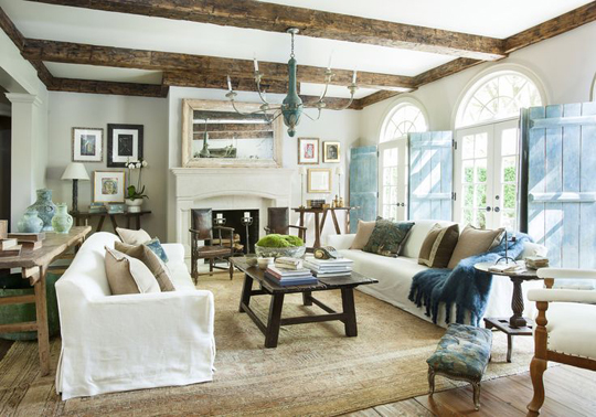
It reminded me a bit of the larger, more primitive table in this lovely living room I have saved on Pinterest.
Our table is genuine mid-century and made of solid teak. Dad has already removed the metal rosettes and cleaned and oiled the wood to improve the colour consistency, conceal the scratches and add a soft lustre. It looks quite orange in the sun-drenched photo though in reality is more of a golden brown. Ordinarily I would probably be tempted to stain it walnut though in this case I want to steer away from anything too dark due to the brown sofas. Hopefully the warm toned wood offers a nice contrast.
4 ARMCHAIRS
Upholstered items are always the trickiest for me. I struggle with the concept of buying brand new furniture (mainly due to the expense) which is fine when it comes to timber pieces which wear their age well and can be easily refreshed with a simple coat of paint. Though most second-hand upholstered items simply look worn, tired and dirty and need to be completely recovered, a task which for me takes A LOT of time, patience and swear words.
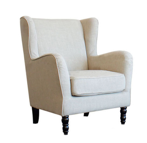
Luckily, I was introduced to Ned’s about a year ago. I’ve mentioned this store before. They have some super affordable stylish furnishings and homewares and offer free national delivery on lots of their items. We couldn’t go past these taupe wingback armchairs.
Normally retailing for just $350 each, I was super fortunate to be able to negotiate a two for one deal!
We’re toying with the idea of painting the feet or maybe even switching them out for something a little more sleek. We’ll see.
UPDATE
The same day I published this blog post, Ned’s ceased selling online. They are still retailing from their bricks-and-mortar stores which are all located in South Australia.
5 CABINET
I’m still hunting for some kind of small storage cabinet for the wall behind the dining table. I think I’ll probably end up using an old chest of drawers, painted in a soft white or warm grey to contrast all the wood.
6 ARTWORK
I’m currently tossing-up between using a gallery, grid or one statement piece above the sofa. I’ve actually fallen a bit in love with the Rex Brasher illustration I have used in the rendering (Harlan and Alaskan Redtail Hawks from Birds and Trees of North America).
It has perfect proportions and the subtle colours and masculine edge are just so beautiful to me. I’ve found a few sources for acquiring a digital copy I may be able to enlarge though all up it could be a little pricey. I just cant track down a free printable version even though I believe the illustration is now out of copyright. It shouldn’t be outlandishly expensive or anything, just a tad extravagant for this budget-conscious decorator.
7 DINING CHAIRS
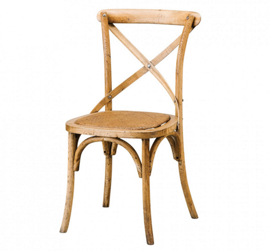
The problem with wanting to use cross-back chairs is that they’re just so timeless and versatile. Doesn’t sound like a problem? Well, having those qualities means they hold their value really well so picking-up a cheap second-hand set is difficult – especially when you’re looking for eight! In fact, most of the used chairs I found were priced similarly to the brand new ones!
After searching for a few months, we decided to bite the bullet and purchase some from a store.
Mum chose these oak ones from Early Settler. Usually $150 each I was lucky to get our set of eight for around $700. I know that doesn’t sound super cheap though for these chairs it is an incredibly great price and mum is super happy – she has always wanted some!
8 SIDE CABINET
This piece is proving difficult. The main issue being the general size we’re after, particularly the height. The rendering shows a table which is quite a bit shorter than the sofa however we’ve decided we need a taller piece which can be viewed upon entering the room (the main entrance is through the doorway you can see on the far right in the above rendering). However, whilst we want something taller, we don’t necessarily want something bigger overall – which will protrude too far beyond the armchairs into the ‘dining area’. Because the sofa arms are quite high this means we’re looking for a piece with unusual proportions. Of course, if we were to go to a few furniture stores we would probably find what we need, though as I’m trying to buy used items our options are somewhat limited. That said, I’ve only been looking casually and am confident I will find something when I step-up my search. Failing that, we can always look into making something custom.
9 DINING TABLE
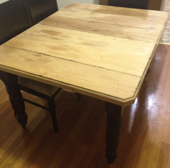
To introduce some farmhouse charm, the idea was always to use a rustic old table. Large ones can be pricey though with some patience I found this one on eBay for just $80.
Please excuse the crappy photo – taken from the eBay listing.
It needs a little work (cosmetic and structural – nothing too major) and isn’t quite as long as I would like though is full of character and is a genuine antique farmhouse table. It has gorgeous turned legs, cute original castor wheels, an extension leaf – which we’ll leave in permanently – and it even came complete with the original charming hand-crank! It is tempting to simply stain the top walnut to match the legs though, as with the coffee table, due to having brown sofas in the living room I want to stay away from any more dark furniture so we’ll probably strip the original varnish off the legs and leave the whole thing natural. I like the idea of having an un-coated scrubbed surface though I think my parents would prefer to seal it. Hopefully applying a sealer doesn’t diminish the lovely raw quality I want to retain.
Although this is an eight seater table, and I’m confident it will seat eight, maybe even ten, if need be (for dinner parties and so on), I’m not confident that eight cross-back chairs will neatly push in around it, mainly because their back rests are so wide. So we will probably end up with only six chairs around the table ordinarily. The additional two might go around a small table in an adjoining breakfast nook, to be pulled up as required.
10 SOFAS
These are my parents existing sofas (you can see them, for real, in the before photos).
11 TRUNK
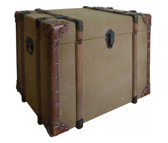
I came across this gorgeous canvas case ages ago.
It was being sold on eBay through the Schots clearance store for $130. I did a bit of research and discovered that was a really great price so decided I needed to have it. Sadly, I couldn’t conjure up a place for it in my own home so turned to my parent’s house. I figure it should sit beautifully beside one of their sofas.
12 FIREPLACE
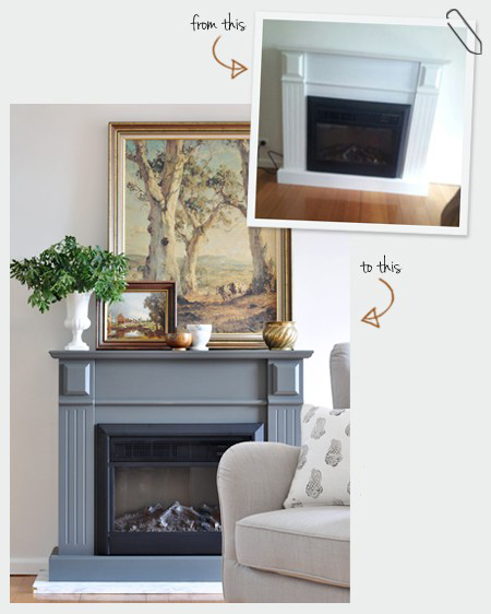
As previously blogged about the electric fireplace has already been transformed.
Sadly, it won’t be styled like this due to the placement of the TV. Dad has actually already mounted the TV above it, and as suspected, the fireplace is completely dwarfed! Oh well. My Mum has a thing for fireplaces and bought it months and months before we even started planning the room makeover. It was on sale from one of those ‘deals websites’ so it’s not like she had options in terms of size, though a slightly larger one would have been better. We might look into using some flanking shelves if needed. Otherwise, meh.
13 CURTAINS
The room already has sheer white curtains, which are okay, though I want to upgrade them to something a little fuller with a bit more warmth and texture. Mum usually makes her own curtains though is a bit time-poor at the moment so we’re thinking of maybe going with something off-the-shelf from Ikea.
Mum has already installed roller blinds to do the actual work – light blocking, privacy, climate control – so the curtains panels will be merely decorative. Their main job is to hide the ends of the roller blinds. Adding some softness and movement to the windows is a bonus.
14 PENDANT LIGHT
We’re not totally sure what we’re going to use here.
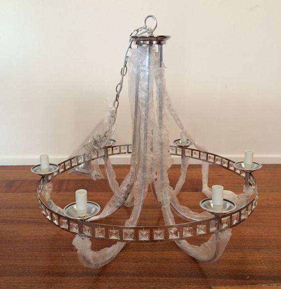
A little while back I found this amazing pendant on eBay for just $40.
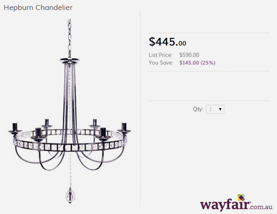
It was being sold as “display stock” as part of a lighting store clearance and after some research I couldn’t believe the actual retail price!
Yes, this is the exact same light!
Although it’s fine as is, and we’re open to incorporating a bit of bling, in person it actually looks a little tacky. It’s also perhaps a bit too blingy for the natural feel we’re going for so I have plans to give it a slightly rustic makeover (don’t fret, despite the hefty pricetag all the ‘crystals’ are simply plastic and the metal is only lightweight aluminium). Unfortunately though, the dimensions given with the eBay listing were inaccurate so it’s quite a bit larger than we wanted. Hopefully we can make it work. If not, it’s back to the drawing board on the light fixture.
So, that’s it for now. I’m still undecided on most of the general decor – soft furnishings, lamps, other wall art, accents pieces – though that’s fine. I always find accessorising the most flexible and fun bit.
What are your thoughts? I’m super open to ideas and suggestions.


Looking great. Can’t wait to see the room!
Love your inspiration pieces and room. And BTW if the light proves too big…..let me take it off your hands!!!
He, he. Sadly, I really do think it might be too big :(
It is going to look lovely! I can hardly wait to see the finished rooms! I love your style, and the fact that you are keeping things real by using what you have, used and sale items!
Thanks Dianne. I’m so glad you mentioned that because “keeping things real” can often be the most difficult and time-consuming part! I know that probably sounds strange though it’s an aspect I go to lengths to incorporate – both for my readers and myself.
Check out this post from A Painted Hive. You may be able to find the print you want, or something close for free, plus the cost of the printing. https://thepaintedhive.net/2015/11/a-famous-bird-illustration-and-where-to-get-your-own-for-free/
Ha, ha. Thanks for the “tip” Suzy (I’m almost not sure if you were being sarcastic or not – you needed to include a winky smiley or something, LOL).
Yes, obviously I know there are a heap of free printable bird illustrations out there. For some reason I just fell in love with that Rex Brasher one. Not sure if we’ll end up using one large print or a gallery though. I’m leaning a little towards a gallery at the moment.
Kristine,
The room is coming along great! I admire your skill (and patience) at finding that “right” piece. Good eye. Looking forward to the next update. :)
Thank you Deb :)
I am genuinely curious and can’t wait to see the transformation and all the steps in-between. :)
Thanks :)
Very neat!
Woo… This dinning hall is really very impressive.
I really liked your pendant light.. :)
Great work!!
Wow! Amazing pieces! I am planning to update my space or add a few pieces to it. Thank you for sharing. This such an inspiration.