Further to my last post about the cottage kitchen renovation at our friend’s beach house, I had another idea about a possible layout option…
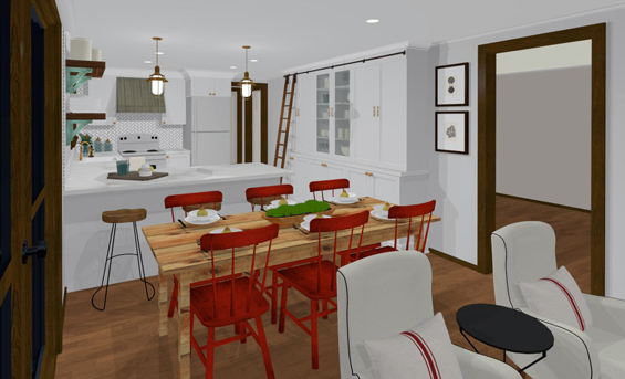
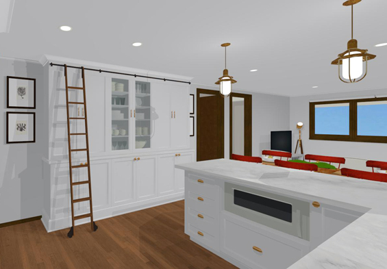
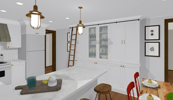
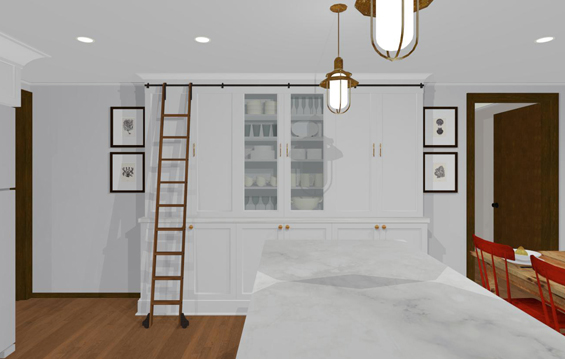
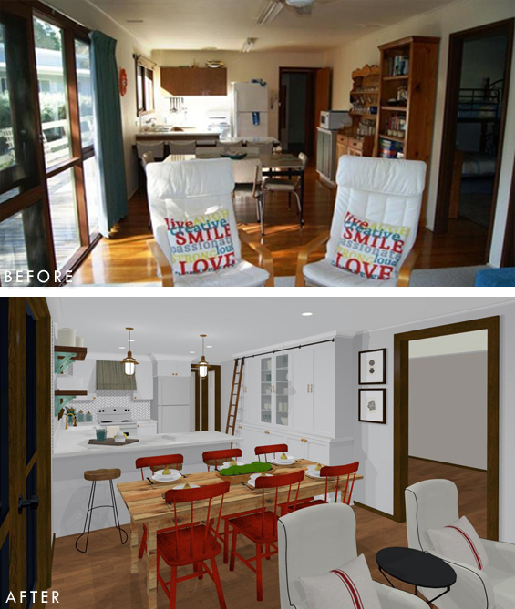
If the symmetry of the ‘U’ was skewed slightly by reducing the length of the peninsula then a bank of narrow cabinets could span the whole right wall!
Yes, this is a slightly more “full-on” look though something about it is quite grand. And the storage it provides is amazing!
The compromise would be losing a tiny bit of counter space and possibly one seat at the breakfast bar though I think it’s worth it. Naturally, it would also be a more expensive option though that’s something for our friends to consider.
I included a rolling ladder just for fun (this might not actually be practical) and gave the central cabinets glass fronted doors for displaying pretties though of course these features aren’t necessities.
Another thing I did, which I should have done in the other plans too, was remove the door from the doorway beside the fridge. I couldn’t think of any good reason the door would actually be used and having a simple doorway with no door would help open-up the wall space beyond, making the entrance feel less narrow.
So, what do you think. Does extra cabinetry help a small kitchen appear more expansive? Or does it constrict the space further? And regardless, does the added storage take priority?
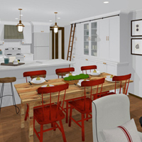
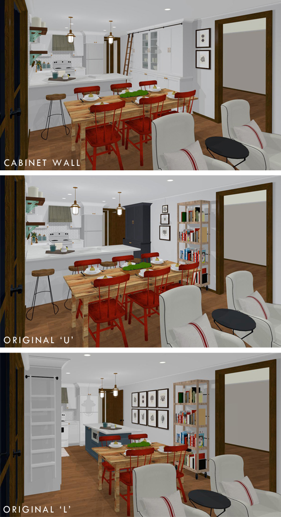
Here are the three plans for comparison’s sake…
PS I’ve just finished designing my next round of free printable quote art and will have it up on the blog next week!


Hm, well I like the bank of cabinets and although it does seem to compress the space a bit it also extends it. Also looks very bespoke and I think the storage does win out.
I love the kitchen with the added storage.
The ladder is a toe killer in a beach cottage.
LOL, yes, I mentioned it might not be practical though it’s so cute!
I love the large unit of cabinetry. It looks great. It offers more storage and gives the whole room a more cohesive look. I love the colour grey on the cabinet in the other photo. Maybe you could paint the kit door that colour if you wanted to but overall I love the huge white unit especially with the glass doors. They make it. Love the ladder too but would it get in the way of traffic coming through that door? Otherwise I love this design..
Thanks Marie. Yes, I love the hint of charcoal in the other designs too and miss it in this one. I tried it on the new wall of cabinets though even if it was only on the base it was far too dominant. I wonder if they could perhaps paint the fridge bluey-grey? Or maybe the rear of the peninsula?
Yes, the ladder might not be practical though it is sweet. Another option would be to have it mounted to the side of the cabinet (like in the ‘L’).
I think the wall of cabinets took that kitchen up to a whole new level!!! I love the way you added glass fronted ones to break up the bulk. And that ladder, whether it gets used or not, is a great design touch.
Thanks Valerie :)
I love the storage, but still don’t like the Peninsula as it crams the eating area. The chairs at the table and the stools at the bar are too close together. I still think an island works best as women want a work space which is handy to the sink, stove, and refrigerator & the peninsula does not offer that, whereas an island would. Which does your friend prefer? Is she a cook who would want the convenience of an island being handy to everything, or is she interested in having lots of storage while giving up space in her eating area? If they do a lot of entertaining at the beach, I would think having a more open floor plan would work best, however it really doesn’t matter what you or I like…. it’s what your customer prefers.
Thanks so much.
The home owners are leaning towards the ‘U’. I think they feel more comfortable retaining the existing layout. Plus the ‘L’ does push the cabinetry into the dining zone which reduces the available width for a dining table. You’ll notice that in the ‘L’ I have used a smaller four seater table, otherwise there wouldn’t be room to move between it and the pantry cabinet. And if I had used a longer six seater and pushed it further over to the right it would then block the main throughway to the living area.
In reality there should be plenty of space between the peninsula stools and dining table chairs. I’m really only adding one cabinet to the base of the existing ‘U’ so the position of the peninsula will be similar to where it currently lies (and you can see in the ‘before’ pics that there is ample space to play with). Yes, they might need to use a narrower than standard dining table and/or more compact seating in the living area so they can push the dining table further down though it can definitely work without being cramped.
The ‘U’ is only around 1.8 meters/6 feet wide so everything will still be close at hand.
:)
I LOVE the appearance of the wall of cabinets but they should make a decision based on their NEEDS!
Of course, they will Grace. These renderings are just to help give them a visual idea of some of the options. And sharing on my blog and hearing other’s opinions is just for fun :)
Oh dear, I don’t think my comment came across the way I meant for it, to! This is great fun and I wasn’t suggesting otherwise!!
LOL, of course not Grace. Maybe my comment didn’t come across as intended!
:)
I really like the cabinet wall design but think that the ladder would ultimately be annoying. The high stuff won’t be used frequently enough to put up with the ladder obstacle. A step stool would be a better option. Alternatively, if you could have the library track wrap around and provide a “resting” place for the ladder, that might work.
Really impressed with your skill set in Chief Architect. I’ve been using the software for about 2 years while my husband and I design our dream home so I know about that learning curve.
There was one thing that concerned me on all the plans. It may just be an optical illusion because of CA but I think the range/stove is too close to the window wall. My concern is that any pull/handle on the sink side cabinets will interfere with operation of the door on the range/oven. A larger filler piece left of the range with slightly smaller cabinets on the right could solve the issue.
Enjoy your blog!
Yes, I thought about some kind of wrap around for the ladder. Or perhaps just having it on hooks so it could “live” on the side of the cabinet (as with the ladder in the ‘L’ shaped plan) and be moved as needed. Otherwise a cute step stool would be fine. Not even sure if the homeowners will go for floor to ceiling cabinetry anyways.
Yes, you’re right about the stove. It does need a little filler piece and I’m sure this will be adjusted when the actual cabinets are installed. These plans are really just designed as a visual guide, they’re not “exact exact” if you know what I mean. Thanks :)
the original, they have a cabinet, a hutch and a bookcase on that wall kind of a mishmash so the wall of cabinets look way better and provide storage which if their kitchen is anything like ours is needed because things just seem to multiply, the ladder although way cool would have to go, it is a child magnet if i ever saw one haha, this kitchen is my favorite so far xx
Thanks Chris.
Love it! What are the dimensions from the edge of the peninsula to the fridge?
Thanks Judy. According to my plan it’s around 1.8 meters/6 feet. Of course, this may be adjusted in reality.
I love this! The ladder especially is pretty to-die for. But… not with the U shaped design. The U design is going to be difficult to work in on its own. Adding the cabinets on the other side may make it feel more clustered than before. Perhaps stick to the L, but remove the island, keep the new cabinets and ladder?
Thanks JD. The home owners are leaning towards the ‘U’. I think they feel more comfortable retaining the existing layout. Plus the ‘L’ does push the cabinetry into the dining zone which reduces the available width for a dining table. You’ll notice that in the ‘L’ I have used a smaller four seater table, otherwise there wouldn’t be room to move between it and the pantry cabinet. And if I had used a longer six seater and pushed it further over to the right it would then block the main throughway to the living area.
Unfortunately removing the island from the ‘L’ and incorporating the cabinet wall would leave almost no counter space. It would feel spacious though! You could still have a central island of some kind though it probably couldn’t incorporate a breakfast bar which might reduce seating options too much.
I love this design! (but I’d probably lose the ladder) Storage is paramount because a beach house is sure to attract friends and family… necessitating space for food, extra dishes, cutlery, dish ware, etc. We have a lake house and recently renovated its kitchen. We tried to make an island fit, because we liked the idea of it. The reality was it just wouldn’t work well with the space we had to work with. We also liked the idea of a peninsula with seating… but it was just too tight with the dining table and chairs behind it (like you have here). We ended up with a peninsula (without seating) that serves as a work space, as well as serving space. And, lots of storage. We love it and I think your friends will greatly appreciate and use the storage space and peninsula. Sometimes, an island just doesn’t make sense in the space you have to work with.
Thanks so much Maureen. In reality there should be plenty of space between the peninsula stools and dining table chairs. I’m really only adding one cabinet to the base of the existing ‘U’ so the position of the peninsula will be similar to where it currently lies (and you can see in the ‘before’ pics that there is ample space to play with). Yes, they might need to use a narrower than standard dining table and/or more compact seating in the living area so they can push the dining table further down though it can definitely work without being cramped.
Great stuff and my vote is for the cabinet wall design. Although I love the “library ladder” I don’t believe it’s necessary or goes well with this particular kitchen design. And like Maureen, I wouldn’t have any seating at the peninsula ~ excluding them frees up a little more space in that area.
Love the ladder. The design seems to work well. Did I say I love the ladder?
Ha, ha. It is cute Rhonny :)
You can never have enough storage so I think reducing the peninsula and adding in the narrow bank of cabinets is practical and looks great too.
Thanks Cathie.
LOVE it. It sits well in the space and then provides an integrated pantry and storage for all the games, books, DVDs etc for the lounge room, neat and tidy behind doors. Fab!
Thanks Julie. Yes, that’s what I thought. The cabinet closest to the living room could hold all of the “living room” stuff.
The cabinet wall is a brilliant idea! I like the extra storage, and it gives the space a cleaner feeling feeling as opposed to a free standing cabinet and book shelf.
I like the cabinet wall option best!
What I love is how you can show your ideas through your computer. Do you think this could help someone like me on a tight budget to plan their home or is the software designed more towards people in business? If you think it might help me can you recommend any computer software for a laptop, please?
Hi Rachel
Yes, I do think it could help – though it does take some learning. Have a look at the Home Designer product chooser: https://www.homedesignersoftware.com/products/product-chooser.html. I believe you can download a free trail before making a purchase. The Interiors version is designed for home enthusiasts, not professional designers, and is very affordable.
Kristine