I know it’s been a long time coming, though the most protracted bathroom makeover in history is ready for its close up…or wide angle…or medium range shot…or whatever sort of photo it takes to finally get this bleeping room up on the blog!
There’s really no good reason it’s taken me several months to complete. I mean, it’s not astoundingly brilliant, we didn’t run into any issues. I guess, as a low priority project, it just took as long as it took. If you’ve been waiting for the reveal, I’m really sorry for how bad I suck at time management, and hope the room is decent enough to somewhat make up for it.
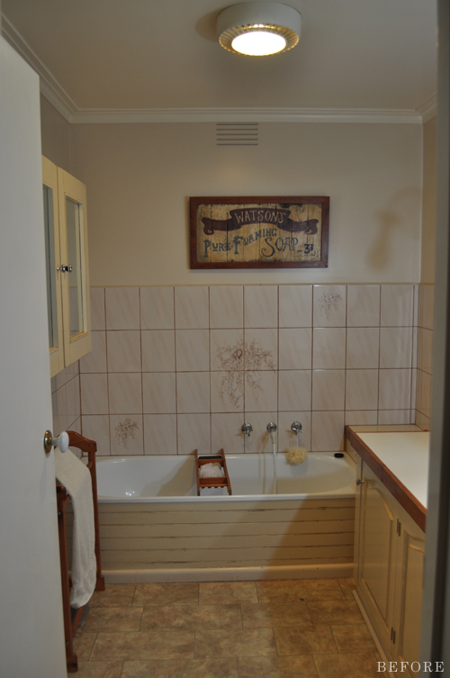
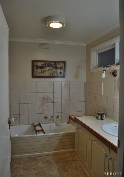
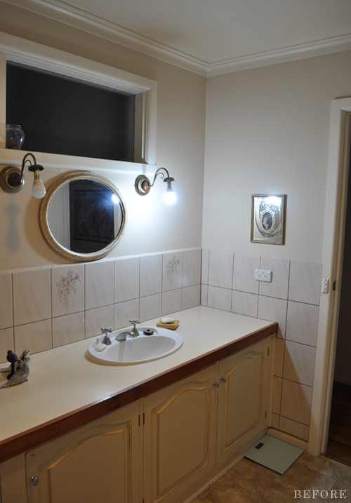
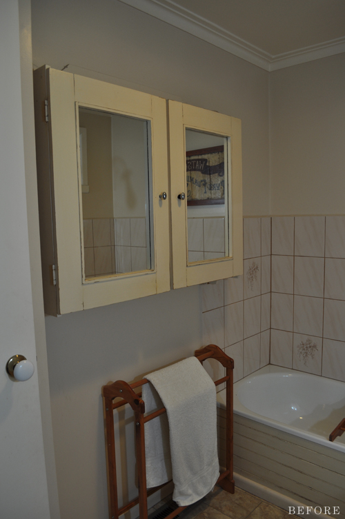
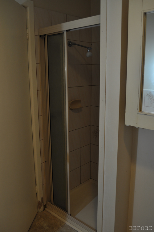
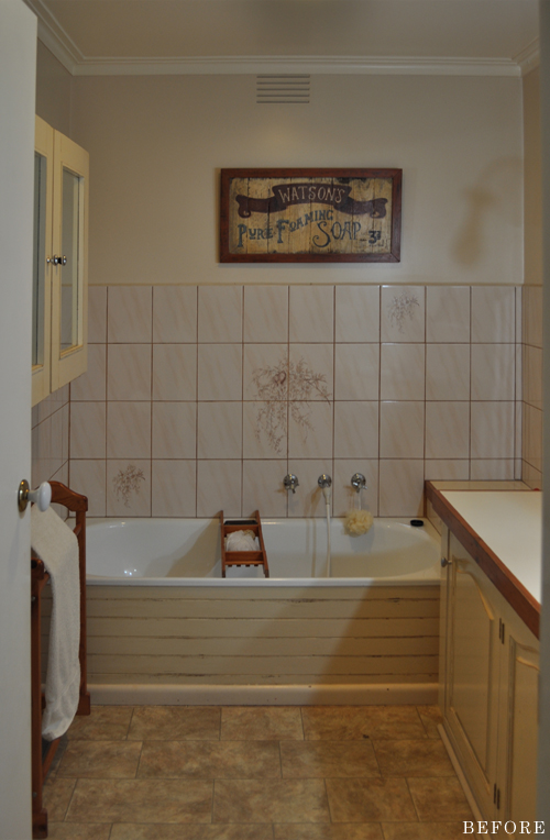
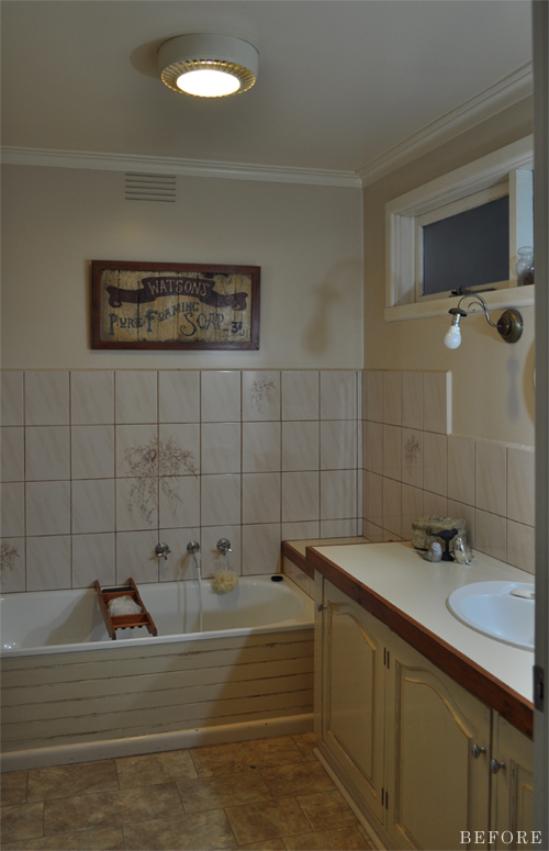
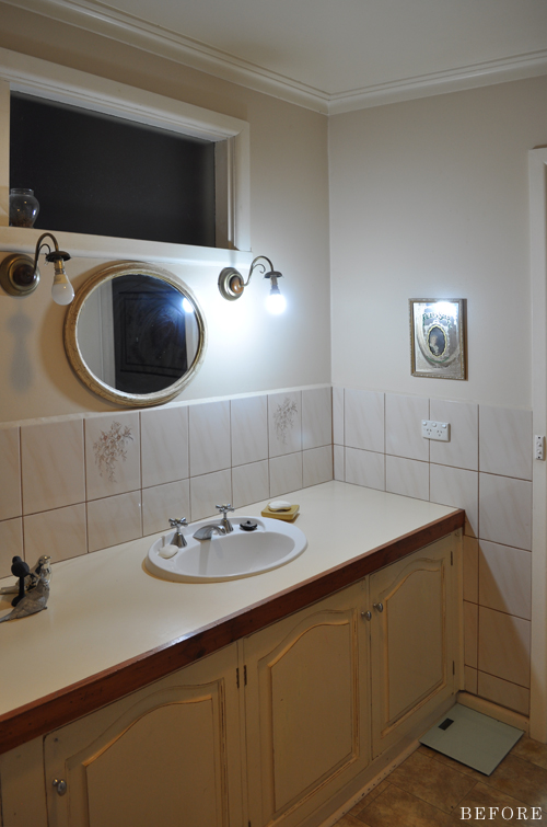
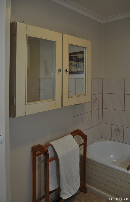
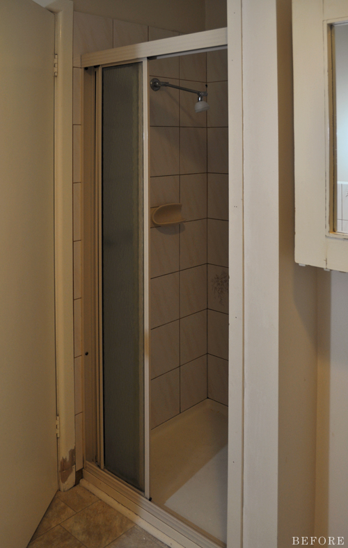
This is the main bathroom at my parent’s house (as they’re now empty nesters it’s rarely used – hence my lack of urgency in getting it done!). They originally renovated it around 25 years ago and, as you can clearly see, it was badly in need of an update.
Sorry, had to take the before shots at night before we started working on it.
Hello beige and cream!
Aside from looking pretty darn ugly, there wasn’t anything really ‘wrong’ with the space. I mean, nothing was badly broken or overly damaged, it functioned well and had everything it needed (there’s a toilet in a separate room). Although a major renovation would have been nice, it also would have been unnecessary – not to mention super pricey. Besides, there’s just something incredibly rewarding about transforming what you already have.
So that’s what we did!
Aside from the shower base and vanity top, which mum chose to have professionally refinished, the installation of a new shower screen, and some minor plumbing and electrical work, which some friends helped with, my parents and I did everything ourselves.
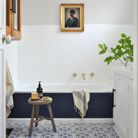
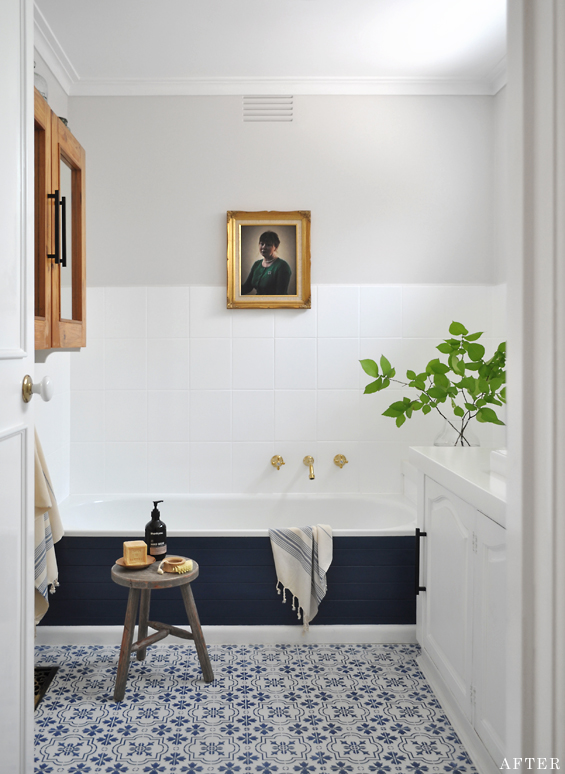
It’s funny, though we never had a distinct design plan. Our main objective was simply to give the room a fresh, bright, sophisticated-yet-comfortable feel. And because mum loves blue and white we decided to start with that and go from there. Luckily, for some strange reason, she trusted me and it all seems to have worked out!
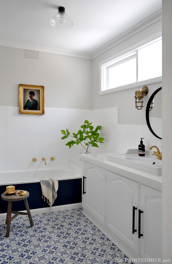
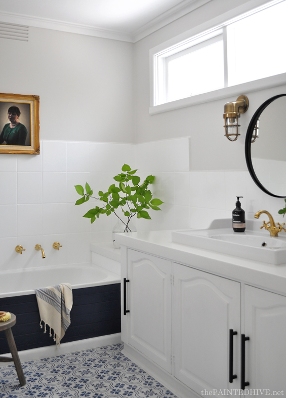
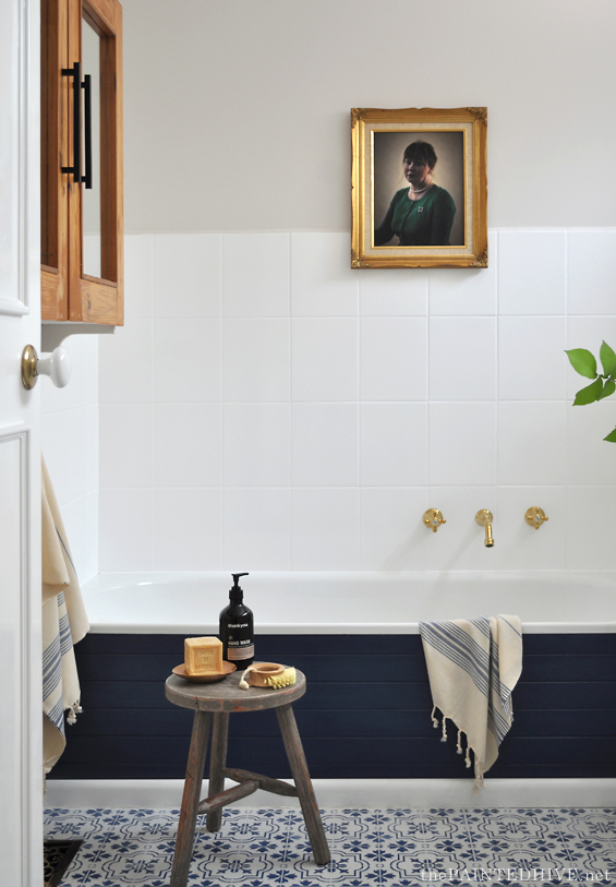
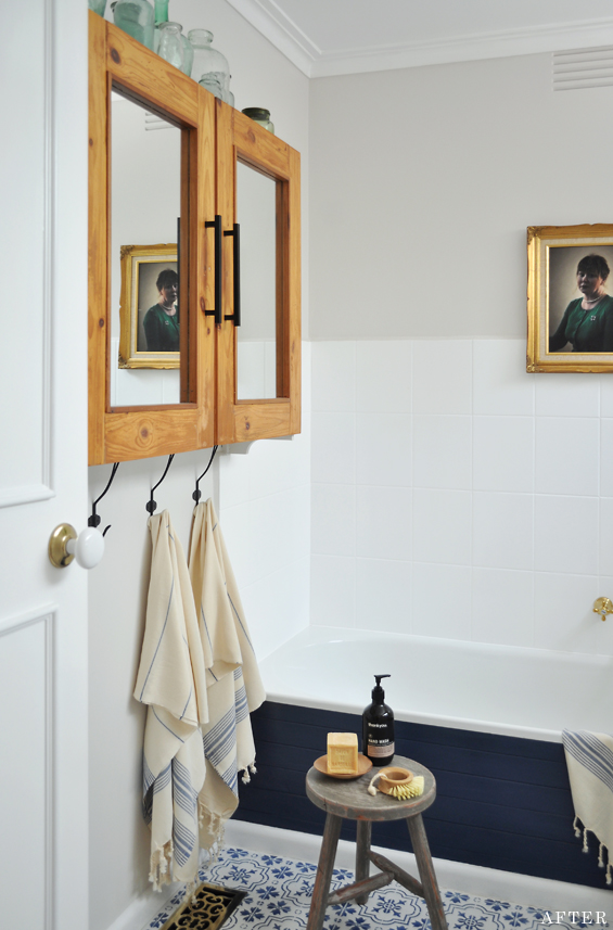
Paint was a MAJOR player in this transformation! The floor, tiles, walls, ceiling, vanity, bath panelling, door and architraves were all freshly coated.
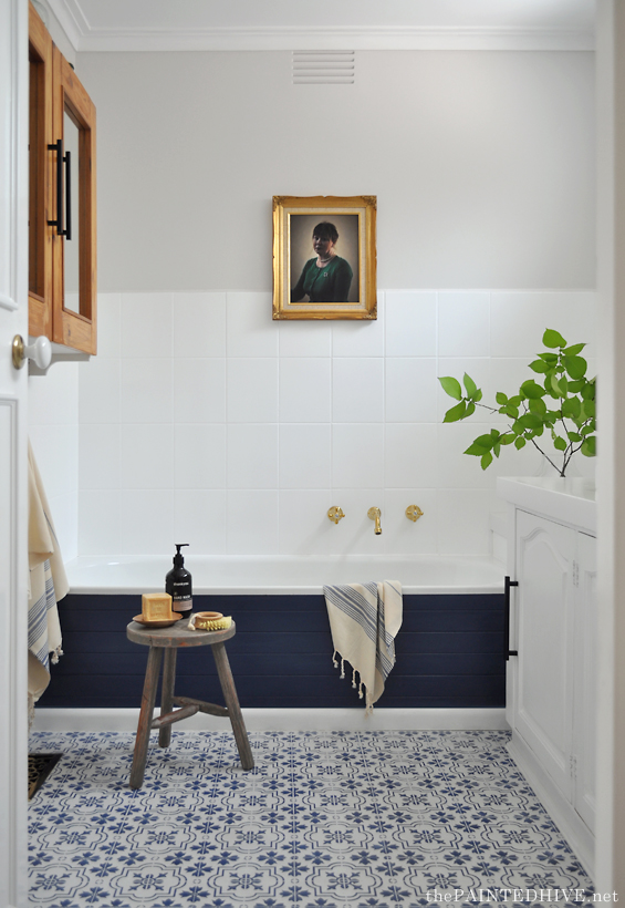
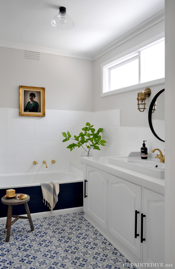
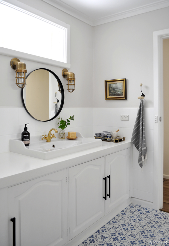
The vinyl floor was hand-painted using a tile stencil from Etsy, Rustoleum chalk paint (in ‘Coastal Blue’) and Cabots CFP sealer (you can find my basic floor painting tutorial here). It was completed several months back and has held up fantastically.
Note: The faux tile sheet vinyl which can be seen in the before photos was pulled up to reveal an older layer of plain vinyl beneath. This is what we painted.
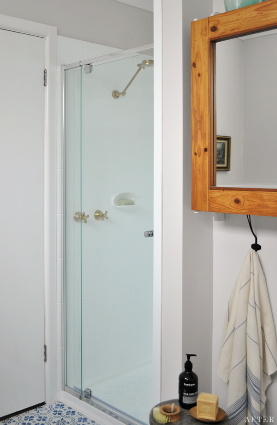
Mum painted the wall tiles using Rustoleum Tub & Tile paint. Brightening those dull tan tiles and losing the dated feature mural made a huge difference!
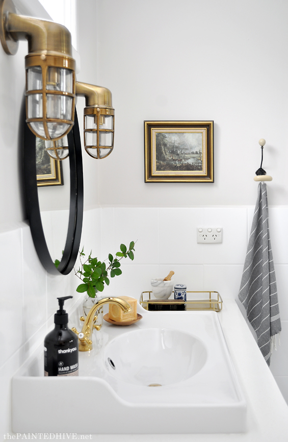
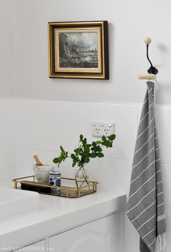
The vanity base was painted in a crisp white semi-gloss. As mentioned above, the top was professionally refinished and although it’s hard to see in the photos, has a faint stone-like fleck (you can just make it out in the above pic – it cost around $350).
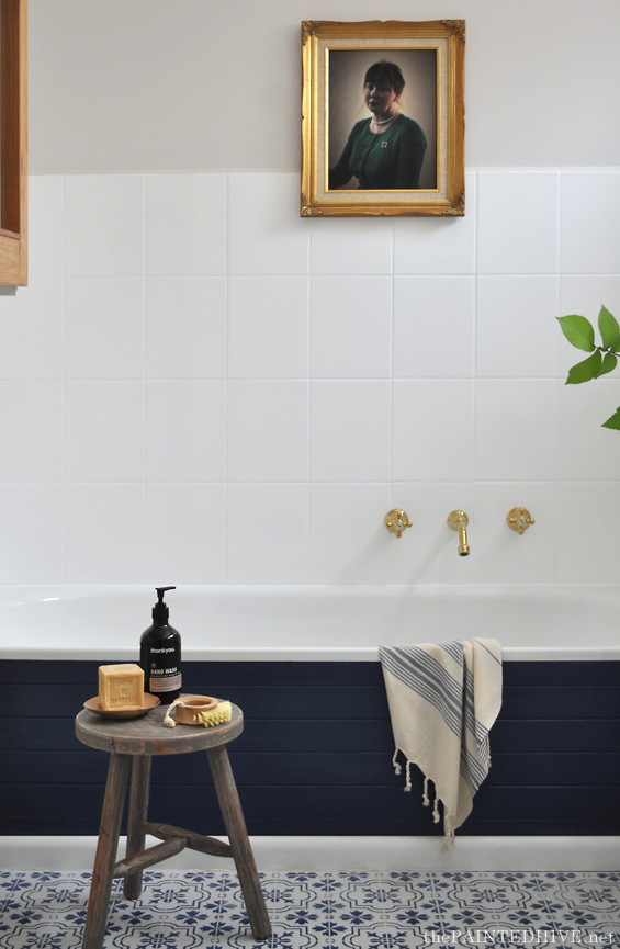
Mum wanted to paint the bathtub panelling white too though I convinced her to use the navy we had left-over from the floor (we added a bit of black to make it a tad darker and less saturated). It references the stencil, adds depth and creates a bit of drama. I think it was the right move.
The bath itself was in great condition so wasn’t touched.
To provide a subtle contrast for all the white we went with a smokey grey (Dulux ‘Limed White’ Quarter) on the walls.
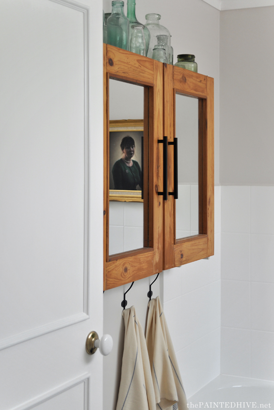
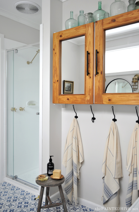
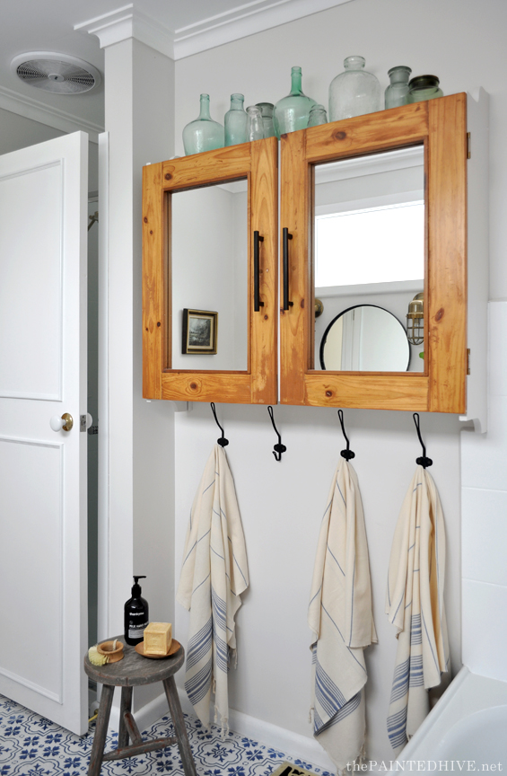
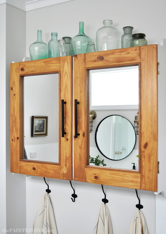
As things were coming together it became apparent to me that we needed some wood! Nothing brings warmth and depth to a space like natural timber. It took some coaxing, though I eventually convinced mum to strip the cabinet doors rather than re-paint them. Their rustic golden finish is just perfect!
The entry door got a little makeover too with some new trim and fresh white paint (you can find my tutorial for adding trim to plain doors here).
I know some people probably consider it dated, though we kept the ceramic handle. I think it’s classic and understated.
As mentioned above, although I like to work with what’s already in a space, there are some things which are best replaced.
The shower screen had seen better days so was switched out for a new glass door (it cost $450). It looks soooo much cleaner.
And as mentioned above, mum had the shower base professionally resurfaced for $350.
The original basin, which was pokey and off-center, was upgraded to a RATTVIKEN from Ikea.
Although these basins are really designed to sit atop a wash stand, we like the uniqueness of it on the long vanity and the character the collar provides.
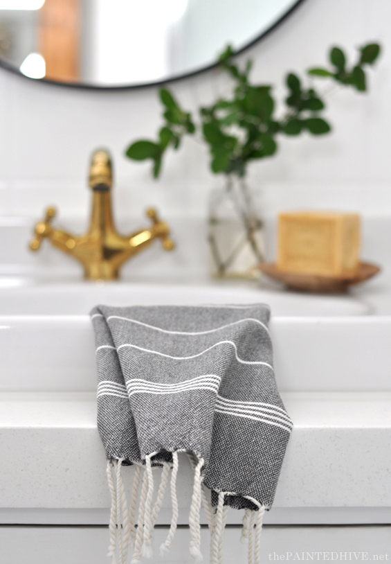
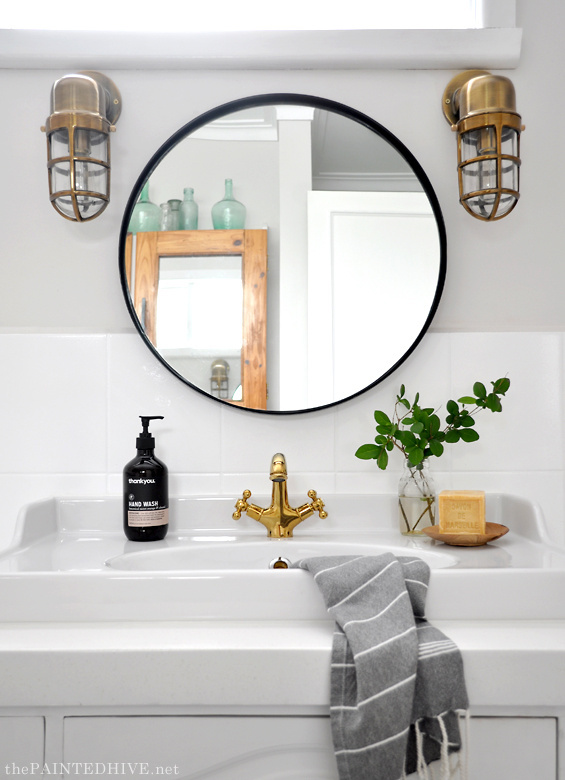
All of the old chrome tapware got updated to brass which compliments the navy accents perfectly. The shower and bath fixtures are simply from Bunnings (around $80 per set – sorry, I can’t see them on the website anymore) and I found the basin mixer on eBay for $60.
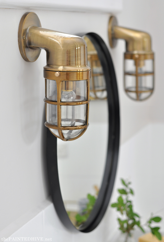
We toyed with lots of DIY ideas to upgrade the existing sconces though then one day I happened to stumble across these ones on eBay…for $25 each! How could I say no? I’d seen similar ones for almost $400!
The ugly old ceiling exhaust was replaced with a simple $50 glass batton fix light from Bunnings (dad installed a new extraction fan above the shower). We considered using a fancy pendant though the ceilings aren’t very high and we figured there was already enough going on in the room.
The vanity and cabinet handles were on sale from Bunnings for just $4 each! They were originally silver so we spray painted them gold. “Gold?” I hear you say, “they look pretty black to me”. Well, yes, I decided I didn’t like the gold so we tried matte black instead – much better!
You’ve actually probably noticed there’s a mix of metals. It wasn’t our intention to have brass, gold, black and chrome though it just kinda worked out that way – mainly due to cost and availability (for example, the shower door fittings were just offered in silver or white, and the sconces came in antique brass only). Though far from detracting from the overall scheme, I think it actually adds interest. So, if you’re agonising over mixing metals, I say chill.
Everything else in the space is just ‘dressing’.
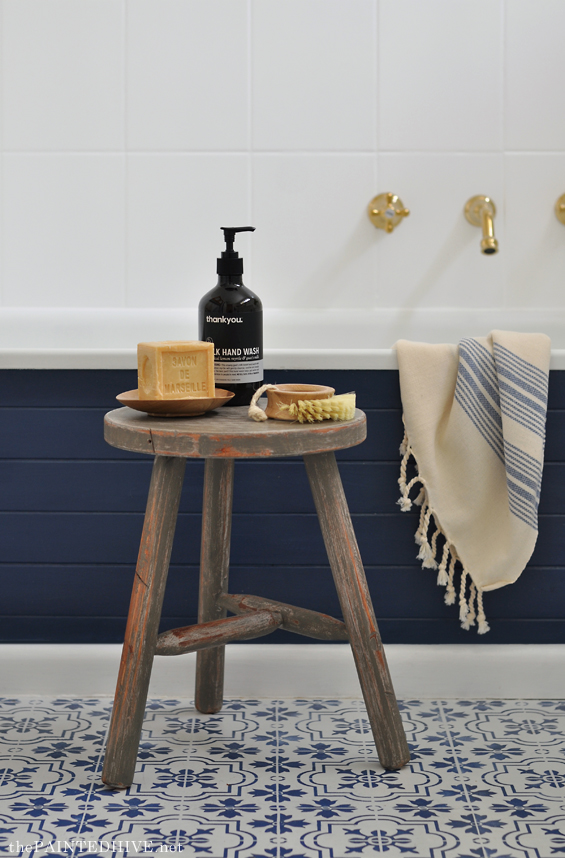
The little stool is a hacked Kmart piece (find the tutorial here). All up it cost less than $20.
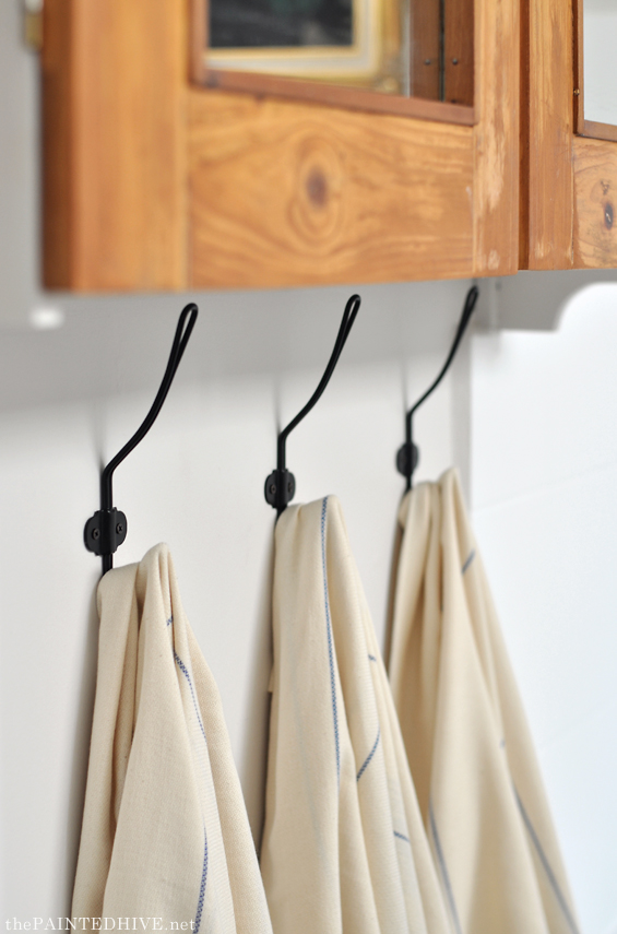
The lovely turkish towels, which hang on $3 SVARTSJON hooks from Ikea, were a bit of a splurge at $28 each. I justified the expense by gifting them to mum for her birthday.
From the beginning I envisioned a single portrait on the rear wall. This one, of my mum, was a fun DIY I shared a few years back. You can find the full how to here.
The other artwork is a sweet vintage print from the op shop.
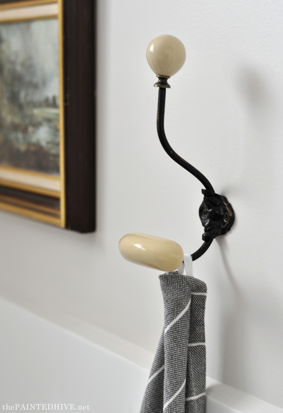
And beside it is this lovely washroom coat hook from Abodent.
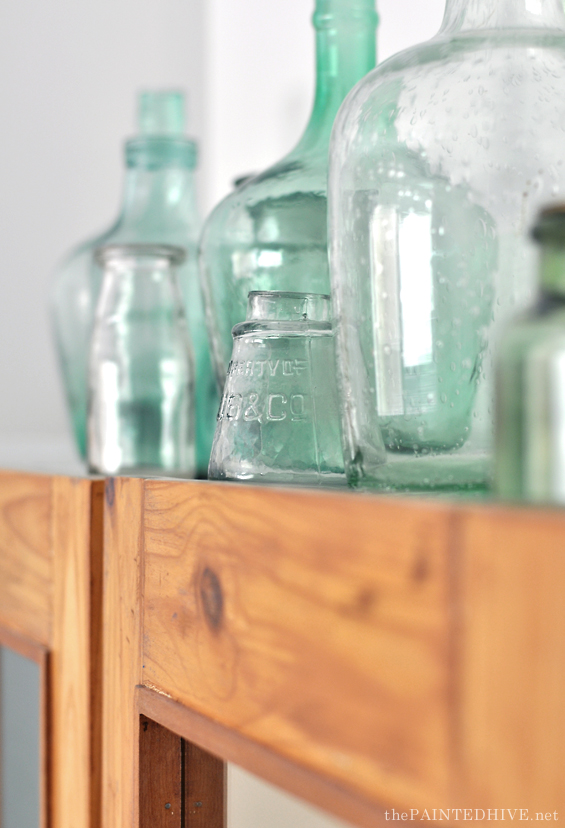
I was going to leave the top of the cabinet empty, though then I started filling it with our collection of green glassware and couldn’t stop!
I get like that with green glassware!
The round mirror is an inexpensive Ikea piece (I can’t find it on their website anymore though mirrors like this are available in lots of places nowadays). It was originally silver so we spray painted it gold. “Gold?” I hear you say, “it looks pretty black to me”. Well, yes, I decided I didn’t like the gold so we tried matte black instead – much better! Is anyone else having deja vu? He, he.
Finally, on the vanity a $12 gold metal tray from H&M holds a few vintage finds.
Okay, I think that’s it. Man, that was a looooong post. Now I see why I procrastinated over writing it – ha, ha.
Sorry I don’t have step-by-step tutorials for all of the projects though my parent’s did a lot of the work whilst I was home wrangling my kidlets. If you have any questions, please ask away.
As always, I really hope this has motivated you to have a go at working with something you have. It’s easy to give up on an ugly room, or to get hooked on the design minutiae, though with some imagination, adaptability and your very own hands, reinvention is totally possible.
Now, to finish, some before and after comparisons just for fun.
I just did some rough calculations and the ENTIRE makeover came in at well under $2,000. Not bad!
I hope you like it.
In other news, I recently started a home decorating Facebook group!
With a focus on stylish, budget-friendly, DIY interior decorating, it’s a positive community of home enthusiasts designed to enlighten, encourage and empower everyone to craft a home they truly love!
You can share information and find creative ideas, ask a question or offer advice, or inspire others by showing-off your latest project or product find.
I’d love to see you there!
JOIN MY HOME DECORATING GROUP HERE





Sooo beautiful! I absolutely adore the floor and all the mixed metal finishes! (And that it was such an impactful but relatively inexpensive re-do!) Definitely keeping this in mind for my bathroom. :) One question about painting the tiles – from the picture it looks like you achieved a smooth finish without a nap. Is that true? And if so, how did you accomplish that? Thank you!!
Hi Elle
There is a very subtle texture though as the paint is quite viscous it self-levels well which softens the roller nap. I tried to get a few close-up pics though the effect wasn’t visible.
Kristine
Thanks!!
Like it? I love it! Thank you for sharing your work! It is truly beautiful, fresh, classic, and AFFORDABLE! You know how rare that is in blogland? I appreciate each post, and I never, ever, ever mind a wait, because it’s worth waiting to see your artistry. Speed kills. :^) Take your time, enjoy the process. I’m just happy to be able to view and be inspired by the results.
Aw, what a lovely comment. Thank you so much Kathleen :)
Hi Kristine Judging from ALL the comments everyone loves it as much as I do. I love the pop of navy on the side of the tub! love it! love the mirror and sink! looks great. what a fun project to do with your parents! laura
Thanks Laura. So glad we chose to go with the navy on the tub :)
This is a gorgeous makeover, certainly worth the wait. My favorite part is the stunning blue on the front of the tub. I am going to use your idea. Love the whole room. Pinning
Thanks so much Leanna :)
Came here from Apartment Therapy and just have to say… this is UN.BE.LIEVE.ABLE.
What a difference in this space! KUDOS x1000000000000!!
Thank you so, so much :)
I absolutely love this! It’s probably my favorite before/after ever. Well done.
Oh wow. What a lovely compliment. Thank you :)
The bathroom turned out great. Did you have to prime the tiles before the paint. I have a pink tiled bathroom I would like to paint.
Hi Bobbie. No, the product I used (Rustoleum Tub & Tile) is self-priming though you do need to do your prep properly :)
It turned out SO nice! I’d love (and am so tempted to) do a similar facelift for our main bathroom, but I think it’s going to need more tough love I’m afraid. Maybe a few things here and there just to help me live with it for now.
I really love this makeover. The room looks so good! To make things even better, this was done without ripping out everything that was there. It bothers me to see perfectly serviceable items torn out of a room when they could be made beautiful and reused. I think of that in a “green earth” context also: somebody mined the marble, trees were cut down for the cabinets, porcelain items were made and hauled in through somebody’s physical effect. That with a little respect, sandpaper, paint, thought and effort, an out of date room was revamped to become an enviably beautiful space makes me happy!
It makes me happy too Barbara! I’m always confused by “before and after” room reveals where the entire space was ripped out :)
That is absolutely gorgeous – I cannot believe the transformation! You truly have a gift. I am new to your site and I cant wait to see more x
Thank you so much Kim :)
Wonderful post… I was just thinking to myself, “I need to paint those ugly tan tiles in my bathroom!” Now, I’m going to do it! Thanks for the inspiration! Your Da Ja Vu remark made me giggle… for several seconds. ;-)
Wow…I’ve been so busy I hadn’t realized how long it has been since I stopped by and check your website. I am sooo sorry about that. What an amazing transformation. I would have never believed it was the same bathroom. Excellent job.
Hi! I just found this bathroom, and am now inspired to work on our old ugly bathroom! I have a question about the vanity top re-do that professional did. What material is that top? Ours is wood and I was thinking I would have to replace it with a synthetic one.
Looking forward to hearing back! Thanks!
Hi Lin
Glad to have helped inspire you. The vanity top had a pine edge and laminate inset. If your vanity top is wood and still in good condition it wouldn’t be too hard to re-finish it yourself (wood is a better substrate for DIY than laminate). What look were you hoping to achieve?
Kristine
Love your work. it is really nice to have a good ambiance. thank you for sharing
Love everything about this bathroom. I am usually not drawn to Blue – But…. I love this! The floor is fantastic.
Thanks so much Dianne :)
Hello Kristine, can I ask if you had any problems installing the sink? I imagine Ikea don’t giv a cut out template, as it is designed to sit on their washstand. I have purchased a 1500mm new vanity that has a cupboard at each end, and 2 drawers in the centre. I expect I will have to blank off the top drawer to accommodate plumbing, but is there anything else I should be aware of ? This bathroom looks amazing !
Thanks Jodie. My dad installed the basin and I don’t recall there being any issues aside from the fact it had a very slight wobble. Can’t remember if this was rectified by him adjusting the hole a little or if it simply righted itself once it was siliconed in. Regardless, there is certainly no wobble any more.
I’ve been looking for a stencil to achieve this same look as your floor. What size stencil did you use?
From memory it was 15cm square.
It’s a very, very beautiful renovation. I felt refreshed with images. And your choice of towels is also very elegantand harmonious with the bathroom. Thanks for sharing.
Mostly nice makeover. I like every detail but the white for me is to bright.
Such a beautiful bathroom! thank you for sharing :)
Making over my bathroom was the toughest task ever. But after I came across this blog, I always equipped with new ideas for decorating my bathroom.
I felt like I was missing something because I saw this blog a little late.
It’s a really great transformation. Very impressive and inspiring….
Thanks for sharing a beautiful job
Hey Kristina! I just wanted to let you know that the pictures of your bathroom are being used as a before-and-after in a leaflet advertising tub and tile painting/refinishing products – here in Greece! I picked up the leaflet a couple of weeks ago at a craft fair, and as soon as I gave it more than the cursory glance before stuffing it in my pocket, I realised that bathroom just looked awfully familiar!
Now, I’ve seen *a lot* of bathroom pictures lately, as I recently finished renovating mine, but something told me this wasn’t Apartment Therapy or some other overly tarted-up cookie-cutter magazine-type bathroom. After looking at it a bit closer, some details started floating up – a blogger, Australian, a DIY job, and something about thrifted picture frames…? So I ran a search on my browser history, which I have set to keep everything for as long as possible because this kind of thing happens to me with surprising regularity, and after a few tries, there it was! Yay!
Which is to say, either I have a freak photographic memory (doubt it), oorrrr, your bathroom somehow really stands out from the pile, even while it’s actually really on trend. Maybe it’ll be like those spaces you see 20 years later and they’re super-recognisable as being from a specific time, BUT they still look great to anyone with the good sense not to get hung up on having the latest.
It’s just unfortunate because you weren’t credited on the leaflet, and probably not even paid for your work, which blows. (Unless you thought ahead and put this in a stock photo bank, in which case, go you!) Anyway, I don’t know what, if anything, you can do about it, especially from a different jurisdiction like that – I bet they actually got it off bloody Pinterest, ugh. But I wanted you to know all the same!
Wow! In Greece? Well, that’s interesting. Thanks so much for taking the time to let me know.
I guess they just grabbed the pics from the net somewhere. Some credit would have been nice though sadly this kind of thing happens all the time. Oh well. At least they liked my bathroom I guess :)
You did a FANTASTIC job!! Way to go. I love it and it does not even look like the same bathroom.
Thanks Bonnie :)
I am wondering what type of paint you used on the tile?
The wall tile? Rustoleum Tub & Tile paint :)
Wow. Just … wow.
Hello! I love your painted bathroom colour scheme. Can I ask how is the stenciled floor holding up a year on? I would like to do this in our main bathroom but a little weary. Did you use a primer first as indicated in your previous loungeroom tutorial? Also for this size bathroom how many tins of paint were needed of each? Primer, main coat and sealant? Thank you kindly, you have given me so much inspiration.
Thanks Elise. The floor is still perfect over a year on however as this is the main bathroom at my parent’s house (and they generally use their ensuite) it doesn’t get a lot of wear so it’s worth keeping that in mind.
From memory we didn’t prime the vinyl – straight on with the chalk paint. Only one small tin of white chalk paint and one small tin of sealer (maybe 1 litre). Of course the stencilling uses barely any paint at all.
Hope this helps a bit. If you hate your floor I say just go for it!
This is so inspiring, i love every detail! I’ve just started getting into DIY and am planning on tackling the master bath. This has the best ideas I’ve seen yet, love your style and how it all comes together!
Thanks so much. This is one of my all time favourite projects too :)
Really really this is very awesome bathroom decoration tips. I like your decoration tips and ideas. I love your post.
Hi there – just wondering how the shower base refinish is wearing – and if well, which company did your parents hire (would they recommend them)? Am also based here in Melbourne. Thanks in advance, Melanie
Hi Melanie
I’ll need to check what the company was called. Yes, it’s still perfect. Though being my parent’s main bathroom (they use their ensuite) it hasn’t had a heap of use.
Kristine
Well, I have to say that what you all have achieved is brilliant. I love it. The transformation looking at the before and after shots is amazing. You have given me some ideas. The stenciling is a clever easy solution to plain vinyl flooring. I must proceed with our little bathroom. Thank you for sharing.
Thanks so much Linda. It was a really rewarding space to work on and still one of my favourite make-overs to date!
Any updates on how the paints held up??
Hi Amy
Yes, I probably should post an update. Still perfect at this stage but the bathroom doesn’t get a tonne of use.
Kristine
I’m looking to do the same thing with the IKEA Rattviken sink. Does the sink sit on top of the countertop like a vessel sink? Also, what size sink did you use? Lovely bathroom remodel.
Thanks Brie.
Oh gosh, this is going to test me as this was done over three years ago now. From memory, it’s the large version of the sink and the actual bowl is deeper than the height (so it’s not a traditional vessel-like sink and does need to be recessed into the vanity).
Hi there! I was wondering if you’d mind letting me know the name of the stencil design you used and the etsy seller you got it from? The link doesn’t work any more and I’m trying to track it down! Thank you so much!
Thanks for letting me know. Yes, the link must have changed.
It was this one:
https://www.etsy.com/au/listing/1033256880/2x-tile-stencils-for-painting-bathroom?ref=shop_home_active_197&pro=1
Hi Kristine! I have another question, I’m sorry! Dulux Limed White Quarter is not available in the UK – do you have any suggestions for a similar paint by Dulux/Valspar that I could try and source here?! I’m really struggling to find something that is pale grey but also warm. Thank you so much! Anna
Hi Anna. Hmmm, I’m pretty sure that the Dulux UK and Dulux Australia colour palettes are entirely different. And I’m not very familiar with Vaslpar sorry. Just looking at the Dulux UK website, I thought you could maybe try something like Ashen White or Thimble Case (perhaps in half or quarter). But this is just me going off the digital swatches so they may look different in reality.
Hi Kristine,
just discovered this bathroom update on Pinterest. I looks awesome!! I have been thinking 0f paint outdated tile in my bath/shower surround….I have two concerns:
1. Mildew in grout – I’ve “bleached” it, but am concerned about it eventually bleeding through paint
2. soap scum on tile – I could use a lot of elbow grease and scrape it off.
Do you have any experience with either?
Thank you in advance for your reply.
Katherine
Hi Katherine. Glad you like the makeover :)
If you currently have mildew, I think there is likely a risk it will bleed through the paint. Bleach hides mildew, but it doesn’t kill it. I would suggest using a product designed to completely eradicate the mildew before you paint. I guess if it reoccurs and does show through, you can treat it again, and if needed even use a grout pen to touch things up.
I haven’t personally experienced a problem with the paint scratching. It’s a super hard epoxy. Still, you will need to take some care. I have damaged the duco on my car by using a sponge that was too abrasive so there is a risk you could scratch the paint if you’re not being a bit careful. Cleaning it regularly may help with any scum build-up which needs a heavier approach.
Hope this helps a bit.