It’s been so hard trying to decide which spaces to share first!
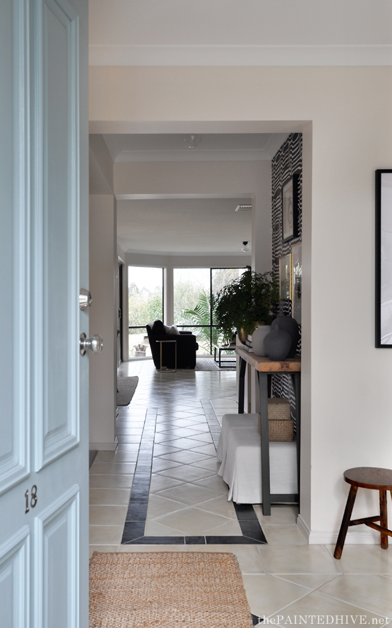
In the end I thought it made sense to lead you through the house from front to back, just like anyone might view it in reality, so I’m kicking-off with the entry and sitting room.
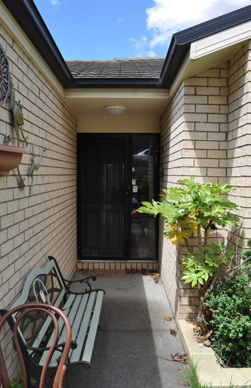
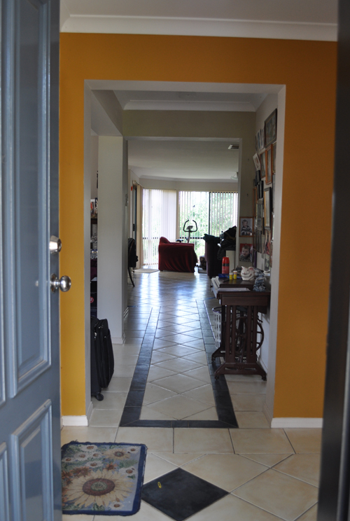
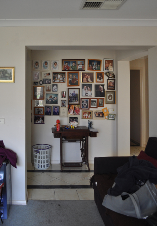
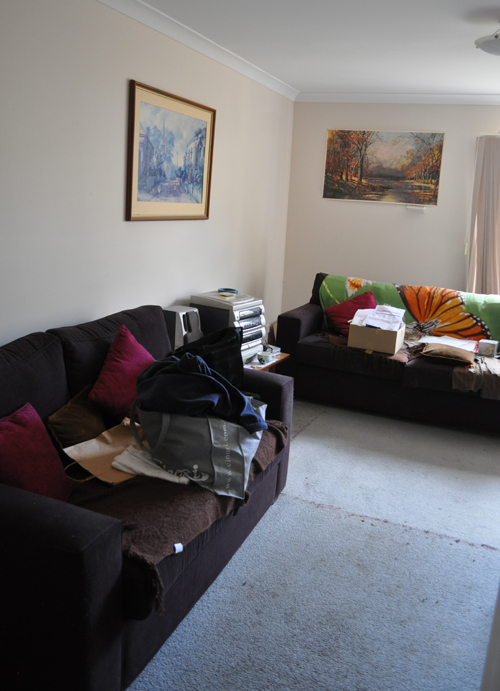
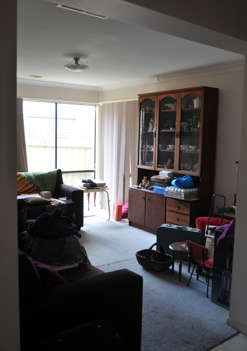
Here’s how things looked a few months back…
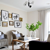
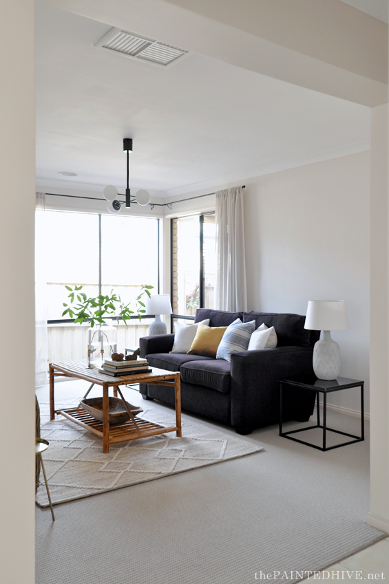
And here are the spaces now…
You can find side-by-side before and after images toward the end of the post.
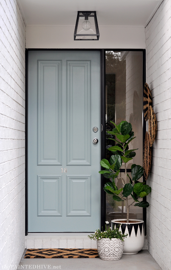
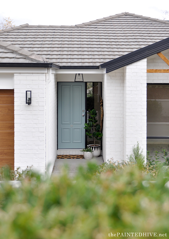
Of course, I’ve already shared the exterior entrance in my facade reveal post.
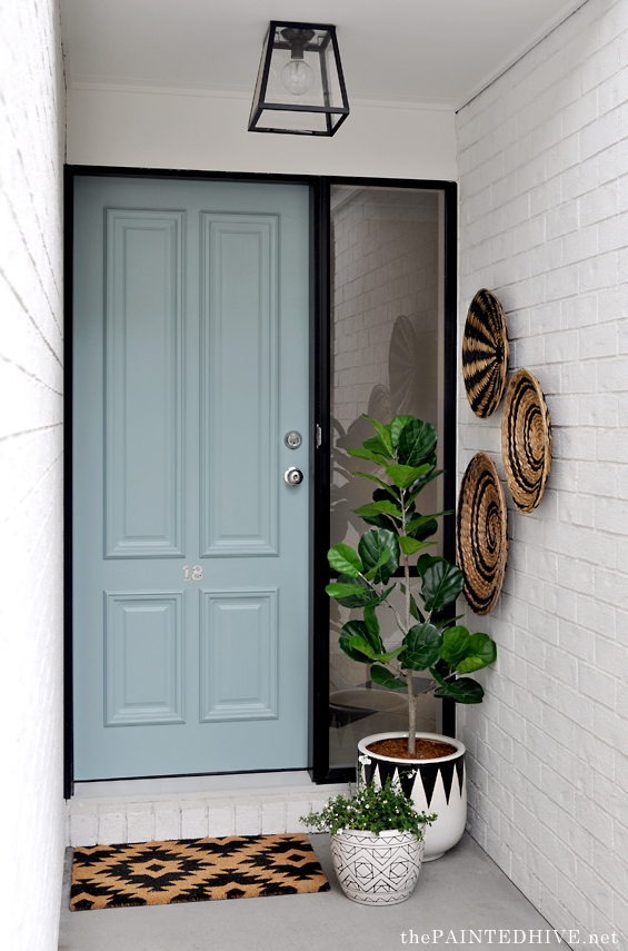
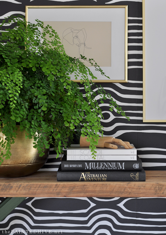
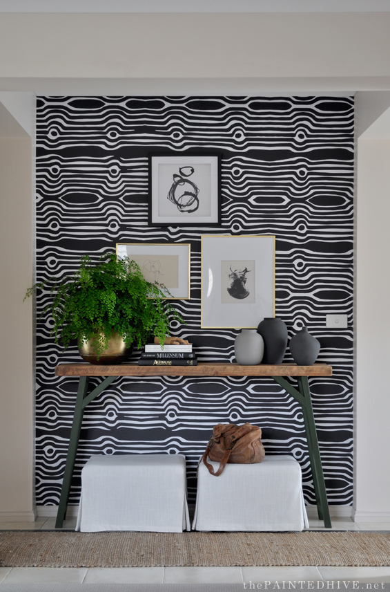
And the interior entrance in my entry reveal post.
So what I really want to show you is the sitting room.
This space was a thorn in my side throughout most of the flip.
Whilst it might look well-resolved and purposeful now, for the longest time I really struggled to envision how things were going to come together in here.
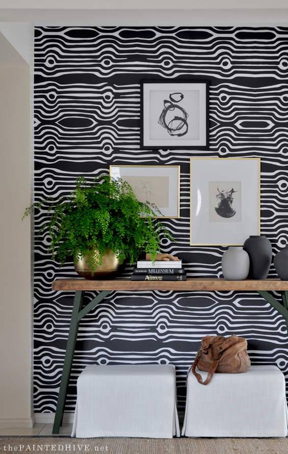
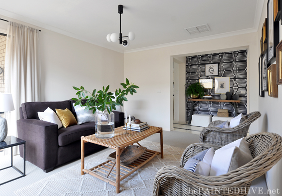
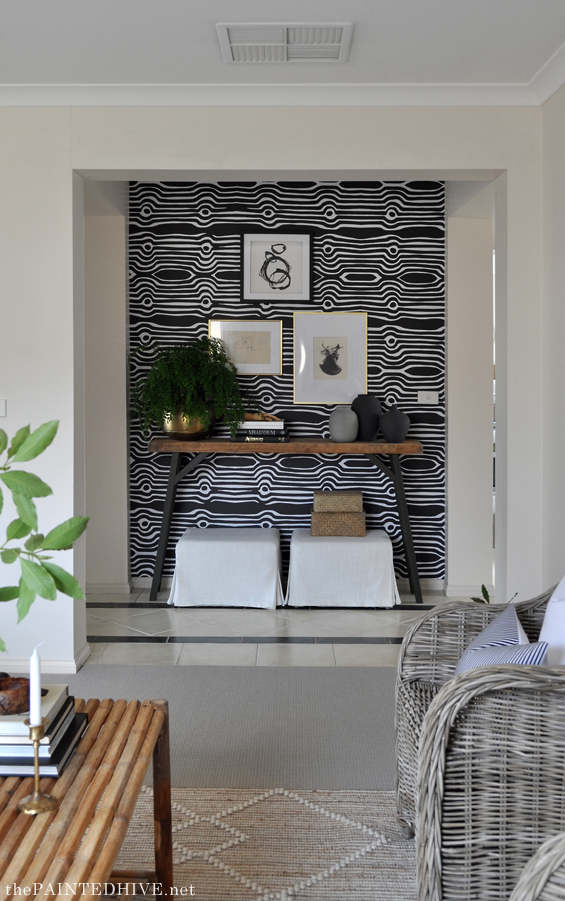
I had a mish-mash of furniture to work with, no focal point (ideally I would have loved a free-standing fireplace – or similar – in here), and a slightly awkward room with asymmetrical corner windows. On top of that I needed a clever way of tying said ‘mish-mash’ in to the quite bold entry so there was a sense of cohesion between the adjoining areas.
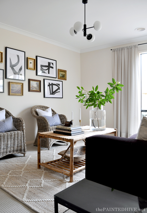
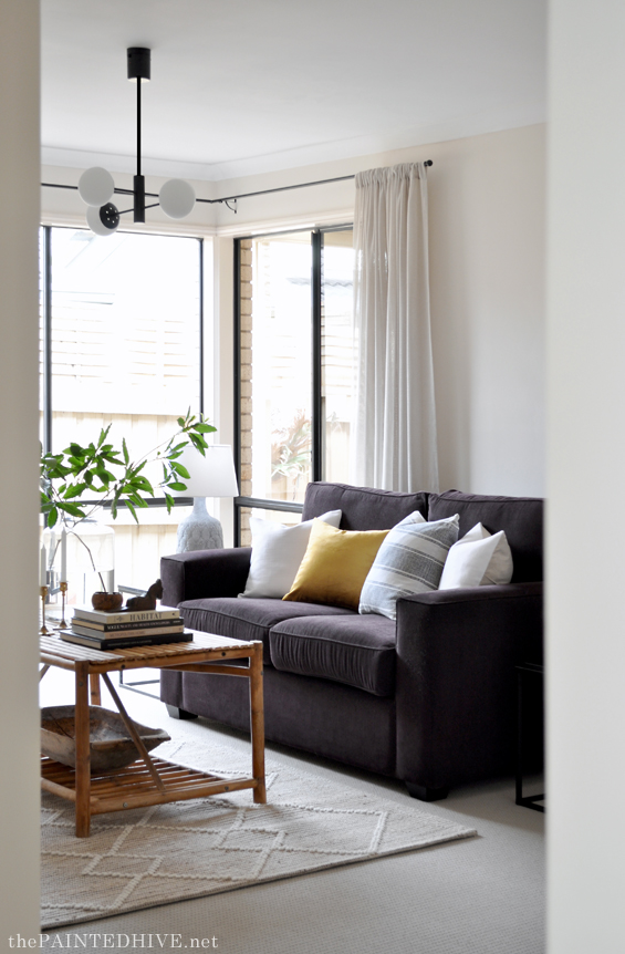
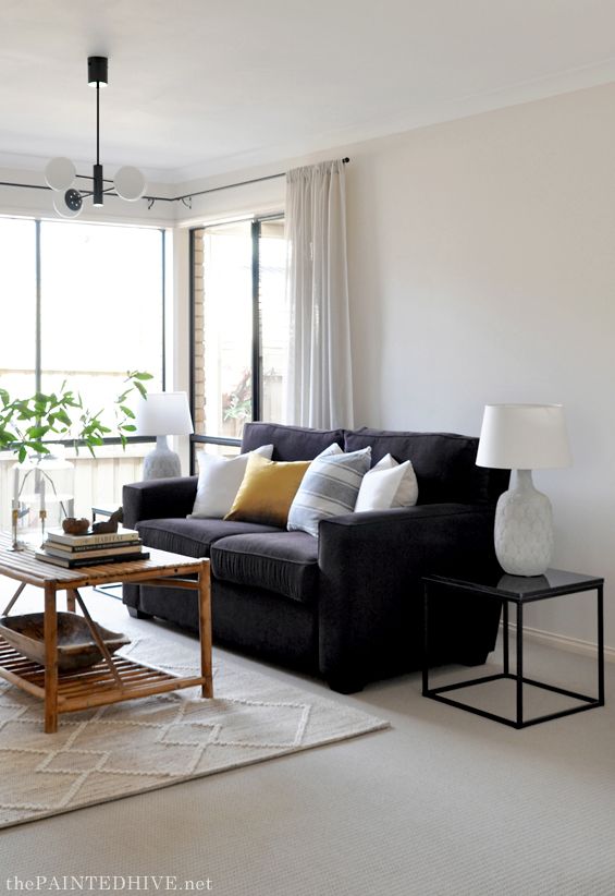
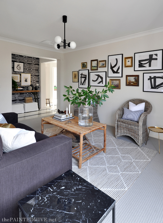
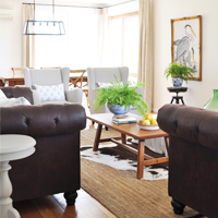
This was very much a ‘make-do’ room. To begin with, I had the raisin-toned sofa (which, as you can see from the before pics, came with the house), the bamboo coffee table which I picked up for $50 from Marketplace, two sweet wicker armchairs I got from Early Settler and the DIY ceiling pendant which came from Bunnings.
Individually they were all pretty great pieces, though together nothing worked.
How was I going to make sense of all this?
With styling…that’s how!
As much as I believe in the power or accessorising, I must admit that I still had my doubts. Though I could not be happier with the way this space has come together.
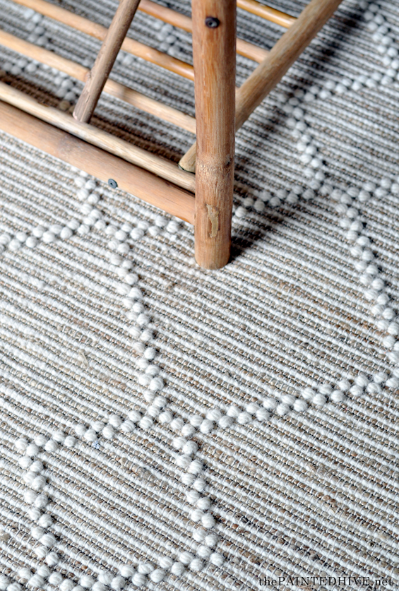
I started with one of the new Bunnings rugs (this is the Wemyss – which I absolutely LOVE!).
And then some simple sheer curtains (I got mine on sale for $40) to help soften the room.
I added matching side tables (these are the Kmart black stone ones) to provide a sense of continuity.
And a simple brass stand (which is actually a gold Kmart tray atop a metal pot tripod!).
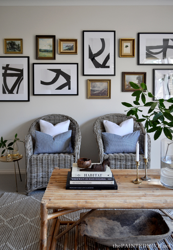
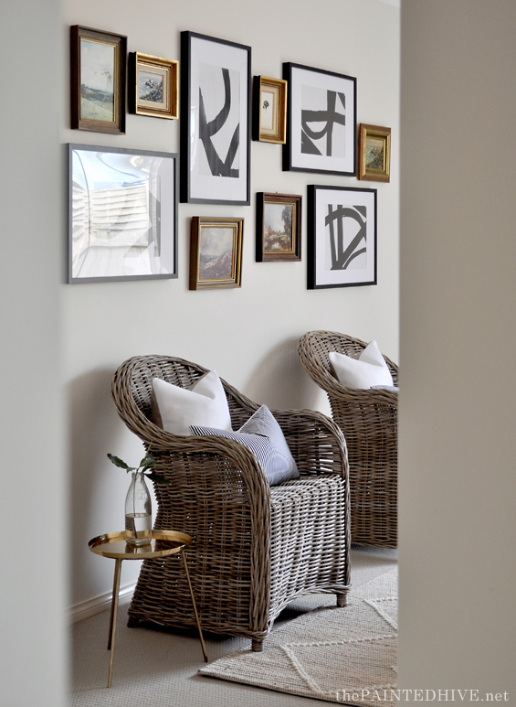
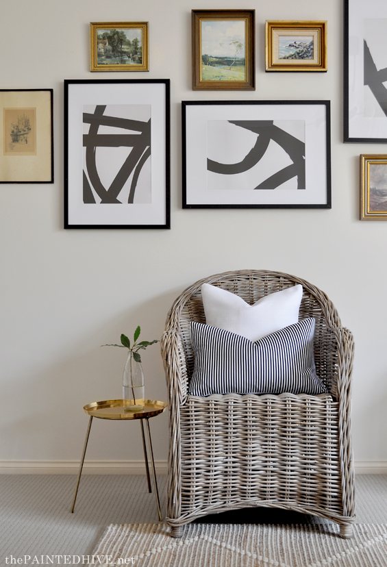
The biggest challenge was the long blank wall above the two wicker armchairs.
I wanted to do something really impactful here, which echoed the graphic nature of the entry wallpaper, without it being too full-on.
Well, it may be a bit too full-on for some people, though not for me :)
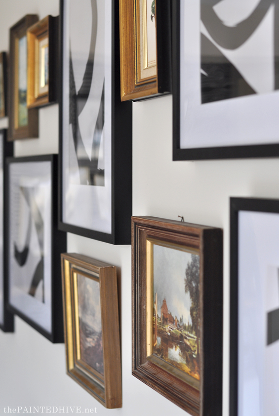
My initial idea was a simple row of four or five really large frames, though even the Kmart ones were going to be too expensive (the sitting room was one of the last rooms I decorated so funds were running low). Eventually I compromised by buying five smaller frames which I filled with a collection of downloadable abstracts from Etsy. I had the art printed as A3 documents at Officeworks for less than $2 each.
I was going to create a gallery with the black and white frames alone, though I just wasn’t convinced they were going to span enough of the wall. This is quite a deep room and I wanted something to compliment the scale. So, at the last minute I decided to add in some of my own vintage artworks.
I couldn’t love this gallery more!
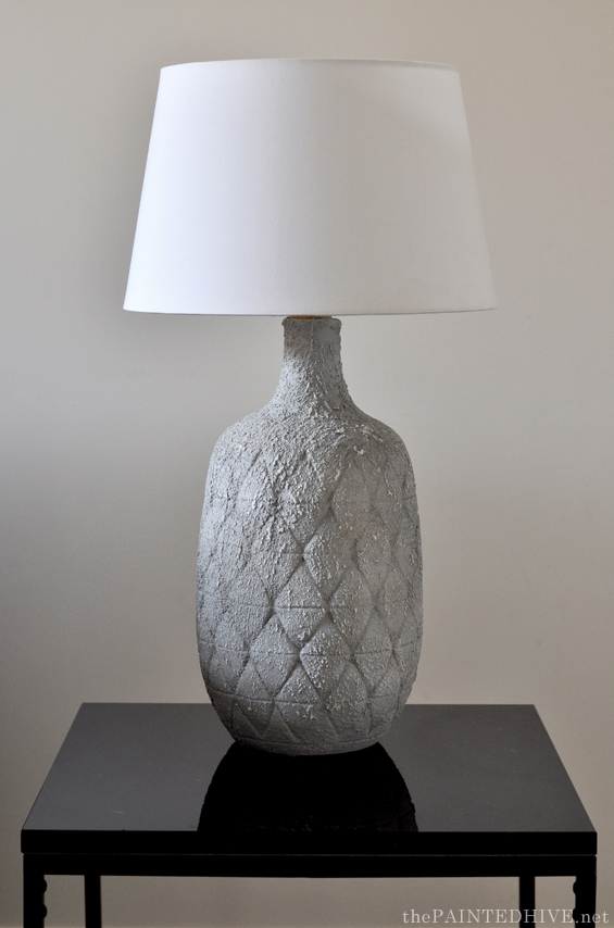
One of the easy little projects was creating “lamps” for the side tables.
I had this vision of large matching stone lamps though they are sooooo expensive! I looked high and low on second-hand sites and in Op Shops however, whilst it’s not that difficult to come across a cool individual lamp, finding a pre-loved pair isn’t quite so easy.
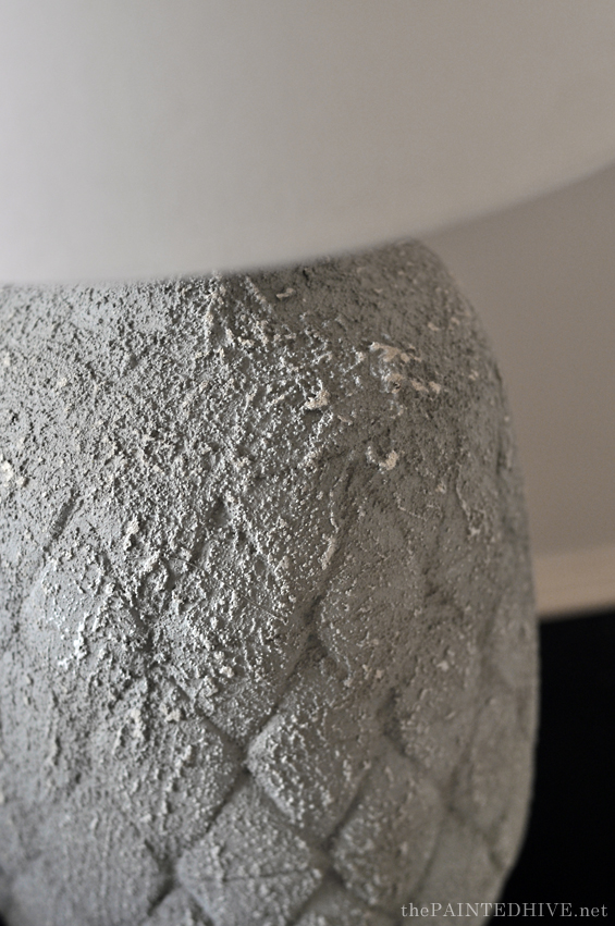
Eventually I stumbled across two large ceramic vases and my mind went ‘ding’. I could totally pop a shade on top and pretend they are lamps! Of course they wouldn’t be operable though for staging purposes that’s totally okay. And once I have time later on I can work out a way to make them function.
The vases were nice though had a bright blue glaze which clearly didn’t suit the colour scheme of the house so I painted them using left-over Dulux Texture Paint from the facade. I then sprayed them grey (again, using left-over paint – Dulux Chalky Finish in Rivieria Grey) and dry brushed on some white to give them a rustic, weathered concrete look.
They shades were a $15 Marketplace find and whilst I could have simply sat them on the rim of the vases, I added little wooden raises (just made from some dowel off-cuts) to boost them up a bit.
All of the cushions are filled with feather inserts from mine and mum’s personal stash. The mustard cover and wide stripe cover are old-stock from H&M. All of the other covers have been sewn by mum using inexpensive fabrics from Spotlight.
I wanted white to freshen the room and brighten-up the dark sofa. The mustard ties-in with the warm wood and gold elements and the classic black and white lumbars reference the wallpaper without competing.
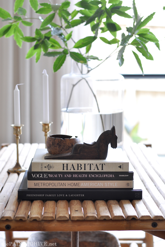
To bring everything together and give the room a sense of “life” I finished by adding a few simple decor pieces.
All of these items are things we already owned.
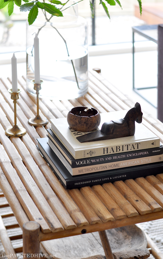
The large glass vase is still available at Kmart and is so perfect for displaying statement foliage. I simply picked these clippings from a massive tree I found on the side of the road and they add just the right amount of punch to the room.
The Habitat book was a recent birthday gift and I highly recommend it. Author Lauren Liess is one of my all-time favourite designers!
So, that’s pretty much it for this area. I hope you like it!
PRICE & SOURCE LIST
Carpet | Daytona by Beaulieu in ‘Green Beige’ | $500
Wicker Chairs | Martinique Arm Chair from Early Settler | $200 each*
Sofa | Already Owned | $0
Coffee Table | Facebook Marketplace | $50
Floor Rug | Wemyss from Bunnings | $149*
Light Fitting | Mika DIY Pendant Light from Bunnings | $156*
Curtains & Fittings | Caprice Montego Sheers in ‘Ivory’ (plus all hardware) from Spotlight | $65 on sale
Stone Side Tables | Kmart | $29 each
Brass Side Table | DIY (gold tray on plant stand tripod we already owned) | $0
Lamps | DIY (ceramic vases topped with IKEA shades) | $25 each
Abstract Wall Art | Kmart Frames with Digital Downloads from Etsy Printed by Officeworks | $53 total
Vintage Wall Art | Already Owned | $0
Large Glass Vase | Already Owned (originally from Kmart) | $0
Dough Bowl | Already Owned (originally from Etsy) | $0
Small Decor (Candlesticks, Wooden Horse, Burl Bowl) | Already Owned | $0 each
Books | Already Owned | $0
White Cushion Covers | DIY using Fabric from Spotlight | $15
Black & White Stripe Lumbar Cushion Covers | DIY using Fabric from Spotlight | $10
Gold & Wide Stripe Cushion Covers | Already Owned (originally from H&M) | $0
Feather Cushion Inserts | Already Owned | $0
TOTAL $791
*We were super lucky to be gifted some items from Early Settler and Bunnings.
I’ve provided their costs however they are excluded from the total.
For further price and source information about the entry and facade, please refer to their original posts (as linked).
Find the side-by-side before and after images below.
As always, feel free to ask any questions and I’ll do my best to help. Looking forward to sharing more soon!
Catch up on all the flip house posts HERE.



This is another beautifully finished and styled space. I love the wall colour and all the pieces you have used come together to make a clean and relaxing look. Great work!
Thanks so much :)
I should clarify that we haven’t painted the walls. It’s just the original colour. Well, aside from in the entry foyer where I changed the yellow feature wall.
Looks great! Your so talented!
Aw, thank you :)
Totally enjoyable one!! Thanks a lot!
Wow Kristine, with the budget you had you’ve worked your magic again.
Truly outstanding work, you should be buying and flipping houses for a living .
Happy styling , Tania
Thanks Tania :)
Wow, just, Wow Love it xx
Thanks so much :)
Lovely!!
Thank you.
Beautiful work! What a transformation!
Thanks Merima :)
It’s beautiful! What an amazing change – I love how it’s transformed this room!
Thank you so much :)
EPIC!! I’m not kidding… You are so amazing, and right up there with Lauren Liess. Seriously.
Aw, thank you. Not sue how Lauren would feel about that though. Maybe I can be the discount version – LOL!
You’re a miracle worker. Amazing as usual. I can’t find any more words……
Great work. I have been looking forward to the final reveal so much and as always you don’t disappoint. Good luck with the sale.
Love your work, so inspiring! And love that you do it on such a slim budget.
It looks amazing! And I love the gallery wall! I have been looking for a wall color that would be good to display wood and/or black framed art! Do you know what color that is?
Sorry, I’m not sure. It’s the original colour from the house.
I think your friend won’t have any problems selling this house!! This entry and sitting room is perfect. It looks like such a relaxing space, with great light and a very calming design. Can imagine it as a place to sit and read – I feel inspired to update my own space!! Great job Kristine!❤️
WOW! Of course! I can hardly believe it is the same sofa!! I love the pretty gold ‘table’ – but those lamps – now that is talent to see their vision!! It looks like a beautiful, welcoming space. Congratulations!!
You never disappoint, Kristine!
You are magic!
Great job! Love how the front door entry was BANG, super transformed. Inspired with your wallpapered nitch. And want that bamboo table
Very nice!
So fresh and clean looking now. The yellow wall right when you walked in was a turn away. Great changes. Love the table you made, so cool. I really like the lighting fixture as well.
Hello. I must admit that, at first, I had doubts about the impactful wallpaper, but now I think it looks so good and has a lot of impact, especially when you look at it from the living room. It’s like a huge artwork. Congratulations!
Thanks so much. I had my doubts about that wallpaper too – I’m not usually so bold. Love how everything has come together in the end…luckily :)
Perfection! I love everything about this space, and I can’t wait to see the next reveal!
Kristine you are a wonder! The room is stunning. It is truly lovely, the highlights, the curtains, the gallery wall, cushions, rug, side tables, very clever lamps, the foliage. You wowed me. It is so elegant and restrained yet is clearly touched with boldness and panache. So proud of you.
Thank you. Love the way you have described it :)
Lovely! My favorite is the mix of modern and your antique prints. Well the wall paper and table are pretty amazing too.
You are incredible! Absolutely loved scrolling through all these images and reading about why you made various design choices. I’m learning a lot from you! The finished spaces are beautiful. Such a mind boggling difference between the before and after photos. And that gallery wall…WOW! I wouldn’t be surprised if the homeowner decides to hold onto the property now!
LOL, thank you. Yes, she did mention that she might want to move in :)
Absolutely brilliant!
Can’t wait to see more.
You ARE incredible… and so bloody real!
Really lovely space.
When you said Lauren Liess, I smiled, because I think you have a similar taste and eye for design.
Aw, thanks. I started blogging at around the same time as Lauren so have always followed her. Love her aesthetic. She sometimes likes and comments on my projects which is lovely.
I say the same chairs as the yellow ones you scored in the new Hamptons magazine. The house looks marvellous. Your photography is excellent! One question, how did you put up your gallery wall? You wouldn’t want to leave a wall full of holes. None of the sticky stuff I have bought works?Congrats on an absolutely fabulous result. I wouldn’t be surprised to see it in print in a magazine soon!
Thanks Lee.
The gallery wall prints are just hung on little nails. I would have been more hesitant if the walls were all freshly painted, however this is old paint and although it’s still in good nic, it’s not perfect. I have had the wall paint colour matched (from when we had to paint over some feature walls) so once the house sells I’ll just patch and spot paint the nail holes.
I actually quite like the 3M Command Strips and have used them in the past though they don’t work with all frames and can be expensive if you need a lot.
Sometimes hard work is all it takes to make a miracle happen. You’ve worked a miracle on this house.
You did wonderful job! It is so amazing how the paint colour on the entryway and door and inside wall colours can so dramatically change a space! Of course all the furniture you chose and the cohesiveness of the colours make a statement as well.
I’m so excited to watch the reveals unfold! On the one hand I want to see it all NOW but on the other I want to savour each and every space and let the excitement last for weeks! I know you’ve talked about the budget you had for this house but I’d really love it if you could do a room by room budget breakdown at the very end – that would be soooo helpful! xx
Thanks Kate.
Yes, I’ve been trying to work out the best way to share the budget break-down. Might add the costs to the current posts.
I know this room totalled about $800 including the carpet. However this excludes the rug, pendant light and wicker chairs which were gifts. Of course, I simply would have used things we already had or gone with cheaper alternatives (or without) otherwise, so it just feels a little erroneous whether I include or exclude these costs. It’s a bit tricky.
Wow…The sitting room went from looking like a storage unit to an actual sitting room. Light, bright and welcoming. I can’t image how much better it would have looked had you had for time and $.
It ties in nicely with the with the enter way. I smell a sale in the air. Great job!
I just love it! Simple elegance, timeless, breathing freshness and calm – it doesn’t say a thing about all your doubts while doing it! You are so talented! And your work gives me so much inspiration!
Thank you for sharing everything with us. Looking forward to seeing more…and more…
:)
Love Love Love wouldn’t change a thing! Hard work I know but so satisfying with results like this. Well done you!
Wow!
Great work Kristine.
Jen
Great decor and inspirational. I am soon to take possesion of a new apartment and will implement many of your ideas to create a beautiful space. Always enjoy your projects.
Simply beautiful! I recently staged a four bedroom house for my stepsons. Only had a $1500 budget but I got it done. I find it thrilling to find good deals to quickly stage an empty spot. You have done a beautiful job and I love your combination of furnishings that come together through your amazing talent. Kudos!!
Awesome. $1500 is super tight so good on you!
Thanks so much.
I look so forward to your posts. I love what you do, and that you do it on a budget. I feel like I repeat myself every time I comment, but I remain in awe over your ability to transform a space, and feel compelled to tell you over and over :)
Aw, thank you so much :)
What an amazing job you’ve done. Can’t wait to see this go on the market and sell in super-quick time! Congrats!
Thanks. Fingers crossed!
Please, please tell me where the black and white wallpaper came from and what it is….. I love it and would love to use myself. Loved that entry area. You totally rocked it!
Hi Lynne
Thanks. Isn’t the wallpaper cool? It’s linked in the Entry Reveal post. It’s from Luxe Walls and is called Water People. You can find it here: https://www.luxewalls.com.au/product-category/aboriginal-wallpaper/.
Best
Kristine
As always I love every detail. The gallery wall in the living room is spectacular. Thank you for sharing
I love the rug you used in this space, it looks amazing! I tried to look it up on the Bunnings website but it does not come up. Do you know if they are still selling it? Many thanks
I’m not sure sorry. I can’t find it on the website either. Am guessing it’s either completely out of stock or now only available in some stores. Might be worth calling a few stores near you.