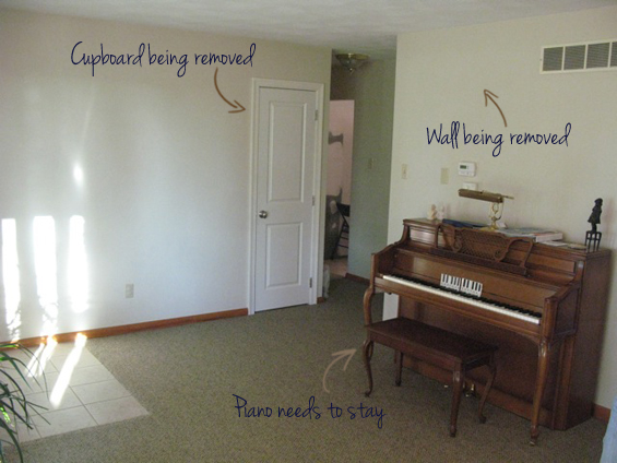
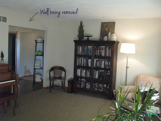
A little while back I was contacted by Corinne who was in the midst of planning a home renovation. She told me she lived in the country on seven acres (lucky thing!) with her husband and five kids and was keen to refresh her interior. Her goal was to create a more open-plan layout and up-to-date aesthetic. Part of her vision involved the proposed removal of a division wall currently in place between her main entrance and kitchen, though with that boundary wall gone, she was unsure how to make her front room work. She wanted a welcoming first impression for guests, though as the room would be directly off her kitchen, also a cozy gathering place for family and friends. She also needed to incorporate her existing piano. In terms of style, she was after a comfortable yet refined cottage feel with a touch of eclecticism.
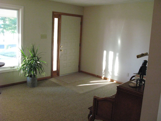
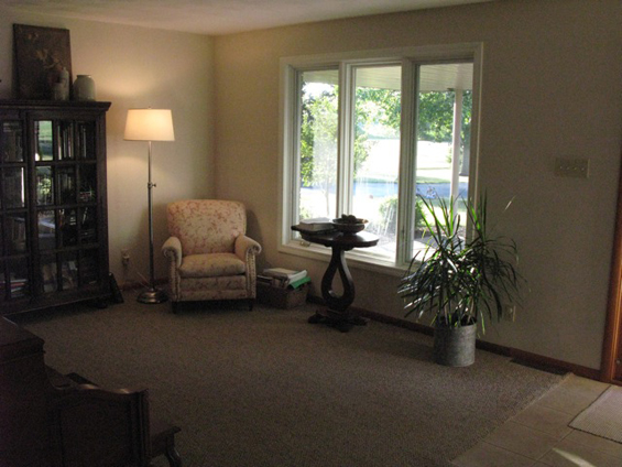
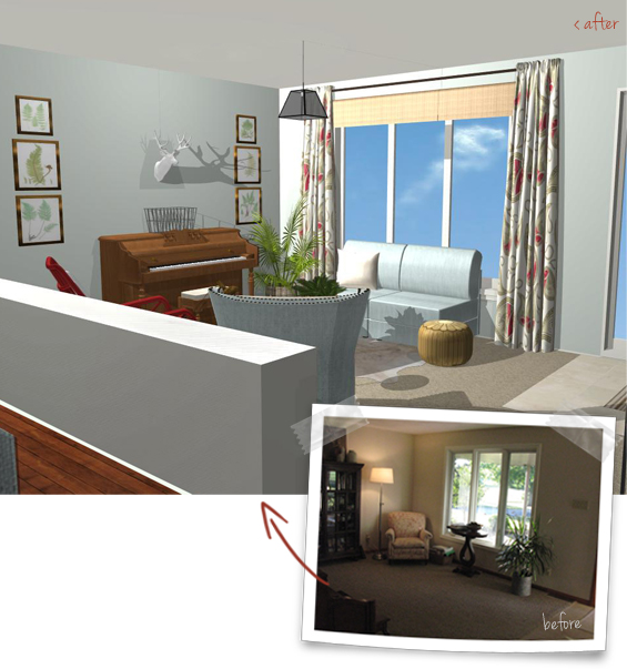
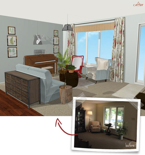
Here’s her entrance room before…
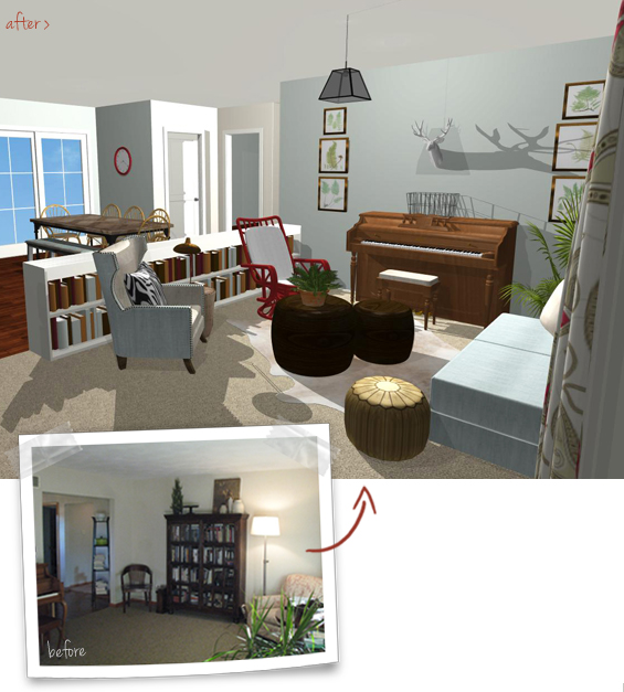
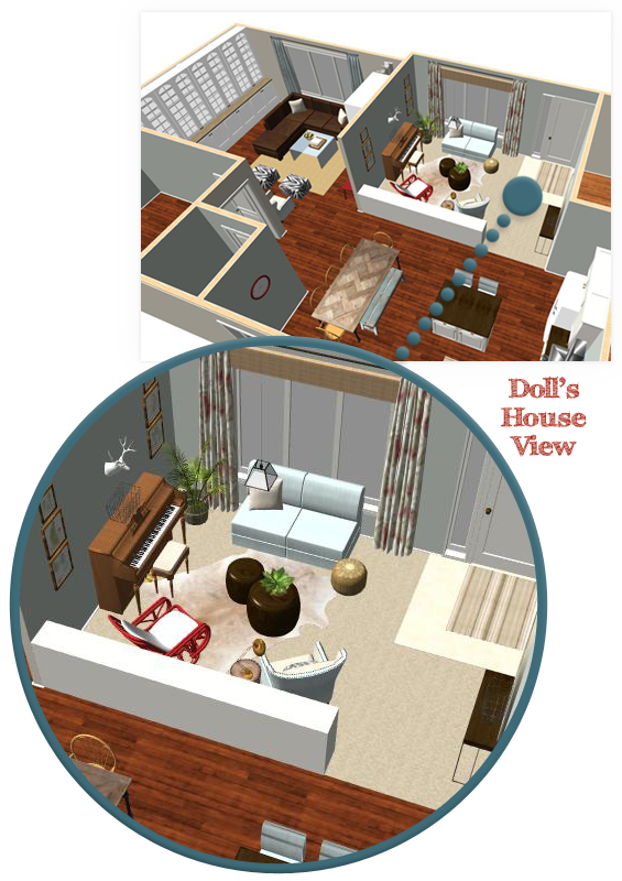
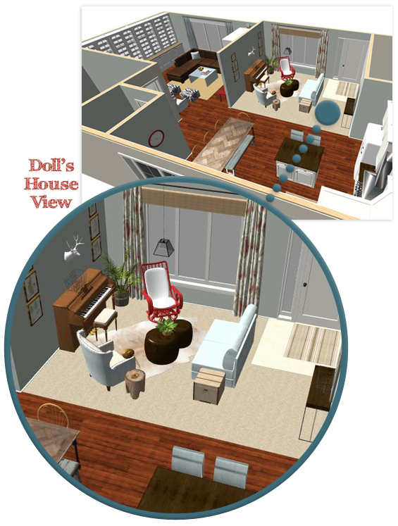
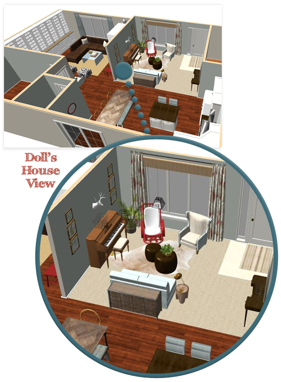
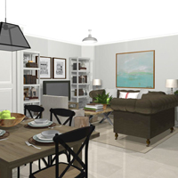
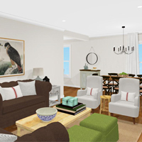
Through my renderings, I wanted to give Corinne an accurate ‘feel’ for the space so roughly incorporated her adjoining kitchen and dining room as well as snippets of her adjacent family room (as can be seen in the overhead doll’s house views). I also gave her three configuration options to demonstrate flexibility in terms of furniture layout.
A divisional half wall in the form of a bookcase helps create a sense of intimacy yet maintains an open link with the kitchen and dining space.
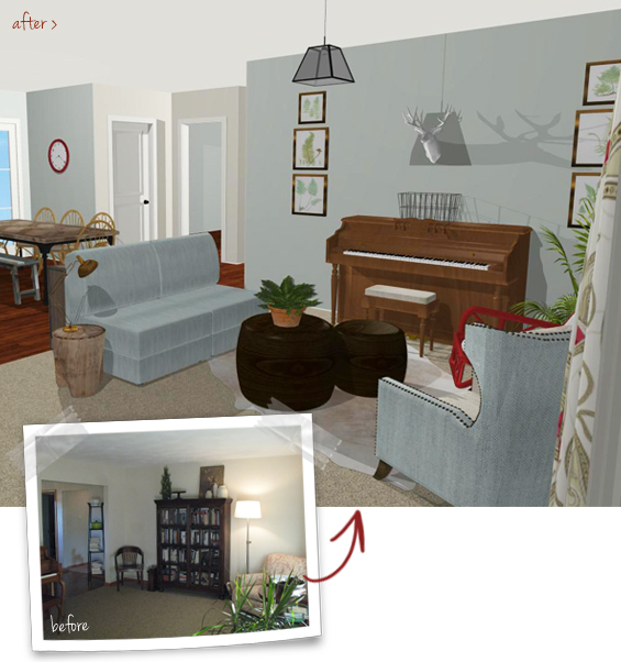
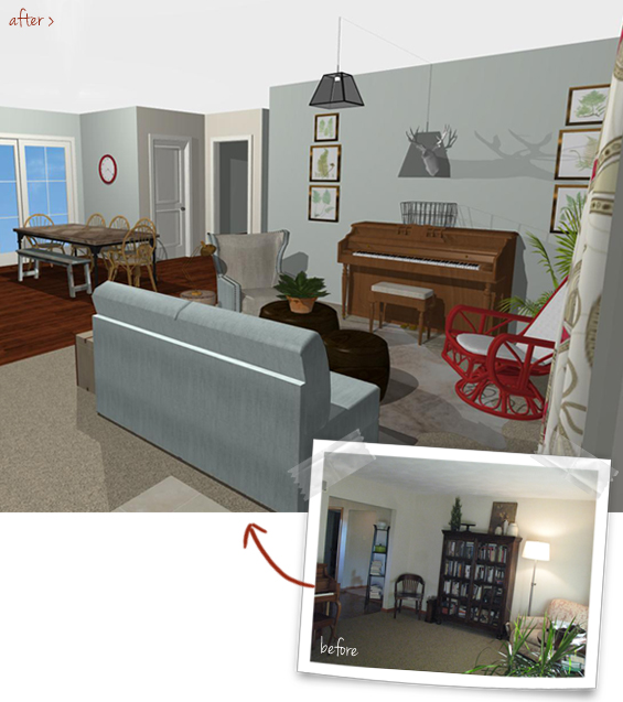
A low slung settee, positioned with its back toward the door, creates an entrance walkway of sorts. Open access to the kitchen and dining room is maintained.
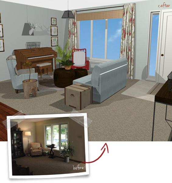
A sofa table (or cabinet) placed behind a settee between the kitchen/dining space forms a subtle boundary.
Which is your favourite? I think I’m torn between concepts one and two.
If you’re interested in some design help for your own home please feel free to view this page for some further information and don’t hesitate to contact me at any time.




OMG! This is totally awesome.
Definitely number one. It provides the sense of separation from the kitchen that the room needs. It would feel much more integrated.
I loved number 3!
Amazing on all 3 concepts. I would never thought of any of them. I’m one of those who can’t see “what might be”. I like the storage *1* gives and offers an area to display for special occasions. I also like *2* giving the open feeling. Even *3* is a good plan. Glad it’s not me deciding!
I think one and three are cool!! :)
My favourite is 1 because of the added storage and display space. Great work on all of them!
I like 2 and 3, they provide more flexibility. You could easily switch between the two with the seasons or on a whim.
I was instantly in love with number 3, great work!
I love them all. The color scheme and choice of furnishings is fabulous too. How on earth do you get them to look so real? Seriously, they almost look like photos. I think I need some virtual photos of some rooms in my home to copy. LOL.
Hi Genie
Thanks for your comment :-)
I’m lucky to have a complex though amazing design program which creates realistic renderings.
I like number two – I think it gives the most open feel and a good flow between rooms. It is very flexible as well and could be easily changed. I love the bookcase wall, because I am a reader, but that would be a more permanent solution. Love your computer renderings!
Christy
Thanks for your comment :-)
I did mention to my client that if she liked the idea of a bookcase wall though was hesitant about its permanence she could always opt for free-standing shelving instead which could be moved in the future.
Number three is the winner! The flow is much nicer, open and more family friendly. Great job!
All are great – love #1 with extra storage but as it is is a little more permanent. Would it be possible to do the same shelving on small lockable castors do it could potentially be moved?
Hi Rach
I did mention to my client that she could choose to in-build or leave the bookcases free-standing to give her flexibility in terms of reconfiguring the layout.
Kristine
Love #3. The program you are using to come up with such comprehensive creative and visual solutions is great!
Wow looks great! Hard to decide, I think #2 is best. Can you have both? ;)
Where is your tall brown bookcase from in the before pictures? I love it!
Emily
There’s actually no reason Corinne can’t have both – well, kinda. The design lends itself to easy reconfiguration so she could choose to change the layout from time to time.
With the removal of the wall there is no longer space in the room for that bookcase unfortunately. I imagine Corinne will move it to another room.
Has to be #3. it draws you in to both spaces, making the whole house more welcoming and inviting.
I love one. I can see using the built in book case as a buffet on holidays and it makes for a nice place for displays. I like that the small sofa in two with its back making the entry feel like a separate space. I hate walking straight into a room. I think this gives the illusion of transition.
I too like the idea of creating a separate space to ‘walk into’ by using strategically placed furniture.
I love #2. If you build a bookcase there, then she will be pretty much stuck with that furniture placement. If you go with #2 (or #3), she has the ability to move furniture around when she wants to. Plus, #2 helps with the fact that you’re not “falling into ” the room when you walk in the front door. It gives a little bit of a foyer feel.
xoxo laurie
I definitely agree that number two creates a sense of ‘entry’. I suggested to my client that if she does like the idea of number one though is hesitant about the permanency of built-ins she could certainly opt for free-standing bookcases which could always be moved in the future.
I love 3 best, but I’d like to see the setee/seating pointing to and including a chat like feel with the kitchen. I live in UK and rented a home not unlike this for a short while. It is an unusual concept in UK and I LOVEd it. In the rental home the relaxed seating was connected to/facing the cook and food prep area so mum can cook and family can stay out of the way, but within chattering distance with correct placement of setees. XXX Wren
Hi Wren :-)
I think this could work if the sitting room wasn’t directly off the front door. As it is essentially the entry into the house there is some need for a sense of separation. Though the space is still very open to the kitchen to allow for interaction.
Definitely #1
BUT … I would make the bookcase accessible from both sides and use sliding doors on it that move to cover different sections….keeping some of the shelves open, some closed, and always changeable.
Hi Cheri
Yep, that’s certainly an option. My initial concepts are just a starting point for Corinne. She can choose to alter or expand on them anyway she chooses which is the beauty of e-decorating.
I like the first one best, personally. I like the sense of division that the bookcase wall provides, and even though it is more permanent, I think it provides a better sense of “this is a seperate room” than the others do while still having it be quite open.
My favorite is concept 1. I really like how you incorporated the half wall so there is additional storage space.
I like numbers 1 and 3. I think you need some sort of division between dining/kitchen area, and the living room. The flooring is different between dining and living room. I think you should “solidify” that difference by putting up some kind of barrier, like low bookcase or sofa. Great ideas you have!
I love #2. I feel like it opens everything up better than the other two options – looks more simple and less cluttered.
the first plan!
My immediate reaction was NUMBER THREE, NUMBER THREE!!! But the closer I look, I like number 2, but I think I’d put the arm chairs beside each other facing out the window. Then the room looks less cluttered and has a definite division between the living and dining room. Corinne has some really beautiful pieces to work with!
Thanks for your comment :-)
Corinne could certainly try configuring the room with the two armchairs beside one another to act as the divisional pieces. That’s the beauty of an e-consult, she gets some clear ideas though also has the option to play around with my indicative plans.