
I should be concentrating on finishing my little girl’s bedroom…or sharing my next batch of free farmhouse style quote art (I know many of you guys are hanging out for these – don’t worry, they’re coming really soon!)…though last week I accidentally got lost designing a kitchen instead!
Over the Easter break we were lucky to be invited to stay with friends at their little beach house. It’s a traditional 60’s fibro in near original condition and sorely in need of a new kitchen. Our friends mentioned they were keen to renovate, though weren’t quite sure how exactly. Basically, as is usually the case, they were having trouble visualising things. So, me being me (that is, a slightly obsessed decoraholic with zero willpower or desire to ignore a design dilemma!), I offered to play around with some ideas in my 3D rendering program.
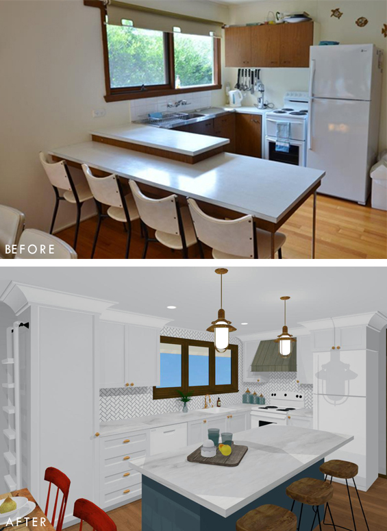
Here’s how the space currently looks…
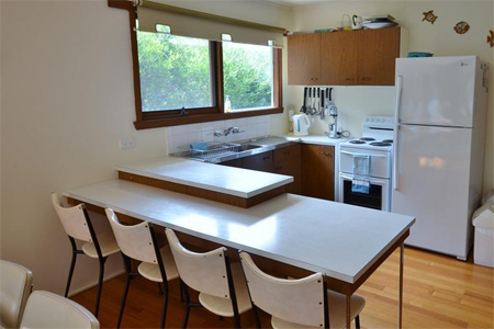
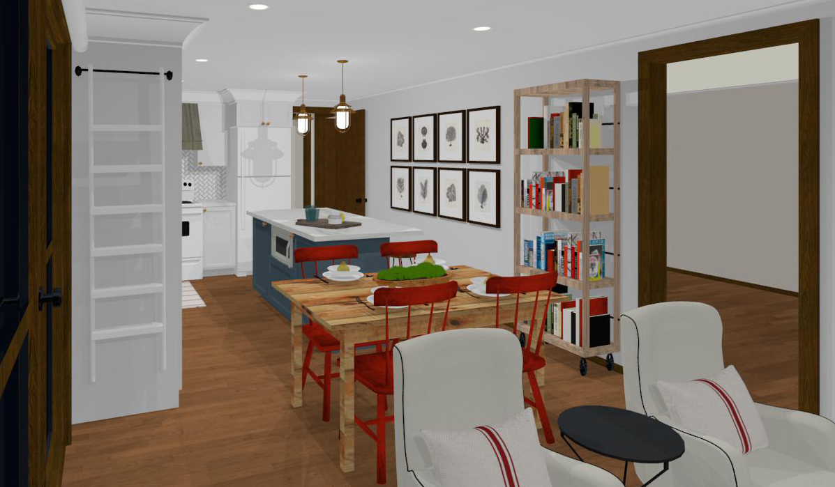
As you can see, the kitchen is part of an open plan room incorporating the dining area and living space. It’s clean, homey and useable though dated, worn and cramped. There’s no pantry or dishwasher, no housing for the rubbish bins or microwave, no ventilation for the stove, the ceiling lights are unattractive fluoros, and the pokey cabinets and tiered counter fail to make the most of the available space. Sadly, there’s little scope for a mere cosmetic refresh here. This is a total gut job!
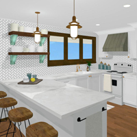
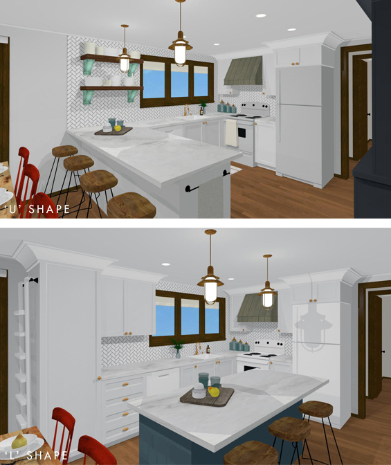
Along with retaining the current ‘U’ shaped configuration I also played around with the idea of an ‘L’ with a separate island.
CLICK THE BELOW IMAGES TO ENLARGE
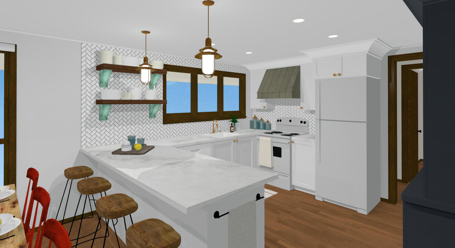
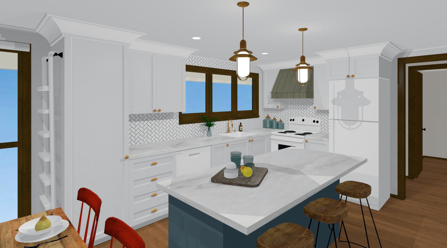
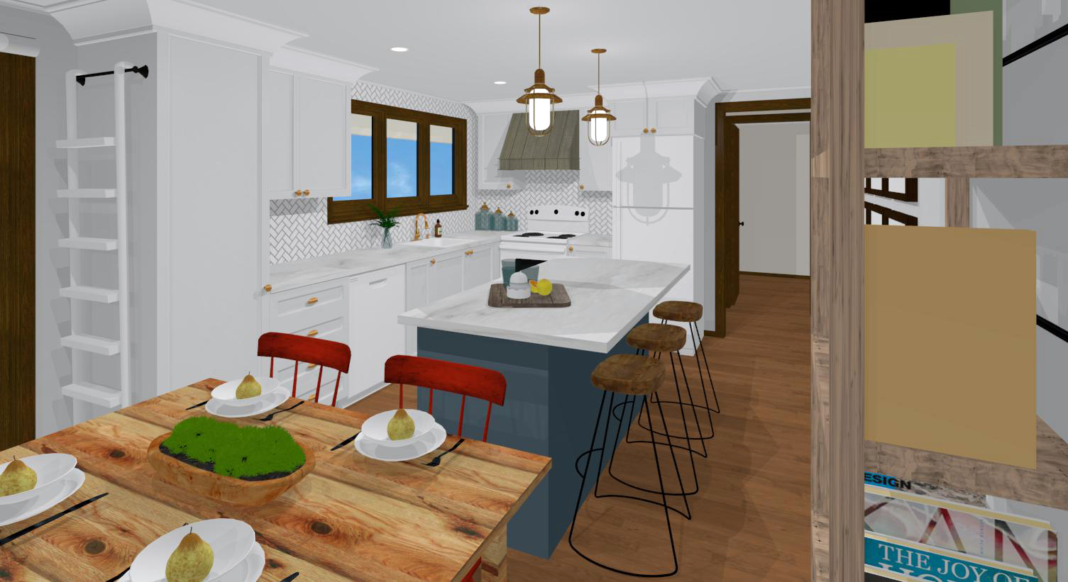
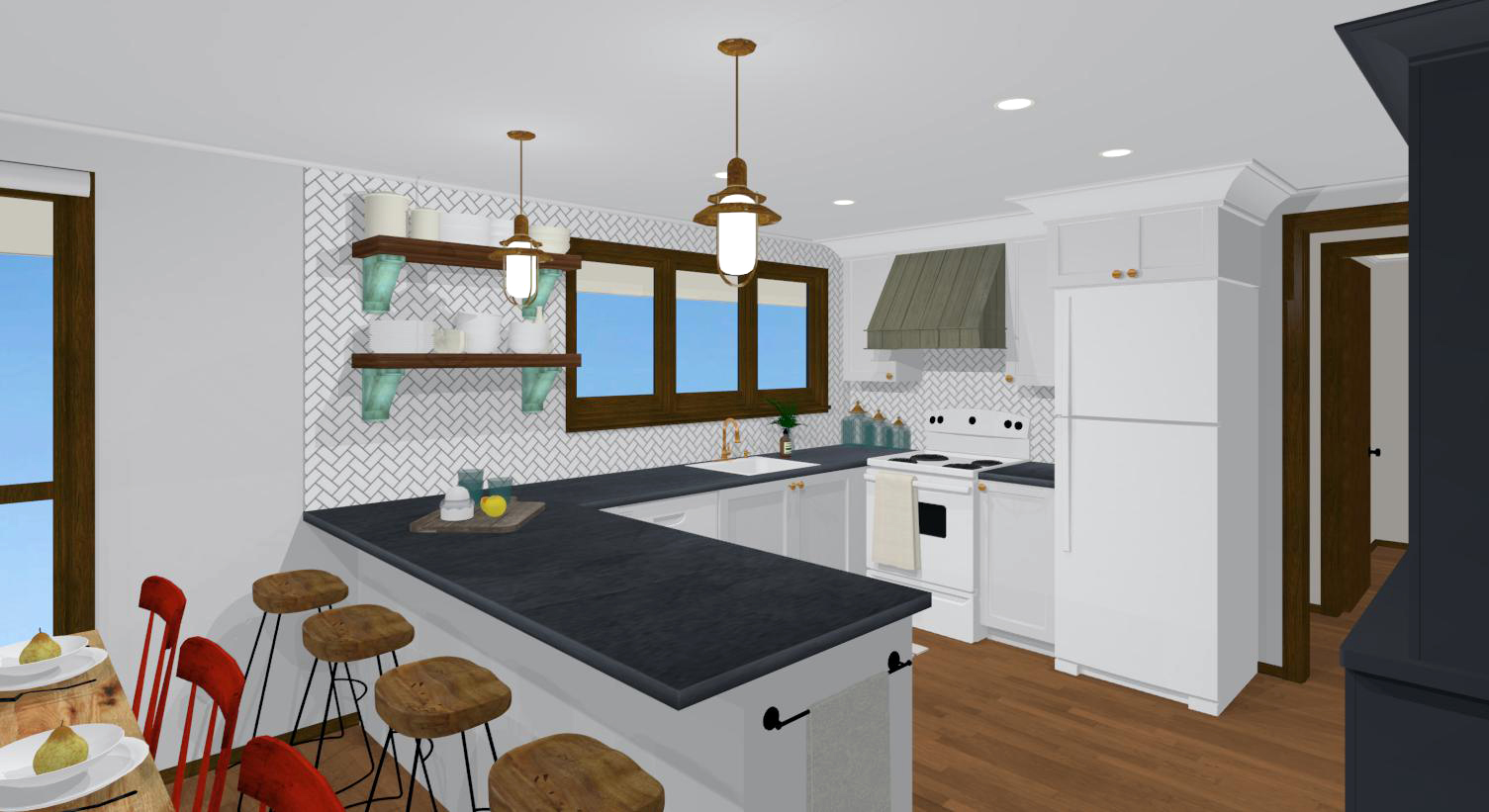
‘U’ SHAPED KITCHEN
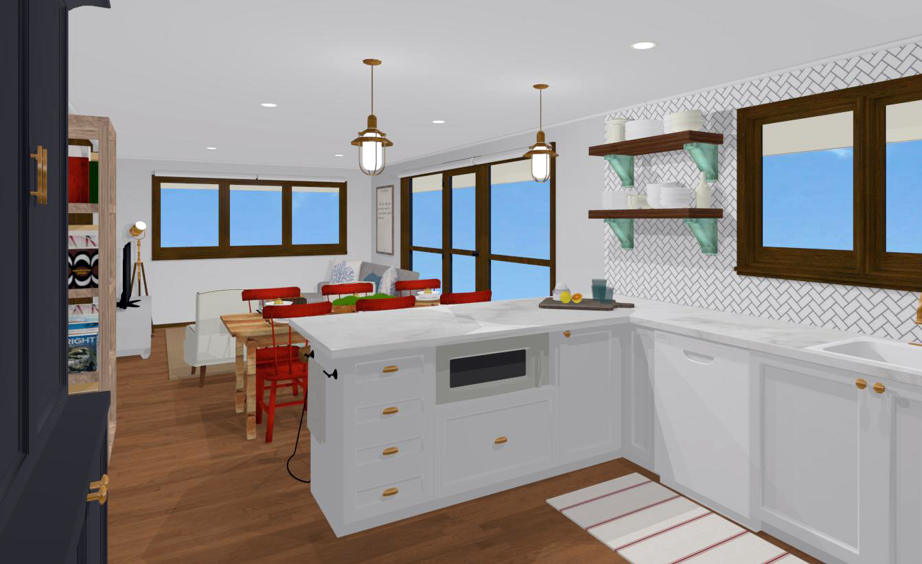
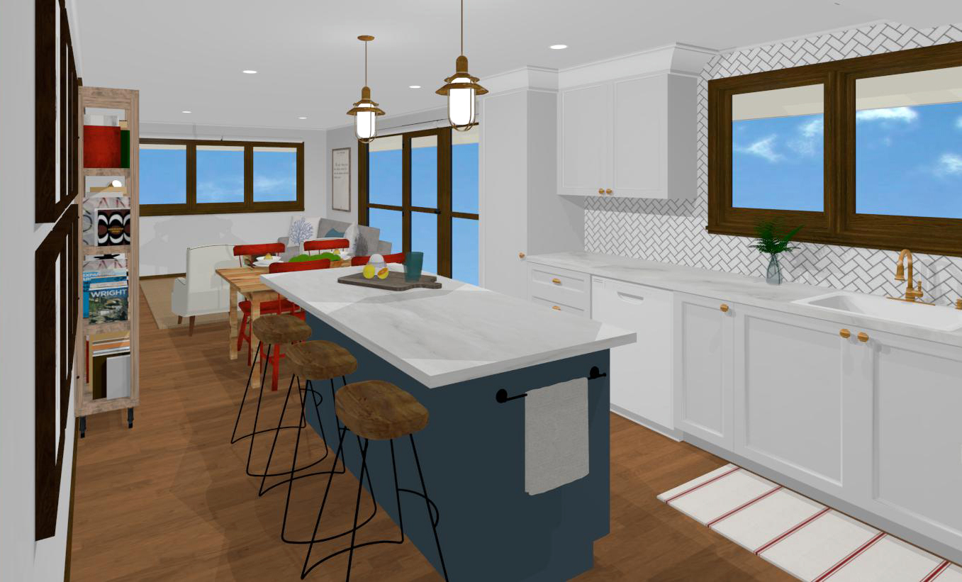
‘L’ SHAPED KITCHEN
Which one do you prefer?
I like them both. The open and contemporary feel of the ‘L’ appeals to me though I think the ‘U’ perhaps sits more comfortably in the space. Does that make sense? It just seems a little more natural.
Also, it’s easy to miss though the ‘U’ accommodates more seating at the counter than the ‘L’ does at the island. I couldn’t make the island any longer or there would be no space to open the fridge or place the dining table. Plus, the ‘U’ allows for a longer dining table as the kitchen cabinets don’t protrude into the dining zone as they do in the ‘L’.
‘U’ SHAPE v ‘L’ SHAPE
As I never fully discussed all of the specifications for the space with our friends, I’ve taken total creative license with these designs! Of course, everything is merely suggestive and open to customisation as desired. Let’s face it, when it comes to decorating taste is subjective and the possibilities are endless!
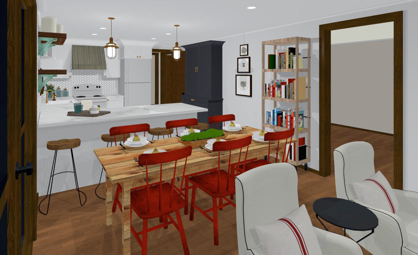
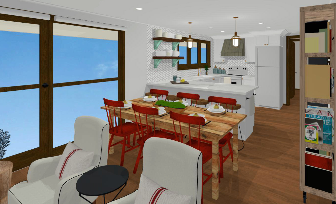
I used a neutral base of white accented with bluey-charcoal and red. I’m not usually a red person though for some reason I love pops of it in a cosy cottage space, especially when paired with bluey-charcoal. The over-all vibe is classic cottage meets modern industrial – or something like that.
One thing our friends did mention was that they were considering a dark counter so I created another plan with black soapstone in place of the white marble…
Do you prefer the contrast the dark counter offers? Or do you like the harmony of an all white kitchen?
DARK COUNTER v LIGHT COUNTER
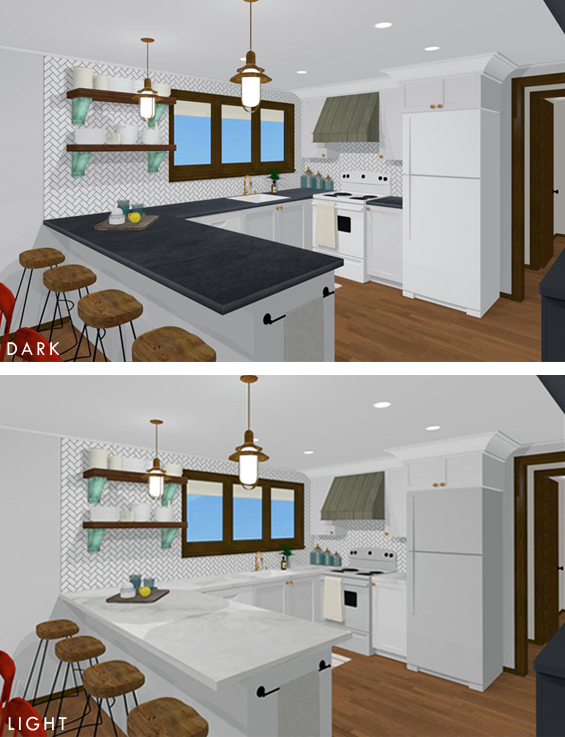
Again, I like both and there’s really no right or wrong here. It’s just a preference thing. I think I would choose the light counter.
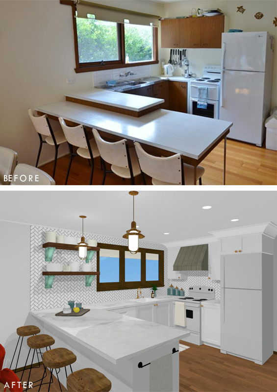
Anyhoo, here are some before and afters just for comparison’s sake…
‘U’ SHAPED BEFORE & AFTER
‘L’ SHAPED BEFORE & AFTER
I had so much fun playing around with this kitchen and it’s lovely to be able to offer our friends a visual guide before they dive into renovating. Hope you like it!
![]()
If you’d like some design help for a room in your home, don’t hesitate to contact me.

You are too clever. Love both designs though adore the island with the dark grey cabinets. So inspiring.
L shape with dark counter tops. I think it leaves more room in the kitchen for several people to be involved in cooking —- as well as room to hang out around the island and watch !
The L-shape with island appears to give a little more counter space and possibly storage space?
Thanks Jane. Counter space and storage space is almost identical. The ‘U’ has a free-standing pantry/cabinet in place of the attached one in the ‘L’.
I would go for the L shaped kitchen!!! I had a U shaped kitchen for 18 years, and now have had a L shaped for 8 years and I wouldn’t go back. I love the flow with my new L kitchen, and with my U shaped it always felt so cut off from my dining room.
W/ limited space, I’d go with the U. Flow in a cottage is, IMO, not the same as flow in a full size house, as the cottage space is so limited. U feels ‘natural’ and the L makes the room look like a railroad car, long and narrow.
I dont care for the open shelving. Besides looking clunky for a small space, it’s a dust collector and cooking oils etc will settle on shelf and contents. I hate picking up an object and feeling an oily coat on it. And i bet they cook plenty of burgers while there.
I do love the way you’ve done the computer work. More than i could ever manage. Very nice job of work all that.
Thanks Dianne.
I tend to agree with you about the ‘L’. I do think the ‘U’ feels more comfortable, as mentioned in my post. I’m also not a huge fan of open shelving in kitchens for the reasons you’ve mentioned however I think used sparingly they can be a nice feature. I just feel that having a solid upper cabinet on that wall might impede into the room, close-off the space too much and hinder the sight-line. I think the shelves provide a bit of character though it’s entirely up to the home-owners whether they use them or not.
Totally going with the U…and the symmetry-fiend in me wants the counter top and window trim to match that perfect bluey-charcoal. Pop of red? Perfect…and easy to update if wanted. Palette is beach cottage without going to that old tired Florida Room place. Love.
Thanks Kathy :)
In my humble opinion, I would choose the “L” shape kitchen. It lends itself to more storage. And I love the island in the center with the seating! Yeah, that’s the one I choose. Heehee
Thanks Evelyn. I think the storage space is actually almost identical. Rather than having the tall pantry on the end of the ‘L’ there is a large free standing pantry in the ‘U’. They both work :)
These renderings are great! I’m so visual so it really helps to see the design in 3D. Just curious, what program did you use and is it difficult to navigate? Beautiful job!
Thanks Deb. I use Home Designer by Chief Architect. Is it hard to navigate? Hmmm, definitely comes with a steep learning curve. Getting a handle on the basic stuff is easy enough though designing more complex plans can get tricky. I think you can download a free trial version if you’d like to have a play around first.
Here’s the link: https://www.homedesignersoftware.com/.
:)
Having remodeled our kitchen I love the white countertops and the U configuration. It looks more open and larger to me than the L because of the tall cabinet on the left. I did notice in both plans that the stove placed against the sink cabinet means you can only open the oven door or the sink cabinet door one at a time. This would be a problem for me as far as access. Great designs overall!!!
Thanks Liz. Yes, it’s not ideal though it’s the best (only?) spot for the oven. Still, wouldn’t the oven door only really be opened for a few seconds at a time for the receipt or removal of food? Can’t see it being a major issue.
L-shaped kitchen for me! Seems to have more storage and I love that a tall pantry can fit in. I have one in my kitchen and it’s a must-have for us.
Thanks Bonnie. There is a free-standing pantry in the ‘U’ shaped plan too.
:)
So, I have a U shaped kitchen (37 years) and hate it….I would think that if you can go with the design that allows for the island you might be happier..Only one person can truly work in my U shaped kitchen, cooking and dishes, without stumbling over people…I just wait until guests are gone to do dishes and things….The L shape could provide much needed space for guests who like to help out!!
Would give anything for the opportunity to reshape my kitchen to a more workable space!!!
Good Luck with which ever design you choose!!!
Thanks so much for your input Shirley :)
One more thing, from experience, with the U shape..notice how the stools and dining set are scrunched together? That is a problem when you have guests….The island sort of separates the two and doesn’t look as cluttered. When someone is sitting a the table and someone wants to sit at the counter, it gets really tight (as least in my space!). Just putting another thought in your head……
I like the U shaped because of the open storage using the dark wood plank style shelves. It brings so much character and warmth to the space! I personally love to showcase dishes and plates as they are art in and of themselves.
I like the lighter countertops because they had height and airyness to the space!
The U shaped looks better and I think will give more usable space over time. Both look very nice though and I think you can’t go wrong with either. Light countertops are way better. I’ve have white quartz with reflective mirror pieces and glass bits for a year and it always looks so clean and airy. My MIL has black granite and it is beautiful, but you see every crumb and lose keys on the dark surface. My vote is U shaped w/light countertops
Thanks Angie :)
I’d definitely go with the L shape as there seems to me more storage and better layout separating the stove/frig is better. I would suggest vetrostone.com for countertops as they offer a mixer of both darks and lights with beach homes . the Primeo collection of theirs includes sea glass and shells. I’d even be onboard mixing darker lower cabinets with light colored uppers .
Thanks Sara. Storage is pretty much the same in both plans, as is the fridge/oven layout. It really just comes down to the overall “feel” you prefer. Thanks for the countertop tip :)
The white in your pictures make the room appear more spacious. Like the U configuration the best. In decorating I would recommend that they invest in a drop leaf table…maybe IKEA?… And use the stools at the bar for most meals. Opens up the whole area. On a personal note, I have a monster great room I’m trying to decorate. How are your skills in that area??? Could use ideas. Thanks.
Thanks Jean. Yes, we did discuss the practicality of an extension table. Definitely a good idea in a small space for when there are guests.
I work on designs for all room types. Feel free to email me directly (thepaintedhive@gmail.com) and we can discuss further.
Kristine
I’d be all over the “L” shaped design.
With the L shaped, those seated at the bar get a view out the window. With the U shaped, those working at the peninsula get the view. Hmmmm, for flow I think I like the L shaped better.
And I’m curious too – what program did you use for these drawings? TY!
Thanks Susan.
I use Home Designer by Chief Architect. I think you can download a free trial version if you’d like to have a play around with it.
Here’s the link: https://www.homedesignersoftware.com/.
Cheers
Great tip! TY
I like the U better! I agree, it seems to sit more comfortably, and since the space is open-concept and not too large, some distinct seperation is nice.
L Shaped. It’s a cleaner, more open flow. I have a U shaped design and HATE it. It’s impossible to have more than one person helping out in the kitchen because we’re all caged up in the work area.
They say the kitchen is the heart of the home, but it drives me crazy that people can’t relax and chat while eating/ cooking in mine.
I adore your design of this cute cottage! I would prefer the L shaped kitchen with the white counter tops. I think the L shape with white tops gives it a more open feel. Also you are providing quite a bit of storage for them! :)
That said- I prefer open shelving uppers with closed cabinet lowers- though I do like that floor to ceiling pantry you included in the L design.
Could a compromise be made between the two designs?
Thanks for all your input. Well, there is a pantry in the ‘U’ shaped plan too (it’s a free-standing one) and given this is a holiday home I don’t think too many open shelves would be practical from a dust stand-point as the house could be sitting vacant for extended periods. Perhaps the ‘U’ is the way to go?
Love the designs! If it was mine…I would go with the L shaped one.
I prefer L shape with light counters and I also would like to see the floor to ceiling cabinets carried all the way across from one door opening to another. As an older cottage the owners could probably use more storage for all the items for all the seasons and guests. It would give that long wall a nice flow and not be chopped up with all the different pieces of furniture. Hidden storage important for easy clean up and keeping things dust free.
Thanks. So, you’re referring to the wall in the ‘L’ where I’ve placed the eight framed prints? Unfortunately that walkway is only narrow (standard hall width) so there is really no space for any cabinetry or furniture behind the island.
Both designs are lovely, but I agree with you on the U shaped kitchen with the light counter tops.
I’m more inclined to go with the U shaped kitchen. I like both the dark & the light counter tops, but would probably go with the light!
I would choose the L shape with the island…..it’s more of an open plan & much more up to date looking, I think. You can move around much more easily & it just looks cleaner all ’round….much better for resale value. To me, U shaped kitchens are outdated looking and make the whole space seem much more crowded. I tried to talk my son and D.I. L. into going with the L when they remodeled, but after spending a fortune, they did it the same old U. All that money spent and they still have a chopped up looking space with no room to move around in. Go with today’s look with the Island which in the end will bring you more of a return on your investment if you ever decide to sell. I’d do it all in white with the island any color of your choice unless you are doing granite, quartz, or marble counters, but a solid colored counter is limiting to your color taste only. I’ve always felt one should choose something they really like, but it should also be something someone else can easily adapt to their color scheme, too, without having to spend a fortune on replacing counters.
Thanks so much. Great advice :)
I’d choose the “L” layout, with island, because it makes the entire space seem larger. The sight line flows from one end of the space to the opposite end, instead of being broken up by the angle of the counter. Also, the issue of flow within the kitchen area is much better, when you’d like to have more than one person in there at one time. Please let us know what they choose to do.
All of these options look amazing! I do prefer the “l-shaped” kitchen. I love having an island it adds the extra counter space, while still keeping an open concept. The bar stools you have chosen are to die for. They really bring a rustic flair to the space!
I do like the “L layout”, with island, because the space seems larger to me. The vertical line of the island provides a nice flow into the dining area, and a sight line from the kitchen to the living area. Counter top color, on the other hand is tougher for me to choose! I like both looks, so I guess it would predicate on what other colors/finishes are incorporated into the space. Thanks for asking!
L shape with white seems best to me, more cohesive with good division of the space.
I prefer the “L” shaped design for its open feeling. As a short lady, I know that having those pretty shelves on the wall (in the “U’ shaped kitchen arrangement) that I cannot reach from either side of the counter without a ladder would be most annoying. The counter top itself blocks you from easily grabbing plates. Also, I prefer the lighter counter surface over the darker one. The dark one seems to push down the kitchen; the lighter counter seems to float without landing which I like.
Thanks Ann. Yes, open shelving can often be out of reach though our friends are quite tall! Still, I would probably suggest keeping lesser used, pretty items on the open shelves anyway. Agree with you on the light counters – they are more “airy”. I guess the darker counters would appeal if you like a grounded feel.
I like the “L” shape with the dark counter. :)
U shape with light countertops. Stunning makeover either way.
Thanks Joyce :)
I currently have a U shaped kitchen, and I love all the space I have on the peninsula to spread out and make bread or bake cookies :) I think the lighter countertop makes the kitchen feel more spacious. But that island………….sigh :) So hard to choose!
Both gorgeous! I do love the L shape in the rendering, for the reasons mentioned previously, but I wonder how congested the kitchen would get with people sitting at the island? It seems as if the hallway at the rear of the kitchen would be cut off – possibly not an issue if it only leads to the laundry or some such. For that reason, I feel like the U shape works better in that whole space because it isn’t as dominant, especially with the cute open shelves. Frankly, for a holiday home, just adding a dishwasher and the extra cupboards in the new, one-level breakfast bar is really all you need. Plus, how much money do they want to sink into it? I would think the U shape option would be much cheaper. Also love the white counters, there is enough texture and contrast with the range hood and shelving in the small space. Just my two cents worth!
Totally nailed it Julie! They aren’t looking to spend a heap and just want something more practical and pretty for their holiday home (with a dishwasher – that was a must!).
Glad you put counter between fridge and range. Right handed people need space on right to put down items coming out of oven. And the heat from a stove not great next to fridge, though insulation seems good, there’s still heat there when you open the fridge and melting your ice before it gets to the glass.
Yes, I thought it was a little strange to have the stove abutting the fridge!
My mom actually had a kitchen with the same footprint as the original here. We took out the U and made it an L with an island. She HATES IT. We find that it doesn’t free up much more space and we get in such other’s way no matter what. We would both take it back to the U if we could. What I would do, in returning the kitchen to the U-shape, is remove the bar stools entirely and move the table closer and perpendicular to the peninsula. Yes, it would reduce total seating, but it would open the space up more, and not look so cluttered with so many chairs.
Thanks Cyndia. Yes, I thought about butting the table up to the counter (in both plans). It’s an option though given the scale and shape of the room it really does work best to have it oriented horizontally. And they need to seat at least six people with the option for more.
Thanks so much for sharing your experience with the ‘L’ shape. It’s great to hear the real-life stories.
:)
In a small kitchen like this I believe the L-shape would be more practical. Although you say the storage space is almost identical, a U-shaped kitchen inevitable incorporates 2 corners and I find corner cupboards very annoying from a storage perspective. I also agree with the others that say it is easier for more than one person to navigate around an L-shape.
Hi Kristine, I love this, the level of detail in these is great, really has a specific up to date coastal feel that is classic and still young and fresh. I think crucially the size of either the peninsular or the island will be the determining factor on the success of the layout for the size of the room. I think you have made both designs look good. Island are very popular with people, however when they are “squeezed in” they can become pointless and actually impractical. The peninsular does seperate the kitchen, which if you have small children is sometimes a good thing, if access into the Kitchen is a factor then the island is better. The exact width of the room probably best decides which would suit. I have tried to use chief architecht and eventually gave up. I wanted to get to doing rooms as detailed as this, but usually ended up only getting the floor plans done. I was able to do a few basic ones for a laundry plan for my parents and kitchen for my brother, but found it had so many compromises on what I wanted it to look like! I think I installed it in 2008!!I found changing everything from the american style really difficult to make it look appropriate or contemporary. Maybe an update is in order….. Can I ask if you found any resources to help with the steep learing curve? You have inspired me to go back and give it another go!
Hi Rebecca
What version were you using? I started a few years ago with Home Designer Architectural and have since upgraded to the latest version of Home Designer Professional. I think they have most (if not all) of the same visual features so both versions can produce identical looking results though Pro just makes a few things easier. You probably know all about this though you can compare their features here: https://www.homedesignersoftware.com/products/product-chooser.html. I’m actually not entirely certain if the extra money I forked out for Pro was worth it though it’s been great having the latest version of something – much quicker with better quality renderings plus some new features.
I too found it very frustrating at first! I had heaps of trouble customising architectural elements, like wall treatments, ceiling lines and cabinetry, (don’t ask me about terrain still – yikes!) and kinda gave up a few times too! I never thought I’d be able to create a decent looking kitchen! Though each time I tackled a new plan I learned more and more and options opened up. I’ve found the Forum and Knowledge Base to be super helpful and have learned to think laterally and improvise where needed too (i.e. using Shapes in place of “proper” elements etc). Yes, there is a steep learning curve and I’m not sure if there are easy ways to overcome it however I can say that many of the things I struggled with at the beginning I’ve since discovered are actually quite achievable! The level of customisation you can achieve is actually pretty awesome. Like you, this is not a statement I would have uttered at the beginning! Of course, there are still certain design elements which are tricky and frustrating (impossible?) to create ‘exactly’ though more often than not you can get close enough.
Not sure if you’re aware, though you can import 3D items from the free Sketchup Warehouse (https://3dwarehouse.sketchup.com/?hl=en) which can help take the appearance of plans to the next level. The quality and quantity of freely available 3D objects has improved dramatically over the past few years as the 3D modelling industry has grown tremendously. I’ve found that not all of them render properly when imported though for the most part they are great.
Anyhoo, let me know how you go and don’t hesitate to email me (thepaintedhive@gmail.com) if you need to talk things through or ask any questions. I’d love for you to feel confident and empowered using the program. It can be really cool!
Best
Kristine
x
L shape with the dark counters.
You’re so clever Kristine. Having had both L shaped and U shaped kitchens, I prefer L shaped layout. I’ve found with our U shaped kitchen we are always in each other’s way and people tend to get “trapped”. Our L shaped kitchen was actually smaller but flowed better. I love the look of both but I’m partial to an all white kitchen. Great work!
Thanks so much Tina :)
Kristine,
What a delight to have you for a friend! Your designs are beautiful – simple, clean lines with classic styling! Having lived in a very small home for many years, white and light helps everything feel more open, so I would go with the lighter countertops. Both layouts are lovely and I’m sure your friends will have a hard time choosing! The “L” is really stunning, but I’m a classic girl at heart, so I would choose the “U”. In a small kitchen it helps to have everything within arms reach, and this layout suits that a little better. I hope your friends will let you post some after the reno photos! Thanks for always inspiring me to be more creative!
Warm regards,
Ruth
Hi Kristine,
I am so grateful for your generous reply! I havent had a chance yet to look at all the information you gave me as my daughter has been unwell, but your suggestions and encouragement have made me feel really positive about trying it again. I think I am probably due to upgrade, and the free sketchup library is something I didnt realise. I know you must have spent a lot of time to get your designs as well thought out and detailed as you have but you have certainly inspired me to go back to it. Thankyou again for making this blog such a wonderful, inspiring, creative and generous place!
Aw, thanks so much Rebecca. You’re totally welcome and I hope you find joy in creating with the program. Let me know how you go :)
Personally, I find the “U-shape” with the darker counter more aesthetically pleasing. :-)
Hi, Kristine. I love your printable so. However, I am having trouble getting any of them to download. When I email the zip file to myself and try to open the zip file, there is nothing there. Could you help me, please. I really appreciate it. My daughter bought a historic condo in downtown Portland. She and I have a thing about birds. The graphic with the conversation between the bird and her mother would be a perfect addition to one of the walls in her condo….but I can’t get it 😞 Thanks for any help you can offer. Janis
Hi Janis
Happy to try and help.
So I can offer you the best advice, can you please run me through step-by-step what you are doing exactly.
Cheers
Hi, great work, like the U shape with light bench tops. (seems open and modern to me) Allways a good idea to physically separate stove and fridge, due to radiant heat causes the fridge to work overtime keeping contents cool, and chewing up power bills.
Fantastic work, love the website.
Jason Stan
Thanks so much Jason.
Awesome. How did you find the software for the design. .my kitchen is soon coming. I like the L. Because it looks like it gave you a lot more cabinets and space. But what did you decide?
Thanks Lee Anne. I use a rendering program Called Home Designer.
I always adore everything you do! (I mean it) Either one will look GREAT, Kristine. I fancy the L-shaped more ;)
Thanks so much. I always appreciate your comments :)
we just redid our kitchen, I love the L shaped. It seems the overall flow is better. We all know people gather in the kitchen. Just a suggestion, love, love, love my new extra large one bowl sink. I can fit any large cookie sheet or cutting board in to wash. Mine is 30 inches by 18 inches.
Have fun and enjoy.