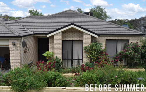
I must admit, from the start it’s been the ‘street appeal’ transformation which has had me most excited about this house. I haven’t had the chance to work on many (any!) full facades so it’s something I’ve always been super keen to tackle.
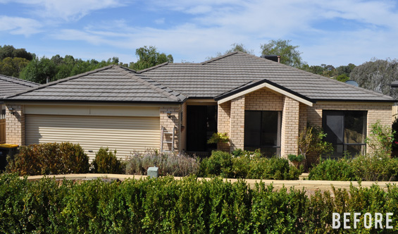
Whilst the original state of things was clearly far from spectacular, I think the classic style and basic bones offered so much potential.
Of course, there are lots of different ways we could have gone with this however to me the general design lends itself to ‘cottage’ so we’re going to try and inject some modern country charm. Not only will this help distinguish the house from most of the other (numerous!) nearby properties on the market, though it should also impart a homey welcoming vibe and work with the semi-rural location (oh, and my personal love of contemporary cottage may or may not have influenced things slightly!).
Obviously we’re on a tight budget so for the most part I’ll be looking for easy and affordable ways to update existing elements and layer character on top.
PAINT
It goes without saying that one of the best ways to transform a house is with paint.
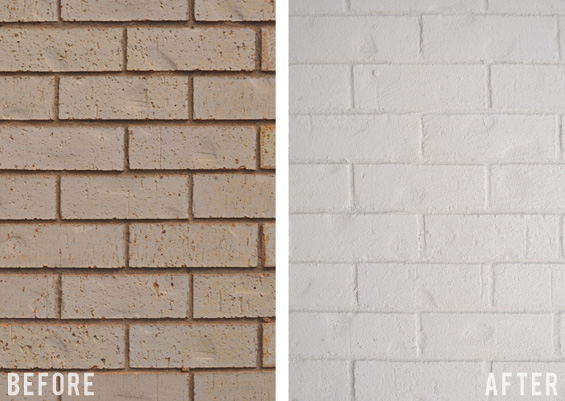
Now, some of you might like to look away because I know not everyone will like this however…the brick is now painted!
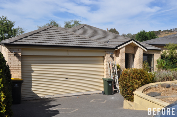
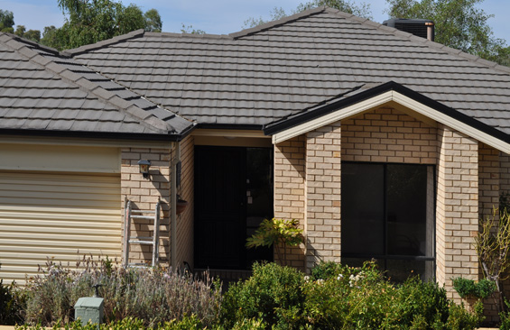
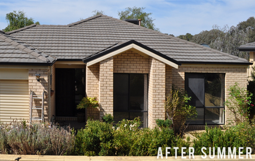
Although the original brick wasn’t completely hideous (bear in mind it does look much better in the photos than in reality though), when teamed with the ashy roof and black trim the whole scheme simply came across as dated and lackluster. There was just no zing!
I wanted to create more contrast and after playing around with a few options eventually decided on white.
When choosing the white I wasn’t sure whether or not we would be painting the existing cream fascia and eaves, and also needed to account for the nearby yellow-toned boundary fences and retaining walls (which we probably won’t be painting) so settled on a warm white which would harmonise well. Dulux ‘Antique White USA’ is a rather creamy white which actually presents as quite crisp outdoors yet still has a hint of softness.
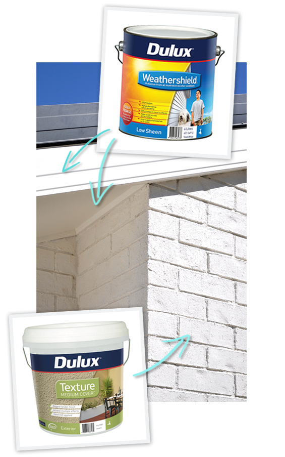
Rather than use regular paint, I decided to try something different.
Dulux Texture Medium Cover is a thick and flexible acrylic paint which provides the rustic look of bagged brick. It’s similar to render though as it allows the brick structure to show through it offers more character – which I personally love.
I’d never used anything like it before and absolutely adore it! You cut in with a brush first, just like regular paint, then apply straight from the bucket using a mitt. It’s a little bit messy though actually fun! Of course it was kinda tricky for me to document the painting process whilst decked out in my stylish painting glove, however if you’d like more information we basically followed the manufacturer instructions and this video tutorial.
Once the brick was painted we decided the cream fascia and eaves were letting the new fresh feel down so painted them to match using Dulux Weathershied in Low Sheen.
Our black and white scheme is now crisp and simple and ready for a soft colour pop (more on that below).
GARAGE DOOR
Unfortunately there’s nothing much we can do to salvage the existing dented cream roller door so have decided to replace it.
This is one of our biggest ticket items of the entire flip. The garage accounts for almost half of the entire facade so I figure making it look great will be money well spent.
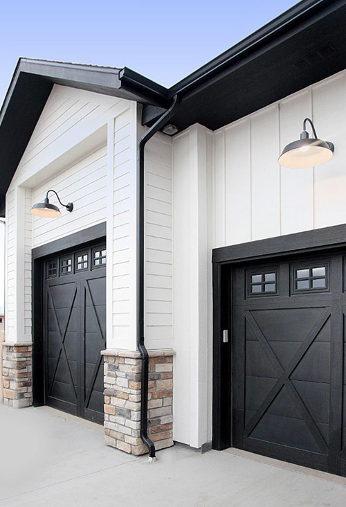
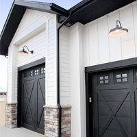
I’ve been to-ing and fro-ing over colour options though think I’ve finally landed on matte black to break up the white and bring in the other black accents. Ideally I’d love a carriage style door though I’m sure you can imagine that they can be pricey.
This is just a rough inspo idea.
So I’ve been looking into some DIY options and affordable alternatives and am excited to see what’s possible. Can’t wait to share what we end up doing!
ARCHITECTURAL ELEMENTS
As mentioned above, something I’m exited about bringing to this house is a sense of charm.
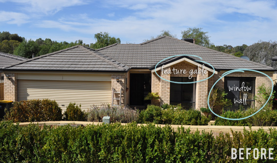
There’s not a huge amount of scope for adding decorative elements, and I certainly don’t want to go over the top, though two areas I’ve identified which could do with some zhoozhing are the feature gable and the window wall.
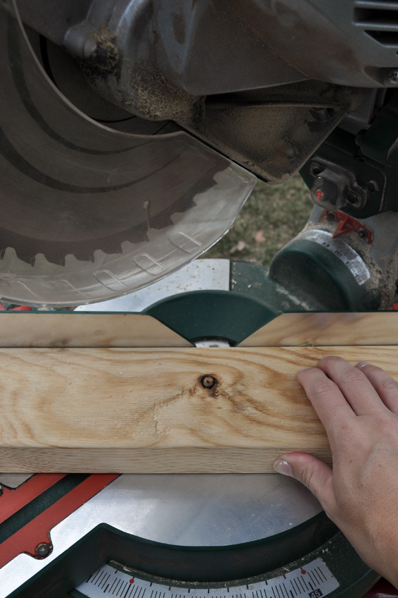
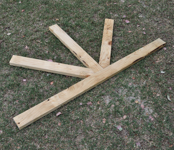
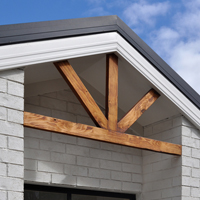
For the gable I’m planning on adding a timber accent pediment. I’ve actually already built it (from a $14 length of treated pine) and am hoping the rustic wood will warm up the white and impart some earthy texture.
I had visions of creating something more decorative though decided that was a bit beyond me (and my tools!) so stuck with nice simple lines. Because I built it at home I made it slightly larger than required so I can easily cut it down to fit when I’m next at the flip house.
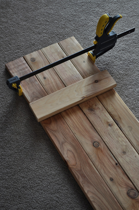
The large window on the right will be flanked by decorative shutters. Again, I’ve already built them (from $40 worth of cypress pickets) and plan to finish them in a soft duck-egg blue.
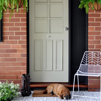
The front door, which is currently dark indigo and comes across a bit like an unwelcoming black hole due to its recessed position, will probably be painted the same duck-egg colour to provide some continuity and brighten things up.
Although black and white alone can be stunning, given the house is quite simple architecturally I want to add one feature colour to provide a bit of interest, liveliness and pop.
GARDEN
When I first saw and photographed the property it was late spring and the garden, although overgrown and weedy, was quite green, lush and pretty.
Then summer hit – and it’s been a long, hot, dry summer. With no-one living in the home to care for the plants many struggled and several died. We’ve had to remove a lot and drastically cut back others so right now things are looking rather brown, withered and barren.
We’re going to try and retain as many established plants as possible then fill the key areas and sparse patches with a simple mix of shrubs. Not certain at this stage though given the house is north facing we’re thinking tough varieties like Westringia and Dietes. We’ll see.
STYLING
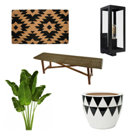
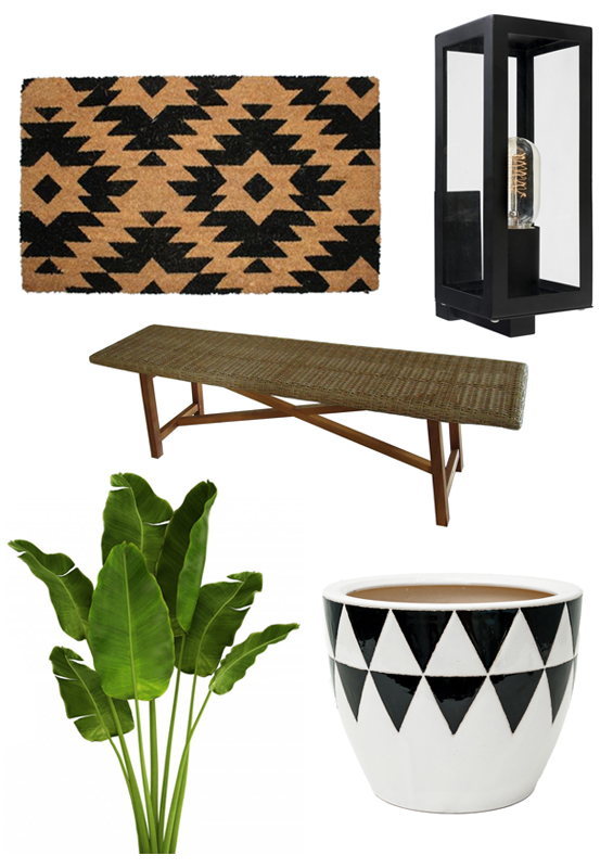
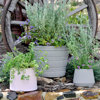
At this point of the flip adding the finishing touches, such as lighting, pots, decor and furniture, is still a bit of a distant dream though I can’t help but look forward because they are the elements which will bring everything together – plus, to me, it’s the funnest bit! I have visions of matte black lighting, pretty pots and lush greenery, and natural materials such as wicker, among other things.
DOOR MAT | OUTDOOR SCONCE | WICKER BENCH | BANANA PALM | GLAZED POT
This is just a rough mood board I put together. Like I said, we’re not quite ready for this yet though I can’t wait!
If reading all this has made you think I must be super self-assured and confident, let me tell you that I’ve actually been doubting and questioning myself the whole way! Like I mentioned, this is my first time working on a facade and, just like anyone doing anything new, I’m simply learning as I go. At this stage all I can do is cross my fingers and toes and hope that, just like with my interior makeovers, things all come together in the end!
Thanks so much for following along.
You can catch up on Part One of the house flip HERE.




Cannot wait to see the results!
Thanks Cathy :)
the same !!! I hoped it is finished :D good luck ! Erika from Slovakia
Thanks Erika :)
I’ve been checking my inbox regularly to see if there are any updates from you; thanks for keeping us in the loop. I have no doubt the house is going to be amazing like everything else you do. :)
I hope so! Thanks Julie :)
The suspense!!!!!!!!!!!!
LOL!
I just love, love, love your blog!!!! It is my favourite and I am checking my box every day to see if you posted anything new! Love your style, your house is beautiful!
I’m with Sylvia! I love your blog too and also love the choices you’ve made on this house! Can’t wait to see it!
Aw, thank you so much ladies :)
looking good
As always, you have great ideas and I love the way that it’s coming together. Thank you for sharing it in this way…I like seeing the “process” behind everything. Thank you!
Thanks Leslie. Yes, it’s always tricky deciding between sharing the straight before and after in one hit or dragging things out with process posts. I always worry people might get bored because I don’t finish things in one week like they do on TV – LOL!
Wonderful planning! Looking forward to seeing the steps along the way.
Sheila
You always have great ideas, and there is no variance here!! I love all of them.
Love that you are painting the brick, and the door. Adding the architectural details!!
Replacing the garage door is going to make such a huge difference.
Are you going to change out the lighting, and add some cool house numbers??
Great job
Thanks Julie.
Yep, the current little lights flanking the garage are just plastic and have seen better days. Hoping to replace them with modern black carriage lights and install a nice ceiling mounted fixture over the front door.
Have been thinking about adding the house number to the door. Not sure yet. It’s just a double digit number (18) so am unsure if it will have enough presence if attached to the house itself. We’ll see :)
Thanks for sharing the process – I appreciate seeing the steps. I’m also excited for you to be done, for 1 – it’s gonna be rad and for 2 – this will be another “first” behind you on this journey you’re so good at. :)
Thank you. I seriously hope it turns out rad. So nervous though there’s no turning back now!
I loved every idea and can’t wait to the see the finish!
Thank you :)
Can’t wait to see, it’s a very good plan!
Love the wood pediment trim idea. It would also be great if you could have some black metal lights as shown in your inspiration photo but there is not enough room above the garage door. I wonder if you could lanterns to the front pillars as a decorative item rather than functional. I know that sort of cheating but…
Ha, ha. Yes, I’ve had that idea. Even stated searching for lanterns! If you look at the before pics you’ll notice there was originally two little wall lights flanking the garage. When I took them down to paint I was surprised to find they weren’t wired – they are simply solar lights. I couldn’t keep them because they were old and plastic and just not very nice though I’d actually like to use the lights in my mood board and install solar bulbs in them. Not sure how effective it would be in terms of light though the house does get full sun so I imagine they would work. And they would look good!
Love the white paint for the brick and wood pediment for the gable. I thought it would be cool to use a shou-sugi-ban (Japanese wood burning torch technique) on the wood pediment to give the wood more texture and either paint it black or black wash it. Maybe add some
Glad the garage door will be replace. I had no idea how you’d work with it as the wide of the slats is out of scale for the rest of the house.
Can’t wait to see the how the outside turns out!
Yes, the garage door isn’t the prettiest thing going around. Can’t wait until it’s replaced!
A charred effect would be cool on the pediment however I really want it to be a warm cedar colour to help lift the white. At least, that’s how I see it in my head. I hope it works that way!
Oh wow! What a beauty that is going to be when you are finished with it! The garage change is fantastic!! I am hoping to add a DIY gable to my house, too, so you gave me a great idea. What I’d like to know is, even tho’ you made it from treated wood, did you put any poly or anything else on it to protect it even more? I know you’re not supposed to paint treated wood for a year or so, but I’m not sure about putting any other kind of treatment on it. Do you know?
Haven’t put anything on it yet though am planning to stain (lightly) and seal to provide a richer look and more lustre (will probably use a water-based all-in-one decking treatment). As far as I’m aware, for best results, treated pine needs to ‘weather’ for 4 – 6 weeks prior to staining or painting. This is to allow the timber to leach and avoid the paint or stain becoming soiled by tannin and oil. For dark colours you can get away with doing it sooner. If you don’t mind a bit of variation and imperfect rusticness you can get away with doing it sooner too. Staining and/or sealing not only changes the look of the timber though does also provide extra UV protection which increases its lifespan. It’s not necessary though the timber is likely to grey over time with no protection. Of course, if that’s the look you want then that’s fine. Silvered treated pine can be really lovely in the right setting.
Thanks for sharing. From the getgo I was wondering what you would do for street appeal and I think you’ve nailed it especially when you add character with the new garage door. Such clever changes designed for max impact. you continue to impress me with your natural flair. You go, girl, you are a natural born FLIPPER!
Thanks Lee :)
Can I ask what the budget is for this reno?
For the facade? Or the entire flip? We’re looking to spend around 10K – 12K on the entire house. Haven’t actually thought about it too much though I’m guessing the facade might come in at about 5K tops. Of course, this will mainly be attributed to the new garage door.
Thats tight!
That’s how I roll – LOL!
You can’t go wrong with black and white with a touch of wood.
It will look awesome – I can’t wait to see the finished pics……….
Thank you :)
That’s looking great! Can’t wait to see the completion. Even without styling, I bet it’s looking better.
keep going girl, you are doing great! Push on through that fear, cause this home is going to bespectacular!
Thanks so much. Not sure about spectacular though it should be an improvement I hope :)
WOW this blog is amazing! You’ve really given the house a face lift! Your work is incredible keep it up. Talk soon, Jamie.
I’m in absolute awe of what you are taking on! I think your amazing and super inspiring. Can’t wait to watch this journey unfold, you’re going to rock it!
Hi, The exterior is looking SOOOO great! Did you use a primer on the brick before painting with Dulux Texture Medium Cover? Thank you :)
Hi Kerri
Thanks so much. We did though I actually don’t think it was needed. It was a very light coat because we only had one tin so had to stretch it out. As long as the bricks are clean, matt and porous (might be a good idea to use primer for glossy or very smooth bricks) I think the top coat would go on fine.
Kristine
Awesome thank you. I think mine are smooth. Will look into it. :)
Worth Appreciating. Great work.
Love your shutters! You mentioned using cedar pickets. Where did you purchase them? I’m having difficulty finding them in the same width. Thank you!!!
Hi! Love this look. Just wondering if you added the antique white to your texture paint or if you had to paint over the texture paint with your antique white colour?
The texture paint can be tinted to whatever colour you like :) Definitely saves on the double handling.