I’ve been slowly working through some of the photos I took of my late mother-in-law’s property (which, for ease, I’m now coining ‘The Staged House’).
At first I wanted to share an over-arching post inclusive of all spaces (similar to what I did for my gran’s house) but given I’m a little stretched for time at the moment, it’s just taking too long for me to get everything together. Sorry.
So, room-by-room reveals it is! Starting with the ‘guest’ bedroom.
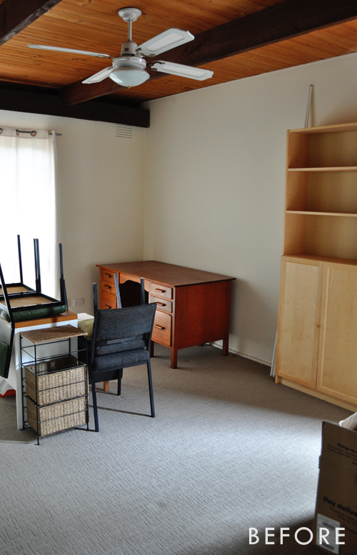
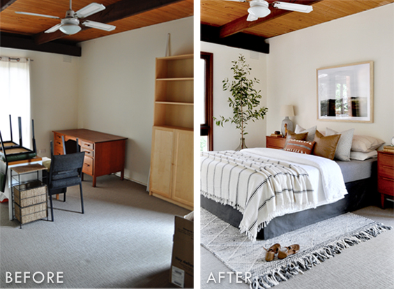
This was my mother-in-law’s home-office/catch-all (we’d already started clearing it out when I took this before pic), but for sale purposes it just made sense to stage it as a regular bedroom.
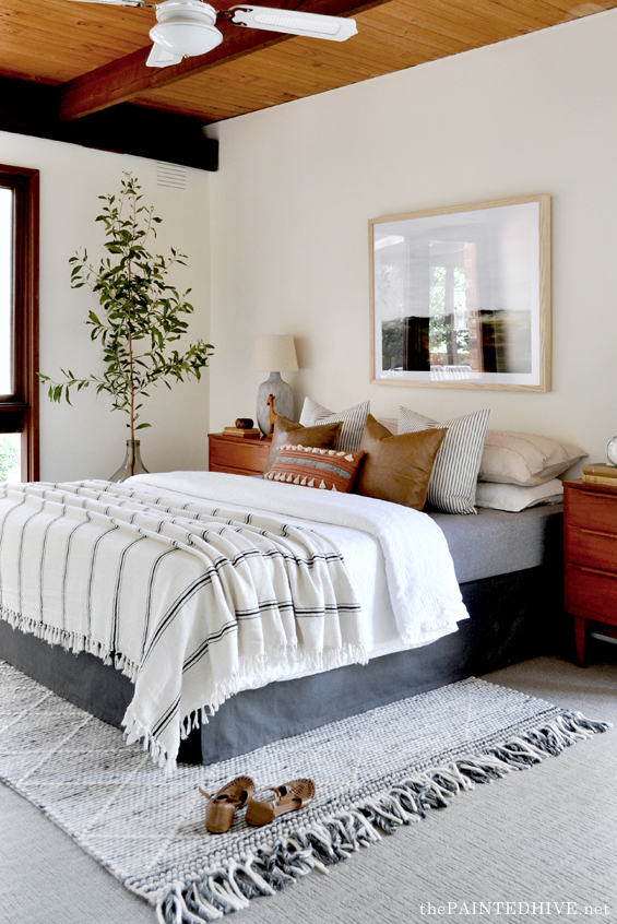
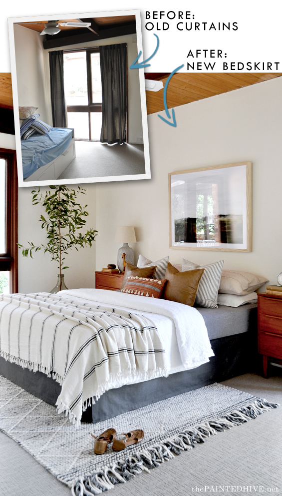
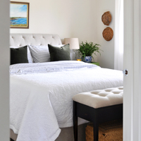
We didn’t have a spare bed to use so I scoured Marketplace for a free queen-size mattress and base, then I added a simple skirt using my curtain trick from The Flip House. Except this time I didn’t even need to buy curtains!
For sale purposes we had decided to remove all of the window furnishings in the house to help make things look bright and clean. At first I was simply going to throw the old curtain panels away, but right when I was about to use them as a rag for my grubby paint-covered hands, it dawned on me that they might actually be useful. And clearly they were!
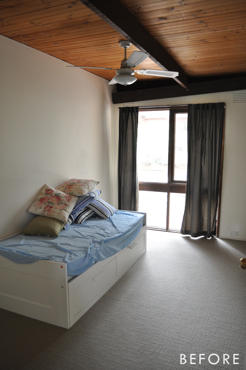
The white curtains you can see in the guest bedroom before pic were used to make a skirt for the master bedroom (I’ll share that space soon!). And the curtains for my guest bedroom skirt were taken from the third bedroom. Here they are before…
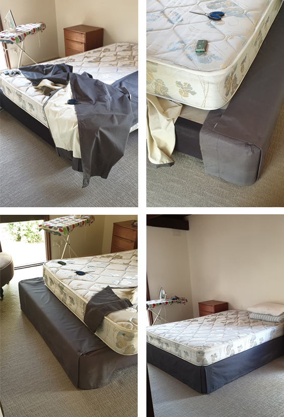
And here are some of my rough progress pics (refer to my past post for a complete how-to tutorial)…
It took me about 15 minutes to completely finish. It’s so quick and easy!
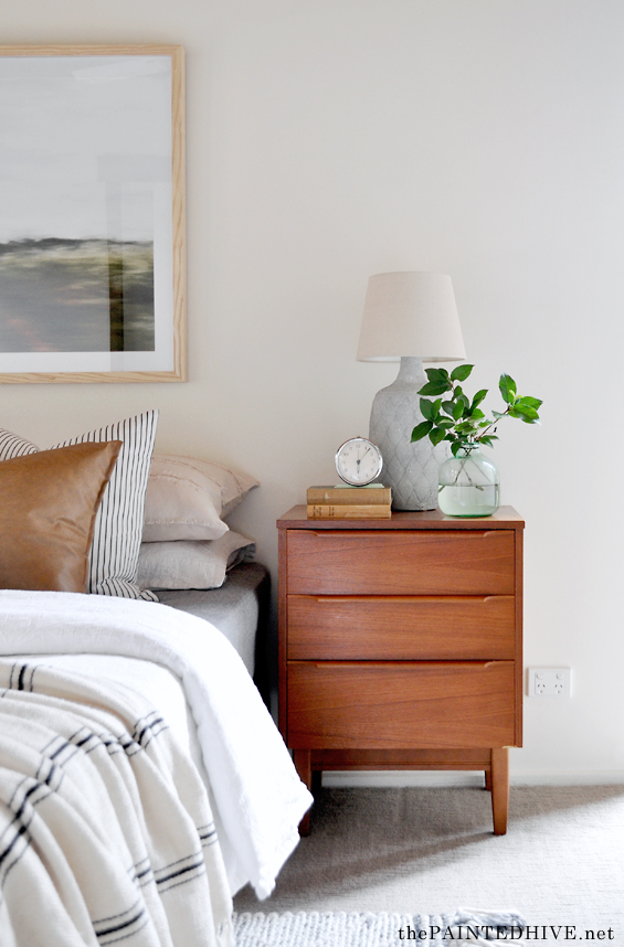
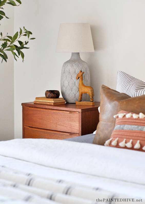
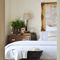
The mid-century side tables were originally in the master bedroom, but I decided to steal them for this space because they work so perfectly.
The master bedroom is actually a tad smaller due to the ensuite and this room could handle the bulk of them better.
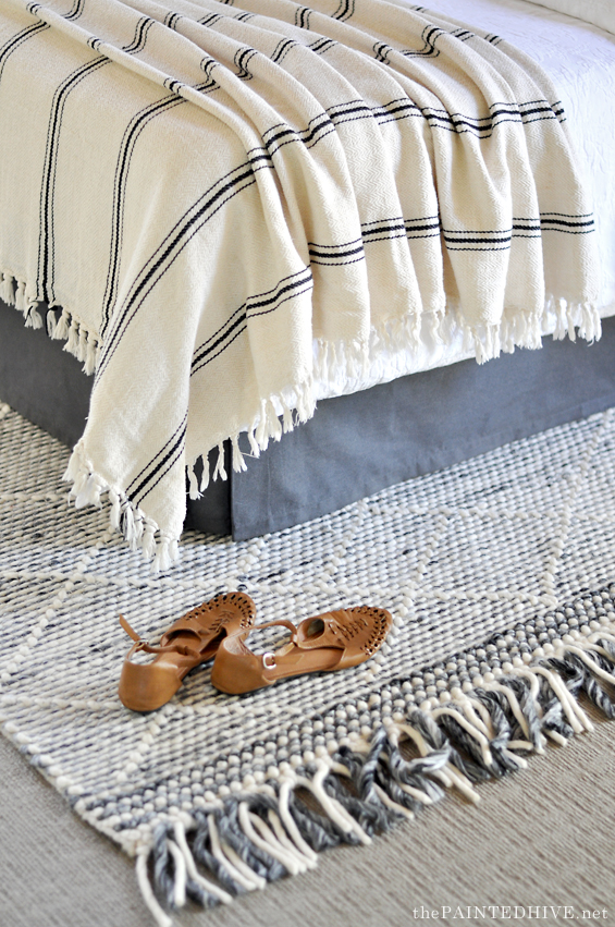
I already owned the rug (you might recognise it from the girl’s bedroom at The Flip House). It was originally from Spotlight.
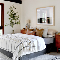
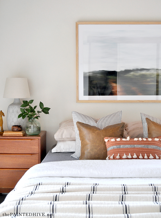
One of the more indulgent elements is the artwork over the bed. I was very lucky to be gifted this gorgeous piece from Urban Road which just works so beautifully in here.
Pardon the reflections!
From the start I knew I wanted to include some tall greenery, but for staging purposes I have used my free cheat of ‘borrowing’ a tree (sometimes I will use a substantial branch) from the paddock behind my house (don’t worry, there are still 5,694 more to choose from!). Sorry, but I actually have no idea what this particular tree is – feel free to share if you know!
I’ve found that if you sit an established woody cutting in water it can last for several weeks. Here I’ve placed it in a large glass demijohn (unfortunately I didn’t get a shot of it but you can just see it peeking out from over the bed).
Most of the bedding, and all of the decor items, are things I already owned.
You might recognise the lamps from The Flip House.
Again, this is just a total staging cheat where I’ve used inexpensive vases (large ceramic lamps can be so expensive!) with shades resting on top. I didn’t add any light source when I used these in The Flip House but this time around I included some battery operated puck lights. The shades are a little smaller than I would have liked though the larger original shades I had were stolen when The Flip House was broken into. So, I’ve just made do with these smaller ones I found in the shed. They aren’t ideal but they do the trick. I would also have liked to paint the bases white, but that was a low priority and never happened. Oh well.
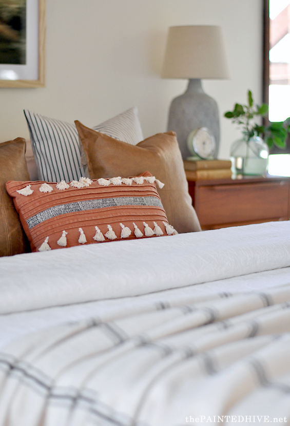
The rust accent cushion is from Target, the faux leather cushions are from Kmart and the striped cushions are from IKEA. They are my new favourites!
I bought the throw a few years ago from Etsy and the white quilt cover is just an old one of mine from Target.
Oh, and the ‘flat’ sheet is actually a Kmart tablecloth! This is another little hack I often use for staging purposes as I find the extra weight in the fabric helps it sit more neatly and appear less translucent than most regular sheets. When no-one is actually going to be sleeping in the bed you can get away with anything!
I didn’t really have a set plan in mind when bringing this space together. For the most part I was just working with what I already had, though I just adore the way things evolved. To me it almost has a subtle Santa-Fe kinda vibe, which is something a little bit different to my usual modern-cottage style.
As always, here are the comparison pics…
Because I’m a little behind in sharing these room reveals, I haven’t really had a good chance to post about the whole sale campaign. Well, just to quickly summarise, our first open for inspection garnered a record agency attendance which was super flattering news. We received twelve separate offers within the first week and the house was under contract in just eight days! Less than two weeks after hitting the market it was officially SOLD – for just shy of 100K above the top price in our listing range! Great result.
Looking forward to sharing more spaces soon. Thanks so much for being patient with me.
Catch up on all the previous posts about ‘The Staged House’ HERE.



Gorgeous! So much charm and you put it together so nicely and without a crazy budget in mind. :) Smart work!
Kristine, you are ALWAYS worth the wait. :)
Ditto!
You totally ARE worth the wait… When I see you in my in-box, it completely makes my day!! How do you get the branch to sit upright in that demijohn?
Thanks Sara. As long as the tree is weighted evenly enough I have found that it will sit upright quite easily. Sometimes it takes a little bit of jigging but so far I haven’t had problems. Once I tried to use an olive branch which was lopsided and whilst it did sit up well, it was slightly wonky which bothered me.
You’ve created a gorgeous calm space – it’s perfect!
Looks amazing, but I do have a question … the ceiling beams look lighter in the after photos …did you do anything with them and if so, what? Or is it just the lighting:)
It’s purely the lighting. You can probably see that the walls look a bit lighter too. In the before pic (which I just snapped with my phone) the curtains were drawn and in the after they had been removed.
Just amazing! And inspiring
So worth the wait as always. Fabulous result as always. I’m not sure you’ve played musical curtains in the past but what a great idea. Definitely more than a hint of Santa Fe in this room and it is awesome. I think it is evidence of your talent that your work isn’t all the same and you do amazing things on a tiny budget.
Thanks so much Julie :)
Looks amazing, but wouldn’t expect anything less from the master!
Beautiful! You definitely have a gift. x
Thank you Rosa :)
Great information. Thanks!
I’m always so impressed by your talents. You just have this amazing ability to pull a space together so well, and you create a space that seems modern but timeless as well. Thank you for sharing this!
One word ~ wow ! Looking forward to the rest of the house reveal!
Thanks ladies :)
Just love this room! You can feel the coziness even through the pictures. This style is my jam, so it really speaks to me. Great job staging. :)
How beautiful! I love the rug but I can’t find it online. Anyone out there know of a similar rug/look?
Yes, I originally bought that rug about two years ago so it’s probably no longer available.
Perhaps try Googling “blue and white rug”. I found this one which doesn’t have the same texture but still has the same vibe:
https://missamara.com.au/products/larissa-blue-and-ivory-transitional-tribal-rug?variant=36536650432584
I love your style! I can see why people can imagine living in your “for sale” houses. So comfortable.
That is a brilliant makeover! The bedskirt was a very creative idea. I absolutely LOVE those mid-century bedside tables!!!
As always, Gorgeous, comfortable, and timeless. Thank you!
What an absolutely wonderful achievement for the sale of this home! I can imagine the work, and love, that went into it. I love the colours of this room, and the way you make budget-friendly items look a million dollars! Lovely as always, Kristine.
I love absolutely everything about this room. Colours, textures, furniture… everything! I can’t believe you wing this together. And on a budget! It would take me many many blogs and design mags to get to this design and then it would certainly not be on a budget.
I’m so sorry this was your MIL’s home and that it was needed to be done at all. You have done something truly beautiful for her and the people she left behind. xx
Thanks so much Anna :)
Looks amazing! I have been hanging out to see these posts, looking forward to the next one. So glad you got such a fantastic result for the sale
Congratulations, 100 k over top askin price is phenomenal. No doubt hugely due to your staging skill. Beautiful and clever as always, love it.
What a wonderful job you did! This proof that staging makes all the difference! Of course, your skills brought it to a whole different level! 100k over asking price is amazing! You must be so happy with that result. Great job as usual, what are you working on now?
Thanks Patricia. I’ve been working on another staging project (this time for a paying client) and also an AirBNB bungalow makeover (again, for a client). Have also got quite a few virtual consultations on the go, and am still chipping away at my parent’s house.
Very cool redesign !! Are the mid-century side tables actually mid-century or a remake? I just love them…they are soooo cool.
Great job.
Yes, original mid-century. They are actually part of a set with an attached headboard but I decided not to use that for this bedroom. I’ll be sharing pics of them “before” when I post the master bedroom refresh next week.
It is a great transformation – amazing what you can pull off on a budget and in a hurry!
But I must have missed something – the flip house got broken into??
Yes, I’m not sure if I ever shared that on my blog, perhaps just through some social media posts. Thankfully it was after the house had sold and we’d already cleared most of the items, but they took such random things…tea towels, quilts, artwork, even plants from the garden!
Even plants from the garden!?! What kind of people do that?? At least it was after the sale.
I love your work. It looks fantastic!
Jude
I want to be your visitor and sleep in that guest bedroom. haha
You did really great work, from a simple office turn to a perfect bedroom.
Wieder viele gelungene Ideen. Vielen Dank. Ich freue mich schon auf deinen nächsten Post. Herzliche Grüße Theresa
Love the whole look! You have style and grace!
Thanks so much.
Lovely! I’d be happy to stay in this guest room!
Great post!!! Thanks for sharing this amazing post.
Very satisfying to look at before and after pictures. good article.