Time for another before and after from my mother-in-law’s house. And this one is a favourite!
The front door opens straight into the large living room so it’s the area you first step into upon entering the house. This makes it especially important in terms of creating impact. You know what they say about first impressions, right?
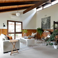
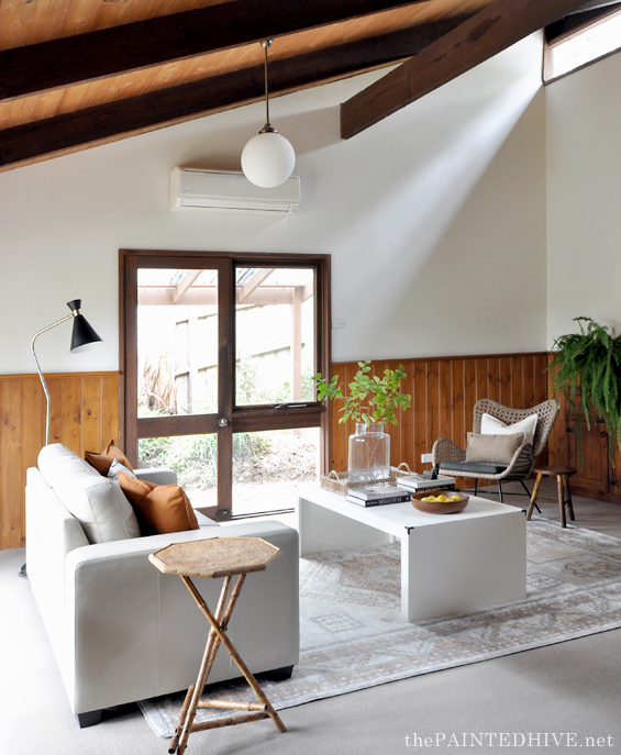
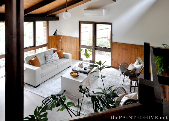
It’s a generous space with soaring vaulted ceilings and lots of timber accents.
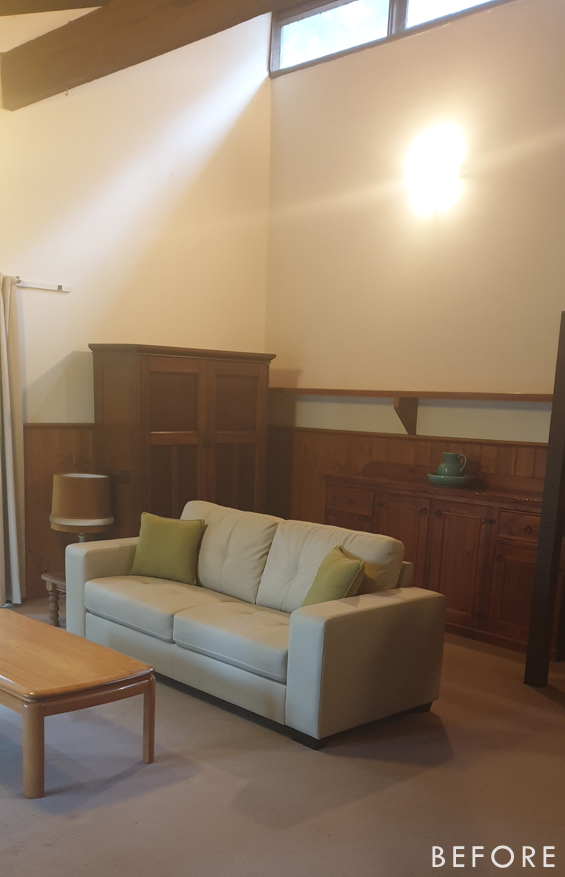
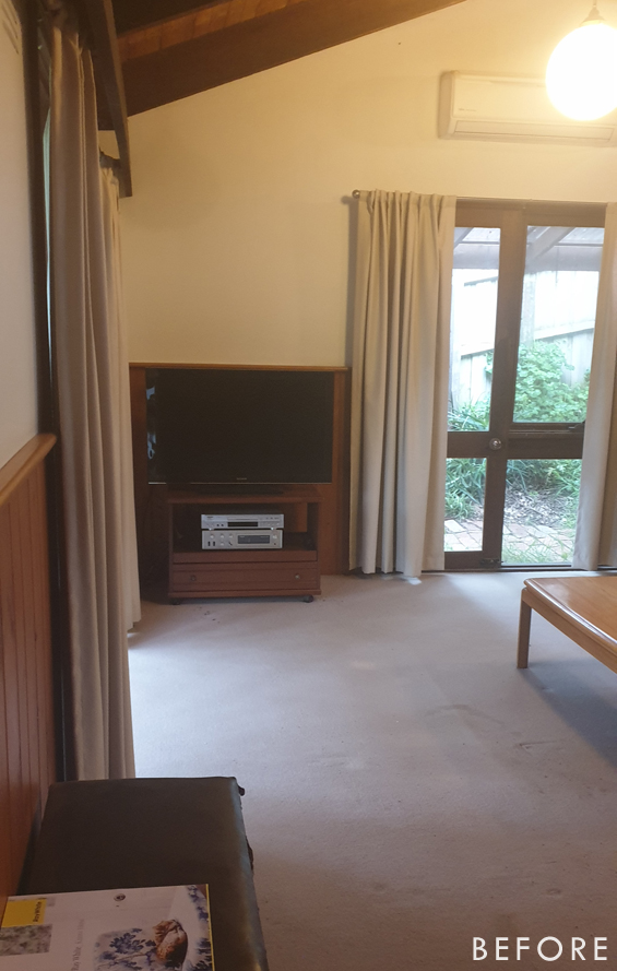
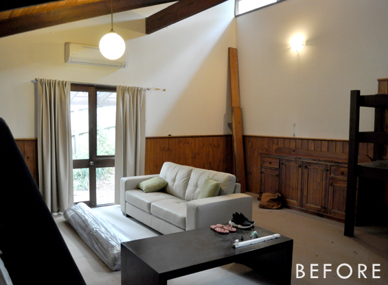
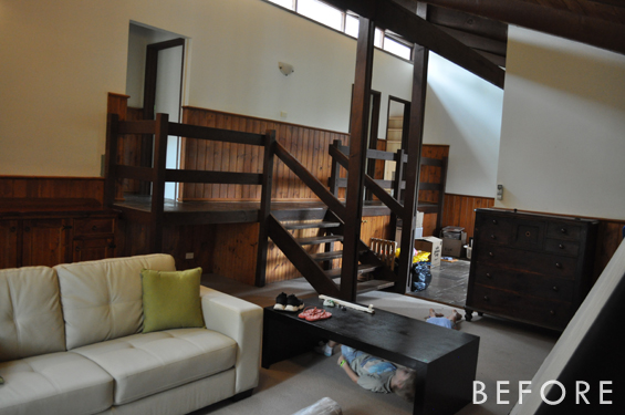
I’m sorry but my before photos are really crappy. I took some of them after I’d already removed all of the wall art and general decor to significantly neaten things up. I then took some more after we’d begun shifting furniture around. Remember, I never intended to share this project so they were just impromptu snaps. Sorry!
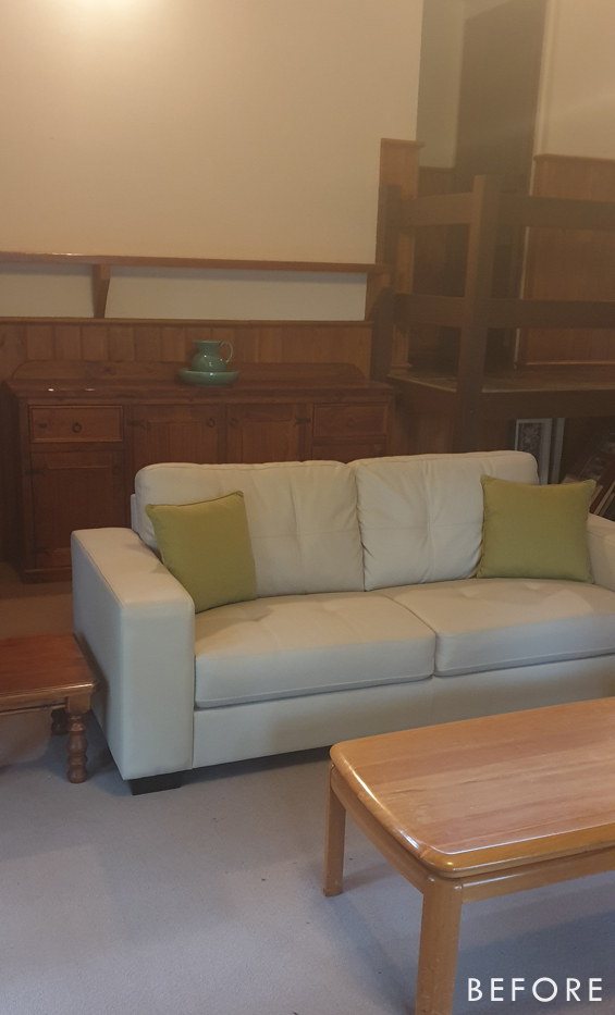
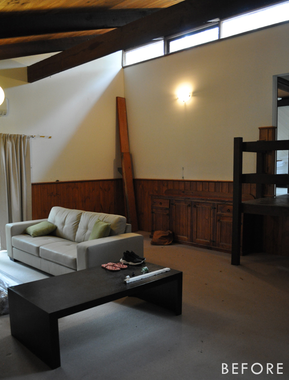
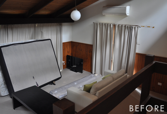
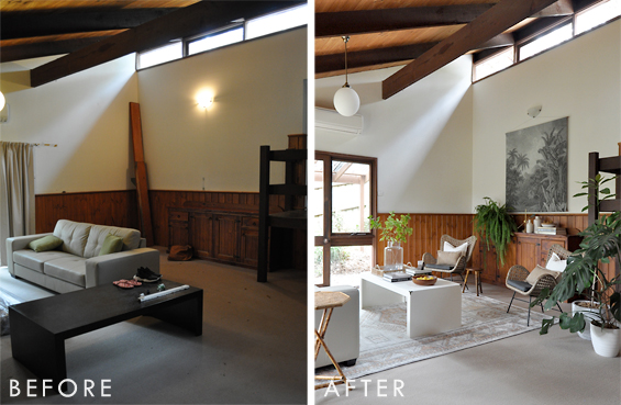
Originally the room was quite dark, despite having two large windows, due to all the timber accents plus heavy curtains which greedily consumed much of the light. There was also a lot of big bulky furniture randomly scattered about which didn’t exactly help the situation.
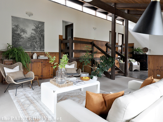
We didn’t have the budget, time or inclination to completely overhaul the space (I know, I know, painting the wall panelling would have been a welcome change), so for the most part it was a matter of working with what we had. My main goals were to optimise the layout, make it feel brighter, and add some punchy pieces to provide a bit of ‘wow’.
The first step was to create a blank canvas, so I cleared out the furniture (we sold any pieces we didn’t need), removed the bulky curtains and took down the long shelf (which was in an awkward position) before patching any holes and spot painting the walls as needed.
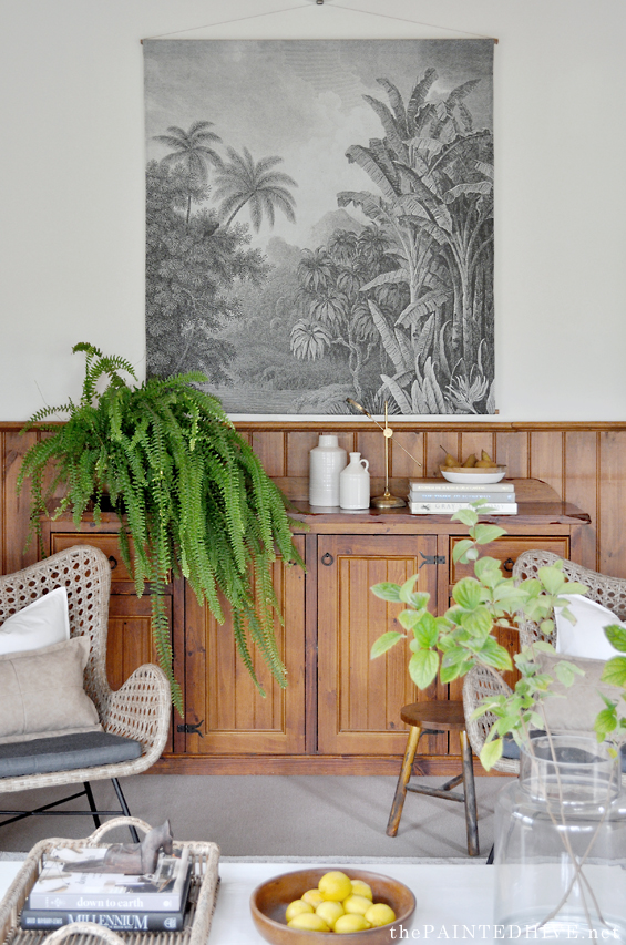
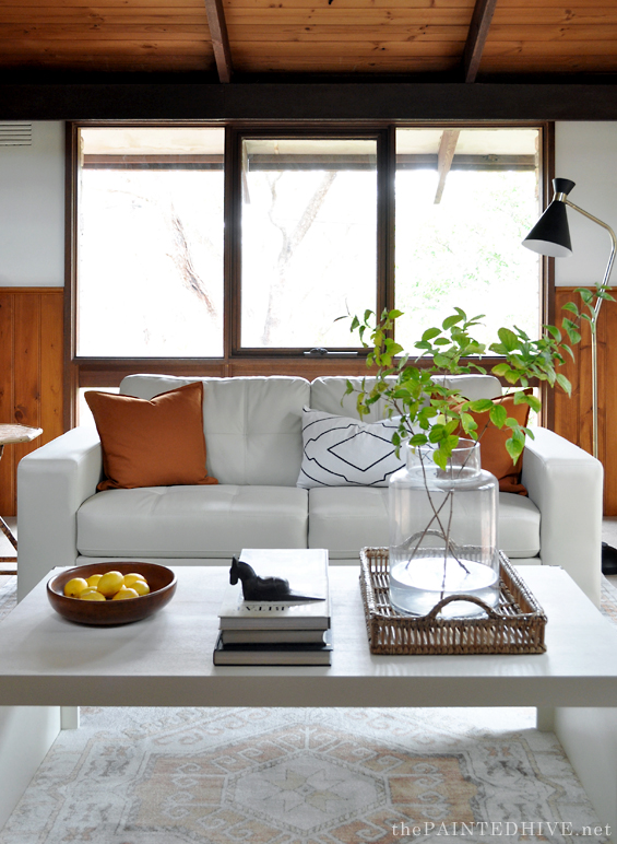
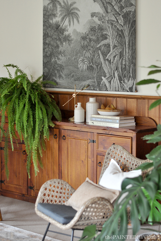
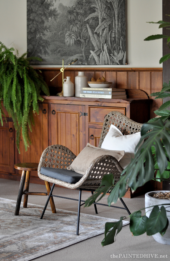
Although they weren’t exactly ideal, I decided to keep the leather sofa and pine sideboard because replacing large items often isn’t easy – it takes lots of patience browsing through second-hand sites to (hopefully) find the right piece, in the right location, for the right price.
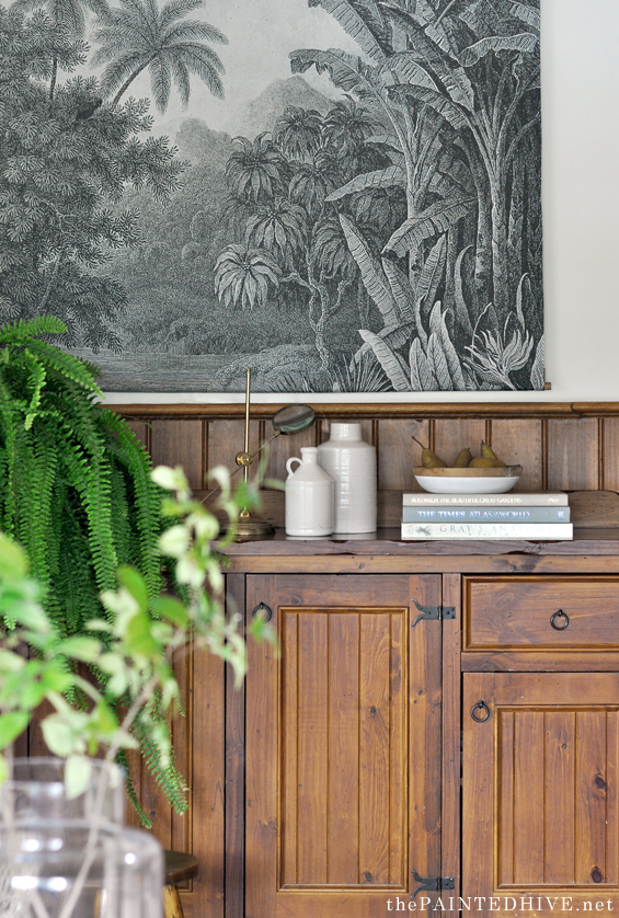
Thankfully they were both well-scaled and neutral enough to be made to work. Yes, it would have been nice if I’d had time to paint the sideboard, but clearly that never happened.
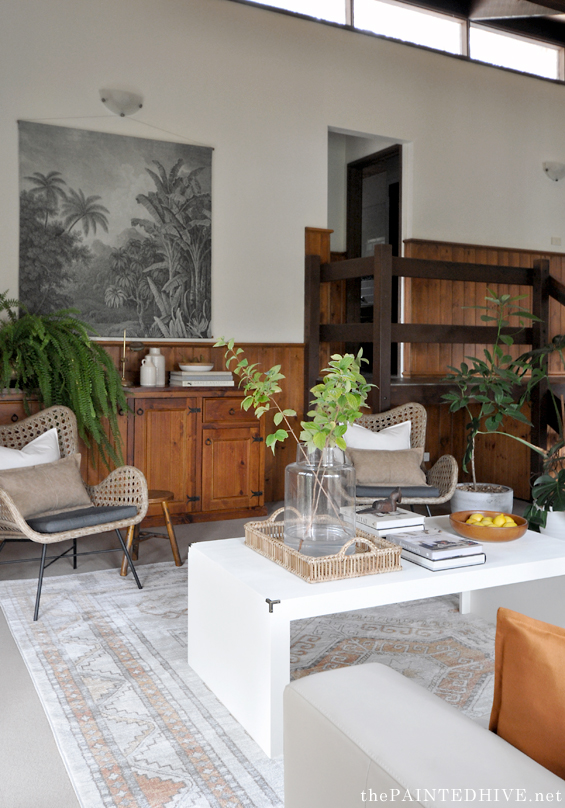
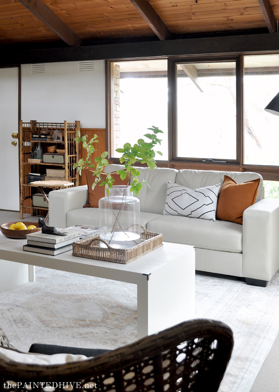
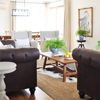
One of the trickier items was the rug. I knew this room needed a really large rug to anchor the furniture and help cosy things up, but affordable large rugs are almost an anomaly! I scoured second-hand sites for a while with no luck, then one day this brand new 3 meter x 4 meter one came up for just $350.
It wasn’t as cheap as I would have liked, and the style differed from what I’d had in mind, though beggars can’t be choosers, right? If anyone is interested, it’s called the Mayfair Caitlen in ‘Natural’ and the standard retail price for the size I used is actually around $650. So I guess it was a bit of a bargain after all!
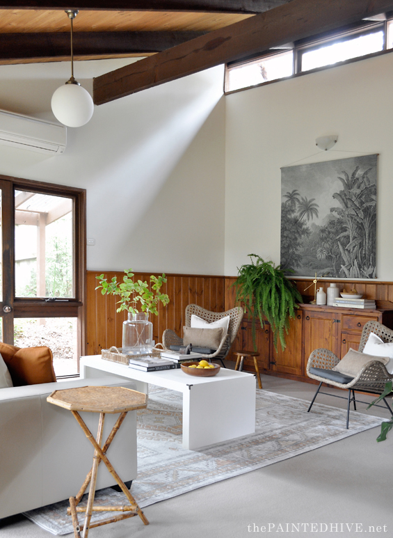
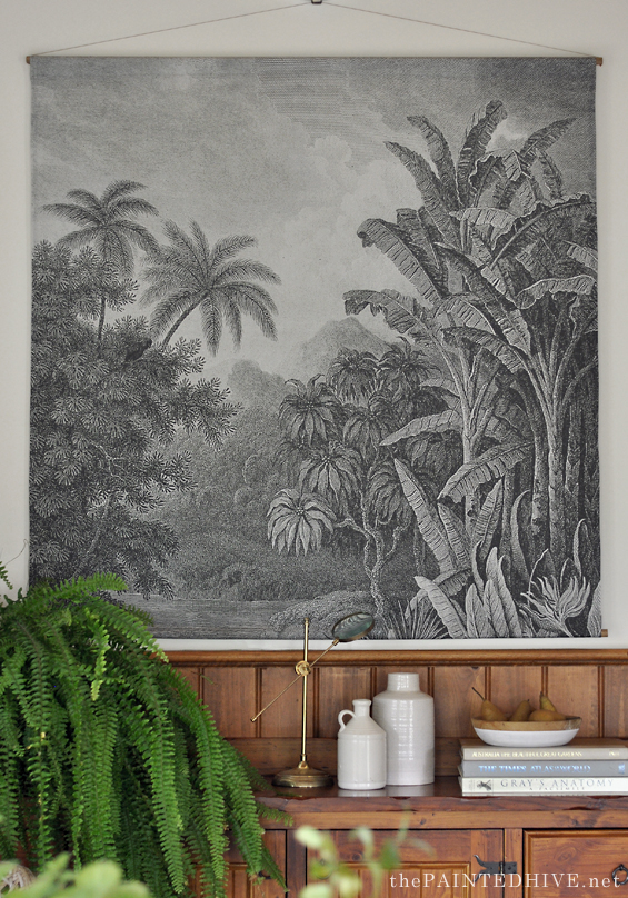
The first thing that grabs you is the over-size wall hanging which I used to take advantage of the high ceiling.
I made the hanging a few years back (from an out-of-copyright digital image I found online then had printed onto fabric through Spoonflower) but haven’t really had anywhere to use it, so I was a bit excited to bring it out!
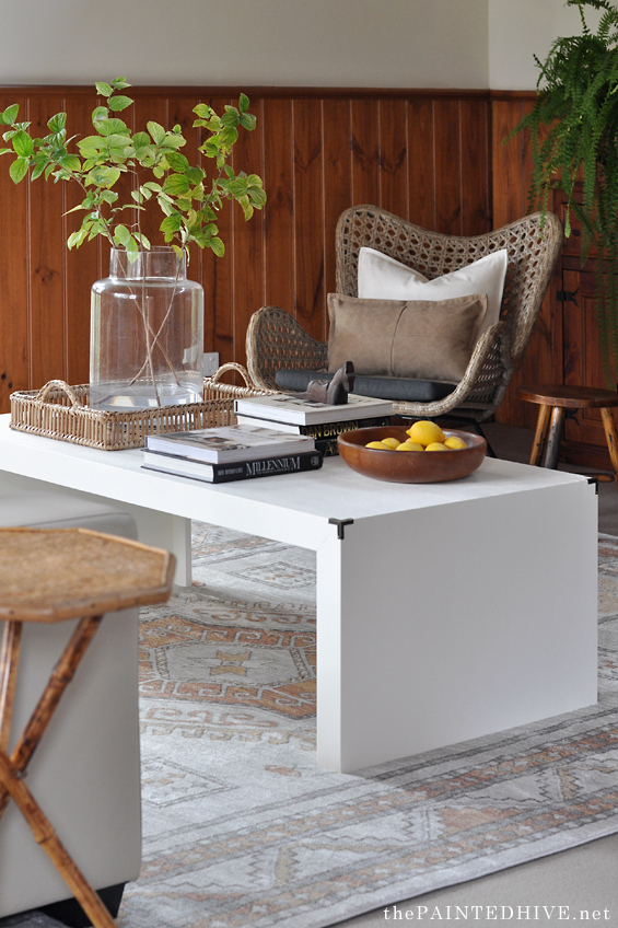
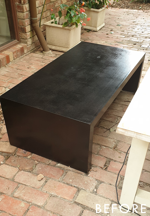
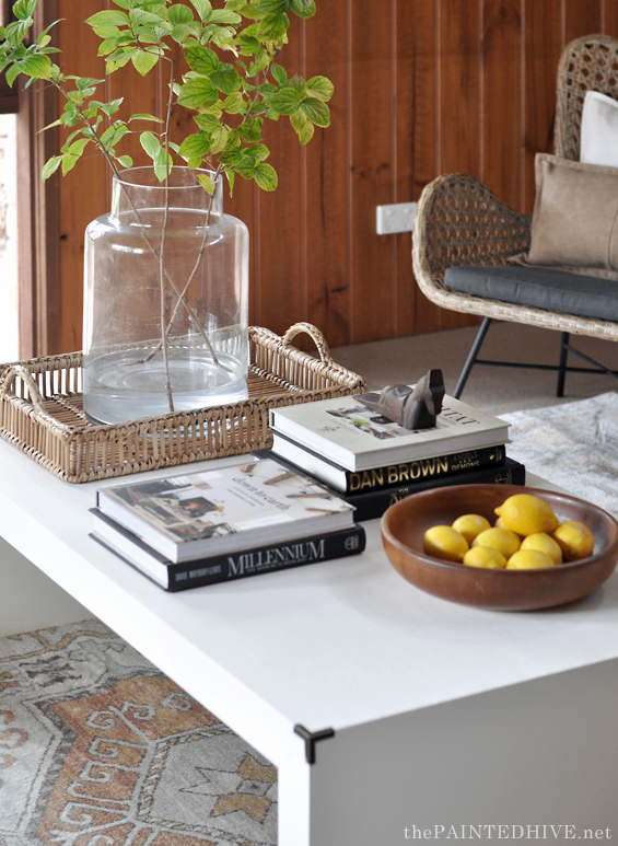
The coffee table was a $15 Marketplace find. I actually bought it last year for a different project though never ended up using it so thankfully the scale was just right for this room.
It was originally stained a deep black-brown which wasn’t exactly going to help my endeavour to brighten the space up!
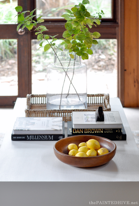
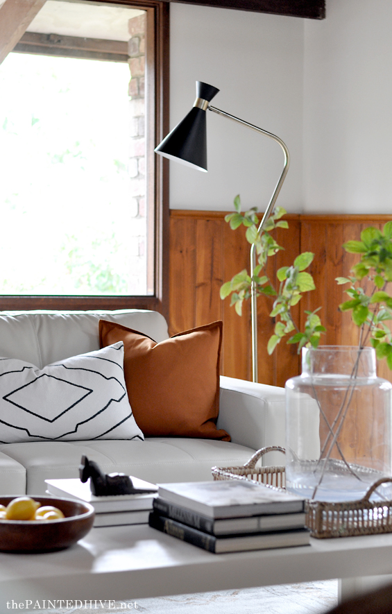
Initially I planned to sand it back to natural, but there were a few penetrating oil stains which I couldn’t get out without going through the thin veneer, so white paint was the next best option. I also added some brass corners just to dress it up a bit.
I’m sure some of you will recognise the gorgeous rattan butterfly chairs and trumpet floor lamp from the living room in my friend’s flip house.
The bamboo gypsy table is from my own living room, and the little timber stool was a Kmart hack from a few years back.
There is a bit of an awkward nook where the stairs and landing protrude which I always wanted to fill with plants.
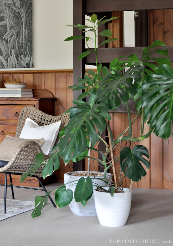
Two of my sister-in-laws came to the rescue here, offering a lovely avocado tree for height, and a totally kick-ass monstera for volume!
Most of the decor pieces are items I already owned but feel free to ask about anything in particular. The only new additions were the rust cushions (from IKEA) and the faux leather lumbar pillows (from Target).
Of course, it’s still far from a perfectly designed and curated room, but for sale purposes it did the trick.
Here are the side-by-sides (or, more accurately, up-and-downs, but that doesn’t exactly have the same ring)…
Catch up on all the previous posts about ‘The Staged House’ HERE.



Oh my goodness, I want this house! All the things you don’t seem to like, I think work amazingly. Even the leather couch (not a big fan normally) and pine sideboard (hate pine) which goes perfectly with the unpainted panelling (which looks great even though I hate pine!) work so well in the house. So much character and warmth. Seriously, I would love to live in that house!
Ha, ha. I personally don’t mind them either. Was just covering myself because I assumed there would be some haters – LOL!
If it was my house I would probably paint the panelling though, only because there is just so much of it and the house isn’t naturally very light. I do love the ceiling as is however. Perhaps just the chunky beams, railing and uprights would benefit from losing the flat chocolate brown stain.
Absolutely amazing!
Thank you. It did the trick :)
You are so talented! I love seeing what you do with nothing. I think the room looks amazing!
Thanks so much. Really lucky to have those lovely butterfly chairs from one of my past projects but sure I would have made do with something else if needed.
Wow! Just wow! I’m curious what color or style of couch you would have chosen ideally because this one looks really good? With the changes you’ve made I’m kinda loving all the wood Paneling. The staircase itself still seems a little heavy but those plants sure help.
To be honest, the couch did work out way better than I’d anticipated. I’m normally pretty good at imagining the potential in items, but initially I think my vision was perhaps a little blurred by the fact I was so used to seeing it in the dark and dated room.
Although the colour and style of the couch in the finished space works really well, ideally I would have liked a more generous sofa – either something longer, or a sectional with a chaise – to really capitalise on the available space.
You never fail to deliver Kristine! That Boston fern is gorgeous and I’m loving the glimpse of the area beyond the stairs; looking forward to that post. :)
Thanks :)
Another magnificent décor of yours, Kristine!
:( Did your mother in law ever ask u to redo her house when she was alive??????
In such a beautiful ambiance, those wonderful vibes u have created so effortlessly beautiful, she could extend her life to another decade ++ for sure..
Hear, hear!
I’m glad you didn’t paint the sideboard, I really love it against the wall paneling! The fern & wall hanging make it look fab. Such as great job 👏
Hello. Wonderful job! I can see from realtor websites that wood paneling is back n style! So you made the right decision not painting it! LOL
I think you’ve done such a beautiful job of accentuating the light, open space. The celling and the beams have become stand out features in the room. I think it was a good call to not paint the paneling – while I might do it if it were my own house, you’ve made it look much brighter, even without paint and it gives the new owner many possibilities. i know from staging my mom’s house, that’s its such a different challenge staging a space for an unknown buyer, than decorating for yourself. Another amazing job – thank you so much for sharing!
Thanks so much Leslie :)
I find it fascinating how layering the light couch in reduces the visual weight of the pine. Same thing with the big fern on top of the pine sideboard and the rattan butterfly chairs in front of that. This room is the coolest space now. All of the features that I would have been at a loss to make the most of, you’ve played up perfectly- like the plants in front of the stair railings. You are so, so good at this!
Aw, thank you. It’s just playing, and moving, and adding plants really – LOL!
I can’t take my eye off the table. I spotted it right off from the before and thought “Is that really the same DARK table?”
Genius!
The room is exquisite and the brown wood plays as a beautiful background.
Another brilliant masterpiece and lots of hard work, Kristine.
Thank you so much Sabrina.
This transformation is amazing! The room looks so light and welcoming.
Absolutely stunning!
Well done….again!!
If I were your MIL, I would ask you to come decorate/design my house spaces. You’ve really got the gift. What I noticed was how taking those curtains off the windows opened it and made it seem to have more “air to breath.” also adding in all the white and neutral furnishings brightened everything up and looks great against the wood. Plants add so much character and “air” to a space, I think.
Question: Are those butterfly chairs comfy to sit in? Or just for effect?
Thanks Jody. The chairs are actually really comfortable. My parents usually have them at their house (I don’t have space) and I often sit in one when I’m having a wine with mum. They are legit the type of chair you could easily fall asleep in.
I thought the wall hanging was leftover wallpaper from the bathroom redo you did last year. Just cut to be art. Love the idea of printing a photo on fabric. The room looks very put together.
Yes, it’s got a very similar vibe to the wallpaper as it’s an antique etching. Was so stoked when I came across the image online because I have seen it being sold through a major retailer for a few hundred dollars.
Such a stunning transformation, great job! I absolutely love the wall hanging! I’ve also had it Pinned for ages but you’re right, it’s pricey. Any chance you could kindly share the link for the image/antique etching?
Hi Aimee. Gee, that’s testing me! I think I saved it somewhere but that was over two years ago now! I know it was from a 16th century book (maybe French?) which I’m pretty sure I found on Internet Archive. Sorry, that’s probably not very helpful!
You are so clever. I love what your eyes see that I don’t but then I see the After photo and I think, But of course that’s the way it should be. I also am a big fan of how your re-use things and look for vintage/used furniture. Why buy new?
Sorry for the loss of your MIL but I think you’ve honored her with your work. I’m glad that you shared this project.
It’s always tempting to start from scratch with any room. Sometimes it just takes clearing it out and only reinstating the items which make sense (whether they are ideal or not), then layering the rest with considered pieces which enhance the general vibe. The results can be fantastic :)
Kristine, you wanted to leave a ‘wow’ factor and that you certainly did! The furniture and layout showcase the potential of the room, and I actually quite like the sideboard against the panelling. The plants look great in there too. As another reader wrote above, this is a beautiful way you are honouring your mother-in-law.
Thank you :)
Totally love what you’ve done with such ‘little effort’. You’ve given it such a modern but old-worldly vibe ….. it’s stunning. I’m sure she’d be proud. X
Thanks Nicolee :)
As always, you’ve made it work beautifully. I actually like the sideboard and that fern is gorgeous! Also live the butterfly chairs. xxxx
Wow and Amazing!!
Amazing transformation!! Just shows you are a creative and talented designer.
Gorgeous! Which base material from Spoonflower did you have the artwork printed on?
Thanks. Argh, I can’t remember. It was either Cotton Canvas or Cotton Twill. Cotton Canvas is thicker (and I think more expensive) but it produces almost the same result visually.
I think the pine sideboard worked so perfectly – I’d ask for it to be included in the home if I were the buyer. It just blended so cleanly with the paneling which I also really like. I should probably toss in a disclaimer that I’m from the Midwest of the USA, so pine paneling basically runs in my blood. The whole vibe of the house is a cabin tucked away in the woods. Great job with the staging!
You absolutely crushed this look! I love the layers of texture …. it all works perfectly together to make a vintage modern room. Love it!
Thanks so much :)
I’m so glad you didn’t paint the sideboard. I love the honey color of the wood and the hardware. It adds a nice warmth to the room as does the wainscoting. Seeing the pieces from previous projects is like seeing an old friend. Especially the rattan butterfly chairs. I am so drawn to old school items used is different ways. Their old and new at the same time. Kristine, you always down play these flips as something would weren’t going to share, but it’s fascinating to see what you come up with on a limited time/$ budget. I learn so much from these posts. Thank you
Thanks Pat. This is so heartening to hear :)
Amen to all of that!
Just excellent. I love your before/ after pics and transformations.
As always, I enjoy your work so much. You make such beautiful spaces on realistic budgets. I have been feeling a really negative nasty vibe lately reading blogs where they agonize over “this marble tile or that marble tile?” or is a “DeVol kitchen too in the moment?” or I kid you not: “How to deal with dog poop in the landscape design?” (pick it up, duh!).
You and Daniel Kanter are my favorite blogs for obvious reasons. Always looking forward to your posts here in New York State, USA.
Thank you. I’m flattered to be so high up on your list :)
What an amazing idea!! Thanks!!
Your living room looks amazing!!
Such an amazing decor, I must say!
Kristine,
I’ve been looking at how to stage my house for selling and this blog post has provided the inspiration. I am in awe of how light and airy you have made the room compared to the before pictures.
You were very strategic with your splashes of colour around the room and I like that you didn’t go overboard. I recently read a blog post by The Spruce (https://www.thespruce.com/beautify-any-room-in-your-home-4165938) that adding some plants or flowers is always a good choice for providing a hint of colour to a room. It’s funny how the lemons just add that extra splash. I covered the lemons in the picture and found that the room needed just a little something more, the lemons give it that.
I too have purchased a rug to make the room pop and noted how hard it was to find a cheap, nice rug. However, it has been a simple way to add colour to the room.
Finally, your white table looks great. I have a dark piece of furniture I want to paint white but have been hesitant. After seeing your table I am inspired to tackle it as my next project. Thank you.
I’m so glad it has helped give you some ideas and motivation.
Thanks for taking the time to send me a message. Good luck with it all!