Thank you so much for the warm welcome back! I was honestly unsure if anyone would still be following along, so it was such a lovely surprise to see all the comments roll in. I really missed you guys!
As promised I’m back to share the reveal of my brother’s bedroom.
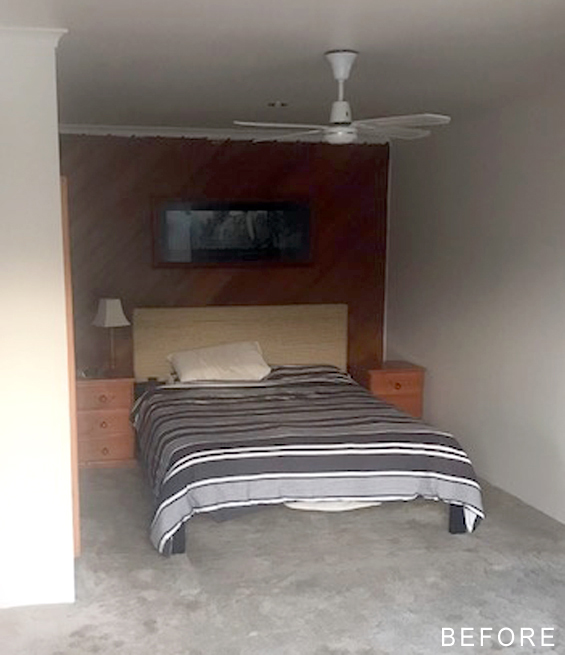
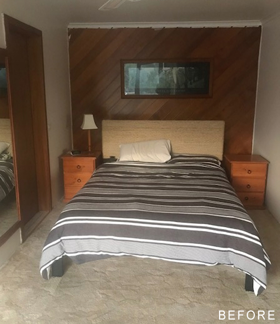
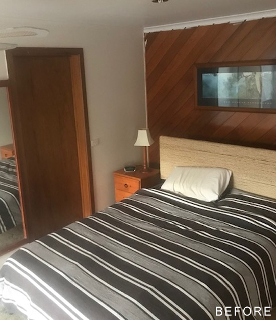
Here are the before shots…
Before we could get to the fun bit of decorating, we needed to create a nice blank canvas to work with.
Several months back, before the latest lock-down began, my brother replaced the stained carpet and painted everything white for a clean fresh feel. He also removed the random wall mirror and took down the old broken ceiling fan (this will eventually be replaced with a sleeker black fan).
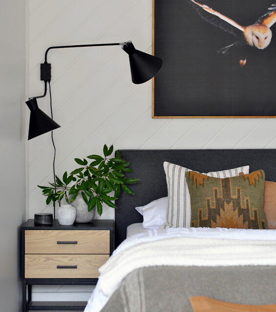
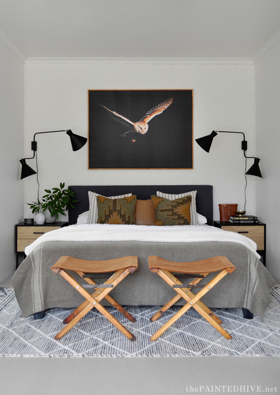
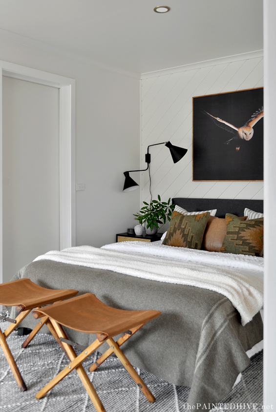
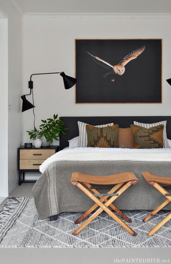
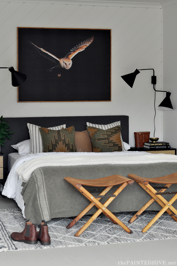
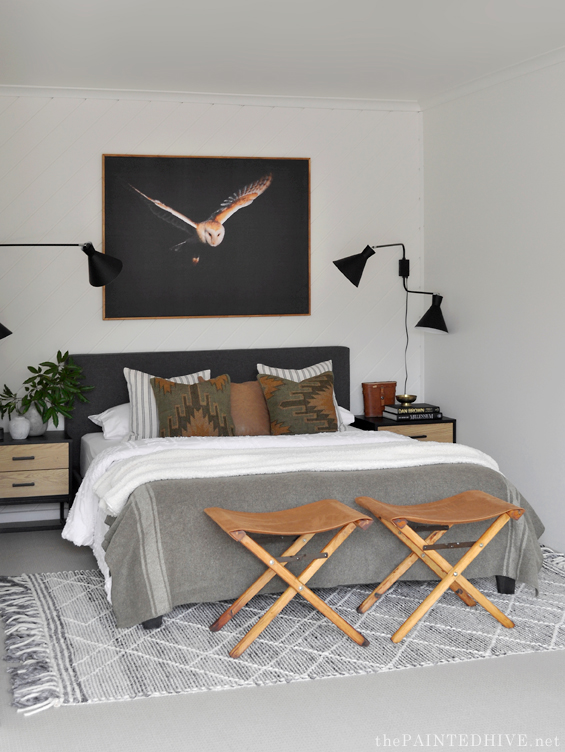
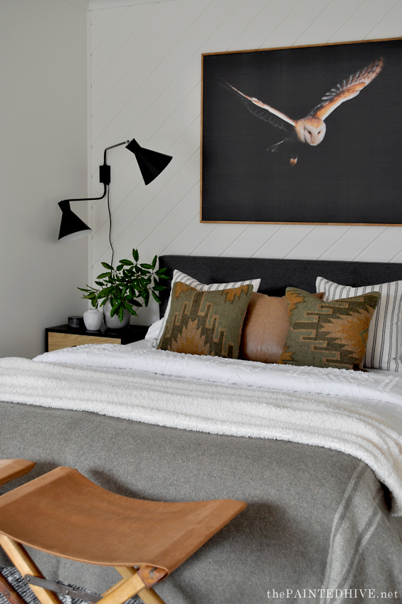
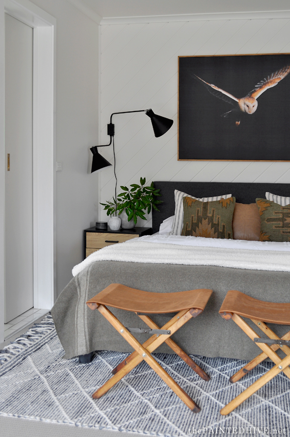
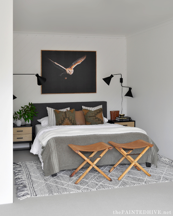
So, here’s the space now…
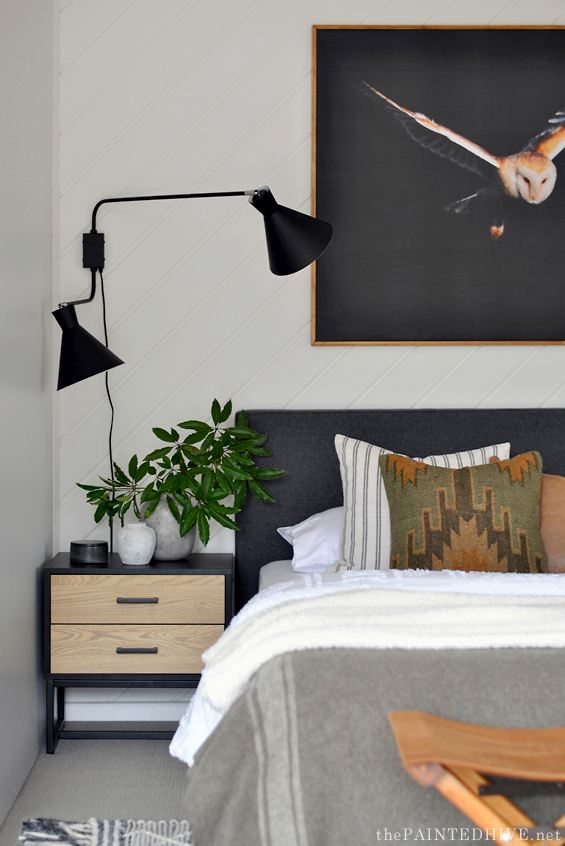
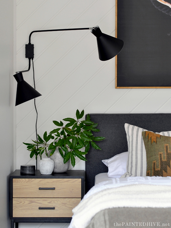
Before you say anything, yes, I realise the wall lamps are a tad intense for this small space.
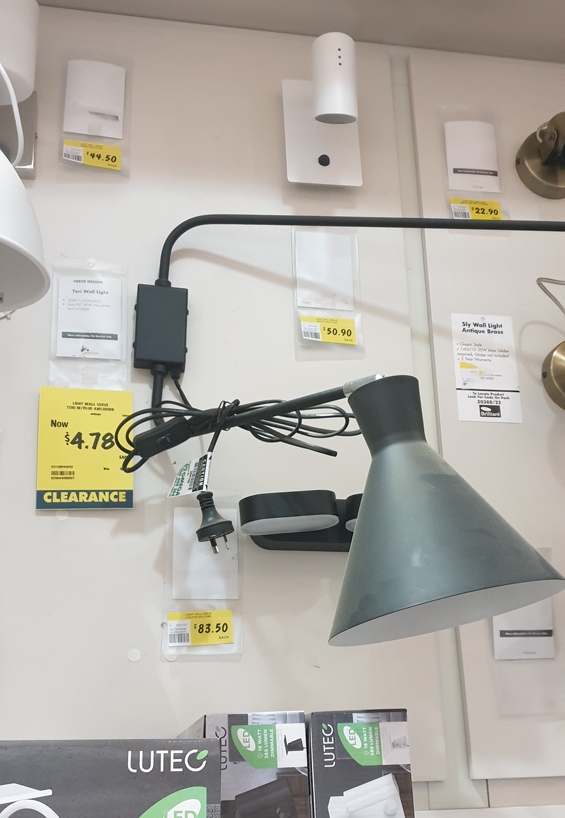
Slightly more petite versions would have been ideal, but for under $5 each I wasn’t going to complain! Plus they will come in handy if my brother ever needs to host a stage show.
Because I got them on clearance I can’t find a link to share, but if anyone is looking for some, they are the Verve Tori Wall Light (from Bunnings). If you’re quick there might still be a few left at some stores.
I contemplated painting them (maybe white or gold – brass ones would have been lovely), but as the room came together I decided they were fine as is. Their boldness certainly provides impact, and their sculptural quality lends interest which helps belie the typicality of the room. Of course I’ve used soft warm bulbs so the lighting itself isn’t too severe (so perhaps my brother will need to increase the wattage for any stage shows – and yes, the bulbs cost more than the lights themselves!).
I know not everyone will like the fact we painted the wood panelling. Although I never hated it, and do love the earthy warmth timber can lend to a space (especially a masculine one), given the lack of light in the room it just felt a bit dark and gloomy.
Having all the walls one light consistent colour helps make the room feel more spacious and cohesive. If anyone is interested the colour is Antique White USA by Dulux.
The original bed was actually one I picked up for free a few years back when I was staging my friend’s house for sale (you can see it HERE). It was always a bit rickety and after several failed attempts to repair it my brother decided he wanted something new.
In order to be able to build the room around the bed, we went for something quite understated in this $220 charcoal upholstered bed from eBay.
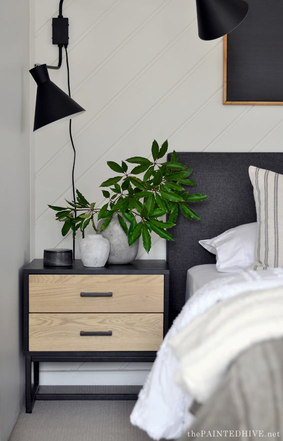
The bedside tables also came from eBay and were less than $100 each.
I contemplated keeping and upcycling the original bedsides, which would have been totally fine, but these new ones are just that bit more ideal.
When it comes to decorating, in general I probably agonise most over choosing wall art – there are just sooooo many options! But I surprised myself this time around by being super decisive and selecting one of the first images I came across.
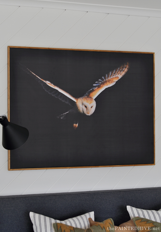
This barn owl was originally a free downloadable photograph from Unsplash.
‘Barn owl hovering before diving to catch prey’ by Bob Brewer.
I edited the colours and applied a digital effect to make it look like a painting before having it printed onto peel-and-stick canvas wallpaper by AJ Wallpaper.
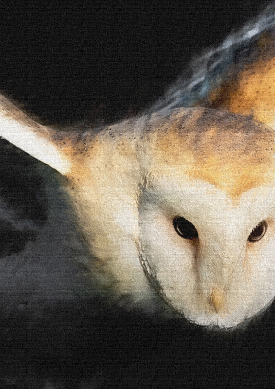
Here’s a close-up section which shows the detail a bit better…
I’ve used AJ Wallpaper a few times in the past and always find them really helpful and prompt, plus their products and services are amongst the most affordable I’ve found.
As per usual I didn’t document the framing process (one of these days I will publish a thorough tutorial on how I generally frame wallpaper art), but it was super easy and cost less than $40. Essentially I cut a sheet of 6mm/.02″ MDF to size, bordered the back with some deeper MDF planks to give it stability, attached the wallpaper to the front, then boxed everything out with some mitred timber trim. I realise things sound a bit complicated when the steps are summarised so bluntly so feel free to ask if you want clarification.
If anyone is interested I’m open to sharing my edited owl image as a free download in an upcoming post. Maybe that will give me a good excuse to finally get onto that framing tutorial!
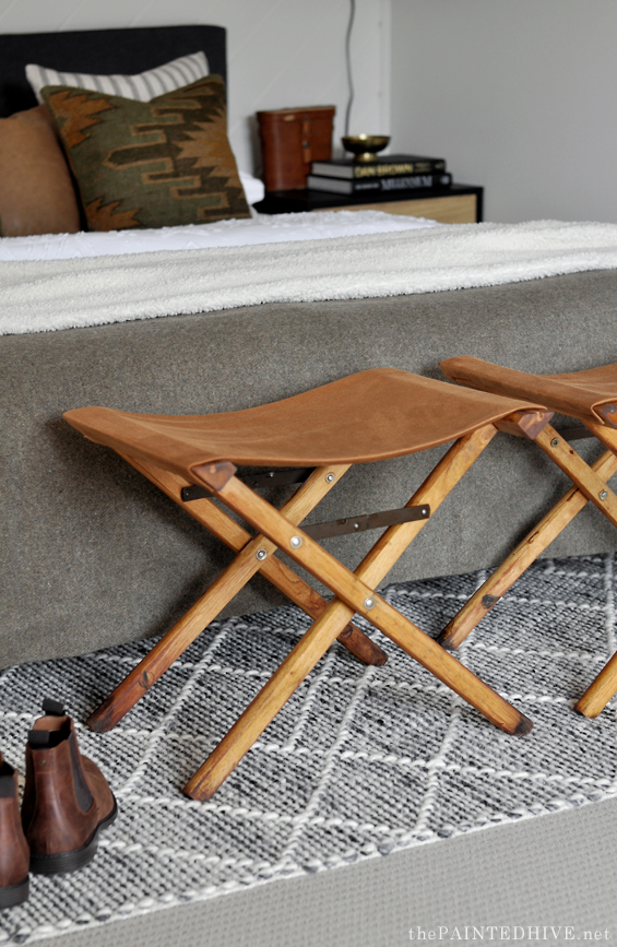
The end-of-bed stools are one of my favourite elements!
I think they just add so much character and interest.
I’ve loved the look of folding military style furniture for ages, especially when used in a masculine room. And this was finally my chance!
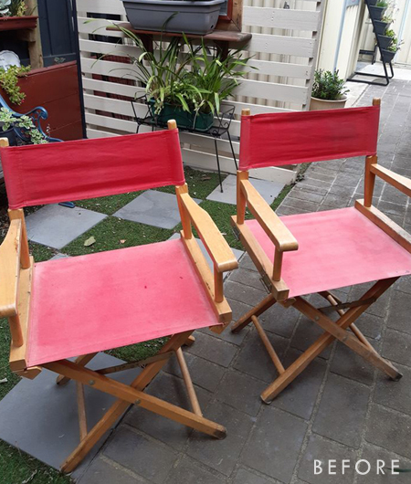
I shopped around for quite a while for something that could work, exploring lots of different options. I was also always open to the idea of building something from scratch if needed, but then I came across two old directors chairs on Marketplace for just $20.
They were perfect!
I will publish a dedicated post about the full transformation process (because I actually managed to take progress photos for the most part!) but as I’m sure you can gather it wasn’t a difficult project.
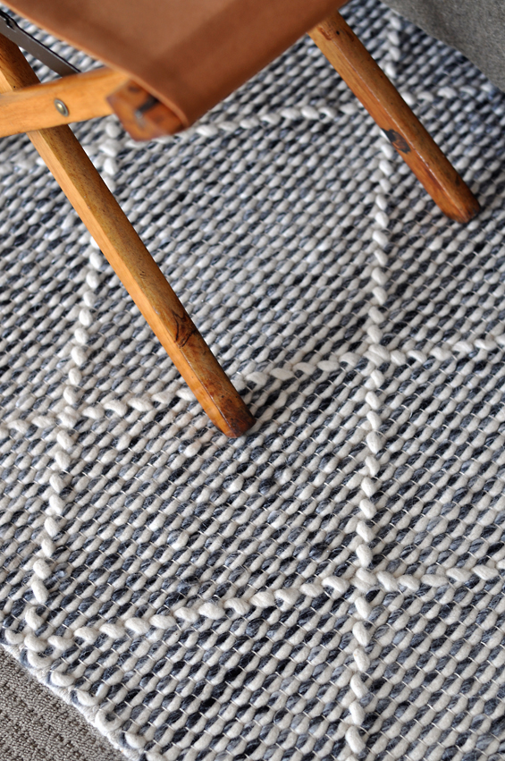
I think many of you will recognise the floor rug from some of my past projects.
It was originally purchased from Spotlight a few years back to stage my friend’s house for sale. Since then it’s been deployed on several different missions (including being stored atop my brother’s Torana for over a year!) but has always held-up amazingly well. It actually still looks and feels brand new! Such an awesome and versatile piece.
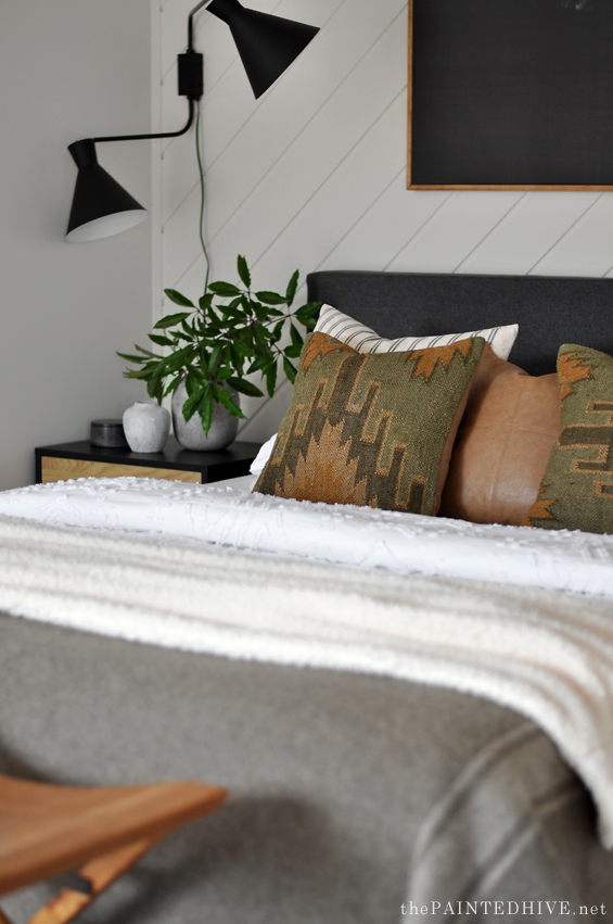
I kept the bedding quite simple in order to showcase the two jute kilim cushions I found on eBay for just $30 each.
They are quite possibly my most favourite cushions ever!
Originally I had both of them orientated the same way (as they are identical) though decided to switch things up by turning one sideways. Does it make you twitch? Or do you like the slight quirkiness?
I’ve teamed them with some basic striped cushions ($12 each from H&M a few months ago) and a faux leather one ($8 from Kmart several years back).
In-keeping with the subtle military vibe I’ve used a wool army blanket (originally from eBay many moons ago). This ties-in well with the kilim cushions and also works to add some tonal depth to the foot of the bed in order to somewhat balance the dark headboard and artwork.
I’ve layered it with a new boucle style throw (from Spotlight) which adds a nice hit of softness.
The decor items are just bits and pieces I already owned, mostly thrifted.
So, here are the side-by-side before and afters…
I brought the room together over a few days and it’s fair to say my brother was skeptical until everything was in place. And I don’t blame him because, to be honest, I was a little unsure myself. It’s easy to feel doubtful about a space whilst it’s still in progress. Sometimes pieces don’t seem to work together or the balance and scale can look off. More often than not it’s the final touches which make sense of everything.
Hope you guys like it.


LOVE IT! Looks fantastic and l look forward to the tutorial for the chair and artwork.
Amazing transformation! You did a great job.
Thanks Jeanene :)
Amazing work. I love what you’ve done with this room.
Wow! I love it. Those lamps are just insane for that clearance price. Right place, right time.
I’m putting my hand up as a YES for the owl image. My step daughter adores owls and I’d love to make something like this for her wall.
Glad to see you back :)
Thanks Carol. I’ll try and get the owl print post together soon :)
What an improvement! Painting the wall behind the bed was a good idea. It was kind of cave-like with it unpainted. I hope your brother likes his new room! :o)
Yes, it was like a dark void with the wooden panelling. It feels more open now.
Oh my goodness—that bedroom is gorgeous—in a masculine way! I love the tailored look of it and I think the light fixtures are great in there. You hit it right out of the ball park, once again!
Love your simple, understated style! The bedroom looks great! You are so right – it’s the final touches/accessories that really add polish to the final look! So glad you’re back with projects I enjoy following!
It looks fabulous! :) Nice work, as always. :) I can’t get over how you turned the director’s chairs into the camp-style stools — genius!
Thanks so much :)
Kristine,
Very impressed, I love it!
The wood had to be painted otherwise it would have been too dark – much brighter. I really like everything but especially love the owl art and the military blanket brought back old family memories.
Clever lady!
Look forward to your tut on framing wallpaper.
Jen
Thanks Jennifer :)
Haha – my first thought looking at the first finished shot was Woah! That a lot of light for one single guy!
I had a good chuckle at your ‘Stage light ‘ line a bit further down. I’m also a big fan of the kilim cushions and I love that you didn’t put them both right way up. It adds a bit of quirkiness .
You don’t disappoint- another great room and one lucky brother!
Ha, ha. Yes, when he first walked in before everything was pulled together he was a bit overwhelmed because there was nothing to balance them. Plus it always takes a while to adjust to a change when you’re so used to a room looking a certain way. By the end he loved them!
Like it? I LOVE IT!! I love everything! Love the army wool blanket. The striped cushions with the kilim ones. The painted paneling. The hacked director chairs. God I love everything! And once again your art blows everything else out of the water. I would’ve liked the owl photo but not have any thoughts to evolve into what you just did. Incredible.
And if your brother wish to sell one of his lamps, I’m so up for it. :)
Ha, ha. Thanks Anna.
Amazing as usual! It looks so much larger and brighter. And not like a guys room done by someone’s mom! 😂 I am sure your brother loves it!
Ha, ha. Thanks Pat.
It looks great, very cozy. The owl print is wonderful. I love birds.
I bought a home that was over 50 years old with a dark paneled family room with brick fireplace.
It was a cave!! I had the whole room painted white and it made it so much better. It was the right thing
to do for this bedroom.
Great job on making this room both masculine and welcoming.
Thanks so much Deb :)
Perfection! I think a little drama (lights) is called for when a room is lacking architectural detail. So glad you’re posting again.
Yes, totally. Using interesting decor which plays on scale and boldness is a great way to elevate a room without a lot of architectural impact.
Beautiful! I think the bedding is just fab, too and ties everything together so well with the colors and texturs of the fabric. Kudos!
So much better and very sophisticated! That owl print is just perfect!
Wow! Love it! Your ability to design and style a space is matched by your amazing ability to find the “right” things online and pull them all together. Love, love, love 😁
Thank you Cathy :)
WOW, just WOW Kristine! You are a brilliant stylist and decorator. The room is amazing. I love everything about it, and the lights are perfect. Bargain of the year!
The colours of the bedding are so masculine, yet the whole room feels bright and fresh.
Bedside tables are just right. The directors chairs, now stools, are inspired!
I love that you bring this fantastic look together on a budget.
So happy to see you back 💕
Thanks so much Lorraine.
Such an improvement! 🤩 LOVE the painted wall panelling and refurbished directors chairs, what a brilliant idea!
This is very very nice. At first I thought, like you mentioned, that the sconces were a bit strong, but the longer I looked at the photos, the more I liked them. In the end, I don’t think they are too strong and I really like the sculptural element they bring. They look great with the Kilim cushions, which I very much like with one rotated. I love that you explain how the gray blanket balances the headboard. Love the addition of the soft blanket and the leather stools. A wonderful room!
Thank you so much Kim :)
As usual, you have pulled off a great transformation.
I am interested to see what you did with the window coverings??at the other end of the room.
Good question. It’s actually a very strangely shaped space. At the other end there is a dog-leg with some wardrobes and a double window sliding door which leads to a small balcony. At the moment that end of the room is empty and there is a simple charcoal roller blind. Eventually I think I’d like to add a desk with a gallery wall above. There is a private adjoining sitting room so no need to add a sofa or armchairs etc.
Hello again Kristine. I think you’ve hit it out of the park once again. Every detail is just right. It doesn’t even seem like the same space. I wish you wouldn’t doubt yourself so much. You always give us excellent work.
Very nice. Your brother should be very happy and owes you a really special Xmas present this year!!!
This space is brilliant, totally love everything about it, well done you!!!! Welcome back, you certainly were missed!! Xo
Thank you :)
As always… love your work!
Do you think there are certain key elements that always make an appearance in your room transformations? Not that I want to over-analyse your inspiring creations but I’m just curious if there are certain things that you repeatedly find make a big impact?
Good question Nikki. Hmmm, there are certainly particular decor elements which appeal to me and make frequent appearances – things like brass, leather, stone, vintage books, timber vessels, blue-green glassware, jute/sisal/linen, antique curiosities (old clocks are a weakness!), and definitely plants and foliage. I could probably go on. But these are the finishing details which can always be easily switched and changed as needed.
In terms of the main bones of a room, each space is different. Things tend to be dictated by the large pieces I can obtain on a suitable budget. Sometimes I might choose to make a key element a feature which means that other inclusions can “sit back” a bit, but generally because my spaces are budget focussed it’s about dressing things up with decor.
Perfection! Love what you did to the room. So glad you are back in my inbox
amazing!!! Love having you back!!! The sconces are amazing…I’m on the search for some just like them!!
Wow – Looks fabulous and I love everything about it! Another sensational transformation 😁
I love it!
j’adore, BRAVO,
mélise
Great to have you back! Looks wonderful 👏👏
Absolutely stunning!! You most certainly do not disappoint! Thanks for sharing xx
Fantastic room.
WOW!! The transformation is OUTSTANDING!! Perfect!!
Love the owl, yes, please share with us the details.
The lights are awesome, oh hell the whole room is awesome.
Happy Thanksgiving to you & yours!!
I can believe the difference in the before and after. Painting the timber wall and removing the stripped bedding were such game changers. Very well balanced and calming. I love everything, but my favorites are the jute customs and the d.i.y. military stools. I can not wait to see the tutorial.
And I would love to see a tutorial on the owl picture.
Another incredible makeover. It’s awesome to have you back in production again. :)
You are amazing!
great job! I rally like your posts! Glad to see you again! (From Canada)
You really are amazing! Everything in this room just looks so good – EVERYTHING! To have the vision to take the owl picture and turn it into what is a beautiful, dramatic painting and the chairs into these beautiful stools – what an amazing talent! So happy that you shared this!
Amazing! Looks great. Sorry to hear you’ve been having such a hard time – hope you’ve turned that corner and better times are ahead,
You’re always so inspiring ! Glad to see you back :) !
Bloody BRILLIANT!!!
LOVE it, and your brother is one lucky fella to have such a talented sister!
The owl picture is amazing, and it literally stopped me while I was reading. Every piece in this room works so marvelously together, and your thoughts on how the various pieces work together to form the whole is so appreciated.
Thanks ever so much for sharing, and for your candor about your own doubts as this room came together. That happens to many of us less talented folks, and sometimes we give up before starting.
YOU are incredibly talented and gifted, and inspire so many!
Looks awesome. wish you could come to the US to do mine!
LOL, holiday time!
You did a great job, it looks masculine, but not starts or cold. The cushions really warm out up as does the leather chairs. I love the dramatic wall scones and owl pictures. It really is a nice balance.
We’re looking to buy an older home, possibly from the 70’s with orange carpet, etc…….I am excited to blend in a few of your ideas and skills while adding my own touch. This is so much fun that I am not afraid of a house that needs some massive surface rehab.
‘Love it! It suits a guy perfectly! I especially like the rug and what you did with the two director’s chairs. No longer will I ever throw one of those away! And the nightstands are great too! I’m sure your brother must be happy with the job you did! Thanks for sharing!
Super Heureuse de revoir vos travaux élégants et toujours économes. Bravo.
Linette de France
WOW this looks amazing and masculine vs bachelor it looks fantastic. I was wondering what you were going to do with those red directors chairs and they look awesome. Loved the makover and would love to learn more about the art work and the chair make over too. Kathy, Brisbane
Beautiful, the director chair hack is genius! Would never have thought of it. Mind if I steal it?
Of course. Go for it! That’s what my blog is all about – sharing ideas.
I always love what you do, it doesn’t matter how long since the last post. Such a delight!
Thanks so much :)