I always feel a little hesitant publishing posts like this.
Posts which open a chapter on a new room makeover with the implicit promise of ensuing chapters culminating in a somewhat timely finale.
Finales are not my strong suit.
In fact, over the past few years, I’ve learned to keep my mouth shut about projects in progress. If I wait until I finish something first at least then I can feign efficiency later on. Right? And no-one will have died from boredom (or collapsed with anticipation ;) in the meantime.
Though, enough is enough. This era of procrastination needs to end! So, I’m throwing caution to the wind by blogging about plans for this new room re-do. The idea is that sharing the journey will help propel me to the finish line! You with you?
Anyhoo, here’s the plan…
This makeover is for a space at my parent’s house: their open plan living-dining room. Mum and dad don’t want to make any major changes or spend too much cash so as usual I’ll be focusing on making the most of the space using furniture and accessories.
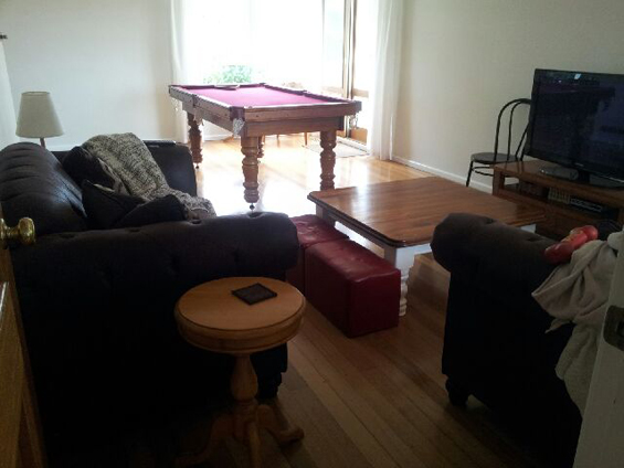
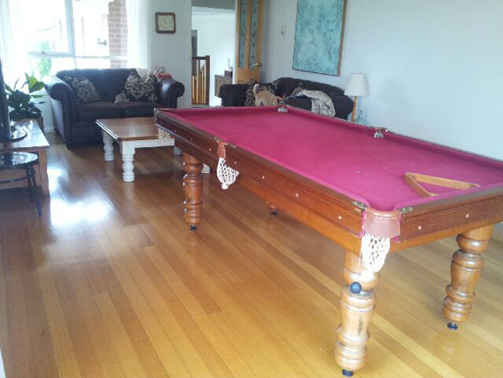
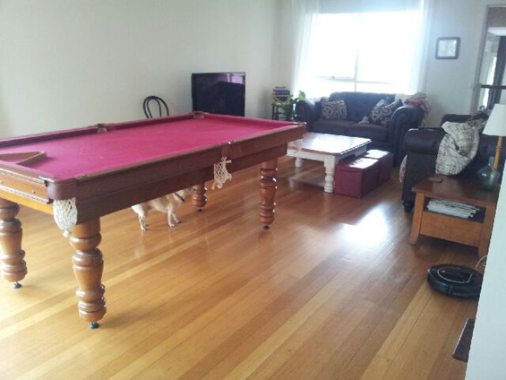
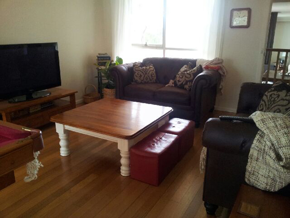
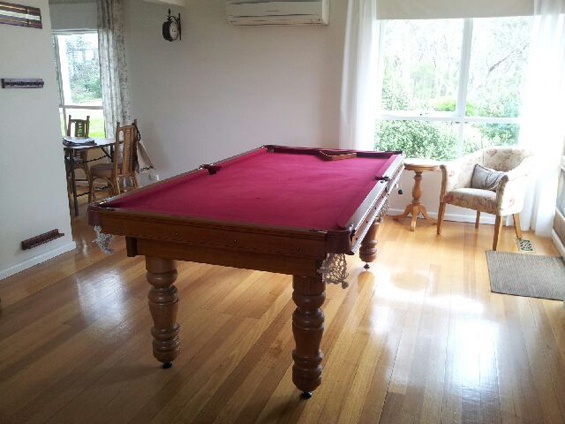
Here are the before shots…
Sorry they’re not the best (taken with mum’s phone).
As you can see, it’s a long-ish, narrow-ish room with a nice, neutral canvas. The main catalyst for re-doing the space is the fact the billiard table will be going (after 20 years!) so the proper dining area can be reclaimed. For the past two decades the dining table has been in the breakfast nook off the kitchen (which you can just see in the above pic) which has always been too squishy. We will be retaining the couches (which are only a few years old) though most of the other furniture (all of which mum has had forever – and now isn’t quite right for the space) will be replaced – with a focus on finding second-hand bargains.
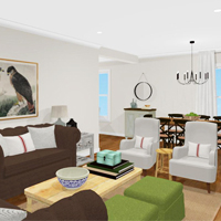
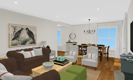
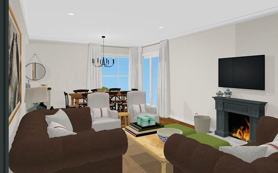
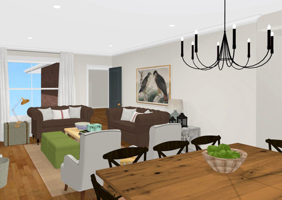
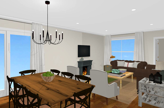
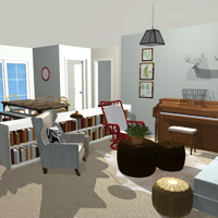
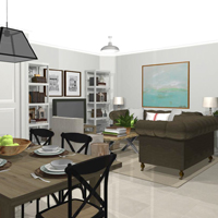
Here’s my rough virtual plan…
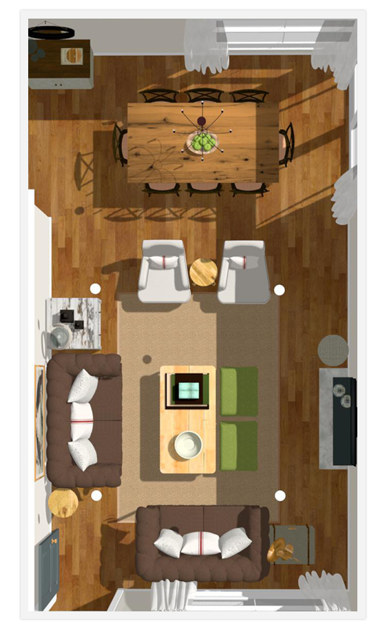
And here’s an overhead view to give a better spacial indication…
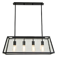
The general layout will remain the same because it just makes sense, plus mum and dad don’t want to have to re-wire for the TV. I have convinced them to re-wire the lighting however. You can’t see the ceiling lights in the before shots though there are three in a weird zig-zag configuration which doesn’t help with zoning the room. Instead, we are going to position four recessed downlights above the living space and one feature pendant over the dining table. I already have a cool DIY plan for that one!
The flooring, walls and ceiling will remain un-changed. I have persuaded mum to paint her old-fashioned lead-light door though.
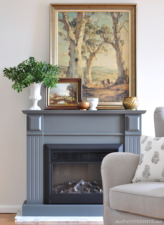
The fireplace was mum’s idea. She has a thing for them though no desire to install a real one. She actually already bought an inexpensive electric unit, complete with surround, around six months back. I know some people have a massive aversion to electric fireplaces. I don’t hate them though I’m not sure if I would use one in my own home. Maybe.
Anyhoo, you may have seen my recent post where I gave hers a mini makeover (click the preceding link to see it before)…
It’s perhaps going to look a little lost on that big, blank wall and maybe a bit small in comparison with the TV though we’ll make it work. I voiced the addition of some kind of flanking shelving, though mum and dad weren’t keen on that idea – and as you might be able to tell from the overhead rendering, there’s not really that much space for more furniture. I think we’ll wait until everything’s in place to decide if the fireplace needs company. Maybe we’ll use some surrounding artwork or something.
Speaking of artwork, I’m not decided on that yet either. Once again, I’ll probably wait until the room begins to come together to make final decisions on the placement of any wall decor. Same thing with the cushion, ottoman and curtain fabrics.
Soooo, that’s the general concept. Remember, it’s just a rough plan, though what do you guys think? Would love to hear any suggestions.
PS I’m in the process of upgrading my RSS feed and email subscription service. There may be a few bugs during the migration so apologies if you experience any issues. If you’re not already subscribed, now would be an awesome time to sign up! There is an email subscription bar at the end of each of my posts and in my sidebar :)



I think it looks amazing. I can’t wait to see the real thing! You are so inspiring!!!
Thanks lovely lady :)
I had to laugh reading your opening to this post. I know the feeling though can only imagine your frustration, as such an inventive soul, at being restricted in your creative endeavors. Your time will come dear. In the meantime we all look forward to whatever posts you have time for. I love this concept and look forward to seeing the real room.
Thank you Kathy :)
Kristine,
Love you blog! I love the virtual design you created. Can you share which software/website you used to create the design?
Thanks,
Kristy
Thanks Kristy :)
I use Home Designer by Chief Architect (https://www.homedesignersoftware.com/). I’m lucky to have the ‘Pro’ version though the basic ‘Interiors’ version can produce renderings just like this (you can compare products here: https://www.homedesignersoftware.com/products/product-chooser.html).
The software does come with a bit of a learning curve though if you’re patient it’s worth it in my opinion. There is trial version available so you can test the software prior to purchase.
Great!! Thank you!!
I love the plan, mostly. The only thing that I would change is the 2 high back chairs. To me, they block the sight line to the dining space. I would put one to the left of the fireplace with a very small “something” to put a glass of wine on or a cup of coffee. Maybe turn that basket upside down and put a piece of glass on top? Just my 2 cents for what it’s worth. Love your blog by the way.
Thanks Val. You’re right, they do create a slight barrier and interrupt the sight-line however we are interested in creating two separate zones in this room. That said, I’m sure we’ll play around with placement once we actually have the furniture. It may well work better to have one angled chair as you’ve suggested :)
I’m excited! You’re mock ups are always so lovely and amazingly balanced but your end results are even more spectacular- in an understated, simply beautiful way. And I totally understand about procrastination and finding time- I have six young kids and if I want to do a project at least two other things get ignored. Generally dishes and meals :) Good luck!
LOL! Yes, something’s gotta give :) And I only have two little ones!
Hopefully I can do the rendering justice. Thanks Becca.
Oh my gosh, does that room ever need your help. I don’t think I could have lived looking at that red pool table for 20 years. I might have run away from home. See? This is why I did not remarry. No slippery brown leatherette chairs or sofas for me. Ugh. Your parents’ room needs warmth. I love your plan. But I wonder if you’ll be able to cozy it up sufficiently given that you are stuck with hard wood flooring, hard walls, and the cold, slick surfaces of the sofa and chair. That room craves soft furniture and signs that a female lives there (happily), too. Maybe instead of a flat or sisal rug, introduce one with a little fluff to it. Perhaps the right lamps could evoke a sense of restrained glam.
Thanks so much for the input Ann :)
We’ll definitely be introducing lots of texture and some natural elements to help with a sense of cosiness and warmth. There will be drapes, pillows, throw blankets, ottomans, linen armchairs and an area rug. The couches are actually finely flocked suede so they do have a certain softness.
Mum wants to stick with a natural fiber rug (they are easy to clean and hide dirt well – she has seven young grandchildren to contend with – LOL!) though we’ll try and find something with a chunky weave. That said, everything we buy will be dictated by budget so our options are somewhat limited. We’ll do our best with accessories :)
Hi Kristine!
Your mock up plan is well done! I can’t wait to see how your personal touch changes the atmosphere of those rooms. I always look forward to your posts – no matter how long they take. ;) Keep on doing what you do!
Thanks so much Deb :)
Great looking plan! I also suffer from the “not finished project” bug! I would also love to know which design program you use!
Thanks and good luck!
Renea
Ha, ha. It’s nice to know I’m not alone Renea!
I use Home Designer by Chief Architect (https://www.homedesignersoftware.com/). I’m lucky to have the ‘Pro’ version though the basic ‘Interiors’ version can produce renderings just like this (you can compare products here: https://www.homedesignersoftware.com/products/product-chooser.html).
The software does come with a bit of a learning curve though if you’re patient and willing to put the time in it’s worth it in my opinion. So much fun to build a room this way!
Kristine
I LOVE that you have thrown caution to the wind.
Be brave.
Blog on the edge.
I live in eternal hope that reality will keep up with my enthusiasm . . . in regards to projects and blogging about them.
I TOTALLY believe that you can do it.
Plus it’s a pretty exciting exercise.
<3
Pia
Thanks so much Pia. Lovely and encouraging words as always :)
One pretty inexpensive thing you could to for the walls is folding screens. I’ve seen some at Pier 1, but a lot of places carry them. They’re extremely portable and lightweight, and you can stain or pain the frames to match your decor.
I bought a new house last fall, and I’m always working on small projects. A little here, and a little there to personalize it. It might take me the rest of my life to finish, but at least I have something that’s mine!
Looking forward to seeing the outcome!
Be blessed!
Amy
Thanks Amy. Do you mean use screens as wall decor positioned either side of the TV? Like shutters? That might look cool. I just don’t want to make the fireplace look any smaller by bulking-up the space above it. We’ll see.
Actually, I was thinking about placing a three-fold screen — or even a pair of bi-fold screens — right close to the wall on the floor to the left of the fireplace to give some visual interest to the long blank wall between the fireplace and the new dining room. If they’re placed close to the wall, they won’t take up much floor space at all, and still provide some decoration,and you won’t have to get as much for the walls.
Just a thought… :-)
Be blessed!
Ah, got ya. I’m sure once all the furniture is in place we’ll stand back and consider what might work best. I’ll be sure to keep this idea in mind. Thanks again Amy :)
Hi Kristine!
Just stumbled upon your blog while looking for home improvement sites. Cool idea on the room. Thanks for providing the software you used for the design, too. I actually thought you used a simulator like the SIMS (my fave!). Do excuse my confusion on that. :) Anyway, I’m glad I found your blog. Please keep us updated on the project. Good luck!
What program do you use to do the electronic renderings and is it difficult to learn?
Love your blog.
Jen
Ignore my question as I just found the answer
Posted in another question/answer above.
Cheers
Jen
Glad you found the answer Jen. It’s a great program which is easy enough to learn though difficult to master. You can download a free trial which should give you a feel for working with it before committing to a purchase.