Thanks so much for the lovely response to the Guest Bedroom Reveal I posted last week. You guys are just the best! I’ve been trying to reply to all of the comments, but have been a bit pressed for time, so please bear with me.
I’m popping back in today to share the master bedroom.
Sorry for the crappy phone snaps. I don’t have one of those fancy new phones which takes decent wide angle pics. I’d already taken down several pieces of wall art and started clearing things away when I remembered to take these.
Although this is the master, it’s actually not as large as the guest bedroom due to the space the attached ensuite occupies.
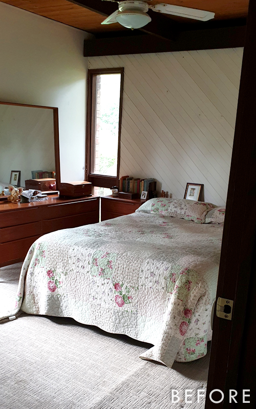
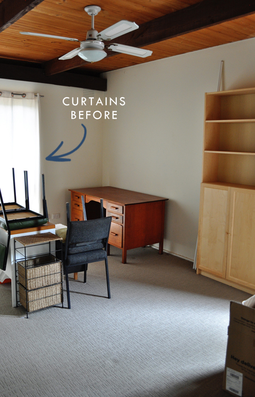
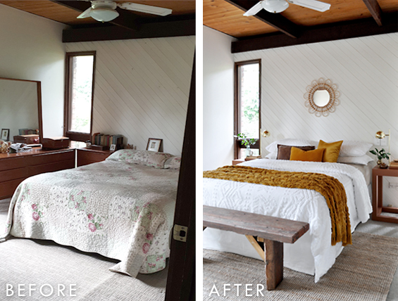
It was overwhelmed by bulky furniture and made dark by heavy curtains (I’d already removed some of them when I took the before shots – there is another large window just out of shot to the left).
My plan was to simplify, brighten and modernise things for a fresher and more spacious feel.
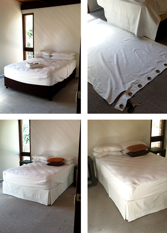
We used the existing double-size mattress and base which I added a bedskirt to using the curtain trick I mentioned in my last post.
The curtains I used to make the skirt were “borrowed” from the guest bedroom…
Here are a few (very bad!) progress pics of that project…
Please refer to my original post about making bedskirts from curtain panels for the full tutorial.
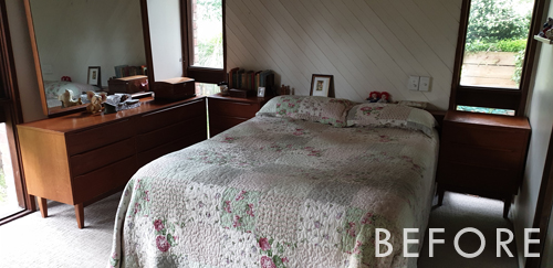
The bed was initially off-set in the room to accommodate the large dressing table, but for staging purposes it just made sense to remove that piece entirely in order to center the bed on the panelled wall, and generally make things feel more open and spacious.
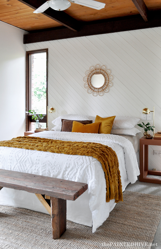
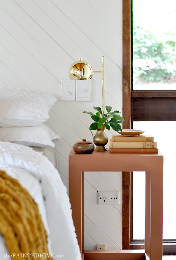
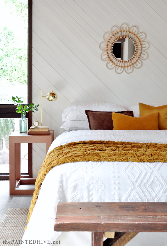
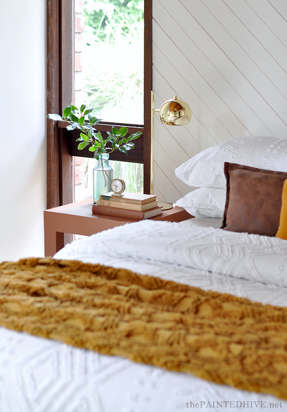
Because the bed is flanked by tall windows which extend from the floor, I chose to switch-out the existing mid-century side tables in favour of something visually lighter (if you caught the guest bedroom reveal last week, then you will probably know that I decided to use the mid-century side tables in that room instead).
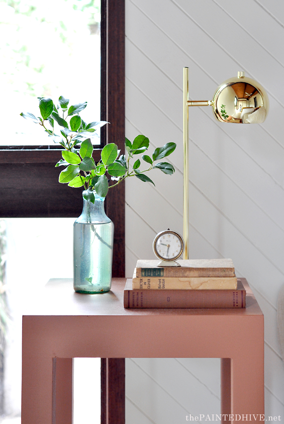
I already owned the cube tables, which you may remember from The Flip House. For that property I painted them a deep green but this house was all about warm and earthy tones so I repainted them a rusty terracotta (colour is ‘African Ambush’ by Dulux).
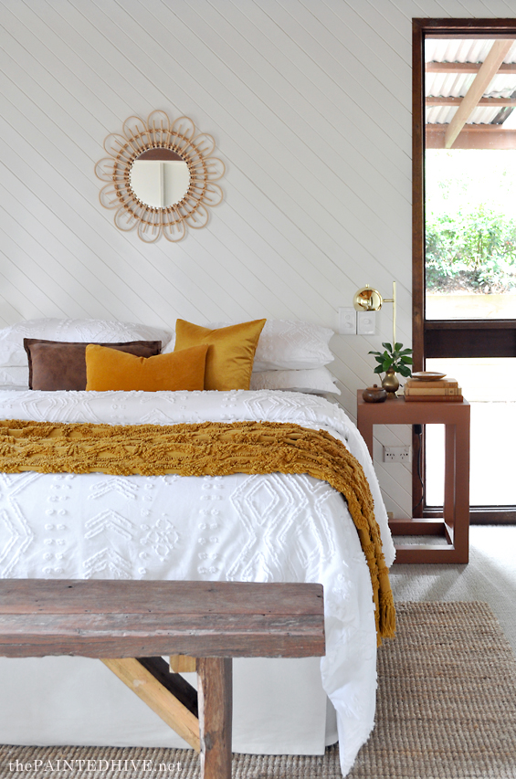
The rug is one of my all time favourites: the IKEA ‘LOHALS’. I use this often because it’s lovely and neutral yet still textural and interesting, plus it’s soooo affordable! It comes in two sizes and for my purposes I have used the smaller one which is 160cm x 230cm.
I wanted a bench at the end of the bed but knew that my go-to green one (which normally resides at the end of my very own bed) wouldn’t work with the colour scheme in here. I had a quick look around online for a new alternative, but never came across anything affordable enough, even on the second-hand sites. Then one day I was at my parent’s house and noticed this rudimentary bench sitting behind their shed.
“Hey Dad, where did this come from? Can I take it to Lorraine’s house?”
“Yeah sure, if you want. I just built it from some scraps I had lying around but I don’t really have anywhere to put it!”
Bench sorted!
It’s not exactly the rustic-refined elm seat I was envisaging, but for free it would totally do!
All of the decor, and most of the bedding, are items I already owned.
I could have used a statement piece of art over the bed, which in the context of this room alone would have looked very impactful, but given I’d already used several large pieces throughout the house I decided to keep things sweet and simple in here, especially due to the panelled wall which is a feature unto itself. The mirror is one I already owned (from Spotlight).
Lamps are from Big W, originally purchased a few years ago to use in The Flip House guest bedroom.
To dress the bed I bought a new basic doona, along with a white quilt cover set, from Target. Although the bed is a double I opted for king-size so it looks and feels generous, plus is more flexible for future use.
The tufted mustard throw is one I already owned (originally gifted by Linen House).
Cushions are also ones I already owned. The faux leather one was from Target, the others were from H&M.
Along with dressing this room, there were also a couple of small jobs needed to bring things up to scratch.
The panelled wall was dotted with multiple nail holes and some decent gauges, so I filled them then gave it a fresh coat of paint.
I also had the carpet re-stretched. You can see in the before pic that there was quite a notable ridge in the carpet (looked even worse in person). I tried to pull it up and flatten it out myself but it’s a job that really needs proper tools. It only took the layer about ten minutes and cost just $60.
Here are the comparison before and after pics…
Catch up on all the previous posts about ‘The Staged House’ HERE.



Congratulations Kristine. It all looks fabulous & fresh. You are a star.
Ha, ha. Thank you :)
Great job again!
Thanks so much :)
Another great room …. and thank you for the previous reply. It is lovely when somebody takes the time to personally acknowledge a question – especially when their schedule is so busy😊
Thanks so much Sharron :)
It looks great! You are SO good!
Ha, ha. Sometimes things come together well :)
Looks great! I’m having a chuckle though at what your own house looks like at the moment, a bit bare? You’re sharing all your good stuff with your projects. “Hey mum, I was using that!” “Not anymore!” 😁
Ha, ha. Totally. Among other “gaps” here are several picture hooks sitting empty on the walls right now!
So lovely ! It’s amazing that just a freshen up and using colours that the room already contains can bring such serenity. I didn’t even notice that long window in the ‘before’ pictures!
What a difference.
You have done a wonderful job once again. I just love your style.
I’m betting that the unused dressing table shows up as a TV table in the lounge room somewhere down the track. Love your work, and especially like that it’s so affordable. Anyone can go into a high end store and decorate a room, it takes talent to get a high end look on a budget.😊
Denise you hit the nail on the head regarding affordable and talent etc.; this girl is so gifted. Kristine you are truly a magician. Please don’t bother to reply to my comment; I’d much rather you started another post. :)
Thanks ladies. You are too kind.
Amaizing! I love the bedding. Pity we do not have a Target shop in the EU. Looking forward to your next posts and have some plant pots lined up outside as you have inspired us to paint them a fun colour!
More inspiration. Thank you Kristine for motivating me. This makeover has got me changing a royal blue, hand-painted filing cabinet to match the freshly painted ‘Sandy Day’ walls in the study.
The handles will be replaced with chrome d-handles and new label plaques.
Some fresh plants and baskets will have us happy.
Thanks again for the great ideas.
Incredible… As always!
I’ve been busy so only just had time to see your work. I love both the guest and main bedrooms. What you’ve done is beautiful and rooms are so much brighter.
Hello Kristine,
it is amazing how many decisions and care goes into your projects. The bedroom turned out very nice and is sure to appeal once the house is on the market for viewing and buying.
Thanks so much :)
Yea, those beautiful windows needed to be seen!
Kristine, I just love the way u refresh everything into one of a serene, marvelous setting.
Simplicity is sssssssssssso sophisticated!
A beautiful room makeover as always. I love how you were able to incorporate your dad’s bench!!
What a beautiful makeover!!! It looks like a spread in a glossy magazine. Your bedskirt trick is The Best, and I especially love the paneled wall. Now, it all looks so clean and new and bright. Excellent job!!
Thank you so much Vikki :)
Another beautiful job! You’ve really accentuated the really nice features of this room – the windows and the panelled wall, and made it look like such a different space. Love the colours that you’re using too!